Seamless HubSpot | Free Website Template | Rocket
Migrate is a split-screen landing page template built for teams moving their data into HubSpot from a legacy CRM. It guides visitors through a visual Problem-to-Solution arc, pairing a chaotic legacy system on the left with a clean, ordered HubSpot dashboard on the right. The design uses a Monochrome Steel palette with a single electric accent to make every call to action feel urgent and actionable.
by Rocket studio
Quick summary
Migrate is a single-page, split-screen landing page template designed for HubSpot migration guide products and apps. It transforms the anxiety of a CRM switch into a confident, step-by-step visual story. The Dynamic Motion theme and Monochrome Steel color system create a focused, high-stakes atmosphere that keeps visitors scrolling and moving toward the download.
Who this template is for
This template speaks directly to the people who carry the weight of a CRM migration. It is built for teams who need to communicate clarity and competence before asking for a commitment.
- Operations managers facing a Salesforce contract renewal they want to avoid
- Marketing directors whose teams are patching together three separate platforms
- Agency founders who have promised a client a smooth transition and need to deliver
What problem this template solves
Most migration tools lose potential users at the landing page. Visitors arrive stressed and skeptical. A plain feature list does nothing to earn their trust. This template solves that by performing the migration story visually before asking for a single keystroke.
- Visitors leave without converting because the page never addresses their specific fear of data loss
- Generic layouts fail to show the transformation from chaos to order in a way that feels real
- Friction-heavy lead forms scare off hesitant visitors who are not yet ready to commit
What you get with this template
You get a fully structured, single-page layout that doubles as a sales argument. Every section is designed to reduce doubt and build momentum toward the primary download action.
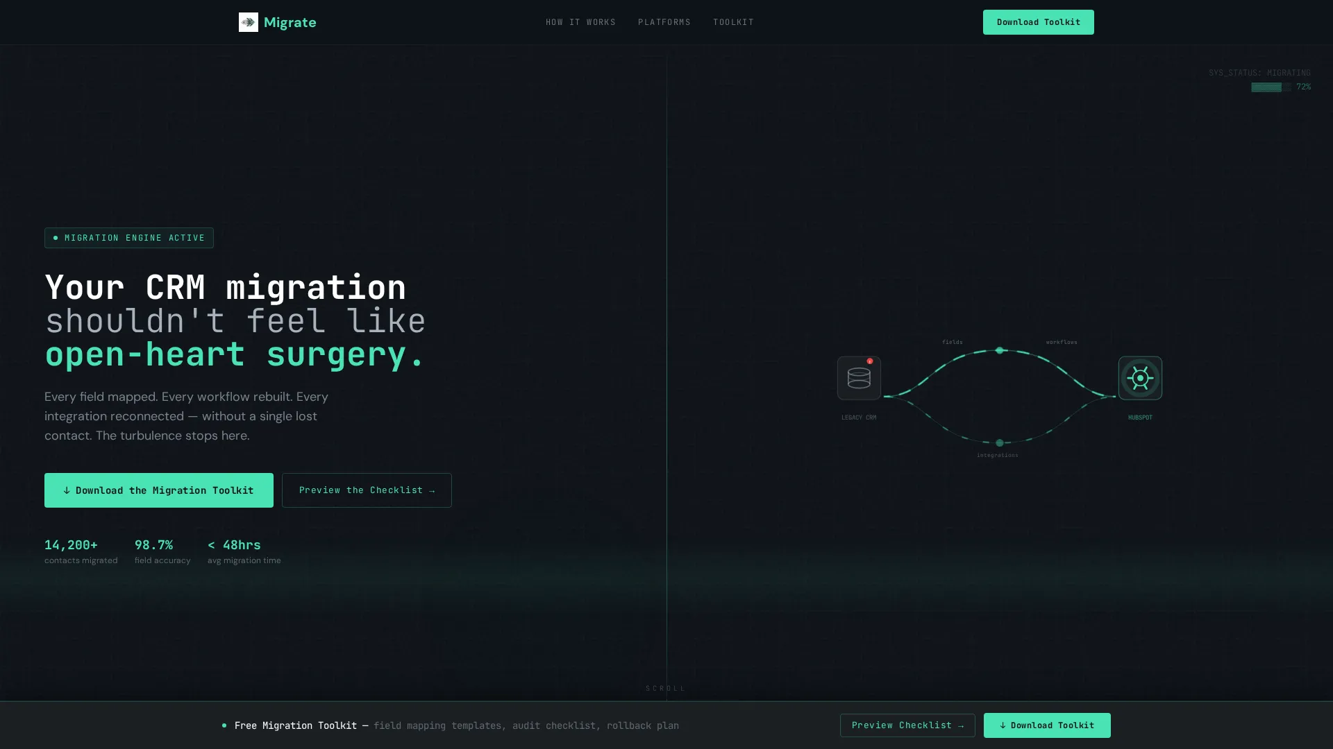
- A dark full-bleed header with a pulsing glow animation and a mono-spaced headline
- A scroll-driven Problem-to-Solution arc using a 50/50 split-screen layout
- A primary download call to action plus a no-form secondary path for hesitant visitors
Feature list
This template ships with a focused set of layout and interaction components, each tied directly to the migration conversion goal.
Dark Full-Bleed Header with Animated Glow
The header uses a panel black background with a soft radial gradient in the electric accent color at roughly twelve percent opacity. The glow pulses like a heartbeat monitor, and a thin animated line traces data particles from a generic database icon to the HubSpot sprocket. The oversized mono-spaced headline anchors the entire visual.
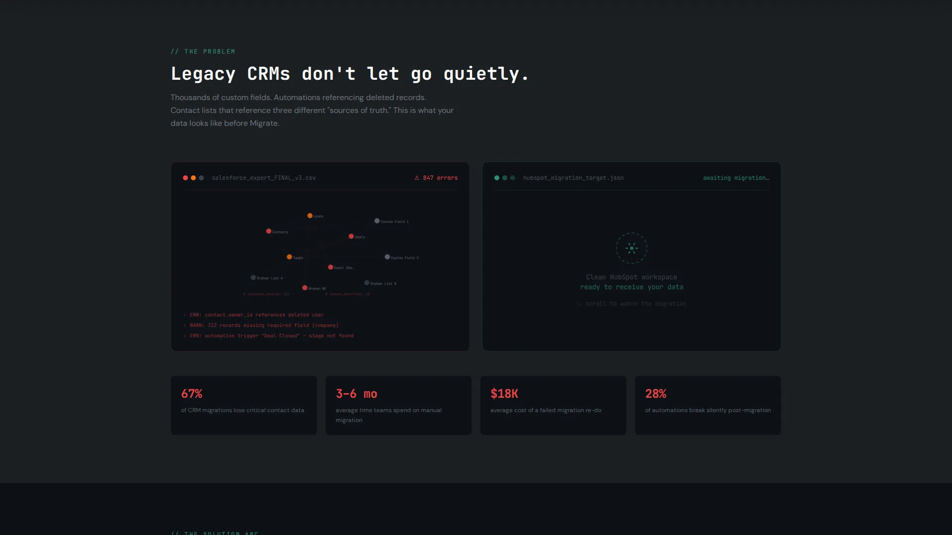
Scroll-Driven Split-Screen Arc
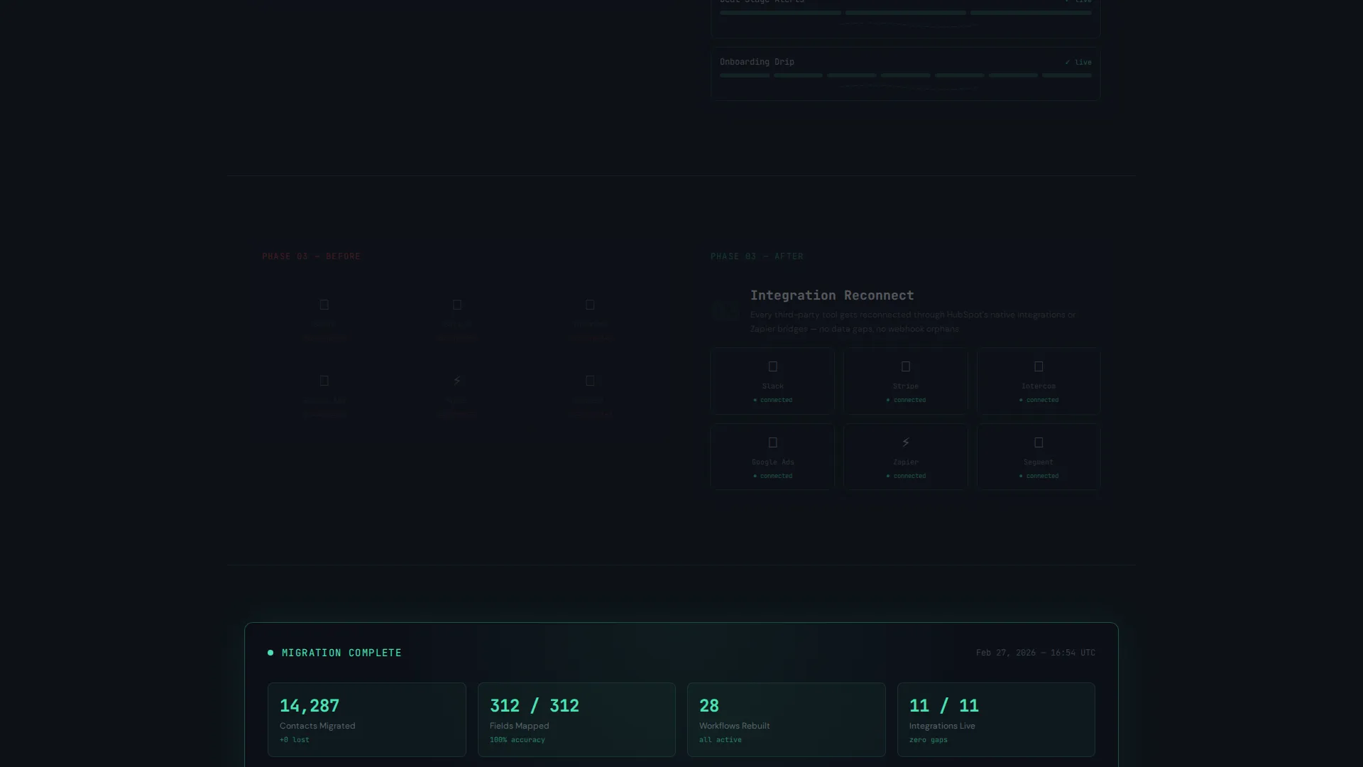
The core layout is a 50/50 split screen that responds to scroll position. The left panel opens with a chaotic node graph of a legacy CRM. As the visitor scrolls, the right panel fills in: field mapping locks into place, workflows rebuild with animated connectors, and integrations light up one by one. By the final section, the left fades and the right holds a clean, glowing dashboard.
Sticky call to action Bar
After the second scroll section, a sticky bar activates at the bottom of the viewport. It carries the primary call to action in electric mint green, ensuring the download prompt is always within reach without interrupting the scroll story.
Modal Lead Capture Form
Clicking the primary call to action opens a slim modal. It asks for a work email, the visitor's current CRM platform via a dropdown, and an estimated contact database size. The form is intentional and minimal, reducing friction while collecting the data most relevant to a migration use case.
No-Form Secondary Download Path
A secondary link labeled "Preview the Checklist" lets hesitant visitors download a free PDF migration checklist with no form required. This trust-building step lowers the barrier to entry and warms up visitors before they commit to the full toolkit.
Monochrome Steel Color System
The palette uses deep gunmetal, brushed chromium, and panel black as base tones. The single electric accent appears only on interactive elements, calls to action, and progress indicators. This restraint makes every actionable element stand out without visual noise.
Page sections overview
| Section | Purpose |
|---|---|
| Full-Bleed Header | Sets the high-stakes tone and anchors the primary call to action |
| Legacy CRM Pain | Shows the tangled state of a legacy system as a dark node graph |
| Field Mapping Panel | Animates field alignment locking into place on the right panel |
| Workflow Rebuild Panel | Shows workflows rebuilding with animated connectors as user scrolls |
| Integration Reconnect Panel | Lights up integrations one by one to signal restored connectivity |
| Clean Dashboard Reveal | Left panel fades; right panel shows a glowing, ordered HubSpot view |
| Sticky Download Bar | Activates after scroll section two; keeps the call to action always visible |
| Modal Capture Form | Collects work email, CRM type, and database size before download |
| Checklist Secondary Path | Offers a no-form PDF download to build trust with hesitant visitors |
Design & branding system
The visual identity follows a Dynamic Motion theme grounded in a Monochrome Steel palette. Every color decision serves a function: dark backgrounds create focus, chromium text stays readable without glare, and the electric accent signals action.
- Base colors: deep gunmetal (#1B1F23), panel black (#0D1117), and brushed chromium (#A8B2BD) for body text
- Accent color: electric mint (#4AE3B5) reserved strictly for calls to action, interactive states, and progress indicators
- Typography uses oversized mono-spaced type in the header, reinforcing the technical command-center aesthetic
Mobile & speed optimization
The split-screen layout is structured to adapt to smaller viewports without losing the scroll-driven narrative. The Dynamic Motion theme uses purposeful animation rather than heavy visual assets to keep the experience light.
- Animations rely on CSS-driven motion rather than large video files, keeping the page lean on mobile connections
- The sticky call to action bar is positioned to remain functional and visible on both desktop and mobile viewports
- The modal form is slim by design, with only three fields, making it easy to complete on a small screen
How this template helps you convert
The entire page is engineered around a single conversion goal: the toolkit download. Every design decision reduces hesitation and increases the sense of inevitability.
- The scroll arc performs the migration story visually, so visitors feel the product working before they ever click a button
- The secondary checklist path removes the all-or-nothing pressure, letting cautious visitors take a smaller first step that builds toward the full commitment
Other information about this template
This template sits within the Documentation and Support category, specifically the HubSpot Documentation subcategory. It is purpose-built for the HubSpot migration guide niche and pairs well with migration toolkits, onboarding apps, and CRM transition services. The intersection match between the Dynamic Motion theme, Problem-to-Solution creative direction, and App Download landing-page direction makes this a tight, single-purpose layout.
- Template style: Split Screen (50/50), single landing page flow
- Theme: Dynamic Motion with scroll-triggered state changes
- Conversion direction: App Download with a modal capture form
- Compatible use cases include HubSpot migration tools, CRM switch guides, and agency transition service pages
Theme
Dynamic Motion
Creative direction
Problem→Solution Arc
Color system
Monochrome Steel
Style
Split Screen (50/50)
Direction
App Download
Page Sections
Scroll-driven Split-screen Arc
Animated Dark Full-bleed Header
Sticky Call to Action Bar
Minimal Modal Lead Capture
No-form Checklist Download Path
Monochrome Steel Design System
Related questions
Can I customize the color palette in this template?
Does the scroll animation work on all major browsers?
Can I add more CRM options to the modal dropdown?
Is the secondary checklist path connected to a form?
Who is this template best suited for?


