No-Code Platform Documentation Cost Calculator Website Template
Migrate is a modular card grid landing page template built for teams that have outgrown their current database tooling. It combines a live cost comparison calculator, a Problem-to-Solution card arc, and platform comparison modules into one structured, dark-themed page. The design uses a Midnight Blue color system and guides visitors from diagnosis to a gated migration playbook download.
by Rocket studio
Quick summary
Migrate is a single-page template designed to help operations managers, startup CTOs, and agency leads present a compelling case for leaving an overpriced database platform. The page opens with a live cost calculator, moves through a structured Problem-to-Solution card arc, and closes with a gated playbook download. Every section builds toward one decision.
Who this template is for
This template is built for technical communicators and product teams who need to turn migration hesitation into confident action. It is especially useful when your audience already feels the pain but needs a clear, dollar-quantified path forward.
- Operations managers running large row-count bases who need to justify a platform switch to stakeholders
- Startup CTOs tracking rising per-seat database costs who want a structured comparison to share with their team
- Agency project leads whose linked record dependencies have broken repeatedly and who need a documented exit plan
What problem this template solves
Database migrations stall not because they are technically impossible, but because the cost, complexity, and risk feel unquantified. Teams stay on expensive platforms longer than they should because nobody has laid out the steps side by side.
- There is no single page that shows both the cost problem and the migration path at the same time
- Comparison information is scattered across forums and docs, making it hard to build internal alignment
- Without a concrete dollar figure and a complexity score, decision-makers push the migration to the next quarter
What you get with this template
This template gives you a fully structured, modular landing page that walks visitors from cost shock to confident action. Every card section is self-contained but builds on the one before it.
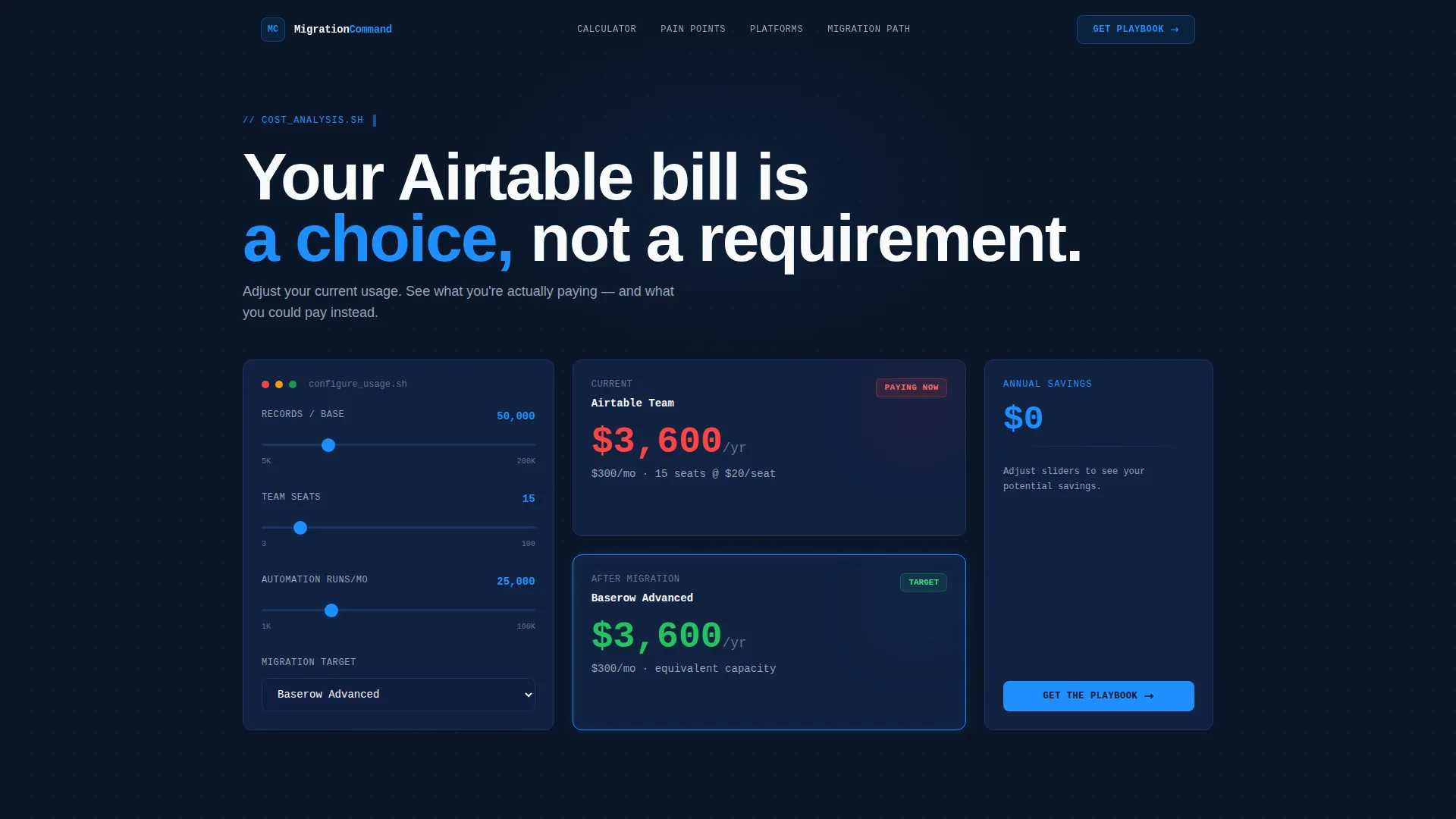
- A live cost comparison calculator pre-populated with realistic numbers and adjustable sliders for row count, user seats, and automation runs
- A card grid arc that moves from pain diagnosis through platform comparison cards, data export methods, schema mapping modules, and API bridge tutorials
- A gated conversion form with a platform dropdown, anchored deep-dive links inside every comparison card, and a primary call-to-action for the migration playbook download
Feature list
This template ships with six purpose-built modules. Each one handles a distinct stage of the visitor's decision journey.
Live Cost Comparison Calculator
The header calculator displays current plan costs on the left and target platform costs on the right. Sliders let visitors adjust row count, user seats, and automation runs. The numbers update in real time, and a summary line below the tool states the annual overpayment amount directly.
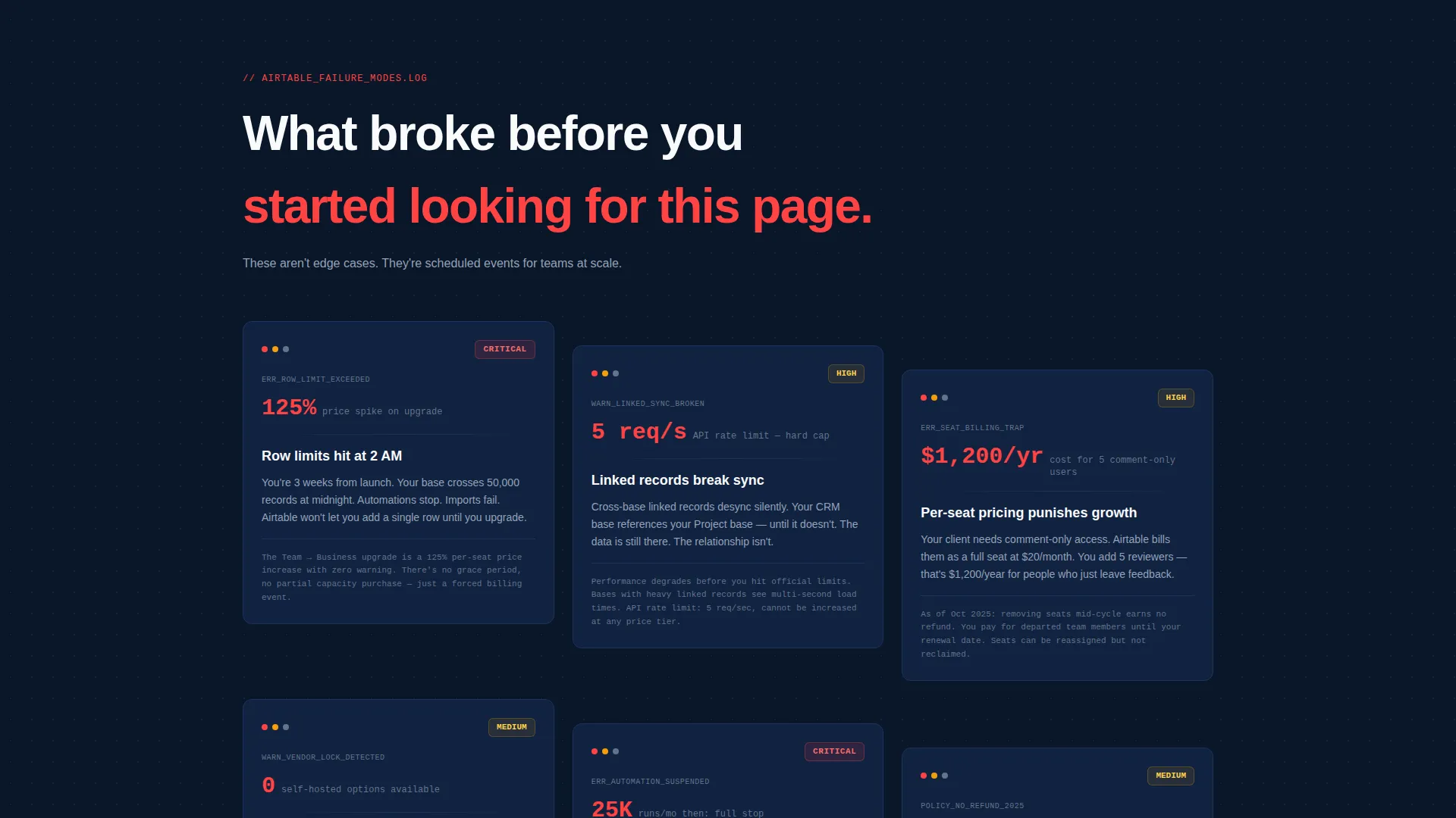
Problem Card Row
The first card row surfaces the core pain points in concrete, scannable fragments. Each card carries a red-flagged screenshot and a specific problem label such as row limit warnings, broken linked record syncs, or per-seat pricing penalties.
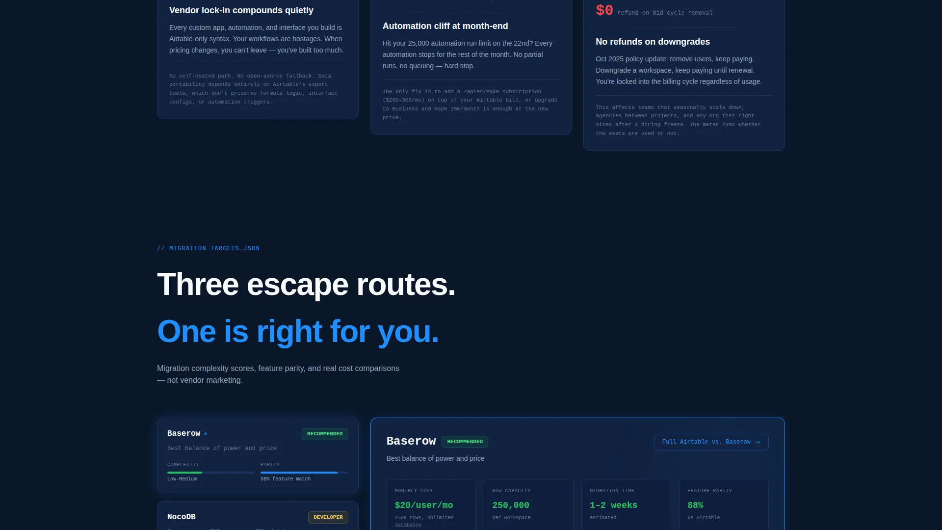
Platform Comparison Card Row
Each card in this row represents a different destination platform. Cards display migration complexity scores, feature parity percentages, and estimated transition timelines so visitors can compare options at a glance without leaving the page.
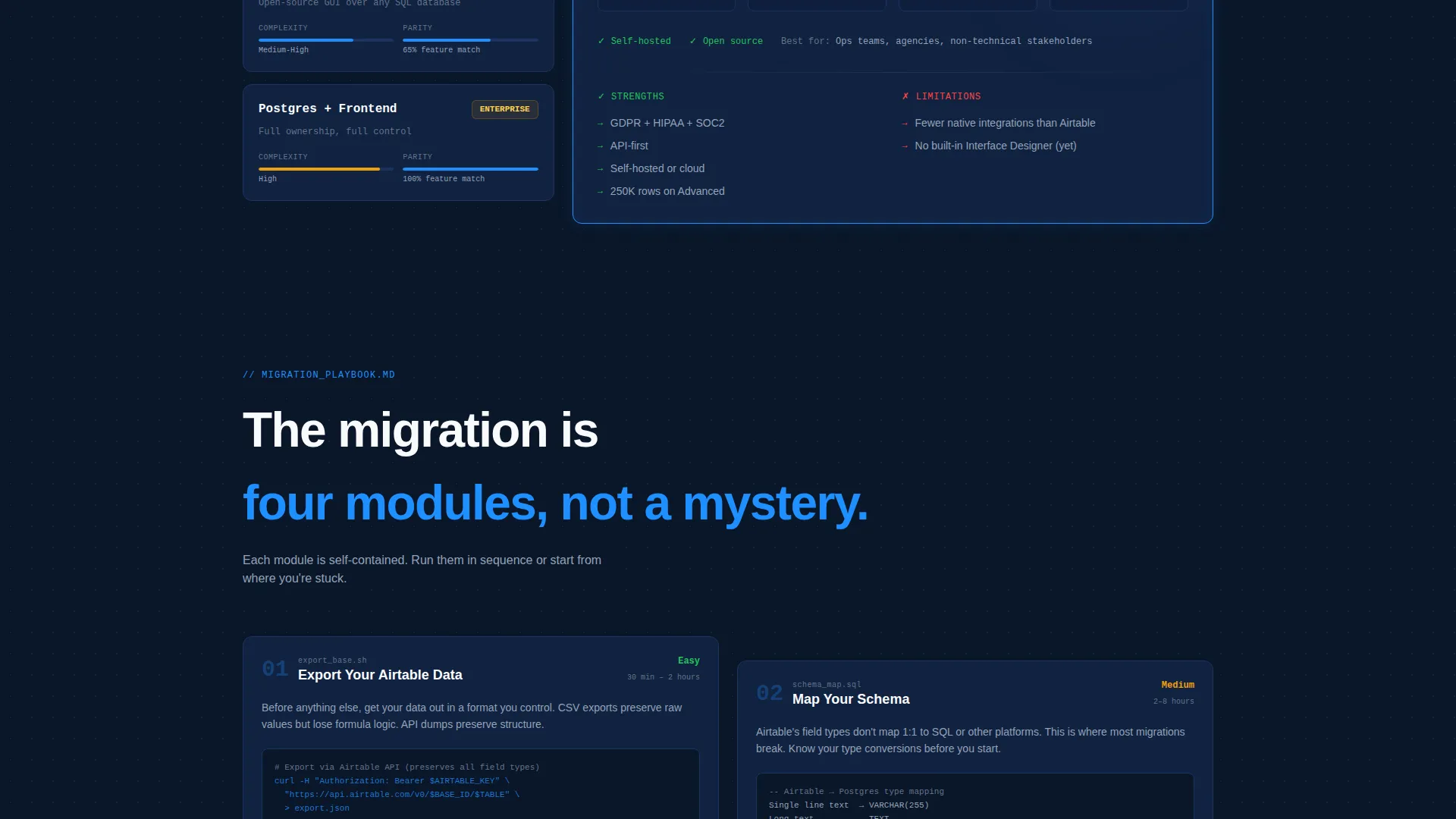
Migration Module Cards
A dedicated card group covers the practical mechanics of moving: data export methods, schema mapping templates, and API bridge tutorials. Each module is self-contained but sequenced to build cumulative confidence across the scroll.
Gated Playbook Download Form
The primary conversion point sits at the bottom of the card arc. Visitors enter an email address and select their target platform from a dropdown before downloading the migration playbook. The form is preceded by the calculator savings figure so the motivation is still fresh.
Anchored Deep-Dive Links
Every platform comparison card includes a secondary call-to-action button. Each button links to an anchor section with a full platform breakdown. This gives high-intent visitors a direct path to the detail they need without scrolling the entire page.
Page sections overview
| Section | Purpose |
|---|---|
| Cost Calculator Header | Show real-time annual savings to hook attention immediately |
| Overpayment Summary Line | Deliver a single dollar-figure verdict below the calculator |
| Pain Point Cards | Surface row limit, sync, and pricing problems with visual evidence |
| Platform Comparison Cards | Compare destination options with complexity scores and timelines |
| Data Export Modules | Walk through export methods in self-contained, actionable cards |
| Schema Mapping Cards | Present schema mapping templates as ready-to-use migration tools |
| API Bridge Tutorials | Cover API connection steps for teams bridging platforms mid-migration |
| Playbook Download Form | Gate the full migration guide behind email and platform selection |
| Platform Deep-Dive Anchors | Host detailed comparison breakdowns linked from comparison cards |
Design & branding system
The visual identity follows a Data Command theme built around a Midnight Blue color system. The palette is designed to feel like a well-organized database interface at night: dark enough for extended reading, with electric blue accents that mark every interactive element.
- Deep terminal navy (#0A1628) dominates all background surfaces, card containers use crisp schema white (#F8FAFC), and muted interface gray (#94A3B8) handles body text and secondary labels
- Active-state blue (#1E90FF) fires on hover states, comparison highlights, calculator slider handles, and every call-to-action element that signals interactivity
- The card grid layout keeps information modular and scannable; each card is visually distinct but unified by the shared color system and consistent typographic hierarchy
Mobile & speed optimization
The card grid layout is structured to reflow cleanly on smaller viewports. Modular card blocks stack vertically without losing their sequential logic.
- Each card is self-contained, which means stacking order on mobile preserves the Problem-to-Solution narrative without requiring horizontal scroll
- Calculator sliders and dropdown inputs are sized for touch interaction, keeping the conversion path functional on mobile devices
- Anchor links from comparison cards resolve correctly on all screen sizes so the deep-dive navigation remains usable on phones and tablets
How this template helps you convert
The conversion strategy is sequenced deliberately. Every section earns the next click before asking for anything in return.
- The calculator leads with a specific dollar figure. Visitors arrive with a vague sense of overspending and leave the header section with a concrete annual number, which primes every subsequent section with financial motivation.
- The Problem-to-Solution card arc moves visitors from recognition to confidence. By the time they reach the platform comparison cards, they have already validated their pain and started evaluating solutions, making the playbook download a natural next step.
- The gated form closes with minimal friction. The email field and platform dropdown are the only required inputs. The secondary anchor links inside each comparison card give high-intent visitors a research path that keeps them on the page and builds further trust before they convert.
Other information about this template
This template is designed for the Airtable migration guide use case and sits within the Documentation and Support category under Airtable Documentation. It is well suited for teams building Airtable alternatives content, database migration resources, or structured comparison guides.
- The template style is Card Grid (Modular), making individual sections easy to reorder, remove, or extend without breaking the page layout
- The creative direction follows a Problem-to-Solution Arc, which is a proven structure for technical decision-making content where the audience already understands the problem but needs a clear path forward
- The Comparison/Versus landing page direction makes this template a strong fit for content comparing Airtable versus NocoDB, Airtable versus Baserow, or Airtable versus a self-hosted Postgres setup with a custom frontend
- The header Calculator/Estimator concept can be adapted for other cost-comparison use cases beyond database pricing, such as SaaS tool audits or infrastructure cost reviews
Theme
Data Command
Creative direction
Problem→Solution Arc
Color system
Midnight Blue
Style
Card Grid (Modular)
Direction
Comparison/Versus
Page Sections
Live Cost Comparison Calculator
Problem Card Row with Visual Evidence
Platform Comparison Cards
Migration Module Card Group
Gated Playbook Download Form
Anchored Deep-dive Section Links
Related questions
Who is this template designed for?
Can I adapt the cost calculator for a different comparison use case?
Do I need coding skills to edit the platform comparison cards?
How does the gated playbook download form work?
Can the template support several destination platform comparisons at once?



