Milestone - Automated Education Landing Page Template
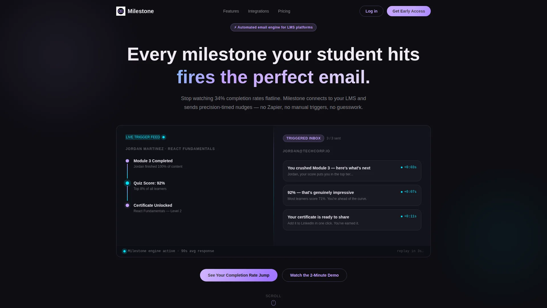
Milestone is a split-screen landing page template built for education email automation platforms. It visualizes the moment a student completes a module, misses a deadline, or earns a credential, then shows the exact email that fires in response. The template uses a Dynamic Motion design with an AI Iridescent color system to make automated learning journeys feel alive and measurable.
by Rocket studio
Quick summary
Milestone is a single-page landing page template designed for education email automation tools. It uses a 50/50 split-screen layout to contrast silent learner dashboards against live, triggered email sequences. The design is built around a Problem-to-Solution scroll arc that makes inaction feel costly and automation feel obvious.
Who this template is for
This template is built for professionals who manage learner engagement and need to communicate the value of automated email triggers at a glance.
- Course creators who are buried in manual Zapier workflows and need a faster, cleaner way to show what their platform does
- Edtech product managers watching completion rates stall and looking for a compelling way to present their solution to buyers
- Corporate Learning and Development directors who must prove training return on investment to finance stakeholders who rely on dashboards
What problem this template solves
Most education platforms struggle to communicate the direct link between a student action and an automated email response. A static screenshot does not capture that relationship. This template solves that gap.
- It visualizes the trigger-to-email sequence in real time using animated milestone nodes and a live inbox panel
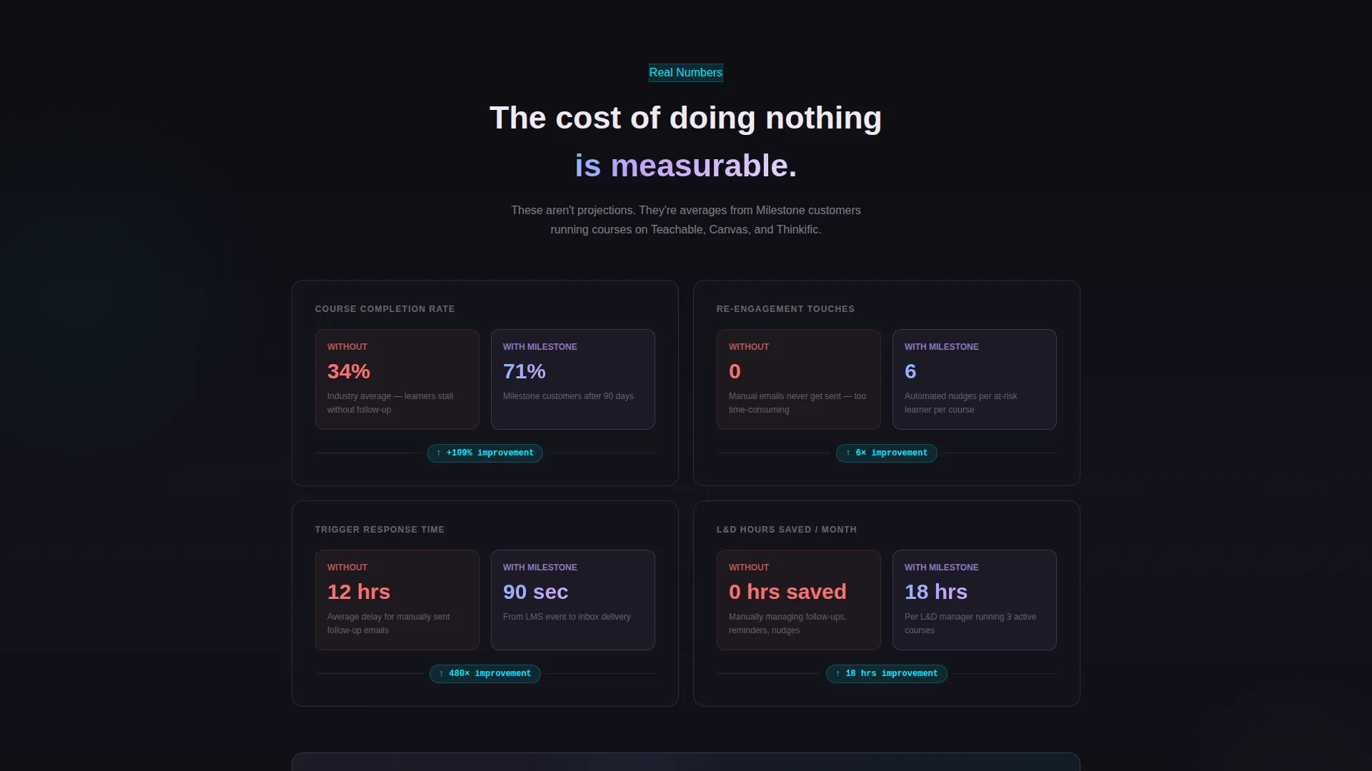
- It replaces abstract feature lists with concrete before-and-after comparisons, such as 34% completion versus 71% and a 12-hour manual delay versus a 90-second trigger response
What you get with this template
You get a fully structured, single-page landing page layout that walks a visitor through the full automation story, from abandoned learner to certified completer.
- A split-screen header showing a student journey timeline on the left and triggered email previews on the right, with sequenced micro-animations connecting each node to its email
- A scrollable Problem-to-Solution arc that progressively lights up the left dashboard and fills the right inbox as the visitor reads further
- A Comparison/Versus section with real metric callouts and two conversion paths: a primary call to action and a secondary demo link, plus a lightweight two-field form
Feature list
This template includes a focused set of interactive and visual components drawn directly from the design brief.
Animated Milestone Node Timeline
The left panel of the header displays three pulsing milestone nodes: module completion, quiz score, and certificate unlock. Each node trails an iridescent connector line that travels to the right panel in sequence, making the trigger logic immediately visible.
Live Inbox Email Preview Panel
The right header panel shows a stacked inbox view with visible subject lines tied to each milestone trigger. Emails appear in sequence as the micro-animations fire, giving visitors a real-time sense of what automated follow-up looks like in practice.
Progressive Problem-to-Solution Scroll Arc
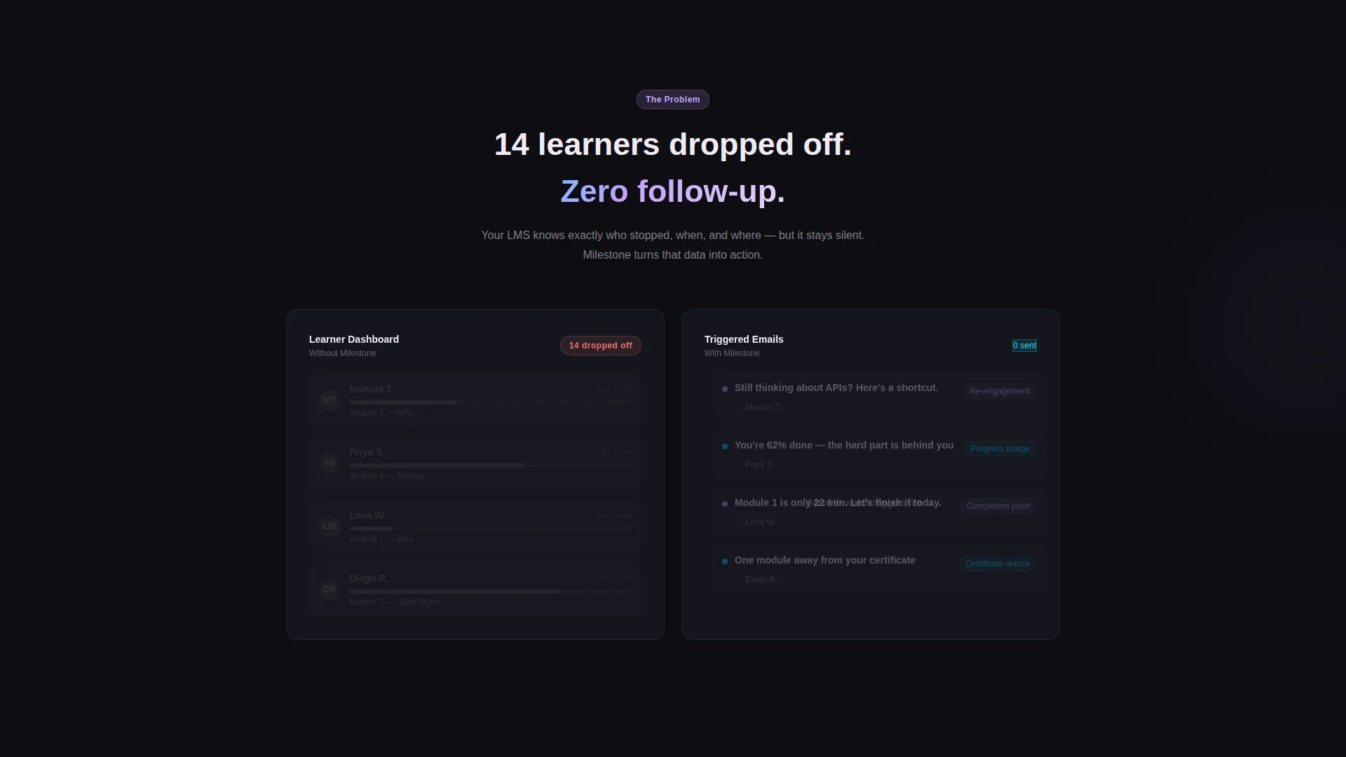
The page opens with a grayed-out dashboard showing 14 learners who dropped off with no follow-up. As the visitor scrolls, the dashboard lights up and the inbox fills. The escalation moves from a simple completion email to a conditional re-engagement sequence to a multi-branch certification flow.
Comparison/Versus Metric Sections
Every content section is structured as a direct contrast between operating without the platform and operating with it. Metrics are specific: 0 re-engagement touches versus 6 automated nudges, and a 12-hour manual delay versus a 90-second trigger response.
Lightweight Conversion Form
The form asks only for a work email address and LMS platform selection from a dropdown that includes Teachable, Thinkific, Canvas, Moodle, and Other. The low-commitment design is intentional, reducing friction to feel like curiosity rather than a sales handoff.
Dual Call-to-Action Structure
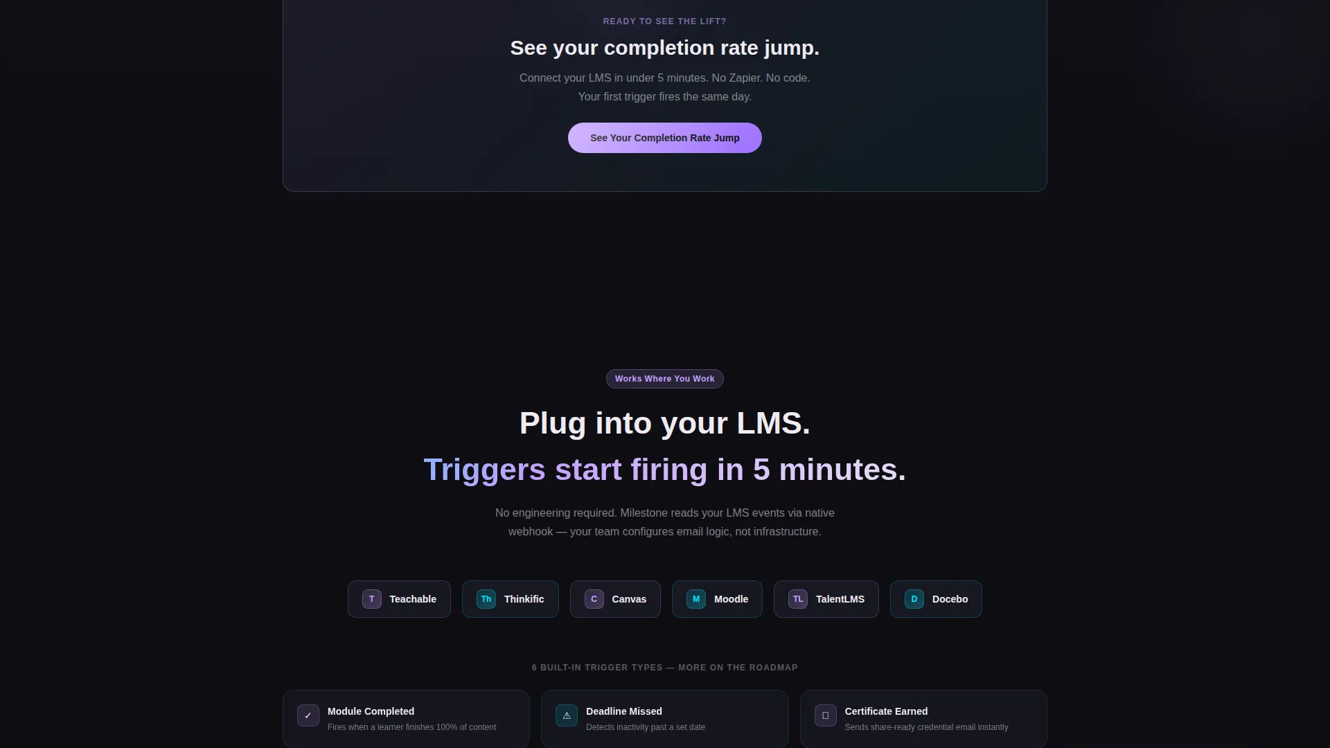
The primary call to action, "See Your Completion Rate Jump," appears at the midpoint after the first data comparison. A secondary path, "Watch the 2-Minute Demo," appears at the bottom. This gives visitors two ways to move forward based on where they are in their decision.
Page sections overview
| Section | Purpose |
|---|---|
| Split-Screen Header | Show milestone triggers firing and triggering live emails side by side |
| Problem Panel | Display a silent, abandoned learner dashboard with zero follow-up |
| Solution Reveal | Progressively animate configured triggers and incoming personalized emails |
| Simple Completion Arc | Introduce the first automation layer: a post-module completion email |
| Re-Engagement Sequence | Escalate to conditional nudges for learners who miss deadlines |
| Certification Flow | Show a multi-branch email path tied to credential earning |
| Comparison Metrics | Contrast before-and-after numbers across completion and response time |
| Midpoint call to action | Place the primary conversion prompt after the first data comparison |
| Conversion Form | Capture work email and LMS platform with a two-field lightweight form |
| Bottom call to action | Repeat primary action and surface the secondary demo path |
Design & branding system
The visual identity follows a Dynamic Motion theme using an AI Iridescent color system. Every color is tied to a functional state, never used as passive decoration.
- Deep void black (#0D0D12) forms the primary background, making every active element appear to glow from within
- Holographic lilac (#C4A1FF) activates on hover states and milestone pulses; electric cyan (#00E5FF) traces data lines and progress connectors; soft pearl (#F0EBF4) is reserved for readable text and card surfaces
Mobile & speed optimization
The layout is designed to keep the split-screen experience readable and functional across screen sizes.
- The 50/50 split collapses cleanly into a stacked single-column flow on smaller screens, preserving the left-to-right trigger narrative as a top-to-bottom sequence
- Micro-animations are scoped to individual section triggers so they fire only when a section enters view, keeping the scroll experience intentional rather than overwhelming
How this template helps you convert
The page is structured to move a skeptical visitor from recognition of a problem to readiness to act, using real data and visual proof at each step.
- The header immediately demonstrates the core product behavior, a student action triggering a precise email, before a visitor reads a single headline, reducing the time needed to understand the value
- The Comparison/Versus layout replaces abstract claims with specific numbers, making the cost of inaction concrete and the benefit of automation measurable before the form ever appears
Other information about this template
This template is categorized under Technology and sits within the Education Email Templates subcategory, targeting the Education Milestone Email niche. It is designed for teams whose LMS platforms include options like Teachable, Thinkific, Canvas, and Moodle. The dropdown form field is pre-structured to match these common platforms out of the box. The template style is Split Screen (50/50) and the creative direction is a Problem-to-Solution Arc, making it a strong fit for product-led growth landing pages where showing beats telling.
- The Intersection Match Score for this template is 13, reflecting a tightly focused niche alignment between the technology category and education email automation use cases
- The header concept is a Dashboard Preview, and the layout direction is Comparison/Versus, both reinforcing a data-driven, results-first presentation style
Theme
Dynamic Motion
Creative direction
Problem→Solution Arc
Color system
AI Iridescent
Style
Split Screen (50/50)
Direction
Comparison/Versus
Page Sections
Animated Milestone Node Timeline
Live Inbox Email Preview Panel
Progressive Problem-to-solution Scroll
Comparison Metrics Layout
Lightweight Two-field Conversion Form
Dual Call-to-action Placement
Related questions
Who is this landing page template designed for?
Does this template include the email automation logic itself?
Can I adjust the comparison metrics shown in the template?
What LMS platforms does the form dropdown include?
How does the scroll animation sequence work?



