Business & Executive Education Careers Website Template
The Milestone Family First PMP Certification Landing Page Template is a single-page, quiz-led layout built for PMP boot camp providers targeting working parents. It combines side-by-side comparison tables, a five-step interactive assessment, illustrated visuals, and a warm Dopamine Pop color system to turn overwhelmed mid-career professionals into enrolled students in twelve focused weeks.
by Rocket studio
Quick summary
This template is a pre-designed, reusable landing page built to promote a twelve-week PMP certification boot camp for working parents. It opens with a quiz that promises a personalized study plan, progresses through comparison tables that make the case mathematically and emotionally, and closes with a secondary lead capture for a free downloadable planner. Every section is calibrated for mobile-first reading after bedtime.
Who this template is for
This template is built for EdTech founders, training providers, and certification coaches who serve working parents pursuing Project Management Professional (PMP) credentials. If your program runs evenings and weekends and your audience juggles Gantt charts and grocery lists, this layout speaks their language from the first scroll.
- Working parents aged 30 to 45 with five or more years of project management experience who feel stuck in self-study burnout
- Military spouses, single parents, and career re-entrants rebuilding professional momentum between relocations or life transitions
- Training businesses and boot camp operators who need a high-converting, emotionally resonant landing page without building from scratch
What problem this template solves
Most PMP certification landing pages look like corporate brochures. They list features, quote pass rates, and move on. They do not speak to the parent studying flashcards after the house goes quiet. They do not acknowledge that your project planning sessions happen between 9:15 PM and 10:30 PM on a Tuesday, or that Saturday mornings belong to soccer games first and study groups second.
- Generic landing pages fail to connect with an audience whose biggest scheduling obstacle is not ambition, but a bedtime routine
- Self-paced course pages rarely show the week-by-week project schedule a working parent actually needs to believe the program is doable
- Standard lead capture forms ignore the emotional permission a busy parent needs before they commit their Tuesday nights to a new project
What you get with this template
You get a complete, section-led landing page designed around a single conversion goal: get the visitor to take a five-question quiz and receive a personalized twelve-week study plan. Every design choice, every block of copy, and every interactive element exists to serve that one action. The template also includes a secondary conversion path for visitors who are not ready to enroll but are willing to share their email for a free planning resource.
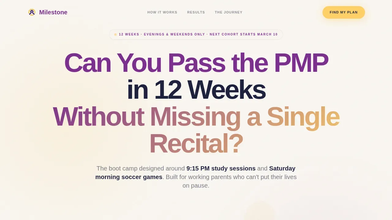
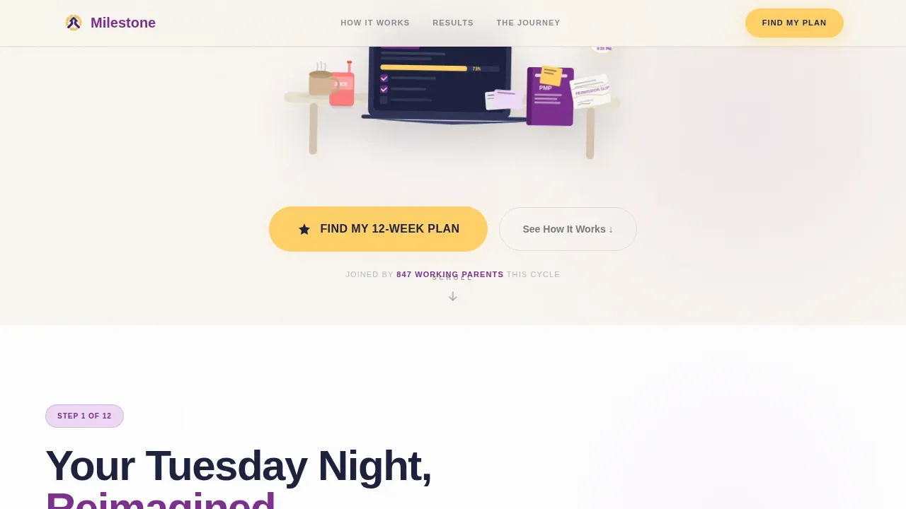
- A quiz-anchored hero section with an illustrated kitchen table scene, a pulsing yellow call-to-action button, and bold ultraviolet typography that opens with a question instead of a pitch
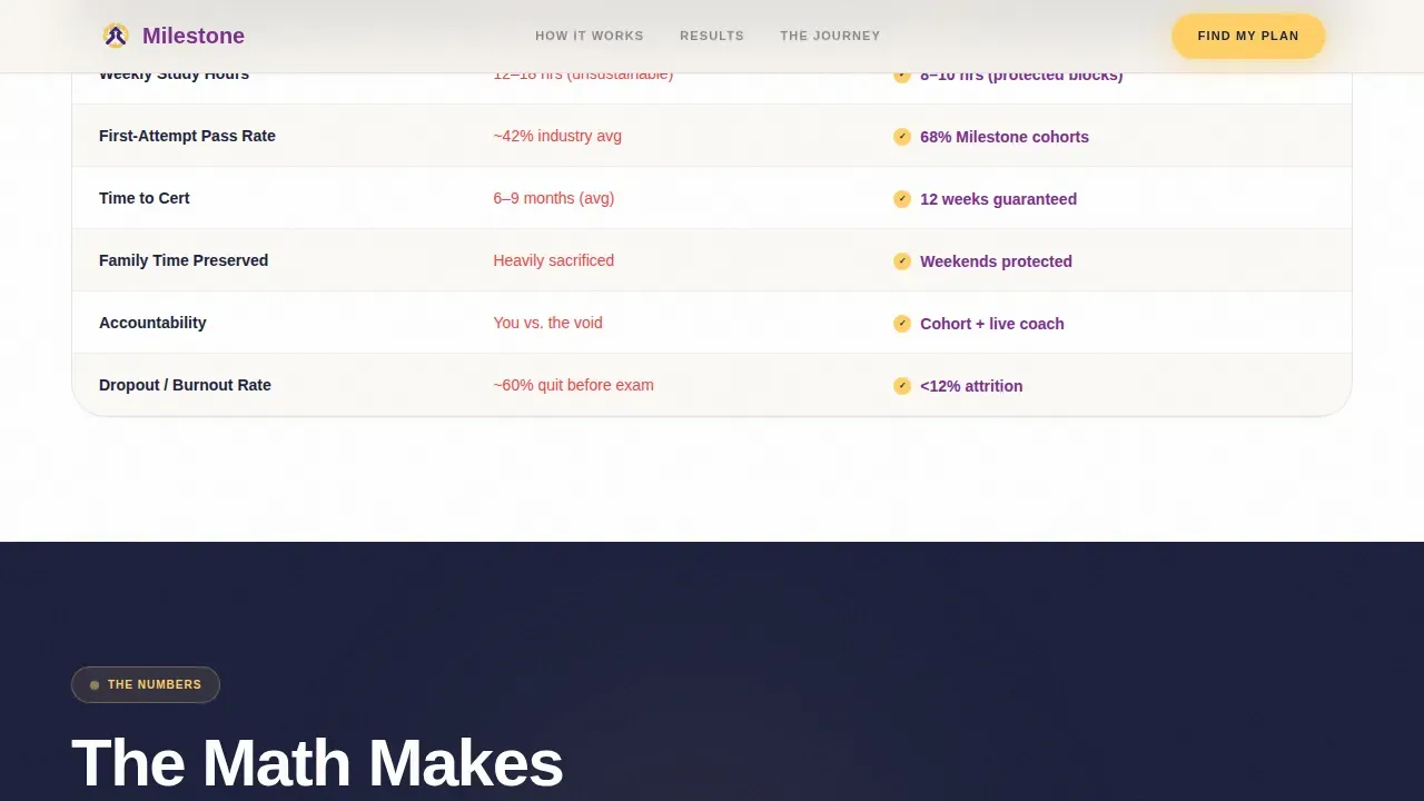
- Side-by-side comparison tables that show actual hour blocks, study method outcomes, pass rates versus industry averages, and cost versus delayed certification salary loss
- A five-question interactive assessment with state machine logic that delivers a personalized study calendar preview and a recommended cohort start date
Feature list
This template ships with six core structural and interactive components. Each one is described below with the specific job it does on the page.
Quiz Starter Hero Block
The header opens with a single bold question in ultraviolet on cloud white. Below it sits an illustrated kitchen table scene with a laptop, a PMP prep book, a juice box, a crumpled permission slip, and a progress bar at 73%. No stock photography. A pulsing yellow button anchors the bottom of the hero. The composition is warm, slightly messy, and immediately recognizable to anyone living this life. This block sets the emotional tone and earns the scroll.
Progressive Comparison Tables
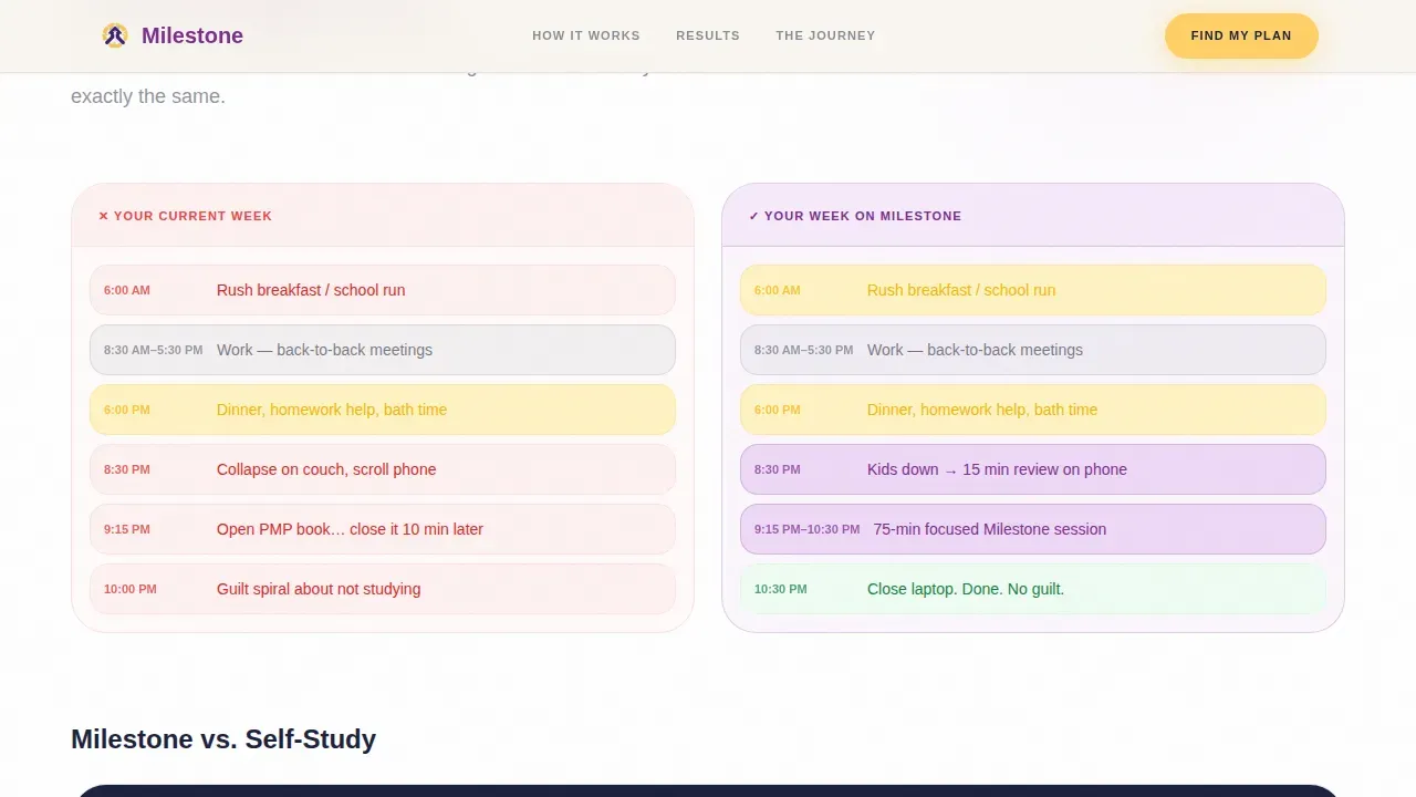
The Step-by-Step Guide creative direction drives the page as a numbered journey. Each section mirrors a week-by-week milestone alongside the realities of a parent's project schedule. The first comparison table shows "Your Current Week" versus "Your Week on Our Plan" using actual time blocks. Subsequent tables stack progressively, comparing study methods versus self-study burnout, pass rates versus industry averages, and program cost versus income lost from delayed project completion. The scroll builds a case that feels both mathematical and emotional.
Five-Question Interactive Assessment
The primary call-to-action launches a five-step quiz with state machine transitions. Questions cover current PMP knowledge level, weekly hours realistically available, biggest scheduling obstacle, target exam date, and learning style preference. Results deliver a personalized study calendar and recommended cohort start date. This component treats each visitor as a particular project with specific project requirements, not a generic lead.
Animated Proof and Stats Section
A dedicated proof block uses animated counters to surface key data: a 68% first-attempt pass rate, a 33% salary lift, and a time comparison versus self-study. These numbers are displayed as large, scrolling figures that load as the visitor reaches them. The section keeps stakeholders informed about outcomes without a wall of text.
Bento Grid Milestone Journey
An asymmetric bento grid maps the twelve-week boot camp as a visual project timeline. Each card represents a milestone in the program's lifecycle, from Initiating through Planning, Executing, Controlling, and Closing. The grid uses varied card sizes to reflect the weight of each project phase. Upcoming milestones are highlighted to show forward momentum and keep the viewer oriented in the big picture.
Secondary Lead Capture for Free Planner
Visitors not ready to commit see a low-friction offer: a free downloadable "PMP Parent's Weekly Planner" PDF. The form collects email and first name only. This secondary path keeps the page useful for visitors at every stage of their decision, and it gives the business a way to continue the conversation through follow-up.
Page sections overview
| Section | Purpose |
|---|---|
| Quiz Starter Hero | Opens with a bold question, illustrated kitchen table scene, and a pulsing yellow quiz call to action button |
| Comparison Tables Block | Shows side-by-side hour blocks comparing the visitor's current week against their week on the plan |
| Proof and Stats | Displays animated counters for pass rate, salary lift, and time-to-certification data |
| Bento Grid Journey | Maps the twelve-week program as milestone cards across a visual project timeline |
| Interactive Quiz Assessment | Delivers a personalized five-question study plan with cohort start date recommendation |
| Free Planner Capture | Offers a secondary lead path with a simple two-field form and downloadable PDF |
| Footer Flow | Cloud white horizontal footer with navigation and program credibility details |
Design & branding system
The visual identity follows a Family First theme using a Dopamine Pop color system. The palette feels like a kid's finger painting pinned to a corporate cubicle wall, joyful, unapologetic, and alive with the tension between professional ambition and the chaos of raising humans.
- Four core colors drive every element: warm serotonin yellow (#FFD166) for calls to action and progress indicators, confident ultraviolet (#7B2D8E) for headings and badges, soft cloud white (#FAF7F2) for backgrounds, and deep bedtime navy (#1B1F3B) for body copy and grounding sections
- Typography uses Plus Jakarta Sans in bold weights for all headings and DM Sans for body text, creating a pairing that feels warm, confident, and readable at every screen size
- Illustration replaces stock photography throughout; the kitchen table scene is warm, specific, and slightly messy, instantly recognizable to any parent who has ever studied after bedtime
Mobile & speed optimization
This template is built mobile-first. The primary audience, working parents studying on their phones after the kids are asleep, needs a page that loads cleanly, scrolls intuitively, and makes the quiz feel effortless on a small screen.
- Static sections use Server Components to keep page weight low, while the quiz and animation blocks load as Client Components only when they enter the viewport
- GSAP ScrollTrigger powers animated counters, cursor parallax blobs, and staggered card reveals, keeping motion meaningful without overwhelming the experience on mobile
- Comparison tables reflow into vertically stacked layouts on smaller screens so all the tasks and data remain readable without horizontal scrolling
How this template helps you convert
The template is structured to move a skeptical, time-poor visitor from "I am curious" to "I am taking the quiz" inside a single scroll session. Every decision, from the opening question to the secondary planner offer, is built around reducing friction and increasing trust.
- The quiz-first hero removes the generic sales pitch and replaces it with a promise of specificity. The visitor is not asked to enroll; they are asked one question. That question earns the click, and the click starts the relationship. This approach keeps the page focused on a single call to action while giving the visitor a sense of control and progress from the very first interaction.
- The progressive comparison tables build a cumulative case for the program before the visitor ever sees a price. By the time cost appears in a table, it sits next to the salary impact of delayed certification. The data does the persuading. Social proof through testimonials and animated counters reinforces the message, keeping stakeholders and prospective students informed with real outcomes rather than vague claims.
- The secondary lead capture ensures the page converts at two levels. Visitors who are ready take the quiz and get a personalized plan. Visitors who need more time download the free planner and enter a follow-up sequence. Neither group leaves empty-handed, and neither action requires more than a first name and an email address.
Other information about this template
This section covers additional practical details about the template's scope, flexibility, and use context that buyers commonly want to understand before customizing or deploying it.
The milestone family first pmp certification landing page template is a pre-designed, reusable web page layout built specifically to promote PMP training courses to working parents. It is part of a broader library of project management templates and project templates designed for certification and education use cases.
The template can support a curriculum overview that breaks down the five project management process groups: Initiating, Planning, Executing, Controlling, and Closing. Providers who are a PMI Registered Education Provider (REP) offering the required 35 Professional Development Units (PDUs) should update the footer and credibility section to reflect that status clearly.
The comparison table structure is flexible enough to serve simple projects with short timelines or complex programs with layered task dependencies. Editors can add tasks, adjust due date fields, and update the end date columns to match their actual cohort schedule. The milestone chart layout inside the bento grid can be edited to reflect a different number of weeks or a different project's lifecycle without redesigning the page.
Project management templates like this one provide a structured framework that saves time and reduces the risk of overlooking critical components in project planning. A well-structured project plan inspires confidence in stakeholders and team members alike. This template can support that by keeping every section of the project management plan visible, scannable, and easy to act on.
- The template can be customized to fit specific audience profiles beyond working parents, including IT teams, construction project managers, or healthcare administrators with specific project requirements
- Editors can swap the illustrated kitchen table scene for a different illustration that matches a new project context while keeping the color system and typography intact
- The quiz component can be repurposed for other certification boot camps or training programs that need a personalized assessment as their primary conversion tool
- Free templates in adjacent project management categories can be linked from the footer to support visitors researching other project planning resources
- The page design keeps external stakeholders and prospective students on the same page by surfacing program outcomes, schedule details, and credibility signals early in the scroll
Theme
Family First
Creative direction
Step-by-Step Guide
Color system
Dopamine Pop
Direction
Quiz/Assessment
Page Sections
Quiz Starter Hero with Illustrated Scene
Progressive Side-by-side Comparison Tables
Five-step Interactive Assessment
Animated Counters and Proof Block
Asymmetric Bento Grid Milestone Journey
Secondary Free Planner Lead Capture
Related questions
Can I use this template for a PMP program that runs on a different schedule?
Does the quiz deliver a real personalized result or is it a static page?
What does the secondary lead capture form collect?
Is this template suitable for project management training programs outside PMP certification?
How do I keep branding consistent if I change the color palette?



