Milestone - Powerful Homeservices Landing Page Template
Milestone is a comparison table landing page built for regional home services companies that run lifecycle email programs. It showcases a trigger-based email engine side by side against competing platforms, with a live metrics header, trade-specific filtering, and two conversion paths that turn table checkmarks into audit requests and gap reports.
by Rocket studio
Quick summary
Milestone is a single-page comparison table template designed for home services businesses that rely on trigger-based lifecycle emails. It opens with a live stats dashboard, guides visitors through a trade-filtered feature comparison, and closes with two conversion paths. The page is built to let the data do the persuading before the call to action ever appears.
Who this template is for
This template is built for regional home services operators who send scheduled, event-driven emails to homeowners. It speaks directly to business owners and marketing managers running fleets of 20 to 200 trucks who need to prove their platform's edge.
- HVAC companies that track every unit by serial number and want warranty-date triggered follow-ups
- Plumbing and restoration franchises whose owners still answer after-hours calls and need systematic re-engagement
- Roofing and electrical contractors looking to convert past customers before seasonal demand peaks
What problem this template solves
Generic email marketing tools were not built for the rhythms of home services work. Milestone answers the question every field-service operator eventually asks: why does my current platform miss every anniversary, warranty expiry, and equipment-age trigger that should be driving repeat bookings?
- Platforms like general marketing tools lack equipment-age logic, seasonal pre-booking sequences, and revenue attribution per send
- Prospects arrive skeptical and need proof, not promises, that a specialized tool outperforms what they already pay for
- The buying decision stalls when there is no clear, trade-specific comparison to point at
What you get with this template
You get a fully structured, single-page layout that builds the case for a lifecycle email platform through live numbers, interactive filtering, and a proof-first table. Every section is organized to remove doubt and move the visitor toward a defined action.
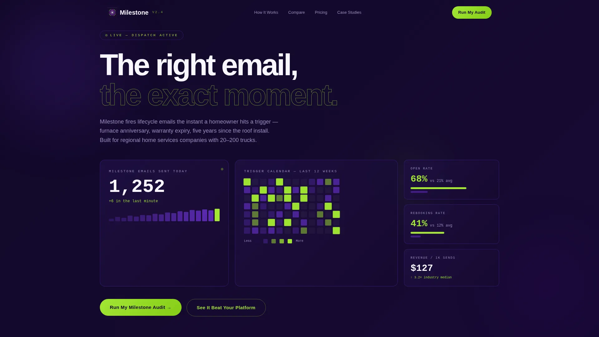
- A Stats/Metrics header showing real-time send counts, a calendar heatmap of triggered sends, and three KPI cards stacked against industry averages
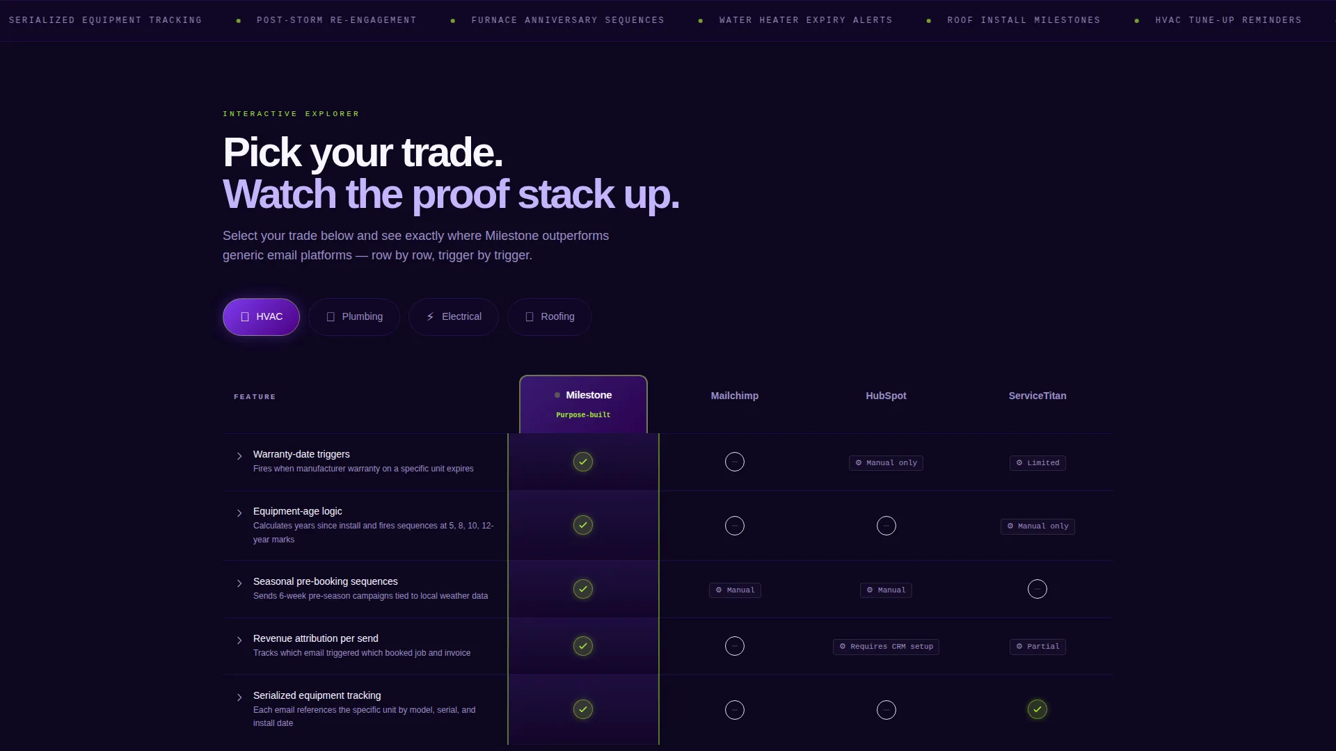
- A trade-filtered comparison table where visitors pick their category and watch the columns reshape to show Milestone's advantages row by row
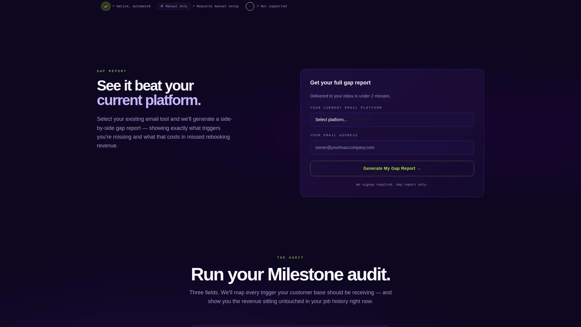
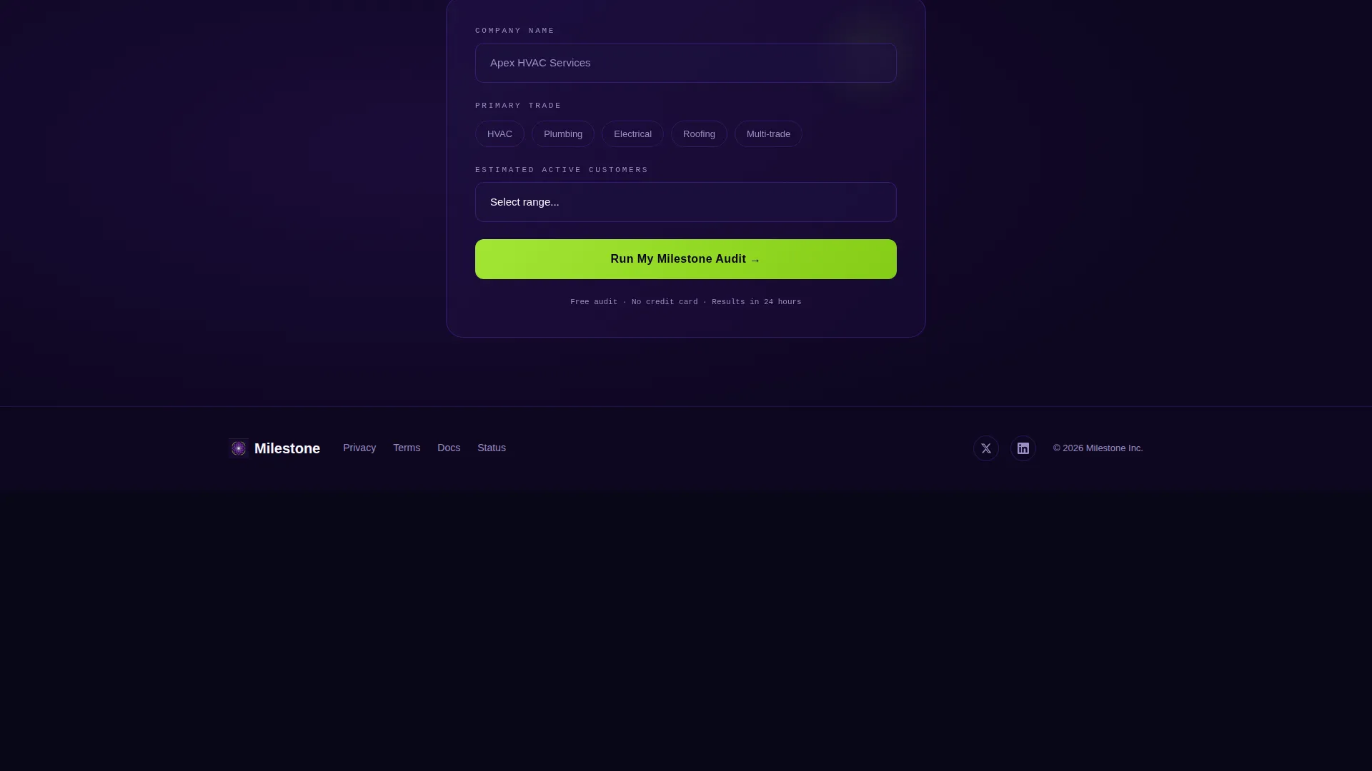
- Two conversion paths: a three-field audit request form and a gap-report generator tied to the visitor's existing email tool
Feature list
This section covers the core capabilities built into the Milestone landing page template.
Live Stats Dashboard Header
The header opens with a metrics panel frozen mid-pulse. A real-time counter displays milestone emails sent that day, a calendar heatmap lights up every triggered send in signal lime, and three KPI cards show open rate, rebooking rate, and revenue recovered against industry benchmarks. Numbers are typeset in monospace and tick upward with subtle animation so the data feels active, not static.
Trade-Filtered Comparison Table
Visitors choose their trade category below the header. The table immediately reshapes its columns to compare the platform against competing tools across rows covering warranty-date triggers, equipment-age logic, seasonal pre-booking sequences, and revenue attribution per send. Signal lime checkmarks stack on the Milestone column while competitors display dashes and asterisks.
Expandable Row Proof Panels
Each comparison row expands on click to reveal a sample email complete with a real subject line and an open-rate benchmark. This turns the table from a static spec sheet into an interactive evidence trail. Visitors move through the page uncovering proof trade by trade rather than reading a flat list of features.
Pinned Audit Request call to action
The primary call to action pins to the bottom of the comparison table. It opens a three-field form collecting company name, primary trade, and estimated active customer count. The placement means the visitor has already seen the checkmarks before they reach the ask, reducing friction at the conversion point.
Gap Report Generator
A secondary conversion path lets visitors select their current email platform from a dropdown. The tool instantly generates a side-by-side gap report and delivers it to their inbox. This path captures prospects who are not yet ready to request a full audit but are curious about what they are missing.
Electric Indigo Visual System
The color system uses deep digital indigo, charged violet, clean appliance white, and signal lime for active states and winning checkmarks. The palette is designed to read like a dispatch screen at early morning: dark enough for instant scanning, with electric color pops that signal which row needs attention.
Page sections overview
| Section | Purpose |
|---|---|
| Stats Dashboard Header | Show live send counts, heatmap, and KPI cards to establish credibility immediately |
| Trade Selector Filter | Let visitors pick HVAC, plumbing, electrical, or roofing to personalize the table |
| Comparison Table | Pit the platform against competing tools row by row with expandable proof panels |
| Pinned Audit call to action | Capture audit requests with a three-field form anchored below the table |
| Gap Report Path | Generate an inbox-delivered gap report based on the visitor's current platform |
Design & branding system
The visual identity follows a Directory and Discovery theme built around the Electric Indigo color system. The palette reads like a dispatch screen at dawn: structured, immediate, and loaded with intent signals.
- Core colors: deep digital indigo (#4B0082), charged violet (#7C3AED), clean appliance white (#F8F7FF), and signal lime (#A3E635)
- Monospace typography for all numeric KPI data creates a live-readout feel; signal lime is reserved for active states, winning checkmarks, and heatmap highlights
Mobile & speed optimization
The layout is structured so that the most important signals, the live counter, the KPI cards, and the trade selector, stay legible and tappable on smaller screens. The comparison table is designed to remain scannable without horizontal overflow on mobile viewports.
- KPI numbers use large monospace type that stays readable at arm's length on any device size
- The pinned call to action at the bottom of the table stays accessible on scroll so the conversion point is never buried off-screen
How this template helps you convert
The page is built around a Comparison and Versus conversion strategy where the table does the convincing before the form ever appears.
- The live stats dashboard establishes proof of scale in the first scroll, giving skeptical visitors a reason to keep reading before any feature claim is made.
- The trade-filtered table personalizes the comparison so HVAC operators, plumbers, and roofers each see rows that match their exact workflow, making the checkmark advantage feel directly relevant rather than generic.
- Two distinct conversion paths, the audit form and the gap report generator, capture visitors at different levels of readiness, so neither the decided buyer nor the still-browsing prospect leaves without a next step.
Other information about this template
This template was designed specifically for the home services milestone email niche, where timing and equipment history drive revenue recovery. It is well suited for any operator who wants to show prospects that general-purpose email tools leave trigger-based revenue on the table.
- The comparison table structure supports positioning against tools commonly evaluated in this space, including platforms built for general marketing automation and field-service management suites
- The Interactive Explorer creative direction means visitors experience the page as a self-directed audit rather than a passive scroll through a product brochure
- The header concept follows a Stats and Metrics pattern, which builds immediate trust with data-driven buyers who want numbers before narrative
- The template style is a Comparison Table layout, making it reusable for any home services software category that needs to demonstrate category-specific advantages over broader platforms
Theme
Directory & Discovery
Creative direction
Interactive Explorer
Color system
Electric Indigo
Style
Comparison Table
Direction
Comparison/Versus
Page Sections
Live Stats Dashboard with KPI Cards
Trade-filtered Comparison Table
Expandable Row Proof Panels
Pinned Audit Request Form
Gap Report Generator
Electric Indigo Visual System
Related questions
What trade categories does the comparison table support?
What does the audit request form collect from visitors?
How does the gap report generator work?
Is this template suitable for restoration companies or multi-trade operators?
What does the calendar heatmap in the header display?



