Nonprofit Landing Page Template | Data-Driven Email
Milestone is a split-screen nonprofit landing page template built to turn donor data and program metrics into compelling milestone emails. Designed with a dark Data Command visual theme, it guides development directors, grant writers, and executive directors from problem to proof using an Industry Report scroll cadence, live email previews, and two high-intent calls to action.
by Rocket studio
Quick summary
Milestone is a single-page template for nonprofit communicators who need donors and board members to feel the weight of real impact. It pairs a stark, monospaced headline layout with an animated email preview, scrolls visitors through benchmarked evidence, and closes with two distinct calls to action that match where each visitor is in their decision.
Who this template is for
This template is built for the people inside a nonprofit who carry the pressure of proving results. They are not designing for pleasure. They are designing to protect funding and deepen donor relationships.
- Development directors at mid-size nonprofits who need donor retention tools that look as credible as they perform
- Grant writers racing toward reporting deadlines who need a page that communicates outcomes fast and clearly
- Executive directors who need board members to feel the weight of program impact without reading through pages of narrative
What problem this template solves
Most nonprofit email communications bury the numbers or leave them out entirely. Donors lapse not because they stopped caring, but because they never saw what their gift accomplished. This template is designed to close that gap directly.
- Donors receive milestone emails too late or too vague, leading to lower re-gift rates and reduced long-term retention
- Development teams lack a professional, structured page that moves prospects from curiosity to commitment using data as the persuasion engine
- Grant writers and directors need a fast, credible way to present outcome benchmarks without building a custom report from scratch
What you get with this template
You get a fully structured, single-page layout with every section designed around the Industry Report scroll cadence. Each scroll step presents one insight paired with a corresponding visual, building conviction methodically from problem through proof.
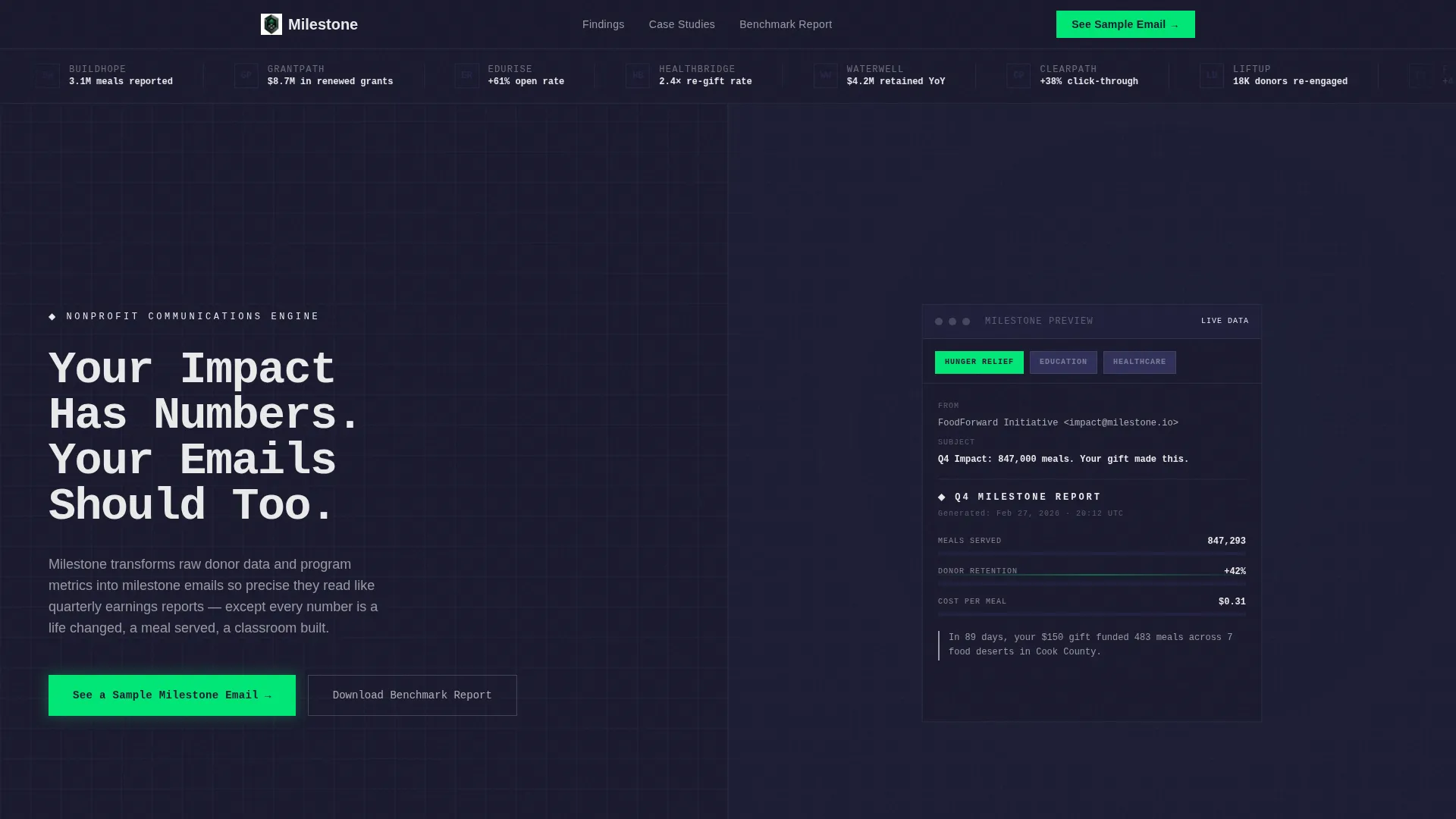
- A split-screen header with a Logo Bar, oversized monospaced headline, and an animated email preview that populates metrics in real time
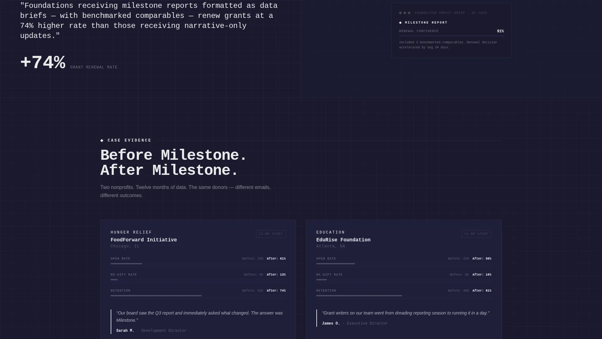
- An evidence-to-proof scroll flow covering open rates, click-throughs, second-gift conversion benchmarks, and case study snapshots with before-and-after engagement curves
- Two conversion paths: a primary call to action routing visitors to a live interactive email demo, and a secondary single-field email capture tied to a benchmark report download
Feature list
This template is built around a small number of purposeful components. Each one earns its place by doing measurable work in the conversion flow.
Split-Screen Header Layout
The viewport opens as a clean 50/50 split. The left panel holds a stark, oversized headline set in a monospaced typeface. The right panel displays an animated email preview with metrics populating as if data is being pulled live. The contrast between static type and moving numbers is intentional.
Scrolling Logo Bar
A horizontal ribbon of recognizable nonprofit logos scrolls at a deliberate, unhurried pace. Each logo appears silhouetted in titanium gray against carbon black, paired with a single stat beneath it. The bar establishes social proof before a visitor reads a single word of body copy.
Industry Report Scroll Cadence
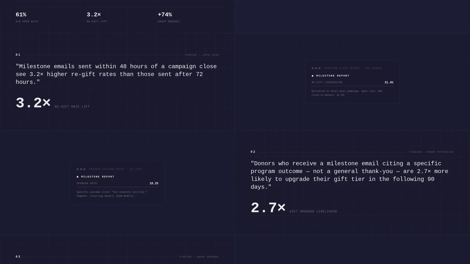
Each scroll section presents one finding structured like a research brief. The left panel carries the insight; the right panel shows the corresponding email template with that metric visualized inside it. The sequence escalates from problem through evidence to proof in a controlled, logical arc.
Interactive Email Demo Entry Point
The primary call to action routes visitors to a live interactive email demo. Inside the demo, visitors can toggle between nonprofit verticals including hunger relief, education, and healthcare to watch the metrics and narrative adapt to each context.
Persistent Bottom-Bar call to action
After the third scroll section, a bottom bar carrying the primary call to action stays fixed in the viewport. It removes the need for visitors to scroll back up when they are ready to act. Placement is timed to appear after enough evidence has been presented.
Benchmark Report Lead Capture
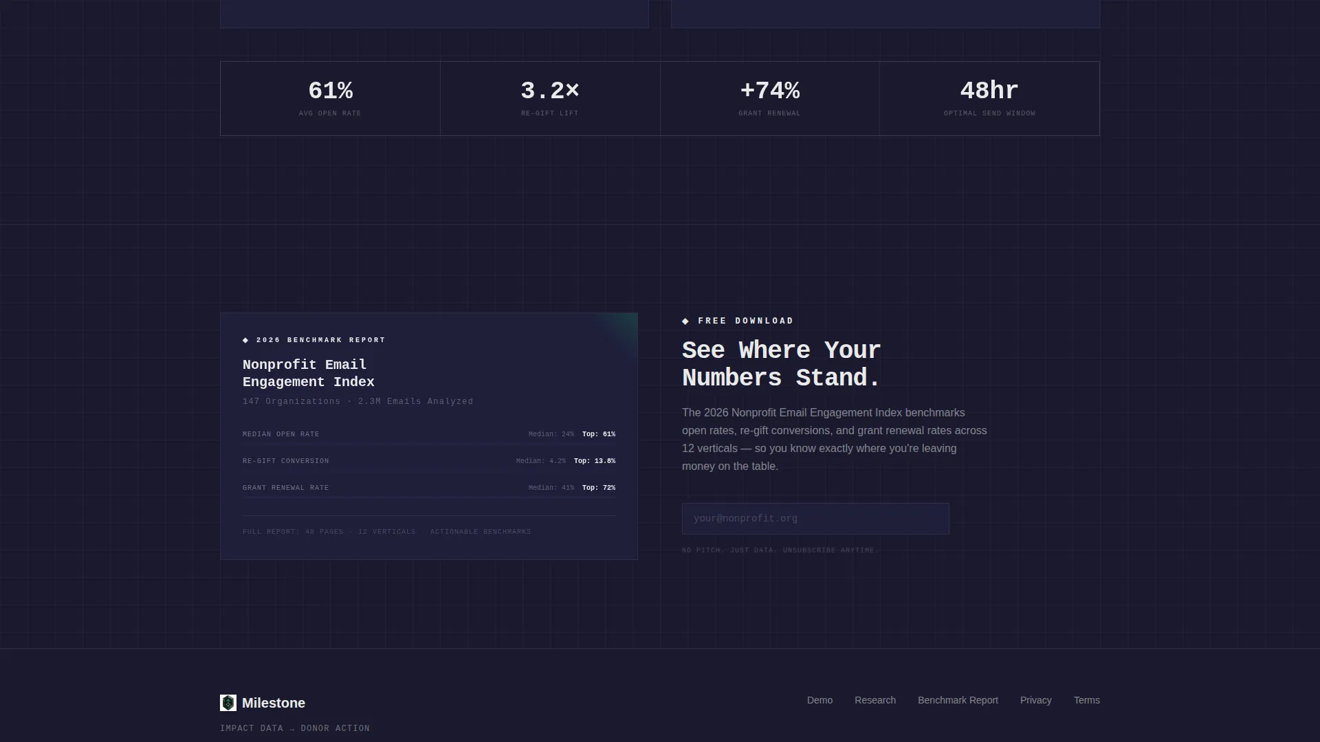
A secondary call to action offers a downloadable benchmark report in exchange for a single email field entry. It is designed for visitors who are not yet ready to explore the product but want the underlying data. A low-friction ask placed at the right moment in the scroll.
Page sections overview
| Section | Purpose |
|---|---|
| Logo Bar ribbon | Establishes social proof with scrolling nonprofit logos and paired stats |
| Split-screen header | Delivers the headline and animated email preview side by side |
| Primary call to action block | Prompts visitors to view a live sample milestone email |
| Insight panel one | Presents the donor lapse problem with supporting context |
| Evidence panel | Shows benchmarked open rates, click-throughs, and second-gift conversion data |
| Proof panel | Displays case study snapshots with before-and-after engagement curves |
| Persistent bottom bar | Keeps the primary call to action accessible after the third scroll section |
| Benchmark report capture | Collects a single email address in exchange for the downloadable report |
Design & branding system
The visual identity follows a Data Command theme. The palette is built to feel like a mission control dashboard: dark, dense, and engineered so that one color does all the signaling work.
- Core colors are deep carbon black (#1A1A2E) for backgrounds, titanium panel gray (#30305A) for surfaces and silhouetted logos, and signal white (#EAEAEA) for data text and metric callouts
- High-voltage green (#00E676) is reserved exclusively for progress bars, percentage lifts, and all call-to-action surfaces so the eye has nowhere else to go when a number or button appears
- Typography uses a monospaced typeface for the primary headline to reinforce the data-report aesthetic, keeping the page feeling engineered rather than decorative
Mobile & speed optimization
The layout is designed with a single-column mobile reflow in mind so the split-screen structure collapses cleanly on smaller viewports without losing hierarchy or readability.
- The animated email preview and scrolling logo bar are built to remain legible and functional at mobile screen widths
- Call-to-action surfaces and the persistent bottom bar maintain their visual prominence on touch devices, keeping conversion paths accessible regardless of screen size
How this template helps you convert
Every design and content decision on this page is aimed at reducing hesitation and increasing the likelihood that a visitor takes one of the two available actions. The page earns the click by giving away insight freely before asking for anything.
- The Industry Report scroll cadence teaches something useful in every section, so clicking the call to action feels like turning the next page rather than making a commitment
- Two parallel conversion paths serve two different buyer mindsets at once: visitors ready to explore the product go to the live demo, while data-hungry visitors who need more time give their email for the benchmark report
Other information about this template
This template sits at the intersection of nonprofit communications and data-driven email strategy. A few additional details are worth knowing before you build with it.
- The template is categorized under Technology and Nonprofit Email Templates, making it relevant for teams that treat communications as operational infrastructure rather than just creative output
- The page is designed around the Nonprofit Milestone Email use case, meaning every layout decision prioritizes outcome reporting, donor re-engagement, and grant accountability over general marketing goals
- The interactive email demo supports three nonprofit verticals out of the box: hunger relief, education, and healthcare, with metrics and narrative adapting to each toggle selection
- The template style is a strict 50/50 split screen, which means both panels carry equal visual weight and neither side is decorative filler
Theme
Data Command
Creative direction
Industry Report
Color system
Carbon Fiber
Style
Split Screen (50/50)
Direction
Click-Through
Page Sections
Split-screen Header with Live Email Preview
Scrolling Nonprofit Logo Bar
Industry Report Scroll Cadence
Interactive Multi-vertical Email Demo
Persistent Bottom-bar Call to Action
Single-field Benchmark Report Capture
Related questions
Who is this landing page template designed for?
What does the animated email preview in the header show?
Does the template support more than one nonprofit vertical?
What are the two calls to action on this page?
Why is high-voltage green used so sparingly in the design?



