Mint - Powerful Token Launchpad Landing Page Template
Mint is a token launchpad landing page template built for founders who need to move fast. It combines a live tokenomics configurator, modular tool cards, and a single-step testnet launch flow into one high-impact page. The design runs on a carbon fiber dark palette with reactor green accents, making every interactive element feel live and ready.
by Rocket studio
Quick summary
Mint is a single-page token launchpad template built for crypto founders who cannot afford a slow start. It leads with a working tokenomics configurator, layers in modular utility cards, and closes with a frictionless "Launch a Test Token Free" flow. The carbon fiber visual system and dynamic motion give it the feel of a live trading terminal.
Who this template is for
This template is built for builders who need launch infrastructure that looks as capable as it performs. It speaks directly to people who already understand the space and want a page that keeps pace with them.
- Indie developers spinning up governance tokens who need a launchpad page that works without a full engineering team behind it
- Decentralized finance teams migrating liquidity to new chains and needing a credible launch surface fast
- Crypto funds and project backers who want their portfolio projects live on-chain without months of runway burn
What problem this template solves
Most token launch pages fail before a single visitor converts. They either look like generic marketing sites or they bury the product behind walls of pitch copy. Founders lose credibility at the moment they need it most.
- Visitors arrive skeptical and leave without acting because the page gives them nothing to interact with
- Launch teams waste weeks building custom configurator interfaces that should ship on day one
- Conversion drops when the call to action appears before the visitor has experienced any real product value
What you get with this template
This template delivers a full single-page layout structured around live interaction and modular capability cards. Every section earns the next scroll by giving visitors something useful to do.
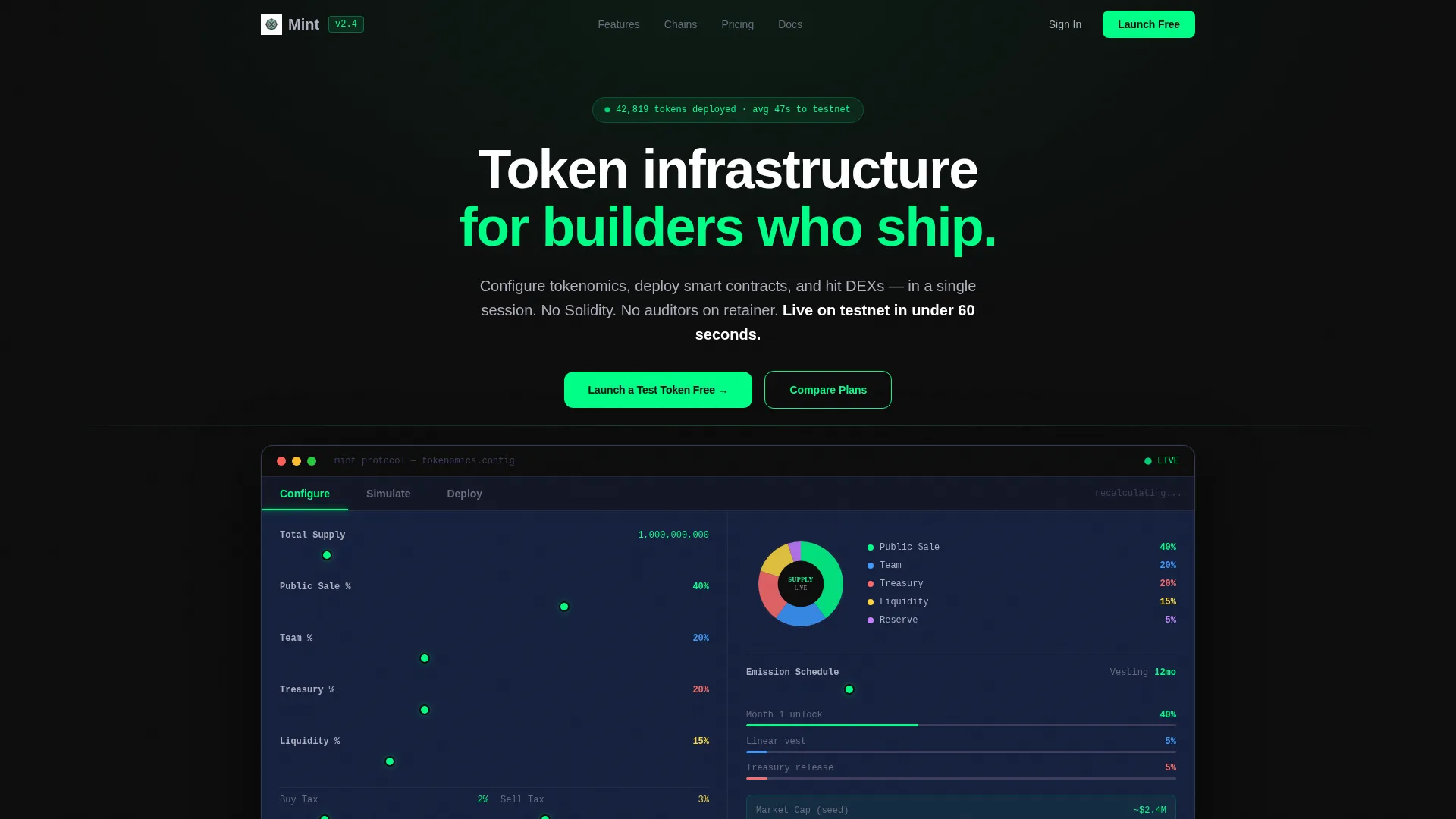
- A Feature Tab Switcher hero with three tabs: Configure, Simulate, and Deploy, each animating into a live interactive panel
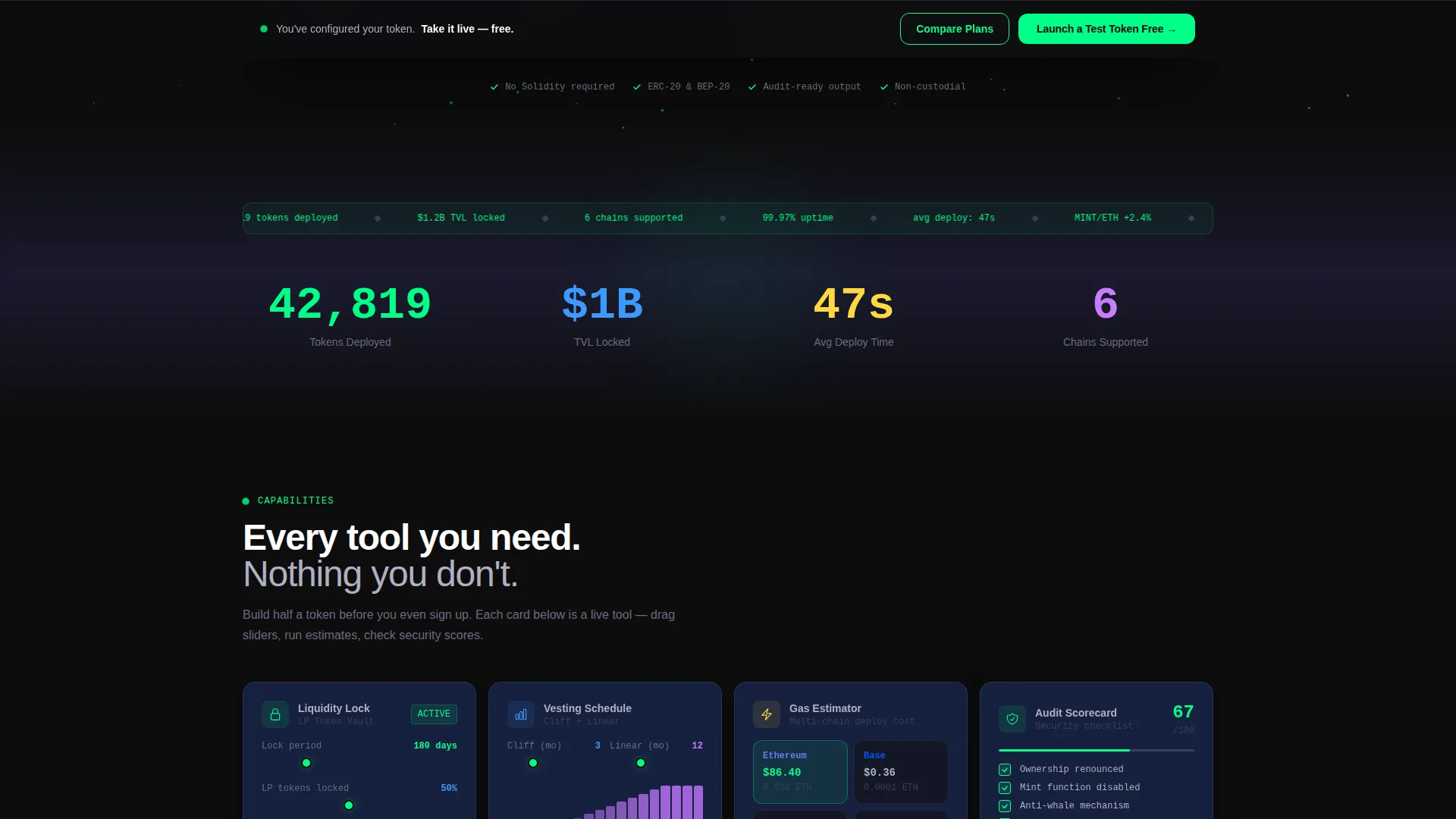
- A staggered card grid below the hero, with self-contained tool cards including a liquidity lock calculator, vesting schedule visualizer, multi-chain gas estimator, and audit checklist scorecard
- A floating bottom bar pinned after first tool interaction, carrying the primary "Launch a Test Token Free" call to action in reactor green and a secondary "Compare Plans" ghost-outlined button
Feature list
This template is built around interactive capability. Each component below is a direct part of the page layout described in the brief.
Live Tokenomics Configurator
The default hero tab shows sliders for token supply, allocation splits, vesting curves, and tax parameters. As visitors drag each slider, a real-time pie chart and emission schedule update instantly. The panel behaves like a working product because it is embedded directly into the hero section.
Animated Feature Tab Switcher
Three tabs sit above the live interactive panel: Configure, Simulate, and Deploy. Switching between tabs triggers card shuffles, live data recalculations, and reactor green pulse transitions. This header concept turns the hero into the most convincing proof-of-value on the page.
Modular Tool Card Grid
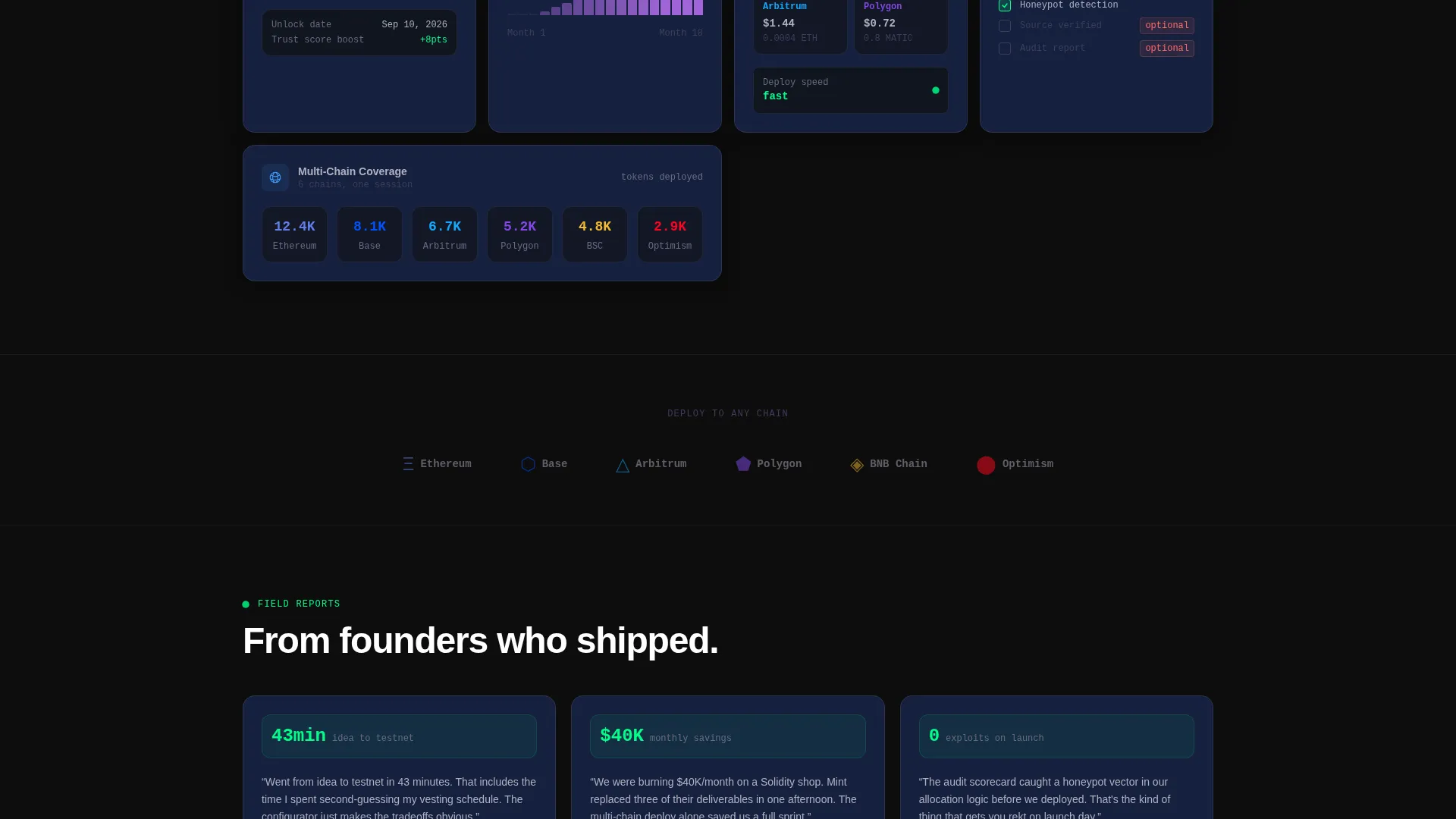
Below the hero, capability cards cascade in a staggered grid layout. Each card is self-contained and includes a specific utility: liquidity lock calculator, vesting schedule visualizer, multi-chain gas estimator, or audit checklist scorecard. Cards respond to hover with depth shifts and glowing green border traces.
Persistent Dynamic Motion System
Particle drift in backgrounds, counter animations on key statistics, and skeleton loaders that mimic real deploy sequences keep the page feeling alive at every scroll depth. Motion is disciplined and purposeful, never decorative for its own sake.
Freemium Wallet-Connect Launch Flow
After a visitor interacts with any tool, a floating bottom bar appears with the primary call to action. One click opens a wallet-connect modal supporting three connection options. From there, a single token name field is all it takes to reach testnet in seconds.
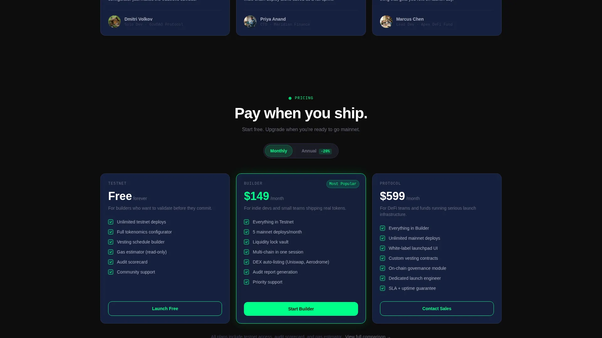
Pricing Card Grid
A dedicated pricing section anchors the secondary "Compare Plans" call to action. It presents plan tiers in a card grid layout consistent with the modular visual system used throughout the rest of the page.
Page sections overview
| Section | Purpose |
|---|---|
| Feature Tab Hero | Launches the tokenomics configurator with three interactive tabs |
| Modular Tool Cards | Showcases individual platform utilities in a staggered grid |
| Stats Counter Row | Displays live-style numbers with animated counter reveals |
| Vesting Schedule Visualizer | Lets visitors interact with token emission and lock timelines |
| Gas Estimator Card | Estimates multi-chain deployment costs before sign-up |
| Audit Checklist Card | Scores project readiness against a visual checklist format |
| Pricing Card Grid | Presents plan tiers with clear feature breakdowns |
| Floating call to action Bar | Pins the primary and secondary calls to action after first interaction |
| Wallet Connect Modal | Guides wallet connection and single-field token name input |
Design & branding system
The visual identity follows a Dynamic Motion theme built on a Carbon Fiber color system. Every surface is designed to feel like the interior of a matte-black high-performance machine with a single glowing telemetry line running through it.
- Core palette: deep cockpit black (#0D0D0D) and woven carbon gray (#1A1A2E) for backgrounds, card surfaces lifted to #16213E, titanium mid-tone (#3D3D5C) for structural depth, and reactor green (#00FF88) reserved exclusively for interactive surfaces, live data pulses, and call-to-action edges
- Body text runs in cool silver (#B0B0C0) to maintain legibility against dark backgrounds without breaking the dark composite panel atmosphere
- Reactor green (#00FF88) appears only where something is live: buttons, input focus rings, progress bars, and token tickers, making every active element visually distinct
Mobile & speed optimization
The modular card grid structure adapts naturally to smaller screens. Staggered layouts reflow cleanly, and the floating bottom bar remains accessible at all viewport sizes.
- Tool cards are self-contained units that stack vertically on mobile without losing their interactive hover states or border trace effects
- The floating call-to-action bar is pinned to the bottom of the viewport and remains visible after first tool interaction on both desktop and mobile layouts
How this template helps you convert
This template is structured around a Calculator/Tool First creative direction. Visitors build trust through direct use before they ever see a sign-up prompt.
- The live tokenomics configurator in the hero lets visitors interact with real product logic immediately, making the platform's value tangible before any pitch copy appears
- Each modular tool card deepens engagement with a new utility at every scroll depth, so by the time the floating call-to-action bar appears, visitors have already invested time and built mental ownership of a token concept
- The one-connection, one-name testnet flow removes all friction from the conversion moment, turning a curious visitor into an active user in seconds
Other information about this template
This template is designed specifically for the token launchpad niche within the blockchain and cryptocurrency space. It fits cleanly into the Technology category and is suited for projects that need a high-credibility launch surface without months of custom development.
- The template style is Card Grid (Modular), making it straightforward to extend, reorder, or replace individual capability cards as a project's feature set grows
- The Freemium/Trial landing-page direction means the page is optimized for low-barrier entry: one wallet connection and one token name field get a visitor to testnet
- This template works well for token launch infrastructure products, decentralized finance project pages, governance token launches, and any Web3 project that needs to demonstrate configurability and speed to early adopters
Theme
Dynamic Motion
Creative direction
Calculator/Tool First
Color system
Carbon Fiber
Style
Card Grid (Modular)
Direction
Freemium/Trial
Page Sections
Live Tokenomics Configurator Hero
Three-tab Animated Feature Switcher
Staggered Modular Tool Card Grid
Persistent Dynamic Motion Layer
Triggered Floating Call to Action Bar
Single-step Testnet Launch Flow
Related questions
Do I need coding skills to use or customize this template?
Can I add or remove tool cards from the modular grid?
What wallet connection options does the launch flow include?
Is this template suitable for a governance token launch?
Does the floating call-to-action bar appear immediately on page load?



