Mise - High Performance Food and Beverage Landing Page Template
Mise is a food and beverage training landing page template built for platforms that drill bartenders, baristas, and line cooks on real specs under timed conditions. It pairs a Dynamic Motion design with a sharp Void and Violet color system, a live-parsed code snippet header, and a side-by-side comparison grid that makes the speed gap between old onboarding and modern drill-based training immediately visible.
by Rocket studio
Quick summary
Mise is a single-page, card-grid landing page template for a food and beverage training platform. It opens with a terminal-style recipe spec header, moves into a scrolling comparison grid, and closes with two conversion paths: an instant free drill and a personalized comparison report request. Every visual and motion choice is calibrated to feel like a busy service shift, not a software brochure.
Who this template is for
This template is purpose-built for food and beverage training platforms that need to convert industry professionals, not general software buyers. It speaks directly to people who understand what "mise-ready" means and why speed matters on the floor.
- Beverage directors onboarding new hires across multiple locations who need consistent, trackable spec training
- Chef-instructors running culinary cohorts who need every team member prep-ready within the first two weeks
- Café owners and bar managers tired of untracked shadow shifts and inconsistent new-hire performance
What problem this template solves
Most food and beverage training programs rely on static PDFs, untracked quizzes, and shadowing hours that leave new hires underprepared and managers without any visibility into readiness. There is no moment where a new hire feels the pressure of a real ticket before they are standing in front of a guest. This template frames that gap visually and viscerally, making visitors feel the problem before presenting the solution.
- Static onboarding materials give managers no pass rates, no completion times, and no skill counts to act on
- New baristas and bartenders learn at inconsistent speeds, and no system flags who is ready and who is not
- Training directors have no side-by-side proof to show stakeholders why their current method is falling short
What you get with this template
You get a fully structured, single-page layout designed around a Comparison/Versus conversion strategy. Every section of the page has a defined role: the header earns attention, the grid builds the case, and the calls to action land only after the visitor has already experienced the difference.
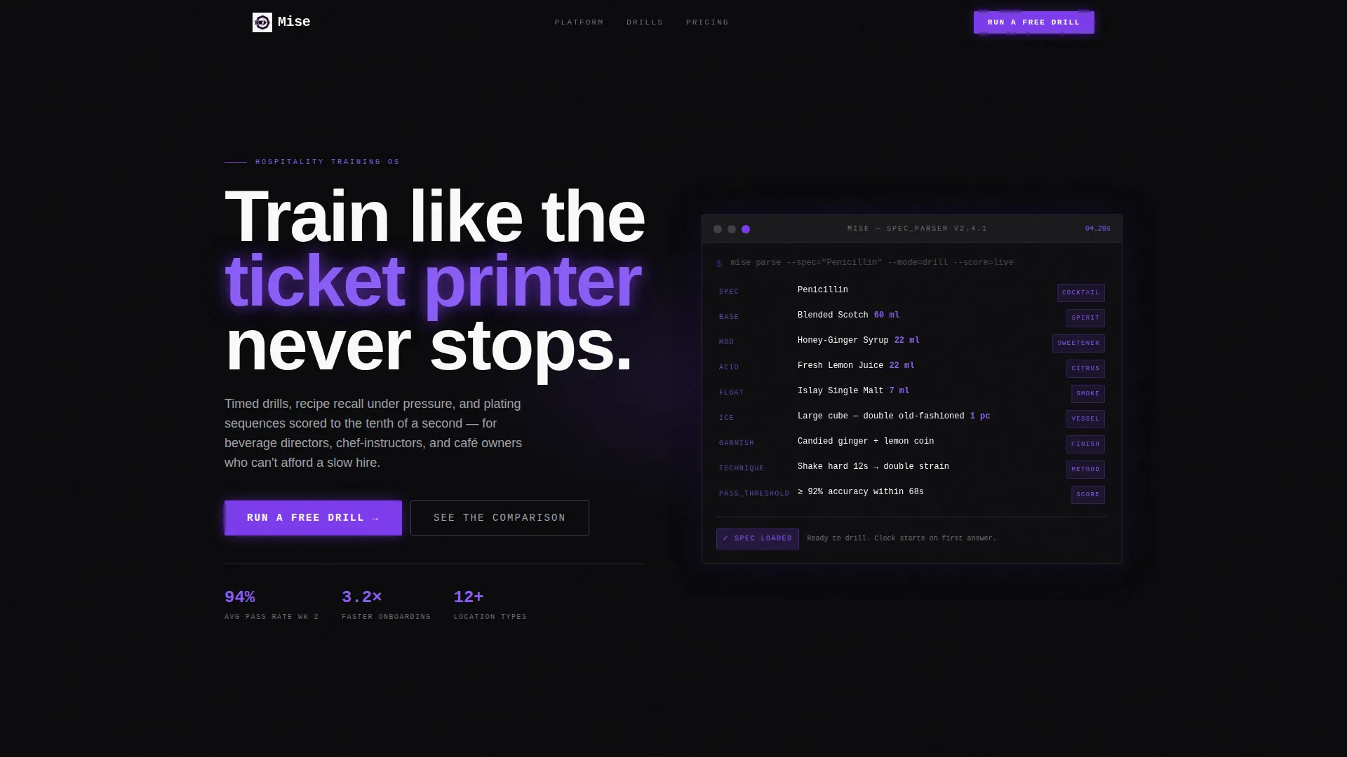
- A code snippet header section that animates a live recipe build line by line in monospaced type
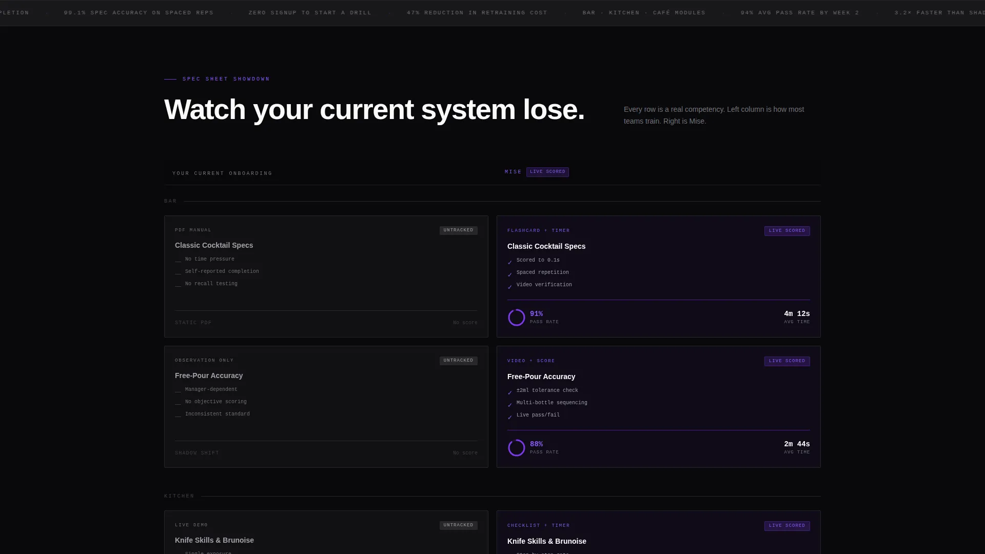
- A modular card grid split into two labeled columns comparing old onboarding methods against drill-based training
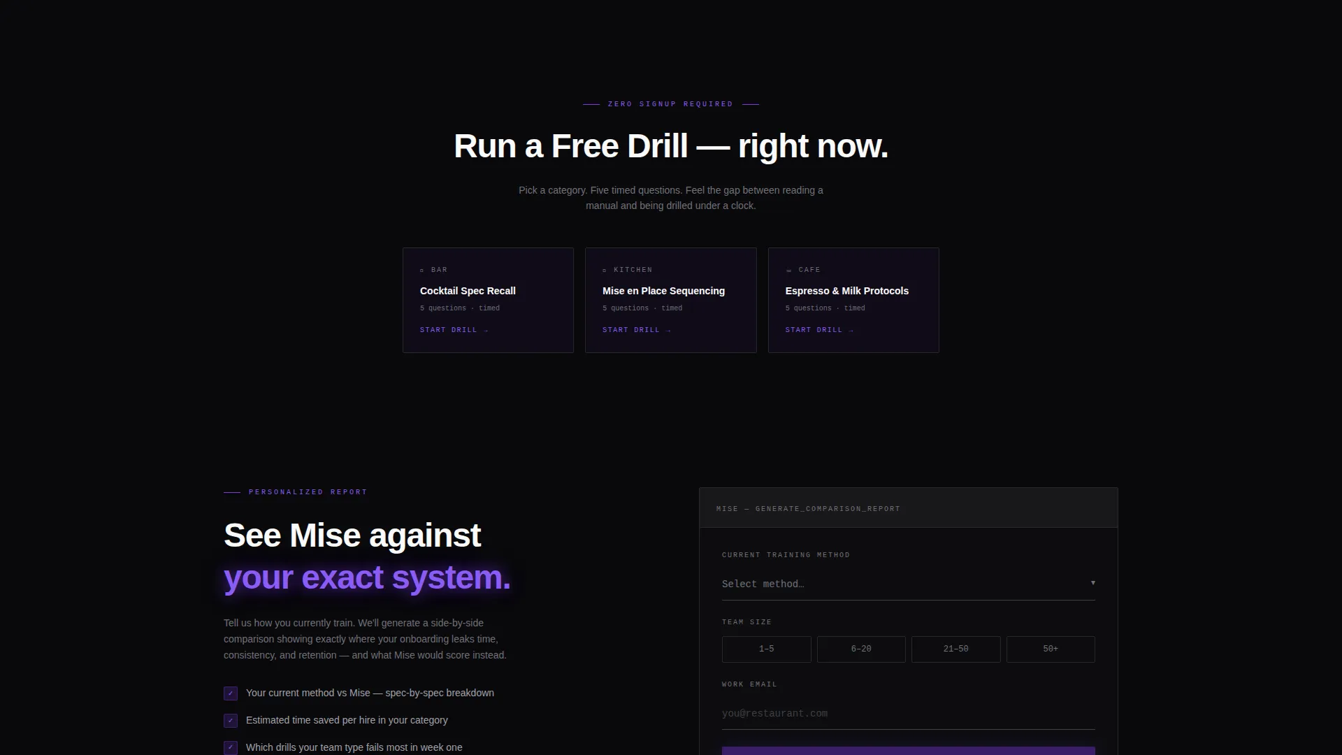
- Two distinct conversion paths: an instant zero-signup free drill and a short form for a personalized comparison report
Feature list
Animated Code Snippet Header
The header renders a real recipe spec as a terminal readout in monospaced type. Each ingredient line animates in sequence, highlights violet on entry, then settles to ticket-white. No stock photography, no hero image. The animation is the product demonstration.
Comparison Card Grid
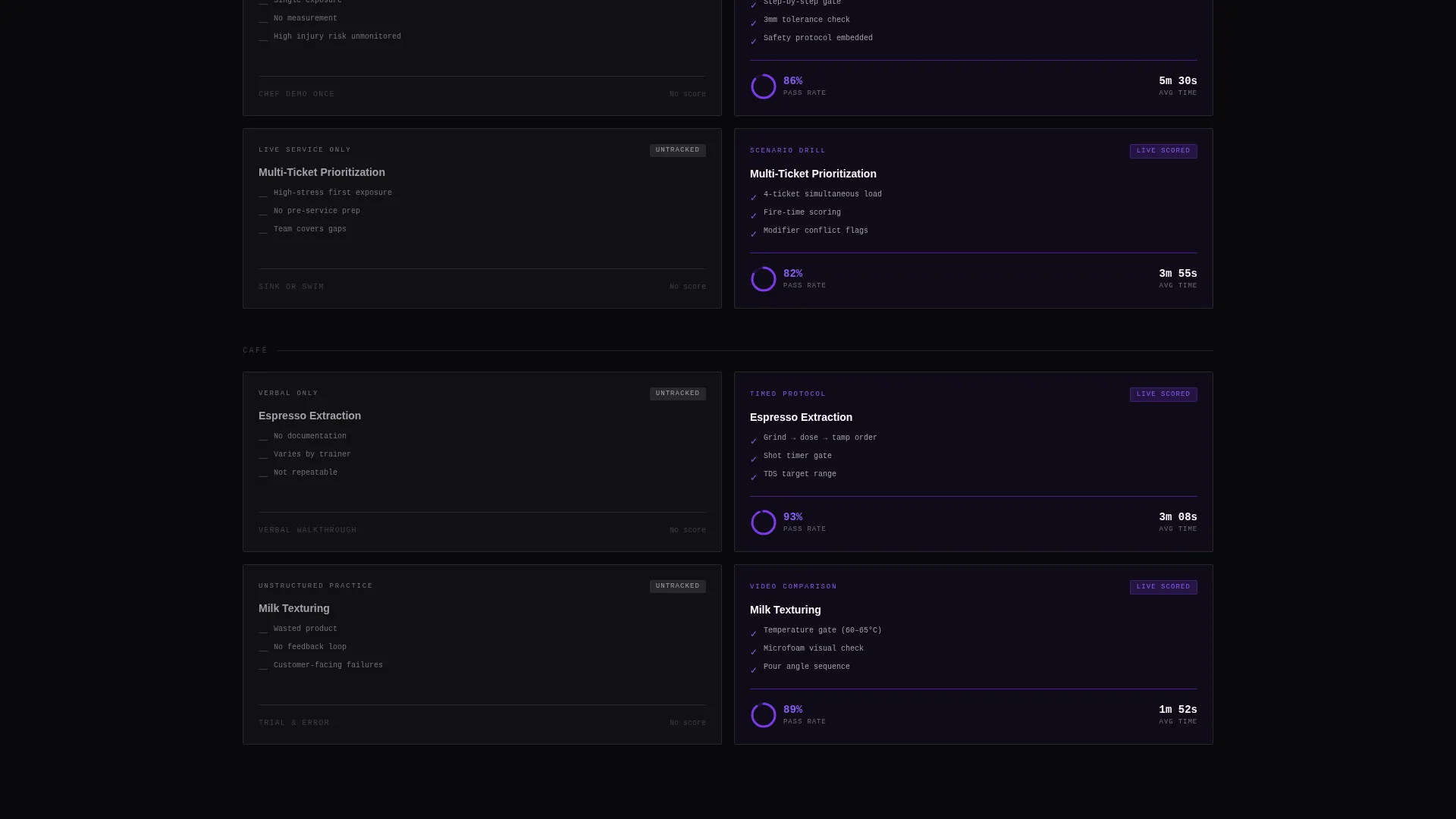
The grid is divided into two visible columns. The left column, labeled "Your Current Onboarding," shows cards representing static PDFs, untracked quizzes, and shadow shifts. The right column, labeled "Mise," shows the same competencies scored with live data, spaced repetition, and video verification. Each card displays module name, skill count, average completion time, and pass rate.
Card Flip Micro-Animations
Every training module card flips on hover to reveal a micro-animation of the drill in action. This interaction gives visitors a tactile sense of the platform's speed and precision without requiring them to leave the page.
Staggered Scroll Motion
As the visitor scrolls, new comparison rows slide in with staggered entrance motion. Each new pair arrives with a subtle violet pulse on the Mise column. The grid escalates from basic knowledge checks to advanced skills like free-pouring accuracy and multi-ticket prioritization.
Sticky Bottom Bar with Primary call to action
After the third comparison row, a sticky bottom bar appears carrying the primary call to action: "Run a Free Drill." The bar persists as the visitor continues scrolling, keeping the conversion path visible without interrupting the content experience.
Zero-Signup Instant Demo Flow
The free drill interaction opens directly on the page. Visitors pick a category (bar, kitchen, or café), choose a drill, and answer five timed questions without creating an account. This removes the barrier between interest and proof.
Page sections overview
| Section | Purpose |
|---|---|
| Code Snippet Header | Animates a live recipe spec to demonstrate the platform's core mechanic |
| Comparison Grid Rows | Contrasts old onboarding methods with drill-based training card by card |
| Sticky call to action Bar | Keeps the "Run a Free Drill" action visible after the third comparison row |
| Instant Demo Block | Lets visitors run five timed questions on-page with no sign-up required |
| Full-Width call to action Card | Closes the grid with a second high-visibility prompt to start a free drill |
| Comparison Report Form | Captures training method, team size, and work email for a personalized report |
Design & branding system
The visual identity runs on a Void and Violet color system that feels like a neon open sign buzzing in a dark service corridor. Void black dominates the background and fills the gutters between cards. Electric violet drives every interactive element, hover state, and progress indicator. Ticket-white sits on card faces so each module reads like a physical index card pinned to a dark prep-station wall.
- Typography uses monospaced type throughout the header section, reinforcing the spec-card and terminal-readout aesthetic
- Card surfaces use ticket-white (#FAFAF9) against absolute void black (#09090B), with deep purple shadow (#2E1065) adding depth to layered elements
- Electric violet (#7C3AED) pulses on hover states, progress rings, and the Mise column to draw the eye to the superior training path
Mobile & speed optimization
The card grid layout is modular, meaning each comparison pair is a self-contained tile that reflows cleanly at smaller viewport widths. The staggered motion and card flip animations are designed to feel intentional on touch devices, not glitchy or intrusive.
- The sticky bottom bar and full-width call to action card remain fully accessible at mobile screen sizes, keeping the conversion path intact
- The zero-signup drill flow is built to run on-page without heavy page transitions, reducing friction for mobile visitors who want proof fast
How this template helps you convert
This template earns its clicks by making visitors feel the speed gap between old and new training methods before asking them to do anything. The conversion strategy is layered deliberately across the scroll journey.
- The animated code snippet header immediately signals that this is a different kind of training product, setting an expectation of precision and speed that carries through the rest of the page.
- The side-by-side comparison grid builds cumulative proof row by row, letting beverage directors, chef-instructors, and café owners see their own current method losing in real time before the first call to action appears.
- The zero-signup free drill removes the final objection by letting visitors experience five timed questions themselves, so the decision to request a full comparison report or sign up feels like a natural next step rather than a cold ask.
Other information about this template
This template is designed for food and beverage software and SaaS platforms competing in a category where most landing pages default to generic feature lists and stock photography. Mise takes a different approach by making the product's core mechanic, timed spec drilling, the visual centerpiece from the first pixel. The Dynamic Motion theme and Spec Sheet creative direction work together to communicate precision and urgency without relying on marketing hyperbole.
- The template style is Card Grid (Modular), making it straightforward to add or remove comparison rows as a platform's feature set grows
- The Comparison/Versus landing page direction is well suited to categories where buyers are actively switching from a legacy method, such as PDF manuals, a learning management system, or informal shadow shifts
- The header concept, a Code Snippet styled as a terminal readout, positions the platform as technical and reliable without requiring any engineering copy to explain it
Theme
Dynamic Motion
Creative direction
Spec Sheet
Color system
Void & Violet
Style
Card Grid (Modular)
Direction
Comparison/Versus
Page Sections
Animated Code Snippet Header
Side-by-side Comparison Grid
Card Flip Micro-animations
Staggered Scroll Entrance Motion
Sticky Call to Action Bar and Full-width Close
Zero-signup On-page Drill Flow
Related questions
Who is this landing page template designed for?
Can I change the recipe shown in the code snippet header?
What are the two conversion paths included in this template?
How does the comparison grid work visually?
Is this template flexible enough for platforms that serve multiple food and beverage segments?



