Culinary & Hospitality Education Specialist Professional Website Template
Mise is a single-page landing page template built for a twelve-week restaurant management intensive. It opens with a provocative quiz question, branches visitors into one of three course tracks via a comparison table, and closes with a low-friction lead capture. The design feels like honest mentorship, grounded, warm, and built to convert first-time restaurateurs into enrolled students.
by Rocket studio
Quick summary
Mise is a comparison table landing page designed for a twelve-week restaurant management course aimed at first-time operators. A quiz-first header qualifies visitors instantly, a branching comparison table guides them to their best track, and two conversion paths capture leads at different commitment levels. The tone is direct, experienced, and genuinely useful from the first scroll.
Who this template is for
This template is built for culinary educators and course creators who teach practical restaurant operations. It speaks directly to people launching a restaurant management course and needing a page that earns trust before asking for anything.
- Sous chefs and kitchen professionals preparing to open their first restaurant
- Family members inheriting or taking over an existing diner or food service business
- Career-changers entering the hospitality industry without prior management experience
What problem this template solves
Most course landing pages list modules and hope for a sign-up. This template solves the trust problem. Visitors in the restaurant management space are skeptical, they've heard pitches before. They need to feel understood before they commit to a syllabus request.
- Generic course pages fail to show visitors which track fits their experience level
- Visitors leave without engaging because nothing asks them a meaningful question first
- Educators lose warm leads who weren't ready to buy but would have downloaded a free resource
What you get with this template
You get a fully structured single-page layout that handles qualification, comparison, and conversion in one continuous scroll. Every section earns the next one, and nothing asks for attention it hasn't already justified.
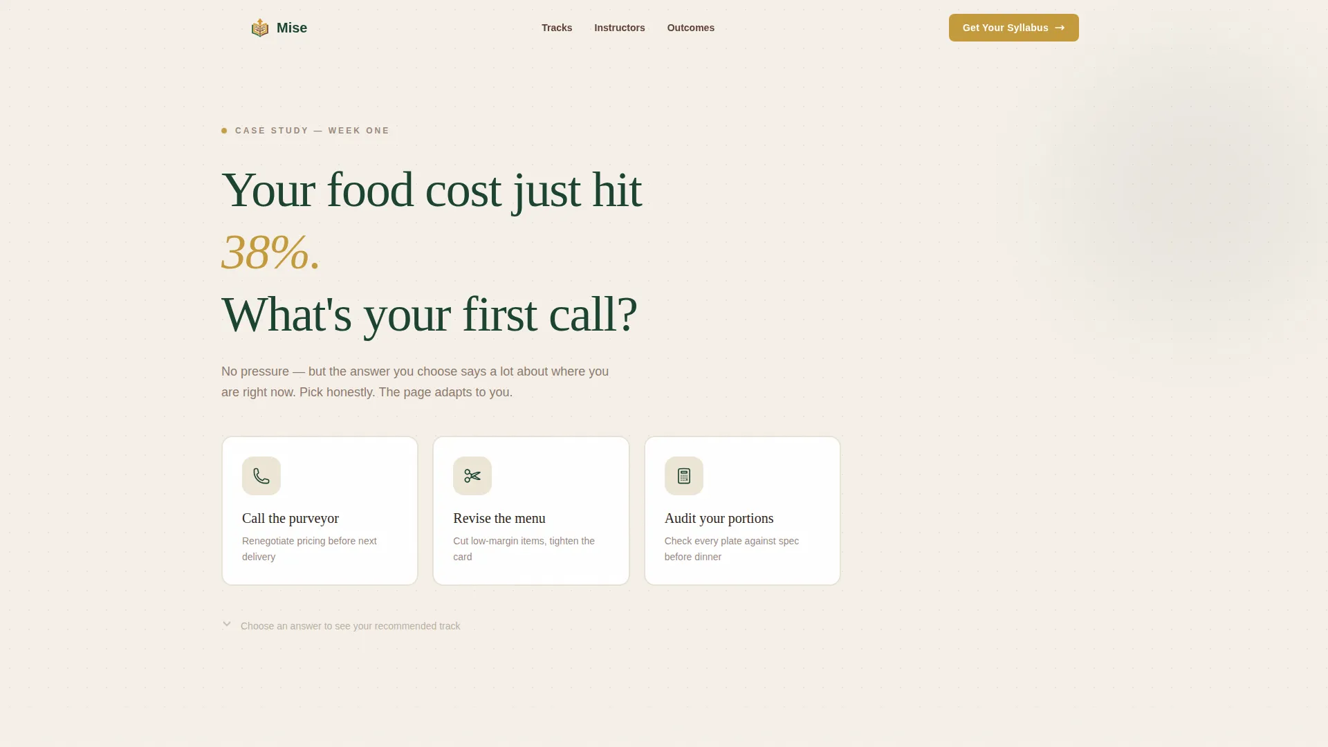
- A quiz-driven header with three illustrated answer cards that pre-select a course track
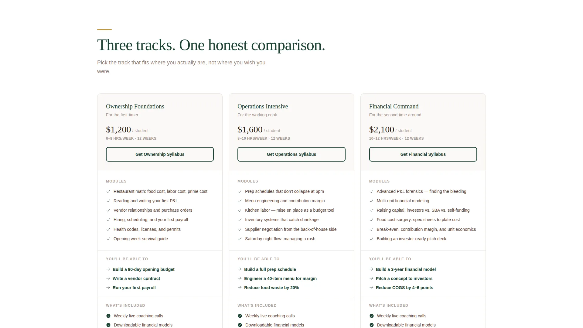
- A three-column comparison table covering modules, time commitments, and outcomes per track
- Two conversion paths: a personalized syllabus request form and a free cheat sheet download
Feature list
This template is built around active engagement, not passive reading. Each feature below is grounded in the page structure described in the brief.
Quiz Starter Header
The page opens with a single provocative question set in large serif type against a soft parchment background. Three clickable answer cards sit side by side, each carrying a simple icon. The visitor commits to an answer before they scroll, which makes every section that follows feel personally relevant.
Branching Comparison Table
Each quiz answer highlights a different row or track in the three-column comparison table below. The table maps three course tracks, Ownership Foundations, Operations Intensive, and Financial Command, across modules, time commitments, and student outcomes. The visitor's recommended track receives a goldenrod border, but the full table stays visible for side-by-side comparison.
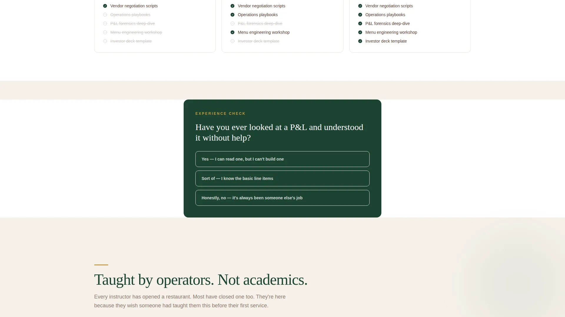
Progressive Micro-Quiz Checkpoints
As visitors scroll through curriculum, instructor credentials, and student outcomes, single-question micro-quizzes punctuate each major section transition. These checkpoints deepen engagement and quietly indicate the visitor's experience level, making the eventual syllabus recommendation feel earned rather than generic.
Dual Conversion Paths
The primary call to action reads "Get Your Custom Syllabus" and appears both at the quiz result moment and at the page bottom. A secondary path offers a free one-page cheat sheet, "The 12 Numbers Every Restaurant Owner Checks Before Noon", for visitors not yet ready to commit. Both paths collect only a name and email.
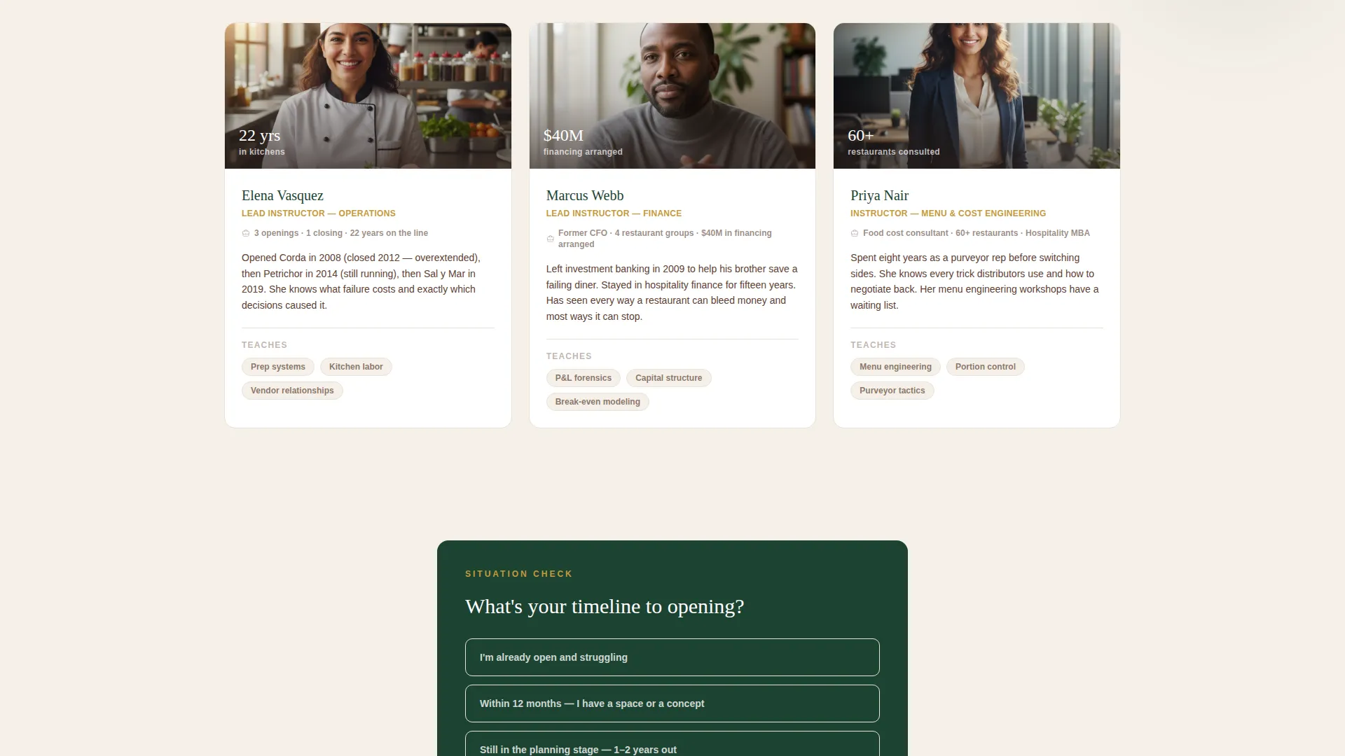
Instructor Credentials Section
A dedicated section highlights real operators rather than academics. This section is designed to carry bios, opening and closing histories, and hard-earned context. It signals that the course advice comes from people who have actually closed out a point-of-sale terminal at 2 a.m., not from a textbook.
Student Outcomes Display
A section surfaces outcome statistics to back up the course's claims. Positioned after the curriculum overview and instructor section, it gives visitors the social proof they need to move from interest to action.
Page sections overview
| Section | Purpose |
|---|---|
| Quiz Starter Header | Opens with a provocative food-cost question and three illustrated answer cards |
| Branching Comparison Table | Maps three course tracks with modules, time, and outcomes; highlights recommended track |
| Curriculum Overview | Details what each track covers across the twelve-week program |
| Micro-Quiz Checkpoint | Single question between sections that profiles visitor experience level |
| Instructor Credentials | Showcases real operators with opening and closing histories |
| Student Outcomes Stats | Surfaces outcome data to reinforce course credibility |
| Primary call to action Block | Presents the "Get Your Custom Syllabus" form with two fields |
| Free Cheat Sheet Offer | Secondary conversion path for visitors not ready to commit |
| Footer call to action Repeat | Repeats the primary call to action at page bottom for returning scrollers |
Design & branding system
The visual identity follows an Educational Guide theme built around the Forest Trust color system. Every color choice carries meaning, nothing is decorative without purpose. The overall feel is like a well-used leather notebook left open on a wooden desk: grounded, trustworthy, and quietly authoritative.
- Deep evergreen (#1B4332) anchors headers and section dividers for calm authority
- Warm bark brown (#5C4033) carries body text; soft parchment (#F5F0E8) dominates all backgrounds
- Muted goldenrod (#C49A3C) appears sparingly on highlights, active quiz states, and call-to-action buttons so every flash of it signals something worth following
Mobile & speed optimization
The layout is designed to feel just as intentional on a phone as it does on a desktop screen. Quiz cards, comparison tables, and micro-quiz checkpoints are each structured for vertical scrolling without losing their branching logic.
- Quiz answer cards reflow into a single-column stack on smaller screens without losing icon clarity
- The comparison table is built to scroll horizontally on mobile so all three tracks remain accessible
- Conversion forms stay compact and thumb-friendly at every viewport size
How this template helps you convert
This template earns the conversion before it asks for it. By the time a visitor reaches either call-to-action button, the quiz has already taught them something genuinely useful about their own gaps in restaurant knowledge.
- The quiz header creates immediate personal investment, visitors who answer a question feel they have a stake in the result, which keeps them scrolling through the comparison table and curriculum sections.
- The dual conversion path removes the all-or-nothing pressure. Visitors who are not ready to request a full syllabus can still capture the free cheat sheet, keeping them inside the course's orbit at a lower commitment level.
Other information about this template
This template is part of a broader category of interactive course landing pages designed for culinary and hospitality education. It is well-suited for restaurant management programs that want to move beyond static enrollment pages and offer something of genuine value before asking for a sign-up.
- The template style is a Comparison Table layout, making it straightforward to adapt for similar multi-track course offerings in food service or broader hospitality training
- The creative direction is Quiz and Personalize, a pattern that works especially well when the target audience has varied experience levels and needs a fast way to self-sort
- The header concept is a Quiz Starter, which can be reused across other educational landing pages where visitor qualification matters more than broad appeal
Theme
Educational Guide
Creative direction
Quiz & Personalize
Color system
Forest Trust
Style
Comparison Table
Direction
Content/Resource
Page Sections
Quiz Starter Header with Answer Cards
Branching Comparison Table
Progressive Micro-quiz Checkpoints
Dual Lead Capture Paths
Instructor Credentials Block
Student Outcomes Statistics
Related questions
What course tracks does the comparison table display?
How does the quiz connect to the comparison table?
What are the two conversion paths on this landing page?
Who is the intended student for the course this template represents?
Can the micro-quiz checkpoints be adapted for other course topics?



