Culinary Arts Comparison Landing Page Template
Mise is a single-page comparison landing page built for culinary arts programs. It guides three distinct prospective student types through an honest, data-led journey from self-doubt to enrollment confidence. The Electric Indigo color system and Corporate Precision theme deliver a high-stakes, immaculate feel. A sticky download call to action and animated comparison table do the convincing work.
by Rocket studio
Quick summary
Mise is a precision-built culinary arts landing page designed around a single goal: turn hesitant prospects into confident applicants. The template uses a comparison table as its spine, layering persona cards, alumni outcomes, and a downloadable program guide call to action across a disciplined Electric Indigo visual system. It earns trust by showing real data first, then asking for the lead.
Who this template is for
This template is built for culinary schools, vocational cooking academies, and professional kitchen training programs that need to reach multiple applicant types at once. If your program spans more than one credential tier, this structure handles the complexity without overwhelming the reader.
- Career-changers in their late twenties to mid-thirties who need a clear value case before committing
- Working line cooks seeking formal credentials to advance into chef or management roles
- Recent high school graduates whose families want transparent tuition and outcome data before enrolling
What problem this template solves
Most culinary program pages bury the details that prospects actually need: program length, tuition, externship hours, and real job placement rates. When that information is hidden or scattered, qualified leads leave before converting. This template puts the comparison data front and center, building trust before asking for anything in return.
- Prospects arrive with different backgrounds and expectations, making a single pitch ineffective
- Generic program pages fail to show how each credential tier fits a specific career starting point
- Hiding pricing and outcomes behind a form damages credibility with career-focused applicants
What you get with this template
You get a complete, single-page layout that walks visitors through a structured decision arc. Every section is intentional, moving the reader from self-recognition to program comparison to proof, then to a low-friction conversion action.
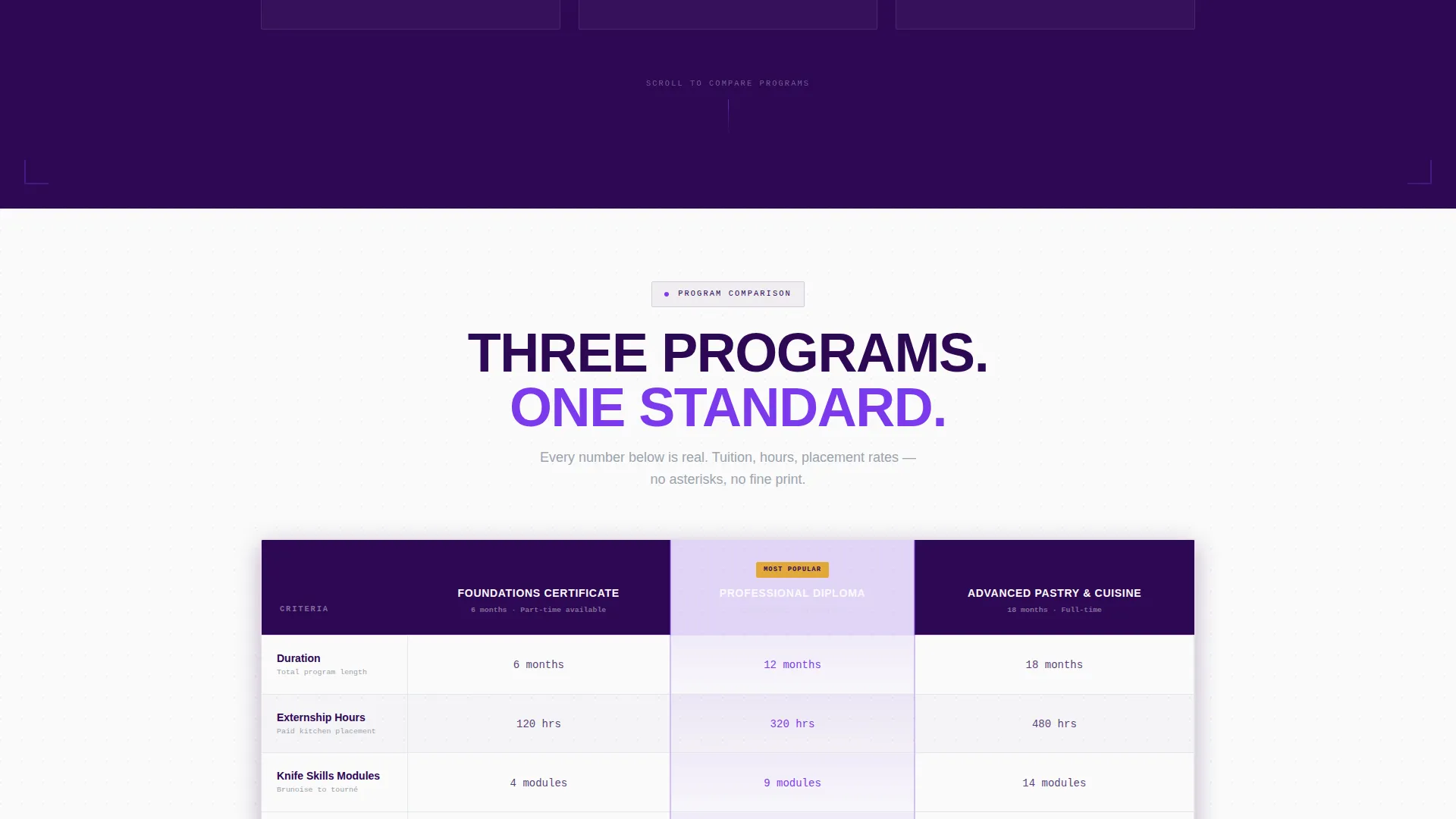
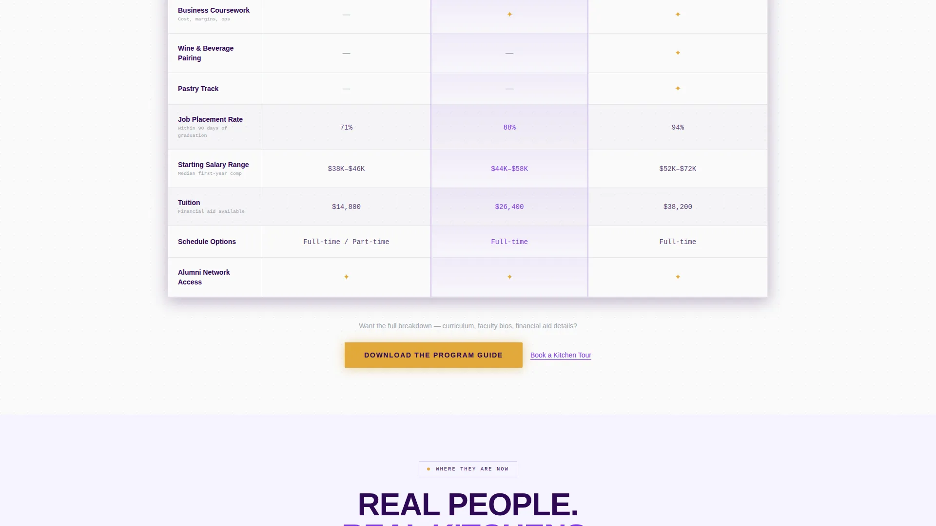
- A three-tier animated comparison table covering duration, externship hours, knife skills modules, business coursework, job placement rate, and tuition
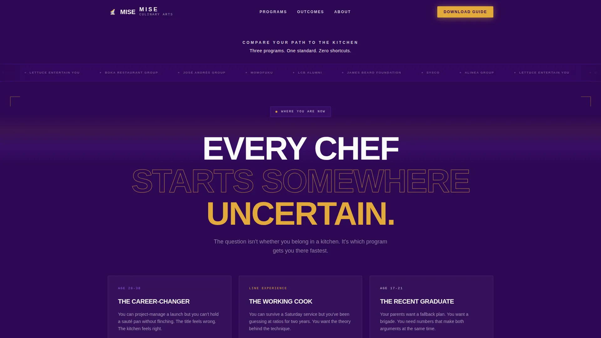
- Three persona cards in a "Where You Are Now" block, each with a candid one-sentence gap statement matched to a real applicant type
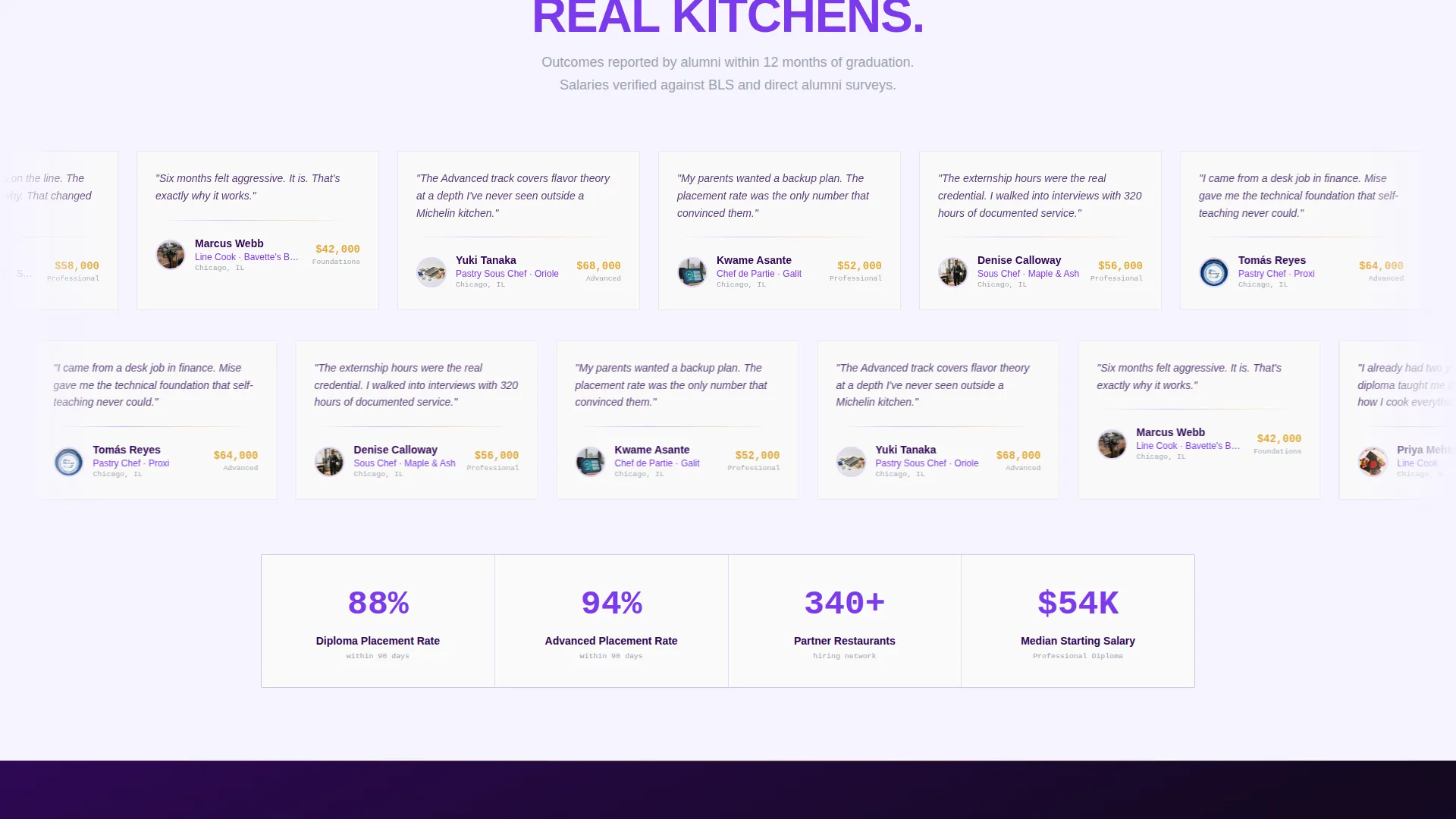
- Alumni outcome snapshots with role titles, restaurant affiliations, and salary ranges to close the proof loop
Feature list
This section covers the core functional and design components built into the Mise landing page template.
Animated Comparison Table
The table reveals its rows sequentially as the visitor scrolls, building the program case cell by cell. Three tiers sit side by side: Foundations Certificate, Professional Diploma, and Advanced Pastry and Cuisine. Each row covers a specific decision factor, from duration and tuition to externship hours and job placement rate.
Persona Card Block
Three cards open the journey by naming the exact reader sitting in front of the page. Each card carries a single honest sentence about the applicant's current gap. This immediate recognition keeps career-changers, working cooks, and recent graduates from bouncing before reaching the comparison data.
Sticky Download call to action
A seared-gold "Download the Program Guide" button lives in the sticky navigation bar and repeats after the comparison table and alumni section. The button stays visible throughout the scroll without interrupting the reading flow, reducing the friction between interest and action.
Lead Capture Form
The form asks for first name, email, and a single dropdown question: "Which best describes you?" The dropdown mirrors the three persona cards, so the data collected is immediately useful for follow-up segmentation. Keeping the form short protects conversion rate on a detail-rich page.
Alumni Outcome Snapshots
Below the comparison table, a "Where They Are Now" block presents real graduate outcomes with role titles, named restaurants, and salary ranges. This section closes the proof arc by showing the destination, not just the path, making the investment feel concrete and achievable.
Partner and Employer Logo Bar
The header opens with a horizontal ribbon of industry partner logos on a deep indigo field, rendered in monochrome silver. This placement signals professional credibility before the visitor reads a single word of program copy. The restraint of no imagery reinforces that the institution lets credentials lead.
Page sections overview
| Section | Purpose |
|---|---|
| Partner Logo Bar | Establishes industry credibility at first glance |
| Header Headline Block | States the page's core comparison promise |
| Where You Are Now | Connects each visitor to their specific persona |
| Comparison Table | Presents program tiers side by side with key decision data |
| Where They Are Now | Proves outcomes with alumni role and salary snapshots |
| Download call to action Block | Primary lead capture after comparison evidence |
| Book a Tour Link | Secondary conversion path for hands-on prospects |
Design & branding system
The visual system follows a Corporate Precision theme built on an Electric Indigo palette. Every color in the system has a defined role, so the page feels intentional and authoritative rather than decorative.
- Deep kitchen-at-midnight indigo (#2E0854) dominates headers and section dividers; burner-flame violet (#7C3AED) handles hover states and active selections; polished silver (#D1D5DB) structures the comparison table itself; plating-line white (#FAFAFA) creates breathing room between dense information blocks
- Seared-gold (#E2A93B) is reserved exclusively for calls to action, badges, and progress indicators, making every action point instantly recognizable
- Typography uses tight uppercase tracking on the main headline and clean body copy in white, reinforcing the immaculate, high-voltage aesthetic of a Michelin-starred pass
Mobile & speed optimization
The layout is built to stay legible and functional on smaller screens, where many prospective culinary students will first encounter the page. The comparison table and persona cards adapt to narrower viewports without losing their structural clarity.
- The sticky call to action bar remains accessible on mobile, keeping the download action within reach regardless of scroll position
- The lead capture form uses a minimal three-field structure, reducing input friction on touch keyboards and smaller screens
How this template helps you convert
The page is structured as a content-first resource, earning the lead rather than demanding it. Every design and copy decision points toward a clear, low-resistance conversion moment.
- Showing full program data upfront, including tuition and outcomes, builds the kind of credibility that makes the downloadable guide feel like a natural next step rather than a paywall
- The persona-matched dropdown in the lead form creates immediate relevance for each applicant type, increasing the likelihood that the submitted lead is genuinely qualified
Other information about this template
This template is designed for culinary arts programs that position themselves as serious, credential-driven institutions rather than casual cooking schools. The page architecture supports programs affiliated with professional culinary networks and employer partners.
- The logo bar layout is structured to accommodate partner names common in professional culinary education, including industry foundations, national food service distributors, and regional restaurant groups
- The "Book a Kitchen Tour" secondary link provides a non-committal conversion path for visitors who are interested but not yet ready to download
- The template style is a comparison table layout, making it well suited to programs that want to present multiple credential options clearly and honestly
- The Hero's Journey creative direction is baked into the scroll arc, moving from current situation through evidence to outcome, which aligns with how career-focused applicants research vocational programs
Theme
Corporate Precision
Creative direction
Hero's Journey
Color system
Electric Indigo
Style
Comparison Table
Direction
Content/Resource
Page Sections
Animated Row-by-row Comparison Table
Three-persona Recognition Cards
Sticky Seared-gold Download Call to Action
Minimal Three-field Lead Form
Alumni Outcome Snapshot Block
Industry Partner Logo Bar Header
Related questions
Can I edit the program tiers in the comparison table?
How does the persona card section work?
Is the lead capture form ready to use as built?
Can this template work for a single program rather than three tiers?
Why does the page show tuition and outcomes before asking for contact details?



