Biology Video Lesson Library Landing Page Template
Mitosis is a modular card grid landing page built for biology video lesson libraries. It guides learners through animated cell division, ecosystems, and DNA replication content via a structured learning pathway. A multi-step form header, sticky calls to action, and progressive card rows work together to turn curious visitors into registered learners.
by Rocket studio
Quick summary
Mitosis is a playful geometric landing page template designed for biology video lesson libraries. It organizes short animated lessons into a card grid learning pathway, from cell basics to complex ecology. A multi-step lab-style form captures leads without feeling like a gate. The Forest Trust color system and hand-drawn-inspired visuals make hours of studying feel inviting.
Who this template is for
This template is built for educators and self-directed learners who need a compelling, visual home for biology content. It fits creators who want their material to feel alive, not like a static slide deck.
- Advanced Placement Biology instructors and tutors building a digital resource hub
- Homeschool parents assembling a structured, visually engaging biology curriculum
- Community college biology teachers who want a sharper visual aid than aging slide presentations
What problem this template solves
Biology learners often abandon study tools that feel boring or overwhelming. Dry slide decks and flat content libraries fail to hold attention, especially when students are cramming the night before an exam. This template solves the engagement gap by pairing visual storytelling with a guided pathway structure.
- Unorganized content dumps leave learners unsure where to start or how to progress
- Generic lead capture forms feel like a transaction, not an invitation to learn
- Static thumbnails and text-only lesson lists give no sense of what a lesson actually feels like
What you get with this template
You get a fully structured, single-page layout designed around one goal: turning a curious visitor into an engaged, registered learner. Every section earns trust before asking for anything in return.
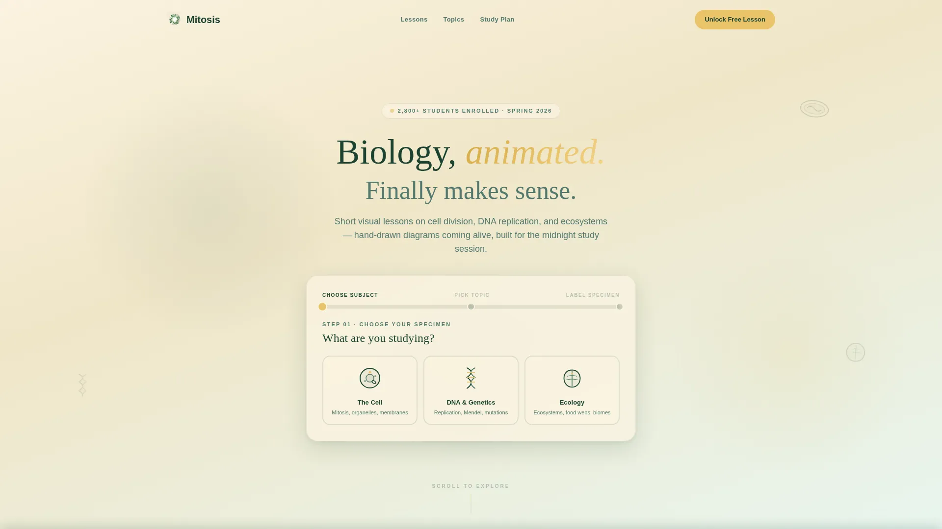
- A multi-step form header styled as a biology experiment, with illustrated specimen-card topic selectors and a cell-cycle-shaped progress bar
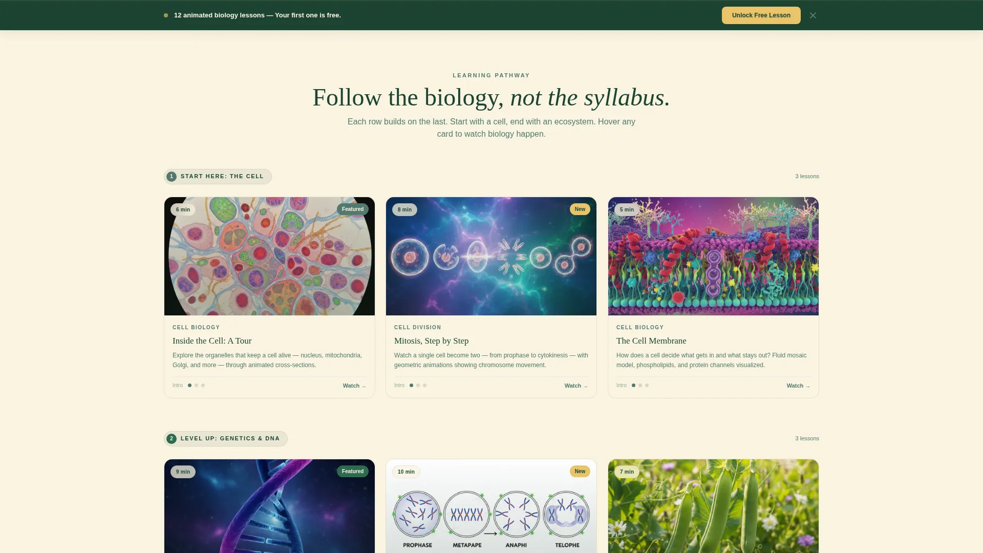
- A modular card grid organized as a step-by-step learning pathway, with difficulty pips, duration badges, and hover-triggered animated previews
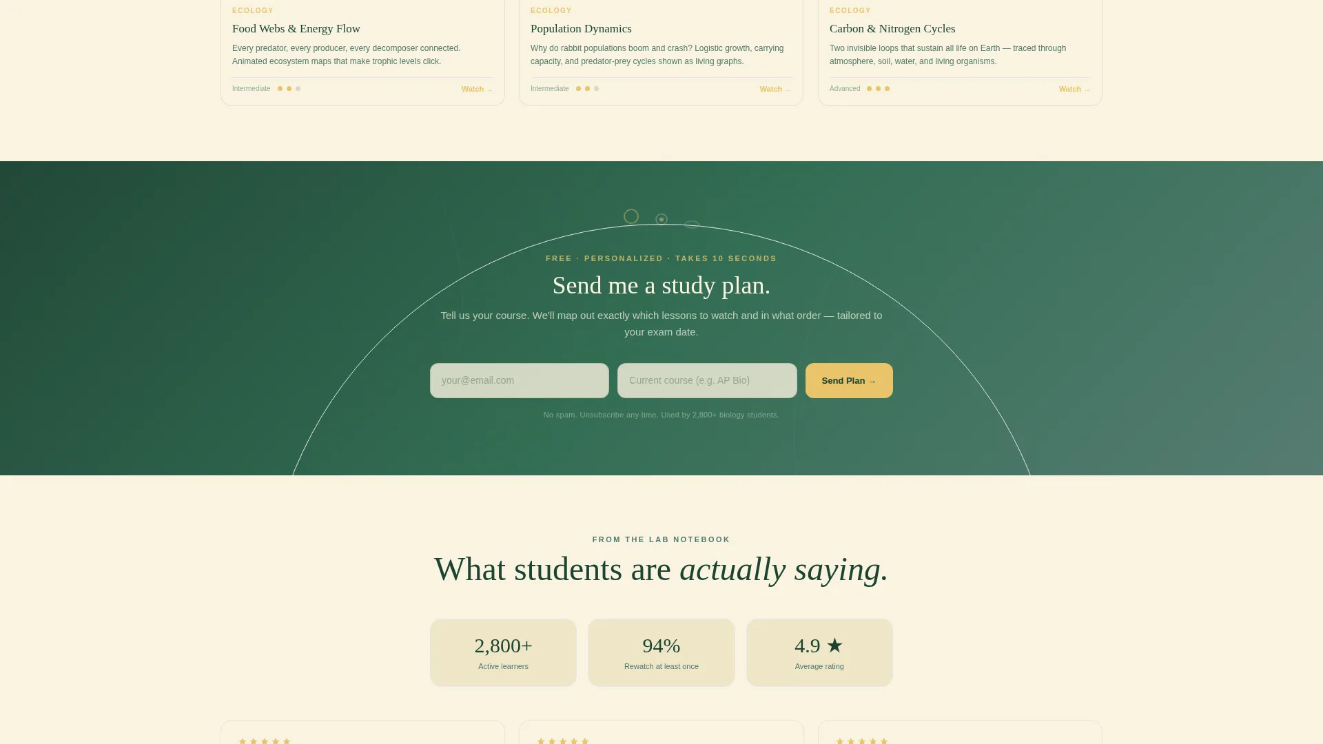
- Two conversion touchpoints: a sticky bottom bar call to action and a mid-page email capture embedded between topic rows
Feature list
This template's features are derived directly from its source brief and built around the biology education context it serves.
Multi-Step Lab Form Header
The header opens with a three-step form styled as a biology experiment. Step one uses illustrated geometric icons, a double helix, a leaf cross-section, and a mitochondrion, as clickable specimen cards. Step two narrows the topic with a progress bar shaped like a cell cycle diagram. Step three captures name and email with micro-animations of geometric organelles assembling around the input fields.
Modular Card Grid Learning Pathway
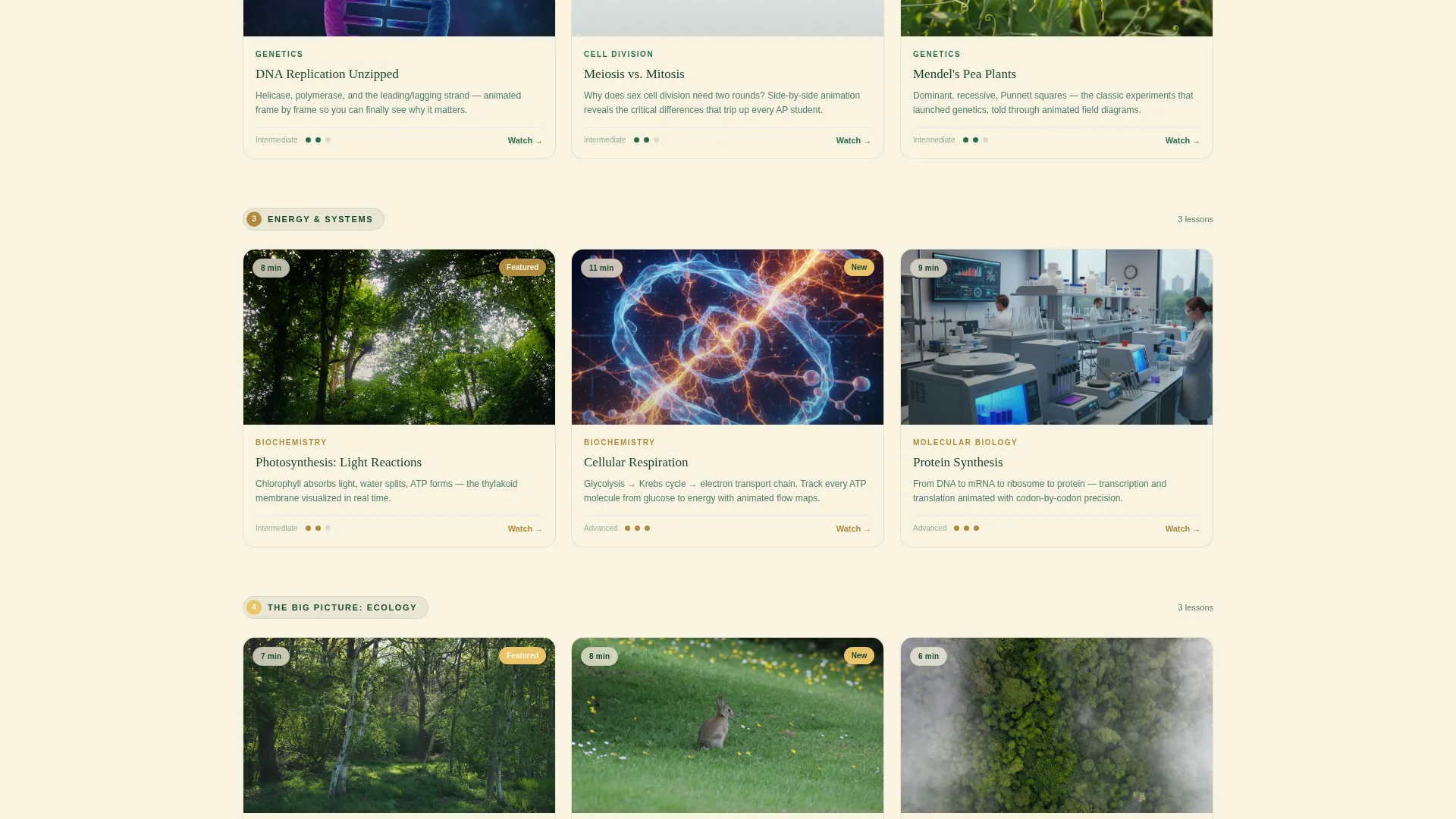
Lesson cards are arranged in labeled rows that escalate in complexity. The first row begins with cell biology fundamentals and subsequent rows move through organ systems to ecology. Each card displays a geometric thumbnail illustration, a duration badge, and difficulty pips styled like field guide star ratings.
Animated Hover Previews
Hovering over any lesson card triggers a two-second animated preview. A tiny geometric organism pulses or divides, giving visitors a real feel for the lesson content before they commit to clicking or signing up.
Sticky Bottom Bar call to action
After a visitor scrolls past two card rows, a sticky bottom bar surfaces with the primary call to action: "Unlock Your First Lesson Free." The bar stays visible without interrupting the browsing experience, keeping the conversion prompt present without being intrusive.
Mid-Page Email Capture
Between the third and fourth topic rows, a secondary conversion block invites visitors to enter their email and current course name to receive a personalized study plan. It asks for minimal information and appears after the visitor has already seen meaningful content.
Progressive Accent Color Shift
As the card grid descends from basic cell topics toward more interconnected ecological content, the accent color warms gradually from deep canopy green into sun-through-leaves gold. This visual cue reinforces the sense of a learning journey progressing in depth and complexity.
Page sections overview
| Section | Purpose |
|---|---|
| Multi-Step Form Header | Captures leads through a lab-styled, three-step topic and email form |
| Start Here Row | Introduces foundational cell biology lessons with difficulty and duration cues |
| Intermediate Topic Rows | Escalates content complexity through organ systems and biological processes |
| Mid-Page Study Plan Block | Collects email and course name in exchange for a personalized study plan |
| Ecology and Interconnection Row | Presents advanced ecological content with warmer gold accent treatment |
| Sticky Bottom Bar | Surfaces the primary call to action after two card rows of scrolling |
Design & branding system
The visual identity uses the Forest Trust color system, balanced between scholarly authority and warm approachability. The palette draws on a well-loved biology textbook feeling: scholarly structure with the warmth of highlighter-marked margins.
- Deep canopy green (#1B4332) and lichen gray-green (#52796F) anchor the layout with a grounded, natural authority
- Sun-through-leaves gold (#E9C46A) and chalk-white (#FAF3E0) provide warmth, breathing space, and card backgrounds
- The Playful Geometric theme uses hand-drawn-inspired diagrams, geometric organelle illustrations, and a field notebook visual personality throughout
Mobile & speed optimization
The card grid layout is built to remain clear and navigable across screen sizes. Modular card rows stack naturally for smaller viewports without losing their visual hierarchy or difficulty indicators.
- Cards scale and reflow gracefully so duration badges, difficulty pips, and thumbnail illustrations stay readable on small screens
- The sticky bottom bar and mid-page email capture remain accessible and functional across device sizes
- The progressive accent color shift and animated hover states are designed to complement the overall layout without slowing down the browsing experience
How this template helps you convert
Every design decision in this template prioritizes demonstrated value before access is exchanged. Visitors see what they will learn before they are ever asked for an email address.
- The animated thumbnail previews and visible topic depth let visitors confirm the content is worth their time, reducing friction at the point of sign-up.
- The multi-step form feels like a lab activity rather than a registration wall, which builds familiarity and reduces drop-off between steps.
- Two strategically placed conversion points, the sticky bar and the mid-page study plan capture, give returning or hesitant visitors a second natural moment to commit.
Other information about this template
This template is part of a broader library of education-focused landing page designs. It is a strong fit for anyone building a biology video lesson library, whether the content covers cell division, DNA replication, or full ecosystem studies.
- The template style is a Card Grid (Modular) layout, well suited for content libraries that grow over time and need a scalable visual structure
- The creative direction follows a Step-by-Step Guide approach, which mirrors how learners actually progress through a biology curriculum
- The lead generation focus means the page is structured to collect emails and course context without blocking access to previews or demonstrations
- The Playful Geometric theme and Forest Trust palette are cohesive enough to carry a branded biology education product from launch through content expansion
Theme
Playful Geometric
Creative direction
Step-by-Step Guide
Color system
Forest Trust
Style
Card Grid (Modular)
Direction
Lead Generation
Page Sections
Multi-step Lab-style Form Header
Card Grid Learning Pathway
Animated Hover Previews on Cards
Sticky Bottom Bar Call to Action
Mid-page Email Capture Block
Progressive Accent Color Warm Shift
Related questions
Who is this landing page template designed for?
Can I add more lesson card rows as my content library grows?
Does the multi-step form require a specific email tool to work?
How does the sticky bottom bar work?
Can the color palette be adjusted to match an existing brand?



