Intelligent Field Operations Landing Page Template
Dispatch is a hub-and-spoke landing page template built for financial services field service management platforms. It presents a mission-control dashboard as the hero, anchors five data-card spokes to a sticky nav, and closes with a 14-row competitive comparison matrix. The Void and Violet color system and Spec Sheet creative direction make every section feel dense, credible, and built for evaluators, not browsers.
by Rocket studio
Quick summary
Dispatch is a single-page template designed for field service management software products targeting financial services operations. It leads with a live-looking dispatch dashboard screenshot, progresses through five self-contained feature spokes anchored to a sticky nav, and anchors its argument at a detailed competitive comparison matrix. The design language is Data Command: dark, dense, and built to earn the trust of operations managers who evaluate tools, not browse them.
Who this template is for
This template fits teams selling or marketing a field service management platform to operations-heavy financial services buyers. It speaks directly to the evaluators who sign off on software decisions and who need hard evidence before they move.
- Regional bank operations managers coordinating 200 or more daily site visits across multiple locations
- Mortgage servicing company dispatch coordinators managing post-disaster property inspection queues
- Credit union network operations leads replacing spreadsheet-and-phone chaos with structured field service software
What problem this template solves
Most field service software landing pages either bury the product behind lifestyle imagery or pile on vague benefit claims without data to back them up. Operations managers do not have time for that. They arrive already knowing their pain: too many spreadsheets, missed appointments, and three hours lost per agent per day to manual coordination. They need a page that proves the platform understands their world before they will give it five minutes.
- Removes the mismatch between what evaluators need (proof, specs, comparisons) and what generic field service templates deliver (stock photography and soft headlines)
- Gives the product dashboard the hero position it deserves, replacing lifestyle imagery with a pixel-accurate screenshot of the field service management software mid-shift
- Structures the argument as a Spec Sheet so every scroll builds a case rather than telling a feel-good story
What you get with this template
The template delivers a complete, production-ready hub-and-spoke landing page. Every section is scoped to serve a field service business that needs to convert skeptical, data-literate buyers. The layout is desktop-first, with tablet-responsive adjustments built into the structure.
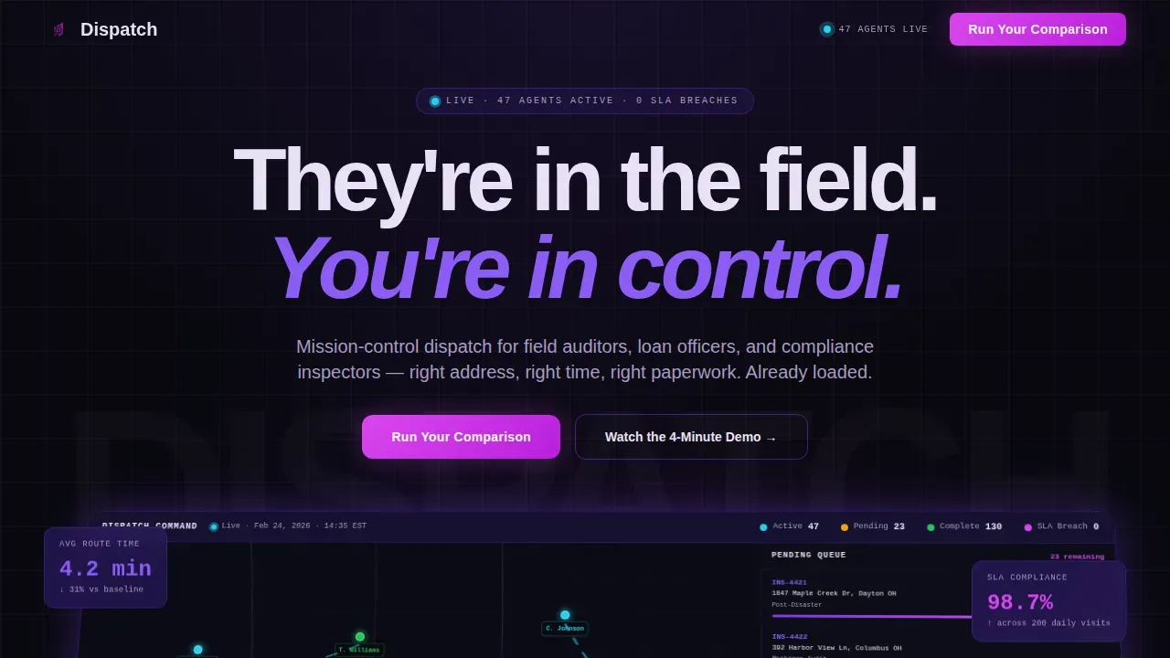
- A hero section featuring a 3D-tilted dashboard screenshot, the headline "They're in the field. You're in control.", and floating stat cards that surface key performance metrics immediately
- Five anchor-nav spokes (Routing Engine, Compliance Packets, SLA Tracking, Mobile Agent App, and Integrations), each formatted as a self-contained data card with a feature name, a KPI proof point, a micro-screenshot, and a three-line technical spec block
- A 14-row competitive comparison matrix, dual call-to-action sections (Run Your Comparison form and Watch the 4-Minute Demo gate), and a linear single-row footer
Feature list
This template was built around a precise set of functional components drawn directly from the platform brief. Each feature serves the same buyer: an operations lead who needs to evaluate a field service platform quickly and confidently.
Mission Control Hero with Dashboard Screenshot
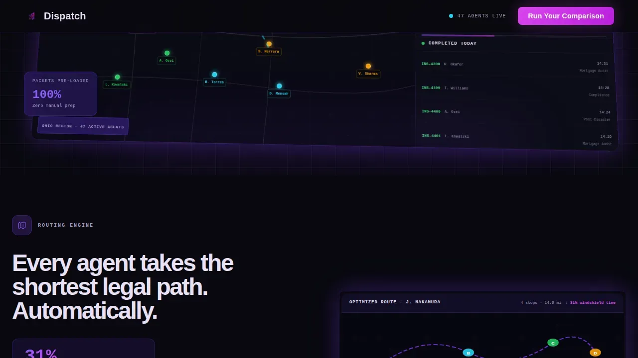
The hero section places a pixel-perfect capture of the dispatch dashboard at center stage. The screenshot sits on a slight 3D tilt against the void-black background, showing 47 active field agents as colored map pins, a sidebar queue of pending inspections sorted by service-level agreement (SLA) countdown, and a completed-visit feed scrolling in real time. Floating stat cards around the screenshot surface key data points above the fold so visitors access real time data before they read a single word of body copy. This approach replaces stock photos and lifestyle imagery entirely, letting the field service management software speak for itself.
Sticky Anchor Nav with Five Data Spokes
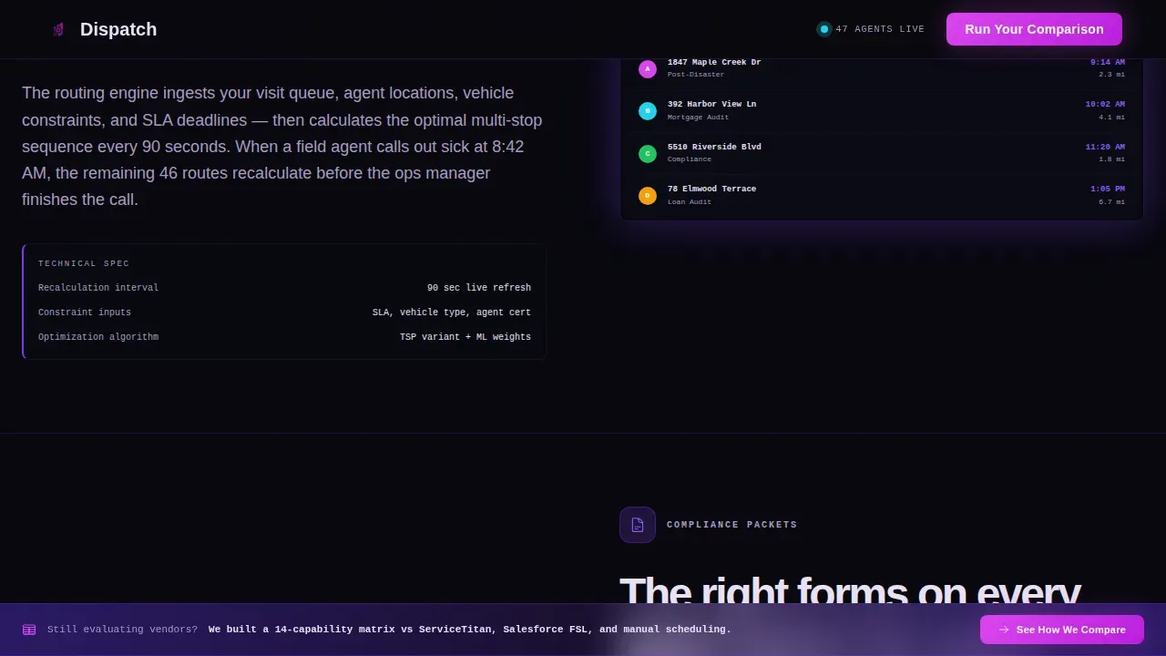
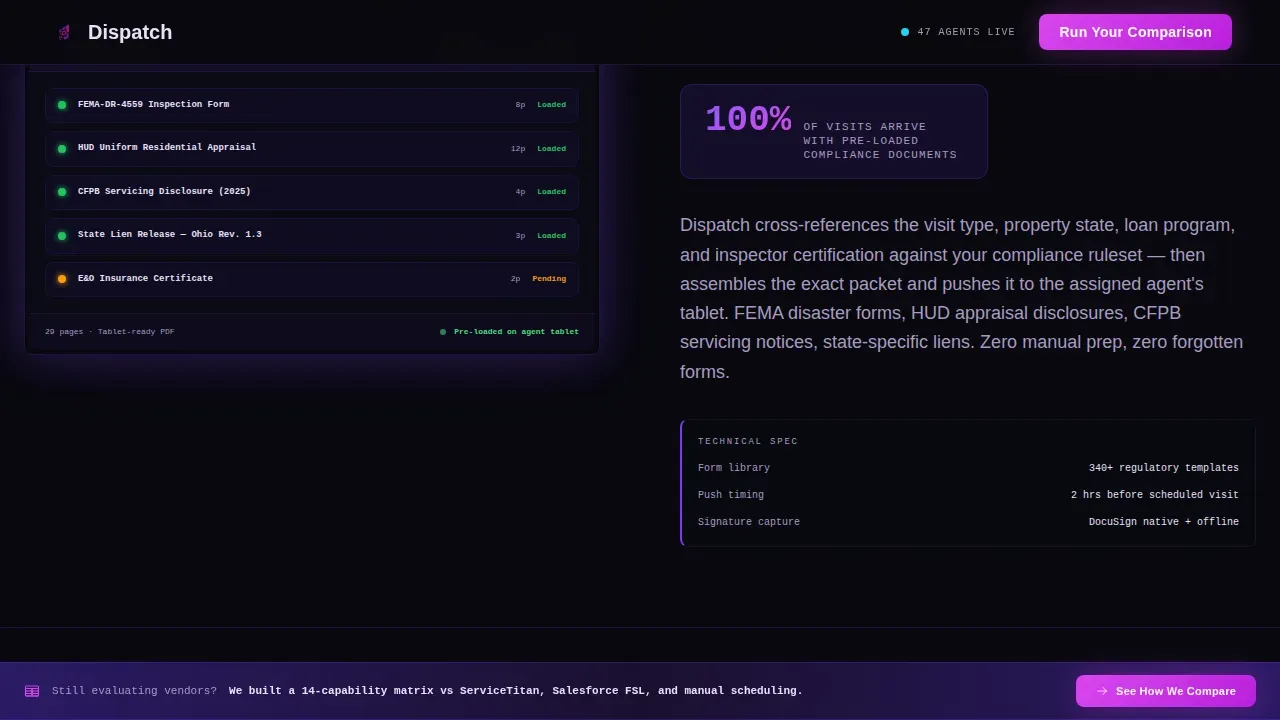
After the user scrolls past the hero, a sticky anchor navigation bar pins to the top of the viewport. It lists five spoke labels: Routing Engine, Compliance Packets, SLA Tracking, Mobile Agent App, and Integrations. Each label jumps to its corresponding data card section. Every spoke card contains a feature name, a single KPI proof point (for example, a 31% reduction in windshield time), a micro-screenshot of the relevant field service app screen, and a three-line technical spec block. The format is deliberately dense: visitors are evaluating, not browsing. Each card answers the implicit question, "How exactly does this work, and what number proves it?"
14-Row Competitive Comparison Matrix
Near the bottom of the page, a structured feature matrix compares the platform against two named competitors and manual scheduling across 14 capability rows. The matrix uses checkmarks, partial-support indicators, and footnoted specifics to give evaluators the detailed information they need for a side-by-side review. A persistent sticky bar reading "See How We Compare" anchors down to this section from any point on the page. Visitors who reach this section have already consumed five data spokes and typically arrive ready to believe the platform knows their field service operations better than their current tool does.
Dual Call-to-Action System
The primary call to action, "Run Your Comparison," opens a short form asking for the visitor's current platform name, number of field agents, and work email. Submission triggers a personalized competitive teardown delivered to the inbox. The secondary call to action, "Watch the 4-Minute Demo," gates behind only an email field, lowering the barrier for visitors who are not yet ready to self-identify their current stack. Both calls to action are styled in signal magenta, making them the highest-contrast interactive elements on any section of the page. This dual structure means the template supports both high-intent evaluators and early-stage researchers without compromising either flow.
GSAP-Powered Animation and Interactivity Layer
The template includes a high-density animation layer using GSAP ScrollTrigger. Components include scroll-triggered counter animations on KPI numbers, staggered card reveals on the data spokes, a 3D tilt effect on the hero dashboard screenshot, and hover state transitions on every data card. The sticky anchor nav updates its active state in electric ultraviolet as users scroll through sections. Server components handle static content while client components manage animations, keeping the rendering architecture clean. This interactivity layer is built to impress the exact audience the platform serves: professionals who spend their days inside dense operational software and recognize quality when they see it.
Linear Single-Row Footer
The footer follows Pattern 1: a clean, linear single-row layout that closes the page without visual clutter. It keeps the focus where it belongs, on the comparison matrix and calls to action above it, rather than expanding into a multi-column sitemap that dilutes the conversion pressure built across the page.
Page sections overview
| Section | Purpose |
|---|---|
| Hero Dashboard Screenshot | Anchor attention with a live-looking dispatch view and floating KPI stat cards |
| Sticky Anchor Nav | Persistent top-pinned nav linking to all five spoke sections after scroll |
| Routing Engine Spoke | Data card covering route optimization logic and windshield-time reduction KPI |
| Compliance Packets Spoke | Data card covering pre-loaded paperwork delivery and audit-readiness spec |
| SLA Tracking Spoke | Data card covering countdown queue management and on-time delivery metrics |
| Mobile Agent App Spoke | Data card covering field-side mobile app features and connectivity specs |
| Integrations Spoke | Data card covering platform connection capabilities and technical spec block |
| Comparison Matrix | 14-row feature grid versus two competitors and manual scheduling |
| Persistent Compare Bar | Sticky "See How We Compare" bar anchoring to the comparison matrix |
| Dual call to action Section | Run Your Comparison form plus Watch the 4-Minute Demo secondary gate |
| Linear Footer | Single-row footer closing the page with minimal visual weight |
Design & branding system
The visual identity follows a Data Command theme that treats every lit pixel as intentional. The palette was described in the brief as a Bloomberg terminal rebuilt by an aerospace user interface team: the darkness is not empty, it is loaded. Typography pairs Plus Jakarta Sans for headings and body copy with JetBrains Mono for data labels and spec blocks, reinforcing the terminal-grade credibility the platform needs to earn from day one.
- Color system: absolute void black (#09090F) as the primary background; deep interstellar violet (#2D1B69) for section dividers and card surfaces; electric ultraviolet (#7C3AED) for active nav states and interactive highlights; pale phosphor (#E8E0F5) for body text and data labels; signal magenta (#D946EF) reserved exclusively for calls to action and comparison win indicators
- Typography: Plus Jakarta Sans for headings and paragraph text; JetBrains Mono for all data labels, KPI figures, and three-line spec blocks, giving the field service reports and KPI cards a genuine data-terminal aesthetic
Mobile & speed optimization
The template is built desktop-first, reflecting the primary audience of operations managers who work at workstations managing multiple locations and coordinating field service teams across long shifts. Tablet-responsive adjustments are included in the layout structure to support coordinators and dispatch leads who may monitor the field service app from a tablet during active shifts.
- Desktop-first layout with tablet breakpoints that preserve the data-card density and comparison matrix readability without collapsing content
- A responsive layout ensures the mobile agent app demo section and sticky anchor nav remain functional and legible on tablet-sized viewports, addressing the common requirement for a mobile-friendly technician app presentation
How this template helps you convert
The template is designed around a single conversion philosophy: prove depth before asking for a click. Visitors who arrive at a field service management platform page are typically mid-evaluation. They have already seen competitor sites. They need evidence, not encouragement.
- The hero section surfaces key performance metrics and real-time data from the dashboard screenshot immediately, giving evaluators a reason to keep scrolling before they have read a headline. The prominent, high-contrast "Run Your Comparison" and "Watch the 4-Minute Demo" buttons are visible early and reinforced throughout, lowering barriers to entry for both high-intent and early-stage visitors.
- The five anchor-nav data spokes build a cumulative case across the page. Each spoke card adds a layer of detailed information: a KPI number, a micro-screenshot, and a technical spec. By the time a visitor reaches the comparison matrix, they have consumed enough evidence to make data driven decisions rather than gut-feel choices. The "See How We Compare" sticky bar keeps the conversion path visible at every scroll depth, so visitors can act fast without needing to hunt for the next step.
Other information about this template
This template sits at the intersection of financial services field service management and data-forward landing page design. It is built for service businesses that operate at scale, where the cost of poor coordination is measured in lost hours and compliance risk, not just missed appointments.
- The field service platform brief calls out specific industries within financial services: bank audits, mortgage inspections, and credit union compliance. However, the underlying layout structure and data-card spoke format adapt well to other specific industries where dense operational proof points matter, such as appliance repair networks, garage door service fleets, junk removal operations, and any other field service business that needs to present a credible case to evaluators.
- The comparison matrix format is deliberately suited to field service software evaluations. The 14-row structure covers capability areas that operations teams care about: managing schedules, fleet management, inventory management, access to job details, real time updates, seamless communication between field and office, payment processing from the field, and the ability to generate field service reports and select reports by date or agent. These are the rows that help buyers make informed decisions.
- The dual call-to-action approach reflects how field service management platforms are actually sold. Some visitors are ready to identify their current stack and receive a personalized teardown. Others want to watch a short demo before committing. The template serves both without forcing either group down a single funnel.
- The field service app spoke is one of the highest-priority sections in the template. Field technicians and compliance inspectors are the end users of the mobile app, and the spoke data card is where the page demonstrates that the field service management software thinks about their daily tasks as seriously as it thinks about the ops manager's dashboard. The mobile app section covers how agents access job details, view service history, eliminate paper forms, reduce data entry, and maintain easy communication with dispatch even when operating in areas with limited internet connection.
- The Integrations spoke covers the platform's connection to other systems, including accounting software and customer relationship management tools. This addresses a common evaluation question for operations leads who need to know how a new field service platform fits into their existing technology stack. The deep integration coverage and integration capabilities section of the data card provide the detailed information evaluators need to assess fit without scheduling a call.
- The field service business model for most platforms in this category is priced per user, per month. The comparison matrix in this template is set up to help buyers weigh cost against capability, so they can see whether the platform delivers more value than alternatives at comparable price points.
- The template supports coverage of key data points such as employee performance metrics, fleet management visibility, and the ability to track multiple jobs across multiple days from one platform. These are standard requirements for regional bank ops managers running daily processes at the scale described in the brief.
- The page addresses common pain points directly: too many spreadsheets, excessive manual work, customer calls that interrupt dispatch workflow, and the daily tasks that pile up when field coordination depends on phone calls rather than software. The comparison matrix win indicators use signal magenta to mark where the platform outperforms alternatives, making the value clear without requiring the visitor to read footnotes first.
- Marketing tools and conversion rate considerations are built into the template structure. The "Run Your Comparison" form generates a personalized output, which functions as a high-value lead magnet. The "Watch the 4-Minute Demo" gate captures email for visitors who are not yet at the self-identification stage. Together, these two calls to action are designed to produce happy customers by matching the right message to the right buyer moment.
- The page earns credibility through the density and specificity of its content. Social proof elements, including testimonials from operations managers and recognizable field service company logos, can be placed above the comparison matrix to reinforce trust before the final ask. Testimonials that highlight quantifiable outcomes, such as reduced fuel costs or improved first-time fix rates, provide the data-backed evidence that evaluators need to move from consideration to decision.
Theme
Data Command
Creative direction
Spec Sheet
Color system
Void & Violet
Style
Hub & Spoke (Anchor Nav)
Direction
Comparison/Versus
Page Sections
Mission Control Hero with Dashboard Screenshot
Sticky Anchor Nav with Five Data Spokes
Row Competitive Comparison Matrix
Dual Call-to-action Conversion System
GSAP Scrolltrigger Animation Layer
Linear Single-row Footer
Related questions
What types of field service businesses is this template designed for?
Can the comparison matrix be customized with different competitor names and capability rows?
How does the dual call-to-action system work?
Is this template suitable for a mid-market field service management platform?
Does the template include the actual dashboard screenshot or do I need to supply my own?



