Architecture Firm Software Professional Website Template
Mobilize is a split-screen landing page template built for architecture firm volunteer management platforms. It connects licensed architects with pro-bono design projects using a dark, dashboard-style layout. The Tech Glass visual identity, interactive project explorer, and click-through conversion flow make it purpose-built for AIA-credentialed professionals and nonprofit directors who need to act fast.
by Rocket studio
Quick summary
Mobilize is a single-page, split-screen landing page template designed for platforms that match licensed architects with pro-bono design projects. It uses a Tech Glass visual identity built on a Carbon Fiber color system. The layout pairs a fixed navigation column with a dynamic content panel, letting visitors explore project categories before committing to a click.
Who this template is for
This template speaks directly to people working at the intersection of professional architecture and civic impact. It is built for platforms that coordinate volunteer design work at scale.
- AIA-credentialed architects looking for meaningful pro-bono project opportunities between paid engagements
- Nonprofit directors who need construction documents and professional design support without the cost of hiring a firm
- Architecture chapter presidents tracking community engagement metrics for annual reviews
What problem this template solves
Volunteer architecture platforms often struggle to communicate urgency and credibility at the same time. A generic landing page fails the moment a licensed professional asks: "Is this worth my time?" This template solves that by showing real project data before asking for anything.
- Visitors can browse active project categories, open positions, and hours donated this quarter without filling out a form
- The interactive explorer layout gives professionals the feel of a dashboard they already belong to, not a sign-up funnel
- The click-through structure removes friction by carrying category context directly into the project directory
What you get with this template
You get a fully structured, single-page layout with every visual and interactive element defined in the design brief. Nothing is left to guess.
- A split-screen (50/50) layout with a fixed left navigation column and a dynamically swapping right content panel
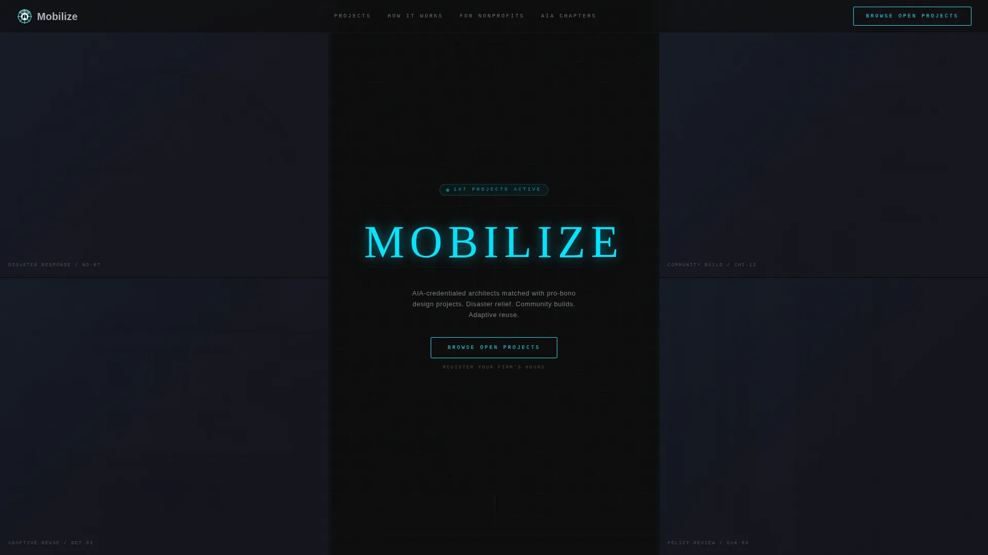
- A Dark Glass Panels header featuring six translucent, parallax-depth project thumbnail cards and a letter-by-letter "Mobilize" title animation in cyan
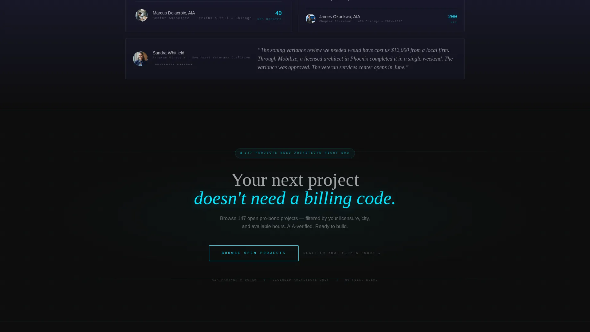
- A primary "Browse Open Projects" call-to-action button and a secondary "Register Your Firm's Hours" text link, with a fixed floating button after first scroll
Feature list
This template is built around a specific set of interactive and visual components described in the design brief.
Dark Glass Panel Header
Six translucent, slightly reflective rectangular cards fill the full viewport in a tight grid. Each card shows a ghosted architecture project thumbnail that sharpens on hover. A subtle parallax effect shifts the panels as the visitor moves their cursor, giving the header physical depth.
Letter-by-Letter Title Animation
After a one-second delay on load, the word "Mobilize" etches itself across the center panel one character at a time. The strokes render in electric blueprint cyan, styled to look laser-cut against the dark carbon background.
Fixed Left Navigation Column
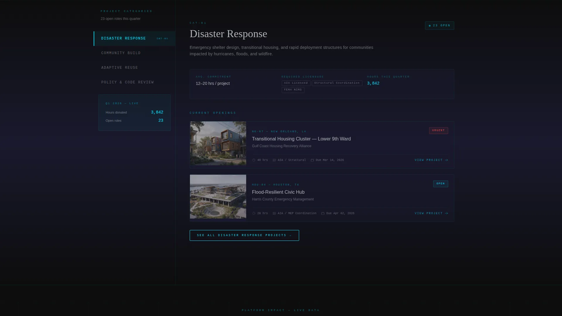
The left panel stays pinned during scroll and displays four project categories: Disaster Response, Community Build, Adaptive Reuse, and Policy and Code Review. Clicking any category triggers a glass-panel transition in the right content panel without a full page reload.
Dynamic Right Content Panel
The right panel swaps content for each selected category. It surfaces volunteer hour commitments, required licensure, current openings, and a live counter of hours donated this quarter. New content sharpens forward while previous content slides behind a frosted pane.
Click-Through Conversion Flow
There is no form on this page. The primary call-to-action button reads "Browse Open Projects" and carries the visitor to the full project directory with filters pre-seeded by their last explored category. A floating fixed button appears in the lower-right corner after the first scroll.
Dual Call-to-Action Structure
The primary cyan-outlined button fills solid on hover, positioned at the bottom of the header sequence and again as a persistent floating element. A secondary text link, "Register Your Firm's Hours," sits beneath the primary button for chapter administrators.
Page sections overview
| Section | Purpose |
|---|---|
| Dark Glass Header | Showcases ghosted project thumbnails with hover-reveal and parallax depth |
| Title Reveal Animation | Etches "Mobilize" in cyan strokes after a one-second load delay |
| Fixed Category Navigation | Pins project category links in the left column throughout scroll |
| Dynamic Project Panel | Swaps category content with glass-panel transitions on each selection |
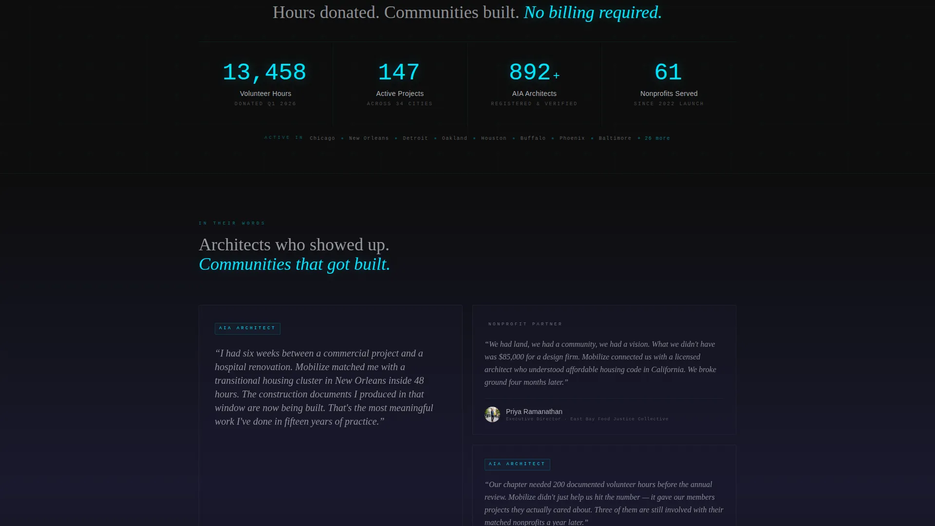
| Live Stats Display | Shows active listings, hours logged, and cities served in real time |
| Primary call to action Block | Positions "Browse Open Projects" button at end of header sequence |
| Floating call to action Button | Persists in lower-right corner after visitor scrolls past the header |
| Secondary Text Link | Offers "Register Your Firm's Hours" for chapter administrators |
Design & branding system
The visual identity follows a Tech Glass theme built on a Carbon Fiber color system. Every surface is designed to feel tactile and precise, like the back of a matte-black device with luminous edges.
- Core palette: deep carbon black (#0D0D0D) and woven graphite (#1A1A2E) for all backgrounds, frosted panel gray (#B0B3B8) for body text, and electric blueprint cyan (#00E5FF) for interactive highlights and hover states
- Clickable surfaces pulse with cyan to signal interactivity, and frosted glass overlays separate inactive content from active content during panel transitions
- The overall aesthetic references a modern architecture firm's lobby at night: reflective dark surfaces, glowing screens, and the quiet hum of work in progress
Mobile & speed optimization
The template is designed with a layout structure that keeps the experience clean and navigable across screen sizes. The split-screen format is the primary layout consideration for responsive adaptation.
- The fixed left navigation column and dynamic right panel are structured to reflow cleanly on narrower viewports
- Hover-based interactions such as panel sharpening and parallax depth are defined for pointer devices, with the layout remaining usable without them
- The floating fixed call-to-action button is positioned to stay accessible regardless of scroll depth or screen size
How this template helps you convert
This template earns the click by earning trust first. Visitors see real project data before they are ever asked to do anything.
- The interactive explorer lets professionals self-qualify by browsing categories that match their licensure and availability, making the eventual click feel like a decision they made rather than a prompt they responded to
- The floating fixed call-to-action button keeps the conversion path visible at every scroll depth without interrupting the exploration experience
- The click-through flow carries category context into the project directory, so the visitor lands on a filtered view that already reflects their interest
Other information about this template
This template is built for a specific professional audience in a focused niche. A few additional details are worth noting before you decide if it fits your platform.
- The template style is Split Screen (50/50), designed for architecture firm volunteer management platforms operating under a project-matching model
- The creative direction is Interactive Explorer, meaning the layout is meant to feel like navigating a dashboard rather than reading a marketing page
- The header concept is Dark Glass Panels, a distinct visual approach suited to technology-forward design and architecture software contexts
- The landing page direction is Click-Through, with no forms or data capture on this page itself
- The Tech Glass theme and Carbon Fiber color system are consistent choices for platforms targeting credentialed professionals who expect a refined, tool-grade interface
Theme
Tech Glass
Creative direction
Interactive Explorer
Color system
Carbon Fiber
Style
Split Screen (50/50)
Direction
Click-Through
Page Sections
Dark Glass Panel Header with Parallax Depth
Letter-by-letter Title Animation
Fixed Left Navigation Column
Dynamic Right Content Panel
Click-through Conversion Flow
Dual Call-to-action Button Structure
Related questions
Is there a contact form or sign-up form included in this template?
Can the project categories in the left navigation column be changed?
Who is the secondary call-to-action designed for?
Does the template include live project data and hour counters?
What makes this template suitable for architecture professionals specifically?



