Nonprofit Software Professional Website Template
Mobilize is a card-grid landing page template built for nonprofit volunteer management platforms. It opens with a live-coded terminal header, unfolds through a three-row modular grid that moves from chaos to resolution, and closes with a sticky lead-capture bar. The design runs on a Tech Glass aesthetic with deep obsidian backgrounds and iridescent glass-card accents.
by Rocket studio
Quick summary
Mobilize is a single-page, card-grid landing page template designed for nonprofit volunteer management software. It guides coordinators from recognizing their current chaos to experiencing a capable, modern platform. The layout follows a launch-sequence scroll, with three card rows that build momentum from problem to solution to measurable impact.
Who this template is for
This template is built for teams and organizations that coordinate volunteers at scale. It speaks directly to the people responsible for keeping operations moving when volunteer counts climb into the hundreds or thousands.
- Volunteer coordinators at food banks managing large recurring weekend crews
- Disaster relief directors who onboard thousands of new volunteers within 48 hours
- Hospital auxiliary leads who schedule specialized volunteers with narrow availability windows
What problem this template solves
Volunteer programs often run on disconnected tools: paper sign-up sheets, reply-all email threads, and spreadsheets that fall apart under pressure. This template gives the platform a page that names that pain clearly and then positions the solution with confidence.
- Shift gaps and no-show patterns have no visual home in legacy coordination tools
- Onboarding surges overwhelm systems built only for steady-state volunteer rosters
- Coordinators lose hours chasing confirmations that an automated reminder could handle in seconds
What you get with this template
The template delivers a fully structured, modular landing page ready for a nonprofit volunteer management platform. Every component is laid out to carry visitors from problem awareness straight to conversion.
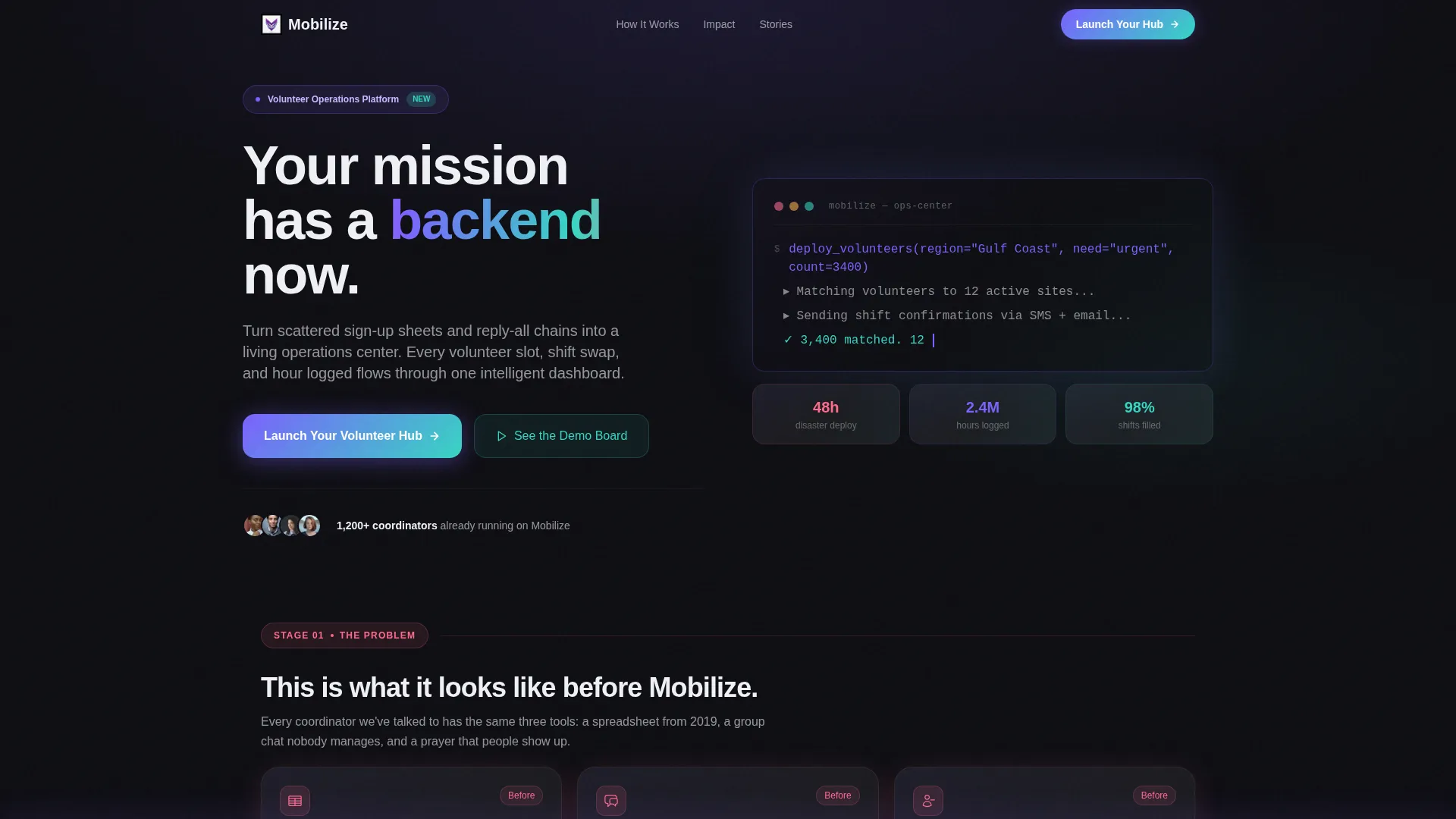
- A live-styled terminal header block with auto-typing pseudocode and teal confirmation lines
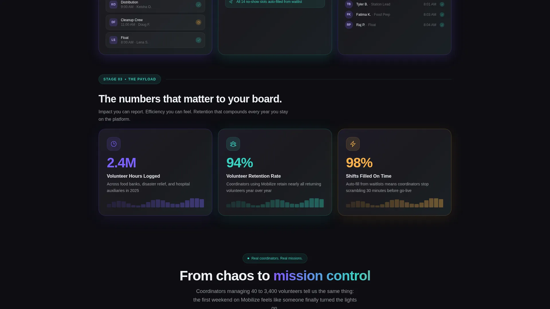
- Three distinct card-grid rows covering problem state, platform features, and impact metrics with animated counters
- A sticky bottom bar with a primary call-to-action modal and a secondary demo-board entry path
Feature list
This template is built around purposeful components. Each one plays a specific role in the launch-sequence narrative.
Live Terminal Header Block
The header opens with a code snippet styled as a running terminal window. Clean pseudocode auto-types against the obsidian background, resolving into a teal confirmation line. The monospace type glows violet and a blinking cursor keeps the sequence feeling alive.
Three-Row Modular Card Grid
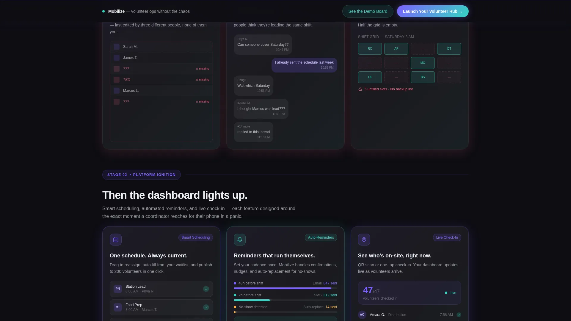
The scroll unfolds in three stages. The first row visualizes the problem state with cards showing spreadsheet chaos, unanswered group texts, and empty shift slots. The second row illuminates the platform features. The third row delivers animated impact metric counters that spin up on scroll.
Glassmorphism Card System
Every card floats on the obsidian field with a translucent frost surface and frosted-glass edges. Hover states trigger a subtle iridescent shimmer across card borders, giving each interaction a spectral quality that reinforces the Tech Glass visual identity.
Sticky Lead-Generation Bar
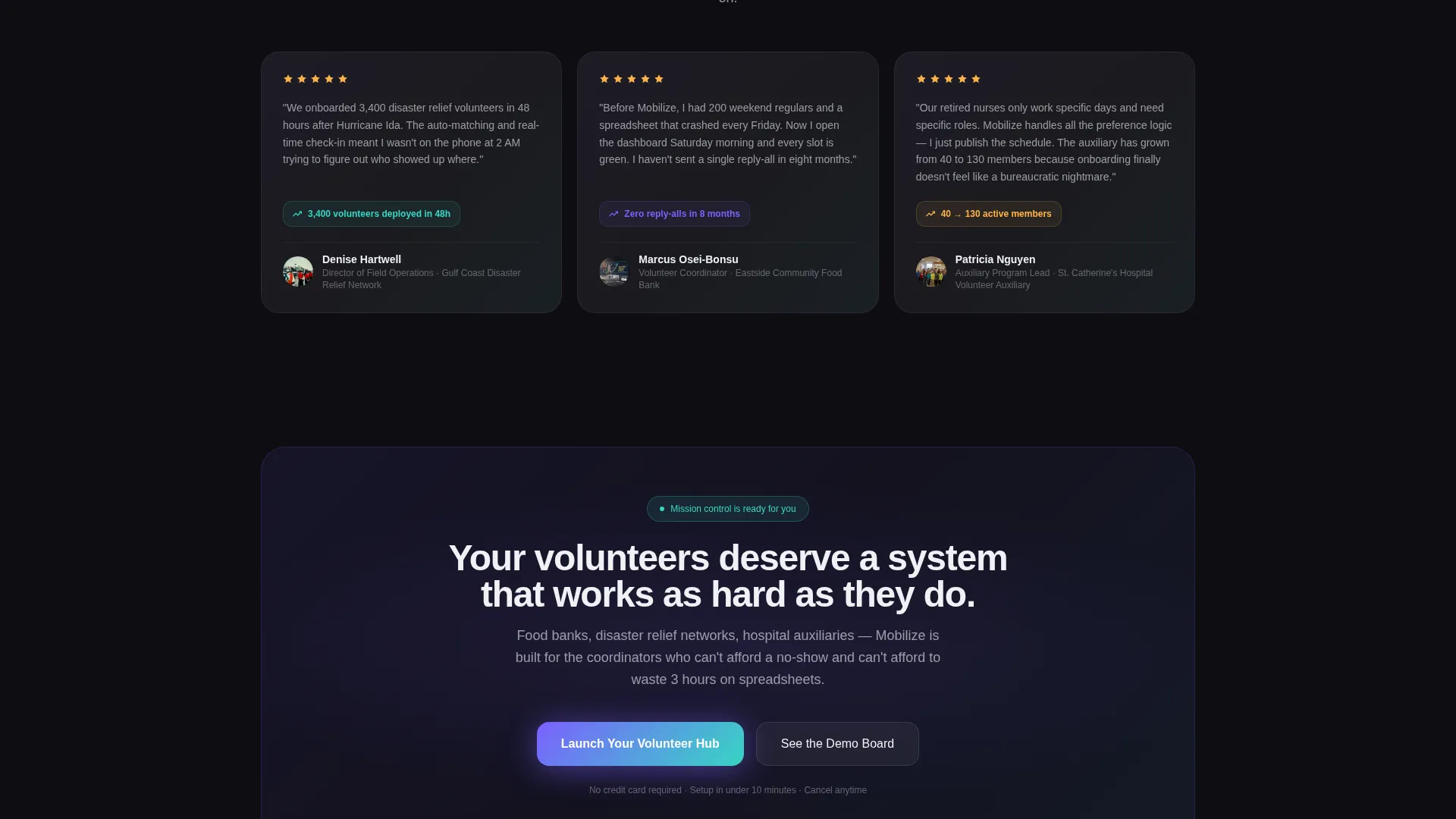
After the second card row, a sticky bottom bar activates with the primary call-to-action. Clicking it opens a focused modal with three fields: organization name, volunteer count range, and work email. Nothing more.
Secondary Demo Conversion Path
A second conversion entry point offers access to an interactive sandbox board. It requires only an email address, lowering the barrier for visitors who are not yet ready to commit to the full sign-up flow.
Scroll-Triggered Card Reveal
Cards in the feature row flip or illuminate as the visitor scrolls into each section. The reveal mechanic mirrors the countdown metaphor, making each row feel like another stage firing in a launch sequence.
Page sections overview
| Section | Purpose |
|---|---|
| Terminal Header Block | Opens with live pseudocode auto-typing and a teal confirmation response |
| Problem State Row | Three cards visualizing spreadsheet chaos, missed texts, and shift gaps |
| Platform Feature Row | Cards illuminate on scroll to reveal smart scheduling, reminders, and check-in |
| Impact Metrics Row | Animated counters show hours saved, volunteers retained, and shifts filled |
| Sticky call to action Bar | Activates after the second row with the primary lead-capture trigger |
| Lead Capture Modal | Three-field form collecting organization name, volunteer count, and work email |
| Demo Board Path | Secondary entry point requiring only an email to access the sandbox |
Design & branding system
The visual identity follows a Tech Glass theme powered by an AI Iridescent color palette. The overall feeling is a prism held up to a dark server room, with light refracting across polished surfaces.
- Deep obsidian (#0D0D12) as the primary background, shifting violet (#7B61FF) as the accent, and iridescent teal (#36D6C3) for highlights and success states
- Translucent frost (#E8EAF0) card surfaces with glassmorphism blur, floating above the obsidian field with frosted edges
- Crisp white sans-serif headline type over the terminal block, with monospace violet type inside the code snippet component
Mobile & speed optimization
The modular card grid is structured to reflow cleanly across screen sizes. The layout is built for coordinators who may be checking the page from a tablet in a relief staging area or a phone in a hospital corridor.
- Single-column card stacking on smaller screens preserves the row-by-row narrative sequence
- The sticky call to action bar remains accessible at the bottom of the viewport on mobile without blocking content
- The terminal header block scales its type and layout to maintain visual impact at narrower widths
How this template helps you convert
The page earns its conversion by showing the pain before presenting the solution. By the time the call-to-action appears, visitors already feel the relief the platform promises.
- The problem-state card row establishes immediate recognition, coordinators see their exact situation reflected back, which builds trust before a single feature is pitched.
- The sticky bottom bar with "Launch Your Volunteer Hub" appears only after the feature row, so the ask arrives at the moment of maximum receptivity.
- The secondary demo path removes commitment friction by asking for just one email, capturing leads from visitors who need more time before signing up fully.
Other information about this template
This template sits at the intersection of nonprofit software and modern technology design. It is suitable for teams building or marketing any volunteer coordination platform that wants to lead with operational credibility.
- The card-grid layout is modular, making it straightforward to swap, reorder, or replace individual card blocks as the platform evolves
- The Launch Energy creative direction and countdown-sequence structure make it well suited for product launches, waitlist campaigns, and event-driven volunteer drives
- The template style and visual system are consistent with current design patterns used in high-growth nonprofit software and civic technology products
Theme
Tech Glass
Creative direction
Launch Energy
Color system
AI Iridescent
Style
Card Grid (Modular)
Direction
Lead Generation
Page Sections
Live Terminal Header Block
Three-row Modular Card Grid
Glassmorphism Card System
Sticky Lead-generation Bar
Scroll-triggered Card Reveals
Secondary Demo Conversion Path
Related questions
Who is this landing page template designed for?
Can I customize the card content and impact metrics?
What does the lead capture modal collect?
Does this template include the interactive demo sandbox?
Is this template suitable for a product launch or waitlist campaign?



