B2B Management Consulting Motion Case Study Website Template
The Consult Dynamic Motion Case Study Landing Page Template is a scroll-reveal landing page built for B2B management consulting firms. It opens with staggered kinetic blue metric counters on a deep graphite viewport, then guides visitors through progressive case study reveals, live SVG chart animations, and dossier-styled social proof. Every animated element earns its place by demonstrating analytical depth before the call to action arrives.
by Rocket studio
Quick summary
This is a single-page landing page designed to turn skeptical C-suite visitors into case study PDF downloads and sector consultation sign ups. The landing uses scroll-triggered animation to build each case study in real time, giving potential customers the sensation of watching an analyst construct a live argument. The result is a landing page that earns the click before it asks for one.
Who this template is for
This landing page template is built for firms that win business by proving outcomes, not by promising them. It speaks directly to high-stakes B2B contexts where the visitor needs to see rigor before they respond to any call to action.
- Management consulting firms showcasing enterprise transformation results to COOs and division heads
- Private equity operations teams that need a landing page to present hundred-day turnaround proof to portfolio stakeholders
- Boutique strategy practices that want creative landing pages with data depth, not decorative motion
What problem this template solves
Most landing pages for consulting firms feel like polished brochures. They describe capabilities without demonstrating them. When your target audience is a COO inheriting a broken supply chain or a PE portfolio manager demanding proof, a standard landing page cannot hold the room.
- Visitors arrive skeptical and scroll away before reaching the call to action because nothing creates urgency or demonstrates analytical depth early enough
- A good landing page for consulting needs social proof presented as outcomes, not just words, and this template delivers that through animated data reveals and dossier-styled testimonials
- The absence of engaging visuals and dynamic elements on a typical consulting page means conversion rates stay flat and capturing leads remains difficult
What you get with this template
This landing page delivers a complete, section-led single-page experience. Every section is purposefully sequenced to guide visitors from cold arrival to informed action. The page design follows a cockpit instrument panel aesthetic: dark, precise, and information-dense.
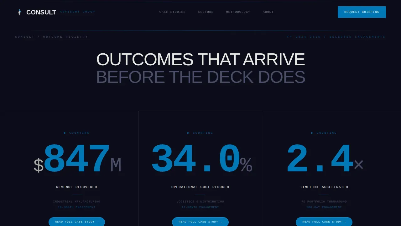
- A hero viewport with three staggered kinetic blue metric counters that grab attention before the visitor scrolls a single pixel
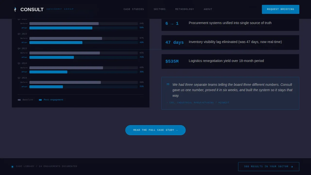
- Progressive scroll-reveal case study blocks where SVG charts draw their axes live, data points plot sequentially, and pull-quotes animate from redacted to revealed
- Sector benchmark transitional frames, dossier-styled testimonial blocks, a pulsing primary call to action after each reveal, and a persistent bottom bar with a secondary call to action linking to a filtered case library
Feature list
This landing page template includes the following built-in capabilities, each grounded in the source brief.
Staggered Kinetic Metric Hero
The hero section opens with three oversized condensed numbers counting up in staggered sequence on a deep graphite black viewport. Each figure is typeset in bold typography using condensed sans-serif display type, with a single understated label beneath each reading the client industry and engagement duration. No hero images, no portraits. Just outcomes arriving with mechanical confidence. This approach uses action oriented language through the numbers themselves, making the emotional appeal immediate and visceral.
Scroll-Triggered Progressive Case Study Reveals
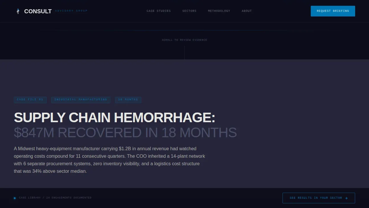
Each case study builds itself as the visitor scrolls. SVG charts draw their own axes. Data points plot one by one. Pull-quotes animate from a redacted state to fully revealed text. This is one of the strongest landing page examples of motion being used as a proof mechanism rather than decoration. The sequence escalates: first a single-metric win, then a multi-variable transformation, then a full enterprise-wide overhaul with interlocking key performance indicators (KPIs).
Sector Benchmark Transitional Frames
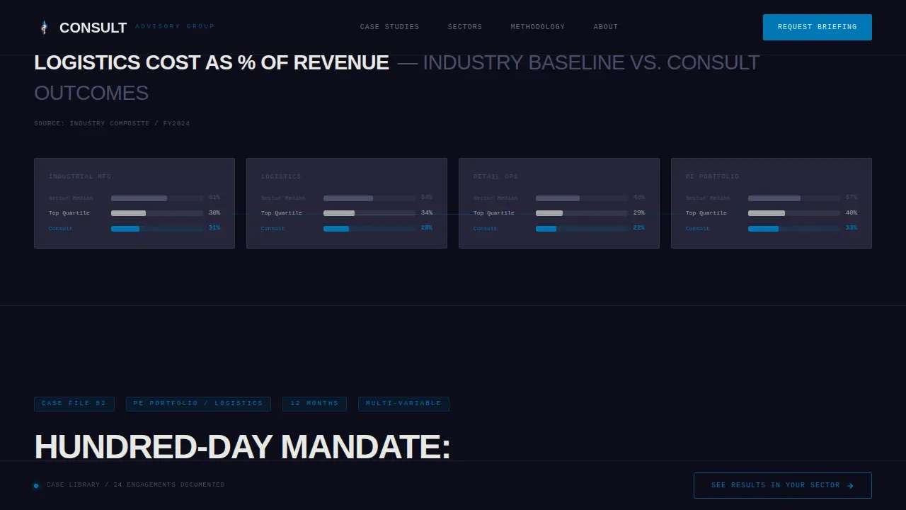
Between each case study, transitional frames present industry-level baseline data. These frames give each new case study context, so the visitor understands exactly how far above the sector average each result lands. This is relevant content that makes the page feel like an industry report, not a promotional asset. These dynamic elements keep the page visually appealing while reinforcing the analytical narrative.
Dossier-Styled Social Proof Blocks
Testimonials are presented as dossier excerpts, outcome-only statements with no portraits and no client logos. This format reinforces the classified-document aesthetic and keeps the focus on results. Customer testimonials styled this way carry strong emotional appeal because they feel like leaked intelligence rather than marketing copy. The social proof section is a key element in the overall conversion architecture of this landing page.
Pulsing Primary Call to Action
After each progressive case study reveal, a kinetic blue pill button labeled "Read the Full Case Study" appears and pulses once when the final metric locks into place. This timing is deliberate: the call to action arrives after the evidence has been assembled, not before. This creates urgency without using countdown timers or pressure tactics. The button uses action oriented language and is styled to stand out clearly against the dark background.
Persistent Secondary Bottom Bar
A fixed bottom bar carries the secondary call to action, "See Results in Your Sector," which links to a filtered case library. This bar is always visible as the visitor scrolls, making it easy to guide visitors toward the next step at any point in their journey. It is a practical interactive element that keeps the path to conversion open without interrupting the primary narrative flow.
Page sections overview
| Section | Purpose |
|---|---|
| Hero Metric Counter | Opens with three staggered animated numbers to grab attention on arrival |
| Progressive Case Studies | Builds each case study live through scroll-triggered SVG chart drawing |
| Sector Benchmark Frames | Places each case result against an industry baseline between studies |
| Dossier Testimonials | Presents outcome-only social proof in a classified-document format |
| Primary Call to Action | Delivers pulsing pill button after each reveal to capture the informed click |
| Persistent Bottom Bar | Keeps the secondary call to action visible throughout the full scroll |
| Footer Pattern | Closes with a minimal developer-style footer for a clean, uncluttered finish |
Design & branding system
The page design draws from a cockpit instrument panel at cruising altitude: dark, precise, and built around information density. The Carbon Fiber color system ensures that every illuminated element earns its place. Elegant typography reinforces the sense of analytical authority throughout the landing page design.
- Color palette: deep graphite black (#1A1A2E) for the base, titanium mid-gray (#4A4E69) for secondary surfaces, signal white (#E8E8E4) for body copy, and kinetic blue (#0077B6) reserved exclusively for data highlights, hover states, and animated metric counters
- Typography: Manrope for display headings and a compelling headline at hero scale, JetBrains Mono for all data and metric readouts, maintaining a visually appealing contrast between human narrative and machine precision
- Motion language: GSAP ScrollTrigger controls all animations; every dynamic element represents data being assembled, not decoration being applied; the motion is purposeful and avoids excessive movement that would overwhelm or distract
Mobile & speed optimization
This landing page template is desktop-first by design, built for a COO or PE audience working on laptops and large monitors. The layout prioritizes information density and precision at wider viewports. However, the page design does not abandon mobile users entirely.
- GPU-accelerated CSS transforms keep animations smooth without taxing the rendering pipeline, which is important for mobile users who visit the page on high-performance devices
- SVG animations are used for chart drawing because they guarantee crisp resolution at any screen size and keep file sizes low, supporting fast load times even on constrained connections
- IntersectionObserver triggers chart animations only when sections enter the viewport, so off-screen content does not consume resources and the page remains responsive throughout
How this template helps you convert
High-converting landing pages focus on one thing: turning visitors into leads or customers. This landing page is engineered to do exactly that by building credibility progressively before any ask is made. Effective landing pages like this one use a clear narrative arc and relevant content to guide visitors through the sales process with confidence.
- The hero metric counters establish immediate authority. Visitors see three massive outcome numbers before they scroll a pixel. This opening is a compelling headline in numeric form. It sets the tone that this is a landing page about proof, not promises. The emotional appeal is built into the data itself, making the page feel unlike a standard landing page from the first second.
- Each scroll-triggered case study reveal adds a layer of evidence. The visitor watches charts draw themselves, sees redacted quotes become visible, and experiences the sensation of gaining access to classified analysis. This progressive trust-building structure is what separates high converting landing pages from pages that simply list services. By the time the primary call to action button pulses into view, the visitor has already been guided through a complete analytical argument. The gated PDF behind the click feels like the logical next step, not a transaction.
Other information about this template
This section covers additional context that helps you understand where this landing page template fits in the broader landscape of landing page design and digital marketing strategy.
- This is a unique landing page built for one specific intersection: B2B management consulting meets high-motion design. It is not a multipurpose or generic page template. That focus is a feature, not a limitation.
- Unlike a standard landing page that uses static text and client logos, this template makes dynamic pages the primary medium of persuasion. The motion is the argument.
- Creative landing pages like this one are designed to grab attention through strong, engaging visuals and a compelling narrative structure. This template achieves both through its Carbon Fiber aesthetic and its scroll-reveal architecture.
- The landing page follows a strict "Problem, Solution, Result" formula across each case study block. This structure is common among the best landing page examples in the consulting and professional services category.
- For digital marketing contexts, this landing page can support ad campaigns by serving as a dedicated destination for paid traffic targeting COO, operations director, and PE fund manager audience segments. Dynamic landing pages that adjust their opening metrics or sector benchmarks can align the page content with the keywords used in the relevant ad group, making it particularly effective for pay-per-click (PPC) campaigns.
- The persistent bottom bar and pulsing call to action work together to maximize performance across the full visitor session. Whether the visitor stops after one case study or reads all three, there is always a clear path to sign ups or consultation requests.
- Capturing leads through gated PDF downloads is built into the primary call to action flow. Each "Read the Full Case Study" button can link to a form-gated asset, making this one of the more practical high converting pages for a firm building a contact list from organic traffic.
- The landing page design does not use countdown timers or aggressive scarcity messaging. The conversion architecture relies on demonstrated rigor, not manufactured pressure. This is appropriate for a target audience of senior executives who respond to evidence, not urgency tactics.
- Maintaining consistency across the dark background palette, the JetBrains Mono data typography, and the kinetic blue accent system is important when customizing the template. If you swap colors or typefaces, maintain consistency between metric displays and chart elements to preserve the cockpit instrument panel effect.
- This template is also well-suited for firms that want to boost engagement with potential customers who have previously visited a homepage or service page but did not convert. A focused landing page with this level of analytical depth often converts where a homepage cannot, because it cuts distractions and focuses the visitor on one landing page with one clear goal.
- For those exploring landing page examples in the consulting niche, this template stands apart from product landing pages or online store conversion pages. It is purpose-built for professional services firms selling complex, high-value engagements where social proof and performance metrics must do the heavy persuasive work.
- The footer uses a minimal GitHub Developer-style pattern that maintains the information-dense aesthetic without adding visual clutter. It is a good landing page closer that does not undercut the seriousness of the sections above it.
- Teams that want to track conversion rates over time can connect the call to action buttons to their preferred analytics layer. Understanding your audience through visitor behavior on this page can reveal which case study or sector benchmark drives the most click-throughs, enabling ongoing data-driven optimization.
- A/B testing is an ongoing process for any high-performing landing page. You can test the order of case studies, the headline copy on the hero metric counters, or the label text on the persistent bottom bar to implement findings and improve conversion rates incrementally.
Theme
Dynamic Motion
Creative direction
Industry Report
Color system
Carbon Fiber
Style
Scroll Reveal (Progressive)
Direction
Click-Through
Page Sections
Staggered Kinetic Metric Hero
Scroll-triggered Case Study Reveals
Sector Benchmark Transitional Frames
Dossier-styled Social Proof Blocks
Pulsing Primary Call to Action
Persistent Secondary Bottom Bar
Related questions
Who is this landing page template designed for?
Can I customize the case study content and metrics?
Does this landing page work for capturing leads from paid ad campaigns?
How does the scroll-reveal animation work in practice?
Is this a good landing page choice if I already have a full consulting website?



