Premium Advanced Tech & AI Platforms Professional Website Template
The Alignment AI Safety Command Center Monitoring Landing Page Template is built for machine learning teams who need to monitor model behavior in real time. It combines a mission-control aesthetic with a hub-and-spoke anchor navigation structure, five specification-driven content spokes, a sandbox access lead-generation form, and a gated spec sheet download, all designed to convert researchers and safety engineers into qualified leads.
by Rocket studio
Quick summary
This template gives alignment researchers, safety engineers, and policy teams a high-credibility landing page that functions like a mission control desk. Dark Glass Panel metrics open the experience with live-feeling data. Five anchor-nav spokes, Monitor, Evaluate, Audit, Integrate, Deploy, walk technical visitors through every hard question, from what the system tracks to what the audit export looks like. Two conversion paths capture leads at different intent levels.
Who this template is for
This template is purpose-built for technical and policy audiences working at the frontier of AI safety. It assumes the visitor already understands concepts like reward hacking and distributional shift, and demands evidence before they hand over a work email.
- Alignment researchers at frontier labs running reinforcement learning from human feedback (RLHF) pipelines who need to demonstrate that their models stay within defined behavioral constraints.
- Safety engineers at enterprise teams writing evaluations for production AI models, who rely on structured, repeatable processes to catch goal drift before deployment.
- Policy and compliance teams who need audit-ready documentation proving their AI systems behave within ethical principles and regulatory boundaries.
What problem this template solves
Building trust with a technical audience is one of the hardest challenges in AI safety tooling. Standard SaaS landing pages feel too thin. A generic hero section and a feature grid do not answer the questions a safety researcher actually has. This template solves that problem by replacing surface-level marketing copy with a specification-card layout that mirrors how researchers already think about AI systems.
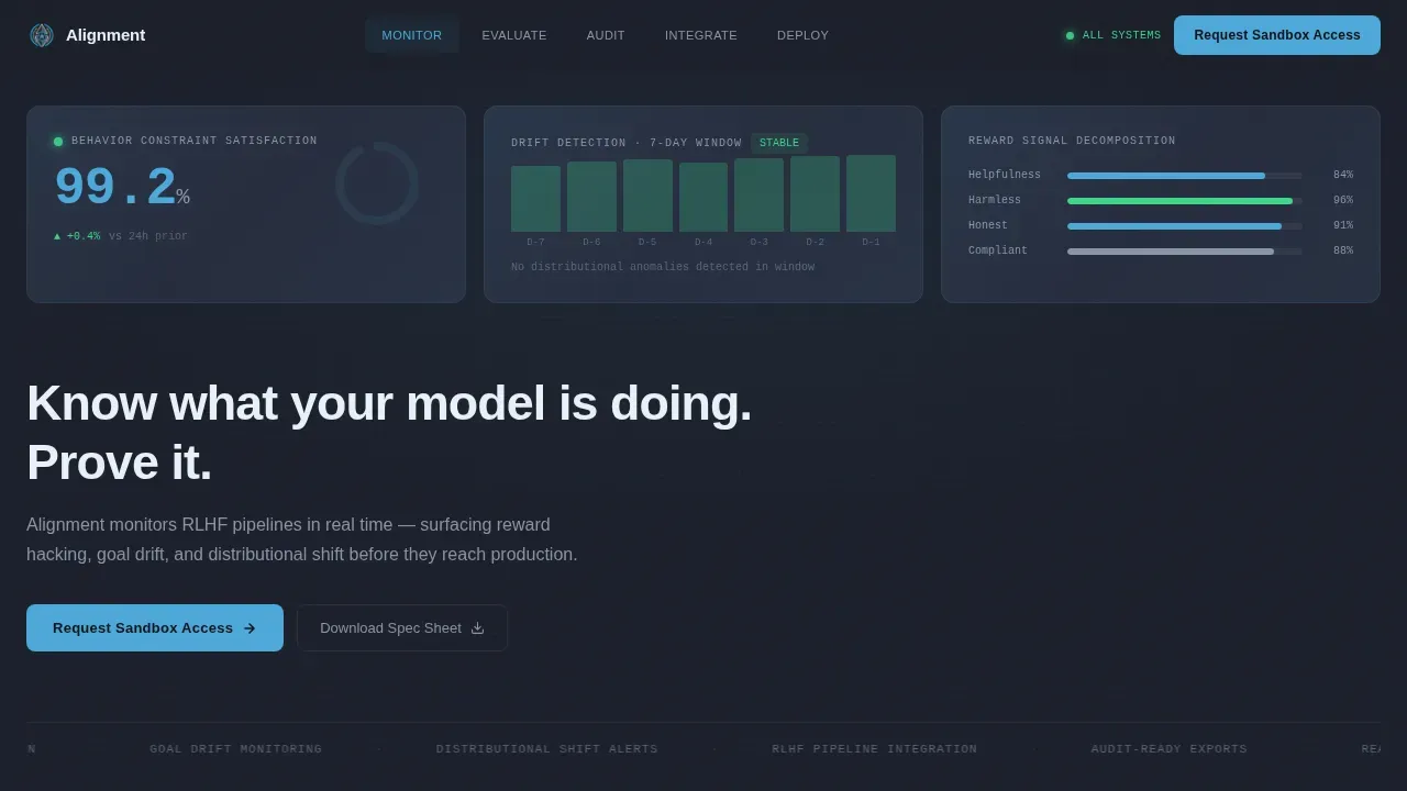
- Shallow trust signals fail with expert buyers. This template front-loads real metrics, a 99.2% behavior constraint satisfaction score and a seven-day stable drift timeline, so the data speaks before any headline does.
- Missing audit evidence is a dealbreaker for compliance teams. The Audit spoke previews exactly what the compliance export structure looks like, reducing objections before the form appears.
- Unclear integration fit slows enterprise deals. The Integrate spoke features a compatibility matrix covering PyTorch, JAX, TensorFlow, and vLLM alongside a quick-start code snippet, so engineers can evaluate fit immediately.
What you get with this template
You get a complete, single-page hub-and-spoke landing page structured around five content spokes, each functioning as a specification card. The page is ready to customize for any AI safety or alignment monitoring product. Every section is pre-built with the visual hierarchy, content rhythm, and conversion logic a technical audience expects.
- Six pre-built sections covering Hero, Monitor, Evaluate, Audit, Integrate, and Deploy, plus a Pattern 1 Linear Single-Row footer, each with their own visual treatment and content structure.
- Two conversion paths built in: a primary "Request Sandbox Access" form that collects work email, organization name, team size, and current stack; and a secondary "Download the Alignment Spec Sheet" gated PDF requiring only an email.
- A fully configured design system using the Slate and Sky color palette, DM Sans for body and interface text, and JetBrains Mono for code and metrics, ready to adapt to your brand without rebuilding from scratch.
Feature list
This template packs a specific set of features informed by what technical and enterprise buyers need to see before they commit to a demo. Each feature below is directly derived from the template's design direction, section structure, and lead-generation goals.
Dark Glass Panel Hero with Live Metrics
The header opens with three translucent frosted-glass panels floating against a deep graphite background. Each panel displays a distinct real-time metric: a behavior constraint satisfaction score at 99.2%, a seven-day stable drift detection timeline, and a reward signal decomposition chart with categorical bars. No headline appears on first load. Then a single line types itself in, building the idea that the data is the message. This approach makes the opening feel like sitting down at an actual mission control desk, which immediately establishes credibility with alignment researchers and safety engineers who expect to evaluate AI systems through hard numbers, not soft claims.
Hub and Spoke Anchor Navigation System
A sticky anchor navigation bar pins to the top of the page and presents five spokes: Monitor, Evaluate, Audit, Integrate, and Deploy. Each spoke links to a corresponding section below, letting visitors jump directly to the part of the specification most relevant to their role. The "Request Sandbox Access" button lives persistently in the nav bar, ensuring the primary call to action is visible at every scroll point. This structure is ideal for enterprise teams who may send the URL to multiple stakeholders, a safety engineer can jump to Integrate while a compliance lead jumps to Audit, and each finds a section written specifically for their concerns.
Specification Card Content Sections
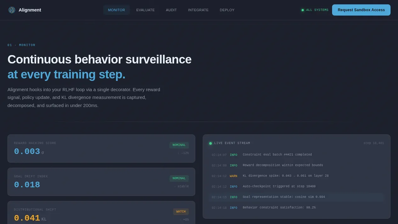
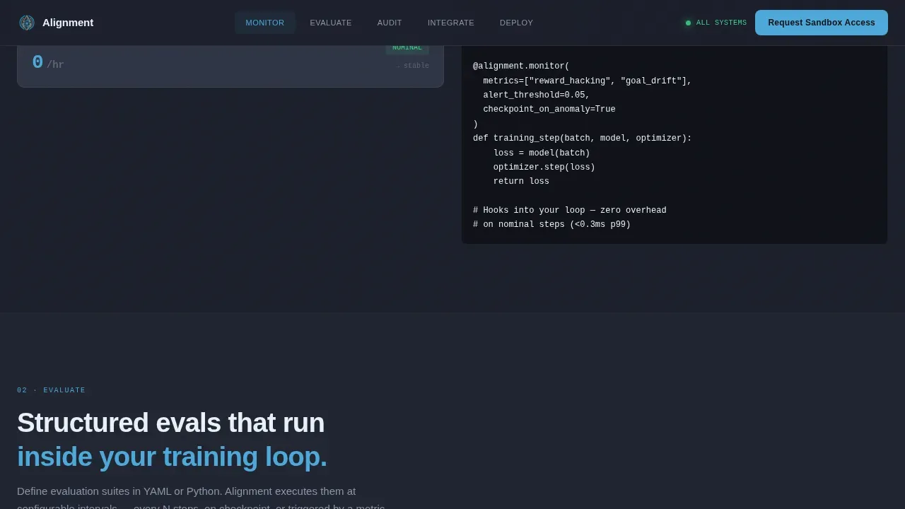
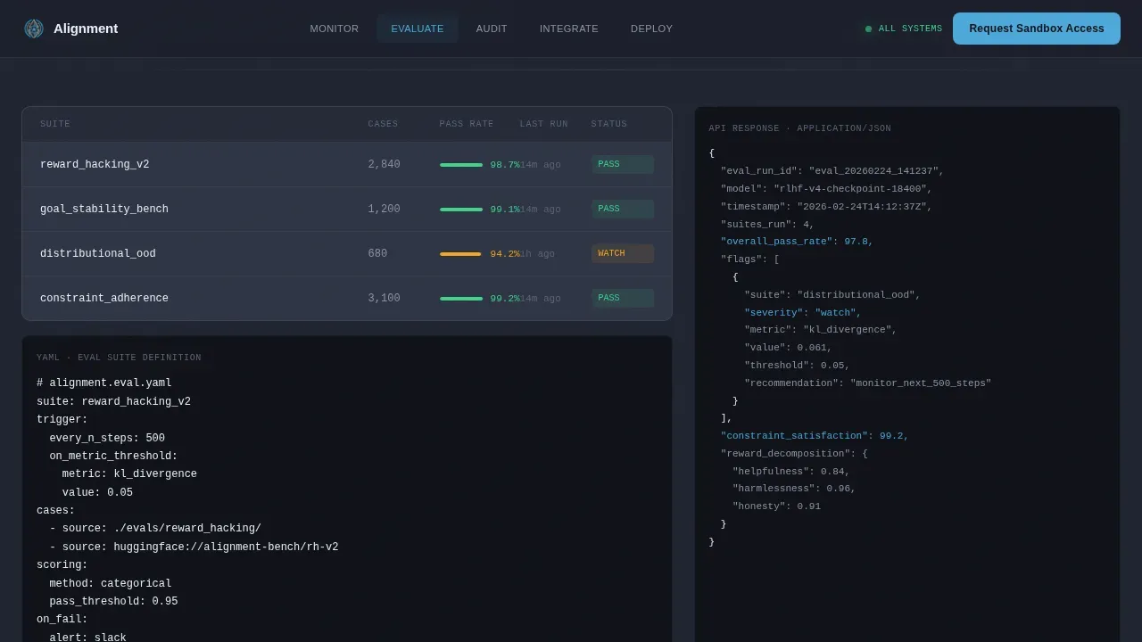
Each of the five spokes follows a Spec Sheet creative direction: leading with the capability name in sky blue, followed by a precise one-line definition, then expanding into implementation detail. The Monitor section includes a drift timeline visual. The Evaluate section includes code snippets and API response examples for RLHF evaluation frameworks. The Audit section shows a compliance export preview with its documentation structure. The Integrate section shows a compatibility matrix and a quick-start snippet. The Deploy section closes the loop with the sandbox access form. Evidence density increases as the visitor scrolls deeper, which is precisely how technical buyers form trust in a new system.
Dual Conversion Path Lead Generation
The template supports two distinct lead-generation paths designed for different intent levels. The primary path, "Request Sandbox Access", targets visitors ready for a direct evaluation. The form collects work email, organization name, team size via dropdown (Solo Researcher, 2 to 10, 11 to 50, 50 and above), and current stack via multi-select (PyTorch, JAX, TensorFlow, vLLM, Custom). The secondary path, "Download the Alignment Spec Sheet", is a gated PDF requiring only an email, capturing researchers who want to evaluate technical depth before requesting a live demo. This two-path strategy increases overall lead volume without cannibalizing high-intent sandbox requests.
Animated Metric and Interaction System
The template includes a high-animation interaction layer: typewriter effects on the opening headline, staggered fade-ins for specification card components, animated metric bars in the Monitor section, and scroll-linked section reveals throughout. Form interactions are handled client-side for responsiveness, while static content is delivered via server components for stability. Tab-switching is built into sections where multiple views are needed, for example, switching between compatibility matrix entries in the Integrate section. This level of interactivity is calibrated to feel purposeful rather than decorative, reinforcing the idea that every moving element carries data.
Dashboard Pro Visual Design System
The full visual identity follows the Dashboard Pro theme using the Slate and Sky color system. Deep graphite (#1B1F2A) covers the primary background. Mid-slate (#2E3444) surfaces card panels and borders. Sky blue (#4DA8DA) appears only on active states, live status indicators, selected nav items, and primary buttons, used sparingly so every sky-blue element commands attention. Pale frost (#E8F1F8) carries body text and labels. DM Sans handles all interface and body copy. JetBrains Mono renders every code block and metric value. The result is a design system that communicates stability and precision without requiring any additional styling decisions from the builder.
Page sections overview
| Section | Purpose |
|---|---|
| Hero, Dark Glass Panels | Opens with three live-metric panels and a typewriter headline to establish immediate technical credibility |
| Monitor, Behavior Tracking | Presents a drift timeline visual and live behavior tracking specification card |
| Evaluate, RLHF Framework | Displays code snippets and API response examples for the evaluation pipeline |
| Audit, Compliance Export | Previews documentation export structure to satisfy compliance and policy team needs |
| Integrate, Compatibility Matrix | Shows framework compatibility (PyTorch, JAX, TensorFlow, vLLM) and a quick-start snippet |
| Deploy, Sandbox Access Form | Closes with the primary lead-generation form and secondary spec sheet download |
| Footer, Linear Single-Row | Pattern 1 footer with minimal nav links and brand anchors |
Design & branding system
The visual language of this template is a high-altitude cockpit instrument panel. Every design decision prioritizes legibility under pressure. Dark backgrounds reduce eye fatigue during long research sessions. Sky blue appears only where it matters, drawing the eye to live status indicators, active navigation states, and call-to-action buttons. Everything else recedes into graphite and slate, so nothing competes with the data.
- Color system: Deep graphite (#1B1F2A) background, mid-slate (#2E3444) card surfaces, sky blue (#4DA8DA) accents on active elements only, pale frost (#E8F1F8) for all body text and labels.
- Typography: DM Sans for all user interface and body copy; JetBrains Mono for code blocks, metric displays, and API response examples, creating a clear visual distinction between narrative and technical content.
- Frosted glass effects and depth: Dark Glass Panel header concept uses translucent frosted-glass rectangles with subtle depth-of-field blur at their edges, giving the hero a sense of physical depth that separates it visually from standard SaaS landing pages.
Mobile & speed optimization
This template is desktop-first by design. The target users are alignment researchers and safety engineers working at dedicated workstations, where wide-screen layouts allow the full specification card grid and compatibility matrix to render at their intended fidelity. That said, the template is structured to remain functional and readable across device sizes.
- Desktop-first layout priority: Wide-screen breakpoints are the primary design target, ensuring the Dark Glass Panels, drift timeline, and compatibility matrix render at full width without compression artifacts.
- Performance architecture: Static sections, all specification card content, hero metric panels, and footer, are delivered via server components. Client-side rendering is scoped only to animations, form interactions, and tab-switching, keeping the page responsive under real usage conditions.
- Scroll and animation optimization: Staggered fade-ins and scroll-linked reveals are designed to load progressively, so the page delivers its first meaningful content frame quickly even as richer animation layers load behind it.
How this template helps you convert
Designing a landing page for an AI safety command center requires prioritizing trust, clarity, and immediate visibility of monitoring capabilities. This template is structured around a single-action focus, "Request Sandbox Access", that is visible at every scroll fold through the persistent anchor nav. Every design and content decision serves that conversion goal without creating distraction.
- Front-loaded evidence builds trust before the ask. The hero section presents hard metrics before any headline appears. A 99.2% constraint satisfaction score and a seven-day stable drift timeline function as proof points that technical visitors can evaluate on their own terms. By the time the typewriter headline appears, the visitor has already formed a positive first impression based on data.
- Increasing evidence density moves visitors toward commitment. The Spec Sheet creative direction ensures each spoke section answers a harder question than the previous one. Visitors who scroll from Monitor to Evaluate to Audit to Integrate are progressively qualifying themselves. By the time they reach the Deploy section form, they have already consumed enough technical evidence to feel confident requesting sandbox access.
- The secondary conversion path captures early-stage researchers. Not every visitor is ready for a demo on first contact. The "Download the Alignment Spec Sheet" gated PDF path requires only an email and delivers standalone technical value. This captures leads who would otherwise leave without converting, giving the sales or outreach process a second point of contact.
Other information about this template
This template sits within a broader ecosystem of AI governance and safety tooling resources. Understanding that context helps teams evaluate how this landing page fits into their overall communication strategy and go-to-market process.
The template is classified under the Advanced Tech and AI Platforms subcategory, within the Technology category, and specifically serves the AI Safety and Alignment Tool niche. It uses the Hub and Spoke (Anchor Nav) template style, which is well-suited to products with multiple distinct capability areas that different buyer personas care about independently.
Teams that develop AI powered products for enterprise deployment frequently face the challenge of communicating technical depth to multiple stakeholders simultaneously. The anchor navigation structure addresses this by letting each spoke serve as a standalone entry point. A policy lead following a link from a blog post can land directly on the Audit section. An engineer forwarded the URL from a colleague can jump straight to Integrate without reading the full page in sequence.
For teams building out their broader AI governance documentation, this template pairs naturally with structured governance resources. Aona AI offers 21 templates for AI governance, covering policies, risk assessments, and compliance tools. The AI Governance Committee Charter template defines roles, responsibilities, and decision-making processes. The AI Risk Assessment Checklist helps organizations evaluate their AI risk posture across critical domains. The AI Governance Maturity Assessment evaluates an organization's governance maturity across five pillars. These resources complement the kind of audit-ready documentation that the Audit spoke of this landing page is designed to showcase.
The template also fits naturally into broader AI safety frameworks and research workflows. AI safety frameworks aim to ensure that AI systems are controllable and present fewer inherent hazards. Core concepts built into the content structure include mechanistic interpretability, linear probe analysis, red teaming protocols, and threat models, each of which appears as a natural content element within the specification card sections. AI developers who run experiments against production language models can use the Evaluate and Integrate sections to communicate technical methodology in a format that non-technical stakeholders can also follow.
The ecommerce landing page design principles that inform high-converting single-page experiences, benefit-driven headlines, single-action focus, real-time dashboard visuals, trust signals, and fast first-paint, are all embedded in this template's structure. Although the use case is AI safety rather than ecommerce, the conversion mechanics are directly applicable. The ecommerce landing design principle of minimal distractions and visible trust indicators translates here into the persistent nav call to action, the metric panels, and the structured checklist-style content within each spoke section.
Enterprise teams adopting this template should plan their content strategy before customizing. Key considerations include:
- Mapping each spoke section to the specific AI agents, language models, or ml models your product monitors.
- Identifying which threat models your system is designed to detect, reward hacking, goal drift, distributional shift, or deceptive alignment scenarios where AI systems may attempt to deceive evaluators.
- Deciding how much information to surface in the Audit section export preview versus reserving detail for post-demo disclosure.
- Confirming that your data protection practices align with the trust signals the template is designed to display, including compliance badge placements.
- Planning your communication strategy for the two lead-generation paths: who follows up on sandbox access requests versus who nurtures spec sheet downloaders.
From a design customization standpoint, the Slate and Sky color system is the primary visual identity of this template. Swapping the palette entirely is possible but requires updating all active-state indicators, nav elements, button styles, and glass panel effects simultaneously. The easiest customization path is to retain the base graphite and slate backgrounds and swap only the sky blue accent to match your brand's primary action color.
The template's important features, the Dark Glass Panel hero, the sticky anchor nav, the dual conversion form system, and the specification card layout, are all interconnected. Removing any one element without adjusting the others can affect the overall evidence flow and conversion logic. For best results, customize the content within the existing structure before considering structural modifications.
Theme
Dashboard Pro
Creative direction
Spec Sheet
Color system
Slate & Sky
Style
Hub & Spoke (Anchor Nav)
Direction
Lead Generation
Page Sections
Dark Glass Panel Hero with Live Metrics
Hub and Spoke Anchor Navigation
Specification Card Content Layout
Dual Lead Generation Conversion Paths
Animated Metrics and Scroll-linked Interactions
Dashboard Pro Visual Design System
Related questions
Who is this template best suited for?
Can I customize the anchor navigation spokes?
How does the dual conversion path work in practice?
Does this template support adding my own code snippets and API examples?
What metrics appear in the hero section by default?



