DevOps Uptime Tracking Landing Page Template
Pulse is a bento grid landing page template built for uptime monitoring dashboards. It targets DevOps leads, solo founders, and Site Reliability Engineering teams who need to prove their monitoring tool is fast, precise, and worth switching to. The design uses a void-black and electric-violet palette with a terminal code snippet header, spec-sheet capability cards, and a sticky competitor comparison table.
by Rocket studio
Quick summary
Pulse is a single-page template designed to market an uptime monitoring dashboard to engineers and SRE teams. It opens with a live terminal code snippet in the page header, flows through a dense bento grid of capability cards, and anchors mid-page on a sticky competitor table. Every section is built to move a skeptical DevOps engineer from "interesting" to "Start Monitoring Free" without friction.
Who this template is for
This template was built for teams and founders who live by their status page and need a landing page that speaks the same language their users do. It works equally well for early-stage products competing on price and for established tools competing on check frequency.
- DevOps leads at Series A startups shipping multiple times per day who need to monitor services reliably
- Solo founders running cloud infrastructure on a handful of droplets who want a cost-effective monitoring tool
- Site Reliability Engineering teams tired of paying for a monitoring system that charges more than the incidents it catches
What problem this template solves
Most uptime monitoring tools look the same from the outside. Their landing pages lead with stock photography and vague promises. Engineers evaluating a new dashboard platform want data, not decoration. They want to see the system response time, understand the check interval, and compare pricing in a single scroll.
- Generic templates fail to communicate the current status of a monitoring product with the density engineers expect
- Competitors are compared in a table that engineers have to build themselves by opening five browser tabs
- Trust signals like incident history, deployment frequency context, and real metrics never appear where buyers actually look
What you get with this template
You get a complete, production-ready bento grid landing page that puts your dashboard's strongest data points front and center. Every section was designed to reduce the number of questions a buyer has to ask before clicking the call-to-action button.
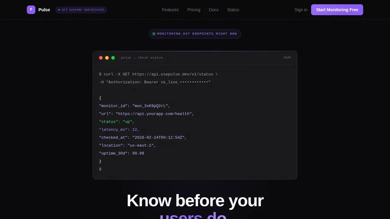
- A terminal-style page header with a live curl code snippet, syntax-highlighted in violet and phantom white, ending with
"status": "up"and a 12ms latency value - A bento grid of spec-sheet capability cards covering check intervals, global monitoring locations, incident timeline, latency graph, alert channels, and status page features
- A sticky mid-page competitor comparison table and a minimal two-field signup section with a primary call-to-action and a secondary path to API documentation
Feature list
This template ships with a focused set of components. Each one is designed to communicate a specific capability that engineers actually verify before they commit to a new monitoring platform.
Terminal Code Snippet Header
The page header skips the hero image entirely. Instead, it renders a styled terminal block showing a real curl request to the monitoring application programming interface (API), with a JSON response arriving line by line. Syntax highlighting uses electric violet for keys and phantom white for values. The sequence ends with "status": "up" and a 12ms latency reading. The headline below reads "Know before your users do." in 56-pixel phantom white. This approach lets the product demonstrate itself before a visitor scrolls.
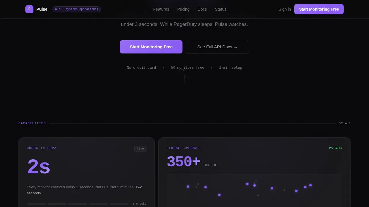
Bento Grid Capability Cards
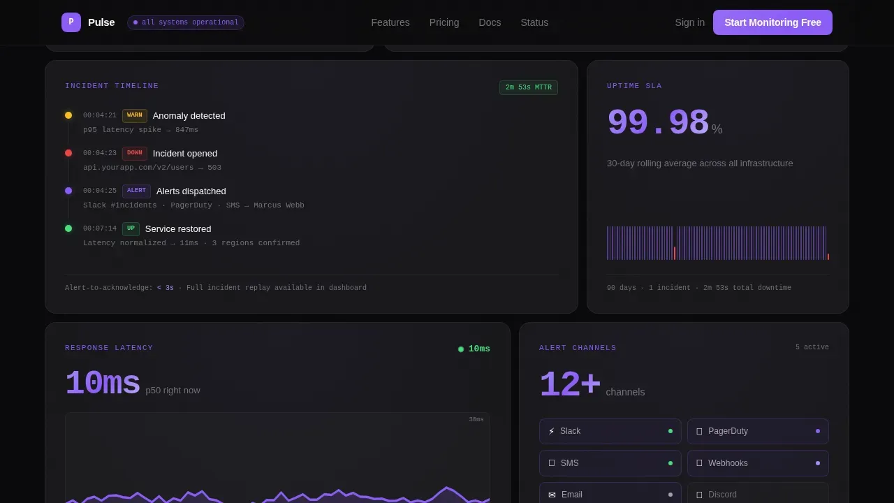
The template's main content area uses a bento grid layout. Each card is a self-contained capability tile with a metric, a one-line description, and a micro-detail engineers care about. Example cards include "2s check intervals" with a comparison footnote, "350+ global locations" over a dot map, and the incident timeline user interface rendered directly in a card. The grid reads like a datasheet: dense, scannable, and honest about what the tool does.
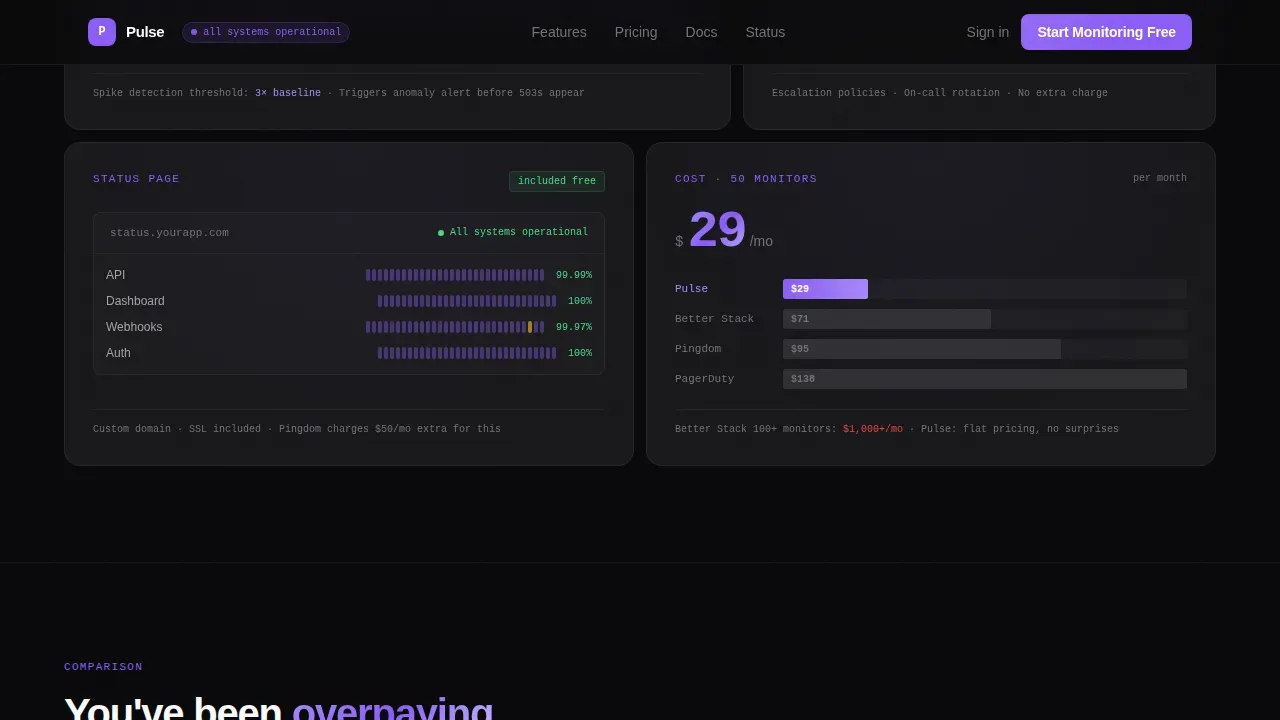
Sticky Competitor Comparison Table
A sticky comparison table lives mid-page and shows your dashboard against popular tools side by side. Columns cover check frequency, pricing at 50 monitors, alert channels, status page included, and API rate limits. Every row where your product wins is highlighted in electric violet. This is the section that earns the click. It shows visitors at a glance whether they have been overpaying or under-monitoring with their current setup.
Multi-Channel Alert Display
The template includes a dedicated card showcasing alert channel integrations. The design supports displaying connections to Slack, PagerDuty, email, SMS, and MS Teams in a clean icon-and-label format. Multiple notification channels are shown as a grid of live-looking channel badges, reinforcing that the monitoring system reaches engineers wherever they actually are.
Status Page Showcase Card
A bento cell is dedicated to the public status page and private status pages the product provides. It shows the overall status view, uptime history bars, and a sample incident communication block. Users can see at a glance how the status page communicates current status, displays service uptime, and delivers subscriber notifications to end users during an outage.
Minimal Signup Section
The call-to-action section keeps friction near zero. It provides two fields maximum: GitHub OAuth or work email. The primary button reads "Start Monitoring Free" and is pinned to the top navigation bar as well as repeated below the competitor table. A secondary link labeled "See Full API Docs" serves engineers who need to read the technical documentation before committing. Free plans and a transparent free tier pitch are built into the section copy.
Page sections overview
| Section | Purpose |
|---|---|
| Terminal header block | Prove the product works with a live curl snippet and the headline "Know before your users do." |
| Bento capability grid | Display spec-sheet metric cards covering check intervals, locations, incident timeline, and latency |
| Competitor comparison table | Side-by-side sticky table showing Pulse against rival monitoring tools with violet win-row highlights |
| Social proof row | Testimonials from DevOps leads with concrete uptime stats and job titles |
| Call-to-action signup | "Start Monitoring Free" with GitHub or email, plus a secondary API docs path |
| Footer | GitHub developer minimal footer pattern with essential links |
Design & branding system
The visual identity follows a Startup Velocity theme built entirely on a Void and Violet color system. The aesthetic is designed to resonate with developers who work in dark terminals and evaluate software by reading, not watching.
- Colors: absolute void black (#09090B) for card backgrounds, deep terminal gray (#18181B) for grid cell separators, electric violet (#8B5CF6) for every interactive surface and live-data accent, and phantom white (#FAFAFA) for primary type
- Typography: DM Sans for all user interface copy and JetBrains Mono for code blocks, metrics, and latency readouts
- Motion and interactivity: staggered bento reveals on scroll, terminal typewriter animation in the header, live pulse dots on status indicators, and violet hover states on every bento cell
Mobile & speed optimization
The template is desktop-first by design, matching how engineers evaluate new software tools. DevOps leads and SRE teams typically compare monitoring platforms on a large screen where the bento grid and competitor table can be read in full without horizontal scrolling. The layout still adapts cleanly for mobile.
- The bento grid collapses from a multi-column layout to a single-column stack on smaller screens, keeping every metric card fully readable
- The sticky competitor table scrolls horizontally on mobile with a fixed first column so row labels stay visible
- The call-to-action button remains fixed in the top navigation bar on all screen sizes so users always have one-tap access to the signup flow
How this template helps you convert
A high-converting landing page for a DevOps uptime monitoring tool has to do one thing well: remove doubt faster than the visitor can generate it. This template is built around that principle from the page header to the footer.
- The terminal code snippet in the header gives engineers immediate proof that the product is real and technically credible, reducing the skepticism that kills conversions before the first scroll.
- The sticky competitor comparison table creates a moment of recognition: visitors see their current tool in a row and realize they are paying more or checking less often, which makes the "Start Monitoring Free" button feel like the obvious next step rather than a sales pitch.
- Minimal signup fields (GitHub or email only) and a transparent free tier pitch eliminate the commitment barrier at the exact moment the visitor is ready to act.
Other information about this template
This template is built within the Uptime Monitoring Dashboard niche under the Documentation and Support category. It is relevant for teams comparing this type of tool against other popular tools in the space. Several practical details are worth noting for buyers evaluating whether this template fits their product.
- The template's competitor table can be configured to compare any monitoring tools. Out of the box it references four columns, but the grid is flexible enough to add or remove columns as your competitive landscape changes.
- The bento grid supports monitor group cards, so you can show grouped service clusters rather than individual endpoints, which is useful when your dashboard supports organizing services by team or environment.
- The status page showcase card can display both public status pages for customer-facing communication and private status pages for internal team dashboards, reflecting the real distinction engineers make when evaluating a monitoring platform.
- The signup section copy is designed to accommodate free plans and a free status page pitch. If your product offers a free tier with access to core services, the section text can be customized to reflect those specific plan boundaries.
- The template supports custom domains in the status page card copy, which matters to teams who want to serve their status page on their own domain rather than a subdomain of the monitoring vendor.
- Engineers evaluating monitoring software often ask about self host options. The template includes a secondary information area where self host deployment notes can be added without disrupting the primary conversion flow.
- Uptime Kuma is one example of a self-hosted monitoring tool that teams consider alongside cloud-based services. This template can be used to market either a cloud platform or a self host product with minimal copy changes.
- The shopify status page and similar high-visibility public status examples are useful reference points when writing comparison copy for the competitor table rows.
- The template's incident history card references a transparent log of past incidents with dates, duration, and resolution notes, which builds trust with users researching the product's operational health.
- Facts from the broader DevOps ecosystem are useful context when writing the comparison table and bento card copy. Grafana is widely used as the visualization layer for building DevOps dashboards, while Prometheus is the most common data source for collecting time-series metrics. Teams familiar with those tools will recognize the density and precision this template's design language intentionally mirrors.
- The four DORA metrics, deployment frequency, lead time for changes, Change Failure Rate, and Mean Time to Recover (MTTR), are useful benchmarks to reference in the bento grid or social proof section when positioning the monitoring dashboard against engineering excellence goals.
- Detailed root cause analysis data helps engineers reduce MTTR. If your monitoring product surfaces root cause diagnostics, the bento grid has a natural card slot for that capability.
- Service level agreements (SLA) compliance is a key concern for SRE teams. The template's uptime history bar card is the right place to surface SLA-relevant uptime percentages.
- The regulated bitcoin exchange sector and other high-availability industries, including the first regulated bitcoin exchange use case, are examples where 2-second check intervals and transparent status communication are not optional features but operational requirements.
- Subscriber notifications are surfaced in the status page card to show how end users receive important updates during incidents, which is a key differentiator between basic ping monitors and full-featured status communication platforms.
Theme
Startup Velocity
Creative direction
Spec Sheet
Color system
Void & Violet
Style
Bento Grid
Direction
Comparison/Versus
Page Sections
Terminal Code Snippet Page Header
Bento Grid Spec-sheet Cards
Sticky Competitor Comparison Table
Multi-channel Alert Channel Display
Status Page Showcase Card
Minimal Two-field Signup Section
Related questions
What kind of product is this template designed for?
Can I customize the competitor comparison table columns and rows?
Does the template support showing both public and private status pages?
How does the free plan messaging work in the signup section?
Is this template suitable for a self-hosted monitoring product?


