Monitor — Dining Platform Landing Page Template
Pulse is a bold, brutalist-themed landing page template built for food and beverage AI analytics dashboards. It targets multi-unit restaurant operators who need hard proof over polished marketing. Two structured comparison tables, a live-metric header with dark glass panels, and a sticky call-to-action flow work together to show operators exactly what AI-powered margin visibility looks like in practice.
by Rocket studio
Quick summary
Pulse is a single-page, comparison-table landing page template designed for a food and beverage AI analytics dashboard. It speaks directly to multi-unit restaurant operators who want numbers, not narratives. The Bold Brutalist visual identity, Electric Indigo color system, and data-driven header create a back-office atmosphere that earns trust before the first scroll ends.
Who this template is for
This template is built for operators and executives who run restaurant groups at scale. It speaks to the people reading profit-and-loss reports at midnight, not browsing polished marketing sites.
- Multi-unit restaurant operators managing fifteen to two hundred locations
- Vice presidents of operations and chief financial officers who report margin performance to stakeholders
- AI analytics platforms selling to an operator audience that responds to proof points, not promises
What problem this template solves
Restaurant groups lose margin to fragmented data. Point-of-sale (POS) streams, supplier invoices, and waste logs rarely live in one place. The result is delayed decisions and unexplained cost swings. This template gives an analytics product the right visual and structural language to address that problem directly.
- Operators cannot quickly explain a two-point margin swing without consolidated, real-time data
- Manual food cost tracking, inventory reconciliation, and labor-to-revenue comparisons are slow and error-prone
- Existing product pages use generic marketing copy that does not resonate with an operations-focused buyer
What you get with this template
You get a fully structured, single-page layout built around comparison tables, live-metric panels, and a conversion-optimized call-to-action system. Every section is designed to do one job well.
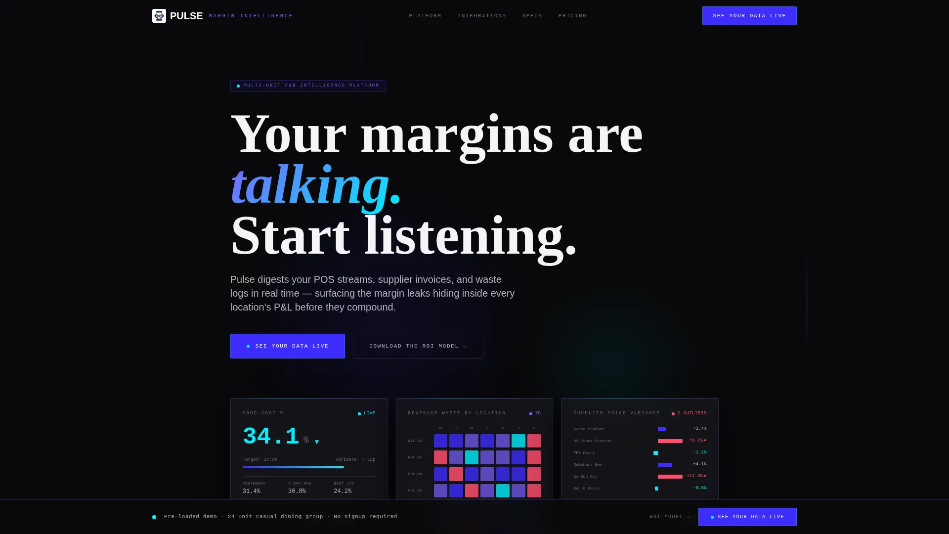
- A dark glass panel header displaying three live metric cards: food cost percentage, beverage waste heatmap, and supplier price variance graph
- Two structured comparison tables and one raw technical spec sheet block covering features, integrations, and data performance
- A dual conversion path: a primary demo call-to-action and a secondary email-capture route tied to a downloadable ROI model
Feature list
This template includes a focused set of purpose-built components. Each one is designed to support an operator-level buyer journey from first impression to conversion.
Dark Glass Panel Header
Three translucent, frosted-glass metric cards float against a void black background. Each card displays a different live data point: food cost percentage, a beverage waste heatmap by location, and a supplier price variance graph with pulsing red outliers. Brutalist monospaced typography and subtle parallax give the header visible depth without stock photography.
"Now versus. Pulse" Comparison Table
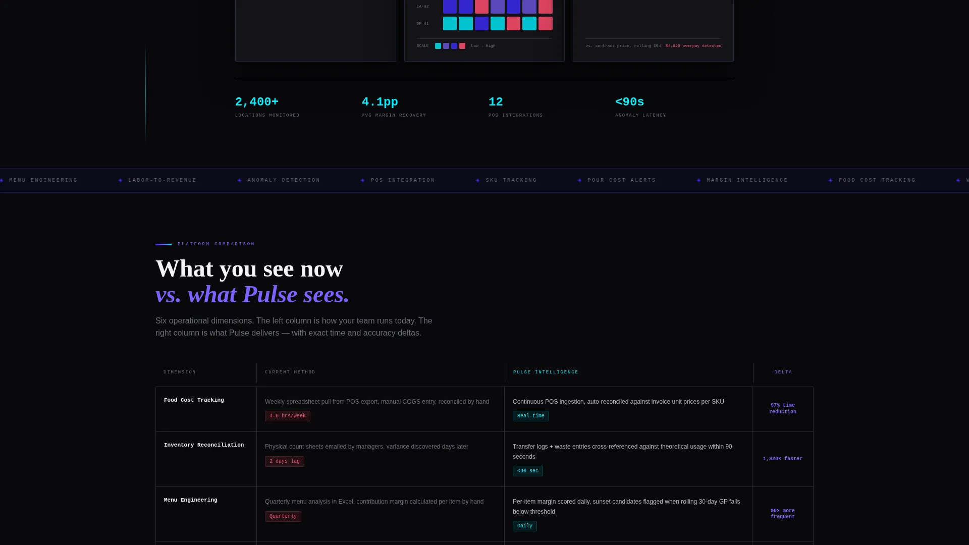
The first table runs a direct feature-by-feature comparison between manual methods and the AI-powered approach. Rows cover food cost tracking, inventory reconciliation, menu engineering, and labor-to-revenue ratio. Each cell includes specific time and accuracy deltas to give the reader a concrete proof point.
Integration Compatibility Table
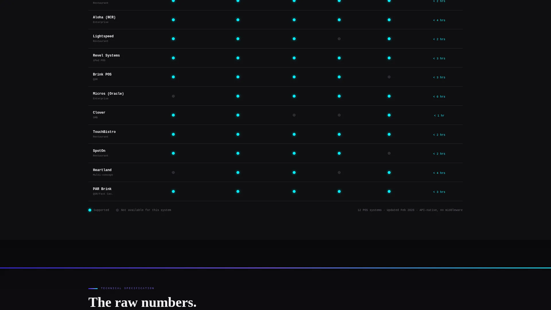
A second table maps compatibility across major point-of-sale systems. Supported connections are rendered as cyan dot indicators rather than generic checkmarks. This makes the integration status scannable at a glance.
Technical Spec Sheet Block
A raw datasheet section presents key performance figures: data refresh rate, API response time, number of SKUs (stock-keeping units) tracked, and anomaly detection latency. The format mirrors a technical product sheet, not a marketing brochure, which builds credibility with an operator audience.
Sticky Call-to-Action Bar
After the first comparison table, a sticky bottom bar anchors the primary call-to-action for the rest of the scroll. The "See Your Data Live" button routes to a personalized demo environment pre-loaded with sample restaurant group data.
Secondary Email Capture Path
A second conversion route offers a downloadable ROI model spreadsheet in exchange for an email address. The model calculates projected savings by unit count, giving the visitor a tangible takeaway before they commit to a demo.
Page sections overview
| Section | Purpose |
|---|---|
| Dark Glass Header | Display three live metric panels with the primary call-to-action |
| Now versus. Pulse Table | Compare manual methods against AI-powered analytics row by row |
| Integration Compatibility Table | Show point-of-sale system support using cyan dot indicators |
| Technical Spec Sheet | Present raw performance figures in datasheet format |
| Sticky call to action Bar | Keep the primary demo call-to-action visible through the scroll |
| ROI Model Capture | Collect email in exchange for a projected-savings spreadsheet |
Design & branding system
The Electric Indigo color system is built around function. Every color in the palette has a defined role, and none are used decoratively. The result is a layout that feels like a live operations monitor rather than a marketing page.
- Void black (#09090B) backgrounds, deep indigo (#3D2CFC) section dividers, and cool gray (#B4B4BD) body text form the base layer
- Phosphor violet (#7B61FF) supports secondary visual elements, while searing cyan (#00F0FF) is reserved exclusively for live data points, hover states, and interactive elements
- Bold Brutalist typography uses oversized slab type for headlines and monospaced fonts for data readouts, reinforcing the back-office aesthetic
Mobile & speed optimization
The template is structured for clarity across screen sizes. The comparison table layout and card-based header are designed to remain readable and functional on smaller viewports.
- Comparison tables are built to reflow cleanly so data cells stay legible on mobile screens
- The sticky call-to-action bar is positioned to remain accessible regardless of scroll depth or device size
- Dark glass panel cards use layered depth cues that translate to both large monitor displays and compact mobile views
How this template helps you convert
Every design and content decision in this template is pointed toward a single outcome: getting the right operator to request a demo or download the ROI model. The page earns the click by showing proof before asking for action.
- The live-metric header immediately signals that the product works with real operational data, establishing credibility in the first viewport before the visitor scrolls
- The comparison tables replace abstract feature claims with specific, measurable differences between the old way and the new way, giving the reader a reason to act
- The dual conversion path captures both high-intent visitors ready for a demo and research-stage visitors who want to model their own savings first
Other information about this template
Pulse is designed as a standalone landing page for a food and beverage AI analytics product. It is built to support a direct sales or product-led growth motion targeting operations-focused buyers in the restaurant industry.
- The template style is a Comparison Table layout following a Spec Sheet creative direction
- The Bold Brutalist theme and Electric Indigo palette are fully integrated across every section and component
- The header concept uses Dark Glass Panels with parallax depth and refracted light edges
- The landing page direction is Click-Through, with both primary and secondary conversion paths built into the layout

Theme
Bold Brutalist
Creative direction
Spec Sheet
Color system
Electric Indigo
Style
Comparison Table
Direction
Click-Through
Page Sections
Dark Glass Panel Header with Live Metrics
Side-by-side Feature Comparison Table
Point-of-sale Integration Compatibility Table
Raw Technical Spec Sheet Block
Sticky Demo Call-to-action Bar
Email Capture ROI Model Download
Related questions
Who is this landing page template designed for?
What are the two conversion paths included in this template?
Can I edit the comparison table rows to match my product?
Do I need real live data to populate the header metric panels?
Is this template suitable for a multi-product platform?



