Healthcare Digital Presence Specialist Professional Website Template
Vitals is a precision-built healthcare landing page template designed for clinics, telehealth startups, and private practices. It combines a Dynamic Motion visual identity with a bold Acid Digital color system. A feature comparison matrix, animated transitions, and a floating call-to-action pill give every visitor a clear, evidence-led path from skepticism to sign-up.
by Rocket studio
Quick summary
Vitals is a healthcare landing page template built around a head-to-head comparison structure. It uses a dark, clinical visual identity and animated feature matrices to show visitors exactly why this template outperforms generic alternatives. The design feels precise and energetic, like a vitals monitor mid-spike, not a stock-photo healthcare page from a decade ago.
Who this template is for
This template is built for healthcare professionals and founders who need a credible online presence fast. It speaks directly to people who know what bad healthcare websites look like and refuse to launch one.
- Solo practitioners setting up their first practice site and working against a deadline
- Clinic managers who need to update their homepage without involving a developer
- Telehealth founders and SaaS builders who need a polished front-end for a patient-facing product
What problem this template solves
Most healthcare website templates look like they were built around a stethoscope stock photo and a blue gradient. They feel generic, outdated, and unconvincing to patients and investors alike. Vitals solves the credibility gap between what a modern clinic or telehealth product actually does and how its website presents it.
- Healthcare professionals lose trust before a visitor even reads a word, because the visual design signals "template"
- Founders waste days customizing a layout that was never built for healthcare context in the first place
- Comparison-stage buyers have no clean way to show why their product is better than the alternatives they are being evaluated against
What you get with this template
Vitals delivers a fully structured, single-page comparison landing page with every section pre-built and purposeful. Nothing is left as a placeholder concept. Every section earns its place in the scroll.
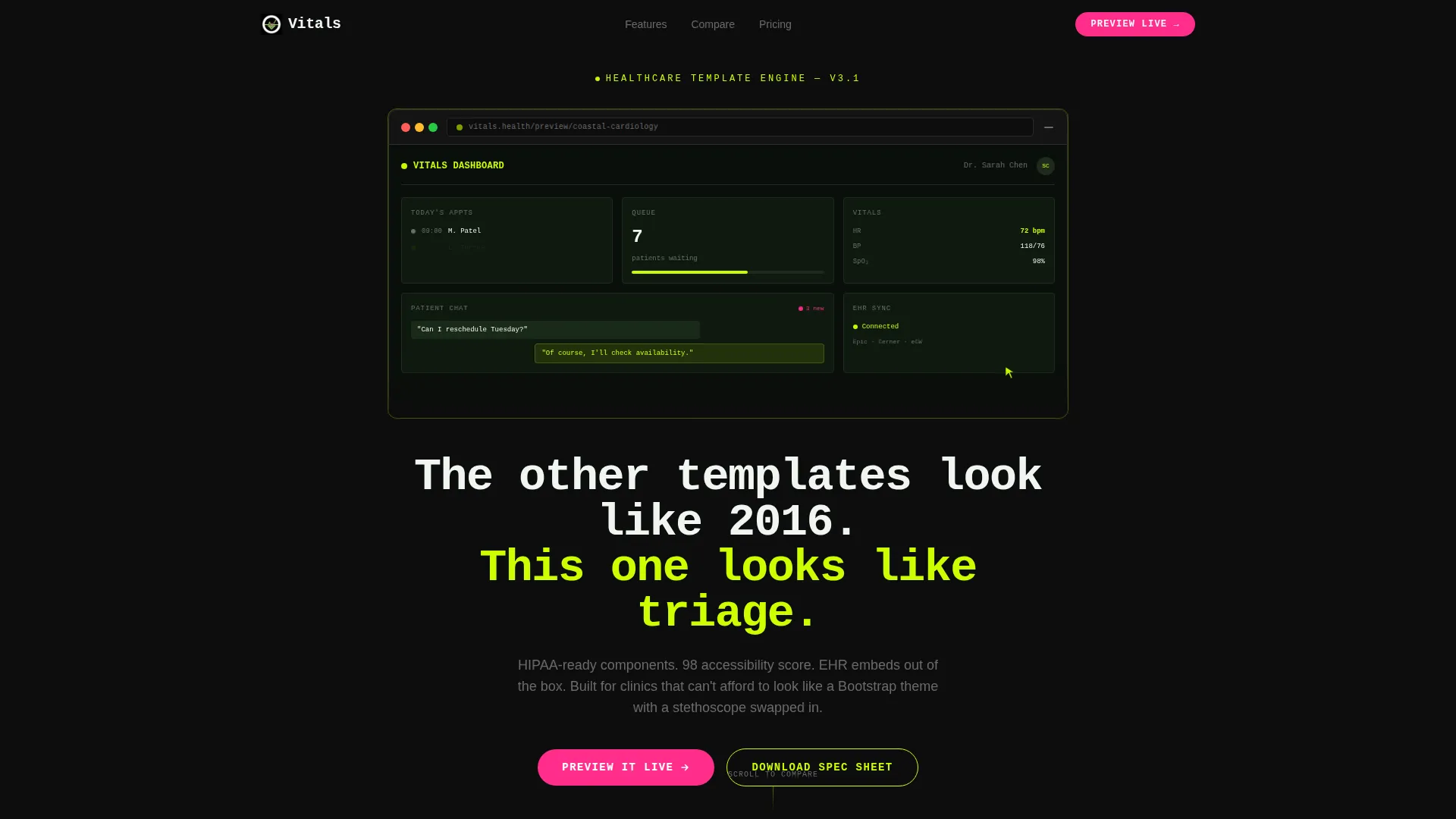
- A browser-chrome-framed hero header with a tilted dashboard screenshot and live micro-animations
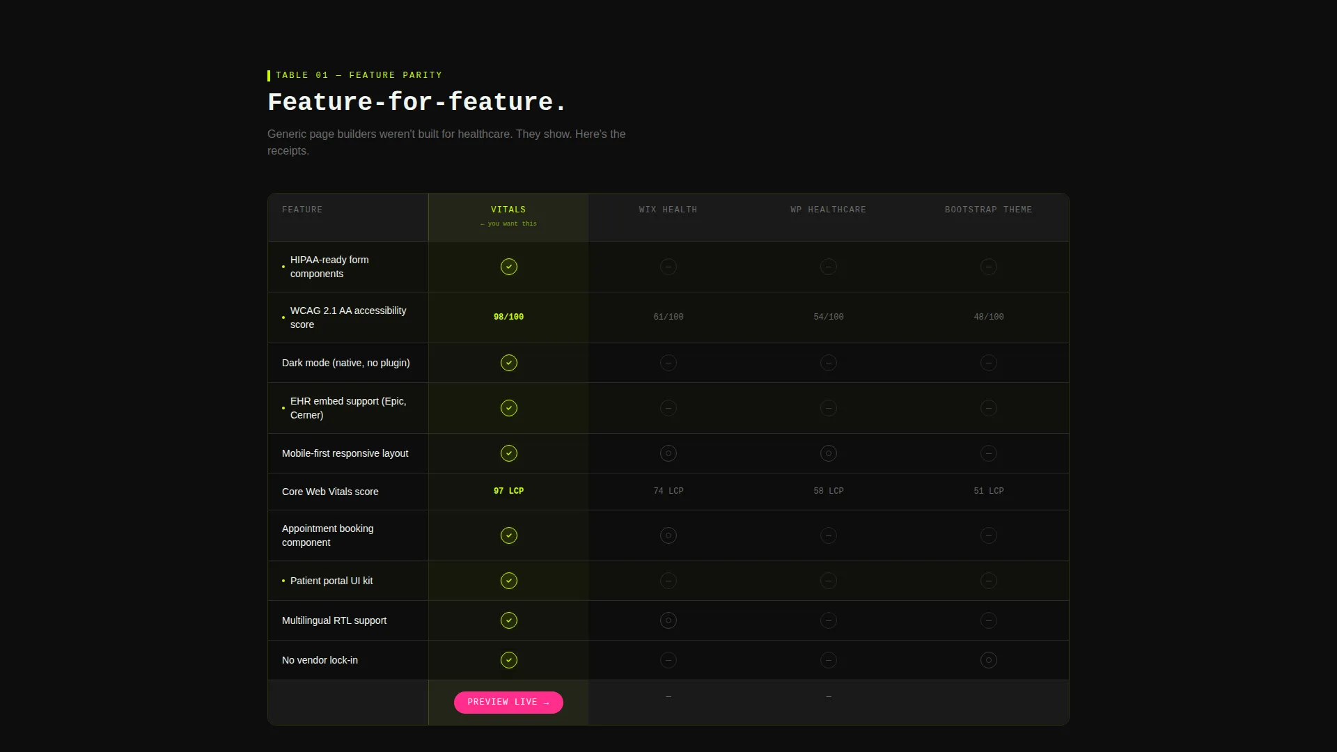
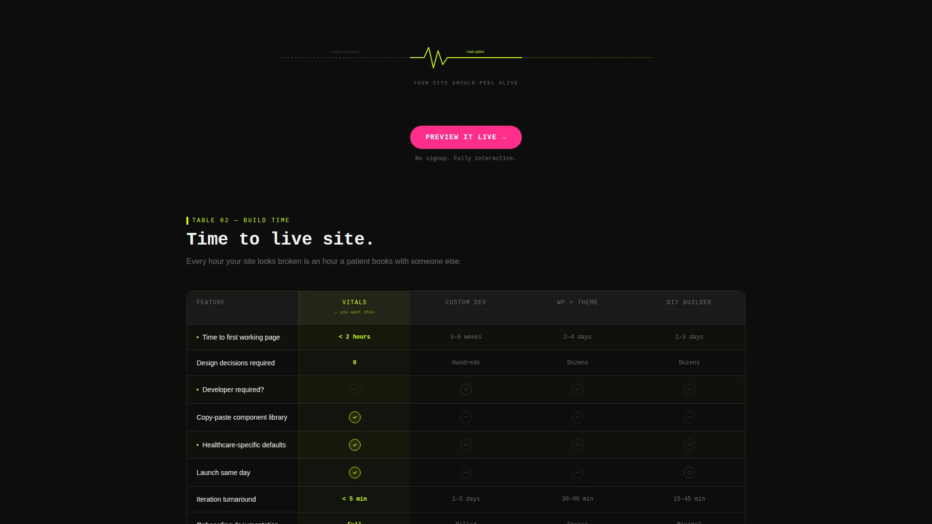
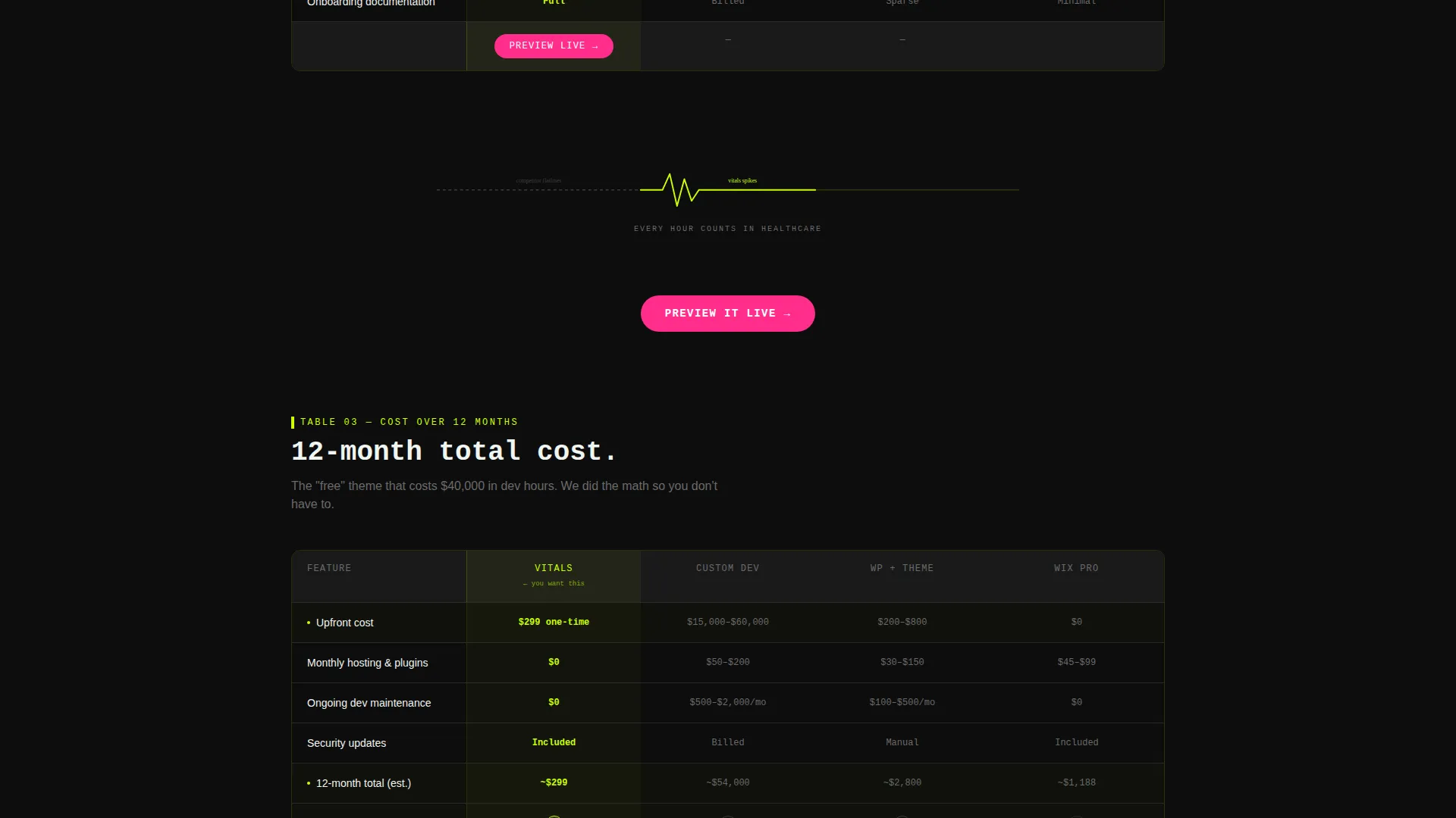
- Three escalating feature comparison tables covering capabilities, build time, and twelve-month total cost
- A floating call-to-action pill and an email-gated spec sheet download as dual conversion paths
Feature list
This template is built around a small, deliberate set of high-impact components. Each one is grounded in what the source design brief specifies.
Animated Product Screenshot Header
The header displays a browser-chrome-framed render of a healthcare dashboard, tilted at a subtle 3-degree angle against a pure black background. Inside the screenshot, micro-animations cycle through an appointment calendar, a patient queue update, and a pulsing chat widget. A chartreuse cursor arrow hovers mid-click, frozen in motion.
Three-Stage Comparison Matrix
The page's core content engine is a set of three feature comparison tables. Each table pits this template against named competitor types including generic page builders, legacy healthcare themes, and custom development quotes. Rows cover areas like Health Insurance Portability and Accountability Act (HIPAA)-ready components, accessibility scores, load times, mobile responsiveness, Electronic Health Record (EHR) embed support, and dark mode availability.
Heartbeat Animated Table Transitions
Between each comparison table, an animated heartbeat line plays across the screen. The line flatlines across the competitor column and spikes sharply through the Vitals column. This keeps the scroll feeling intentional rather than static, and reinforces the stakes of each comparison.
Floating Call-to-Action Pill
A "Preview It Live" button is pinned as a floating pill that remains visible as the visitor scrolls. It also appears as a primary call-to-action after each comparison table. This repetition ensures the conversion path is always one tap away, without interrupting the reading experience.
Email-Gated Spec Sheet Download
A secondary conversion path offers visitors a downloadable spec sheet behind a single email field. This gives the page two distinct conversion modes: one for visitors ready to preview, and one for visitors who are still in research mode.
Dynamic Motion Visual Identity
The entire page runs on a Dynamic Motion theme. Electric chartreuse traces borders, progress bars, and feature-check icons. Defibrillator magenta appears exclusively on calls-to-action and alert-state hover effects. Surgical black and IV-drip white anchor the backgrounds. The palette behaves like a vitals monitor in a dark room, quiet until something demands attention.
Page sections overview
| Section | Purpose |
|---|---|
| Hero Header | Showcases the dashboard screenshot with micro-animations and the primary headline |
| Feature Comparison Table | Compares template capabilities against competitor alternatives row by row |
| Heartbeat Transition | Animates the stakes between comparison tables to maintain scroll momentum |
| Build Time Table | Shows how quickly this template can be deployed versus alternatives |
| Cost Comparison Table | Breaks down twelve-month total cost against competitor approaches |
| Floating call to action Pill | Keeps the "Preview It Live" action visible throughout the entire scroll |
| Spec Sheet Gate | Captures research-stage visitors with a single email field download |
Design & branding system
The visual identity is built on the Acid Digital color system, a palette designed to feel clinical and electric at the same time. Every color choice is intentional and strictly role-assigned.
- Electric chartreuse (#CCFF00) marks borders, progress bars, and checkmark icons throughout the comparison tables
- Surgical black (#0D0D0D) and IV-drip white (#F0F5F0) anchor all backgrounds, keeping the page readable and focused
- Defibrillator magenta (#FF2D8B) appears only on calls-to-action and hover states, so every instance of it signals a required action
Mobile & speed optimization
The Dynamic Motion theme is built to stay legible and fast regardless of device. Animations are purposeful and contained, not decorative noise.
- The floating call-to-action pill adapts to mobile viewports, keeping the conversion action accessible on small screens
- Micro-animations inside the hero screenshot are scoped and contained, so they enhance the experience without overwhelming the layout on any device
How this template helps you convert
Vitals is structured around the comparison-stage buyer's psychology. The page earns the click before it ever asks for one.
- The comparison tables build an evidence-based case first, placing the visitor in a position where they feel the gap between this template and the alternatives before any pitch arrives.
- The floating call-to-action pill and the email-gated spec sheet offer two exit points that match two different buyer readiness levels, so neither a decisive visitor nor a cautious researcher is left without a next step.
Other information about this template
Vitals is a strong fit for healthcare digital presence projects where the visual bar needs to match the professional standard of the service being offered. It is positioned specifically within the healthcare website template category under the Technology sector.
- The template is designed for the comparison and versus conversion context, making it well suited for product pages where the visitor is actively evaluating options
- The Comparison Table template style means every section is built to hold structured data cleanly, not just narrative copy
- The header concept is a Product Screenshot, which is a deliberate choice to show real interface quality before the visitor reads a single feature claim
Theme
Dynamic Motion
Creative direction
Feature Matrix
Color system
Acid Digital
Style
Comparison Table
Direction
Comparison/Versus
Page Sections
Animated Product Screenshot Header
Three-stage Comparison Matrix
Heartbeat Animated Table Transitions
Floating Call-to-action Pill
Email-gated Spec Sheet Download
Acid Digital Color System
Related questions
Is this template suitable for a solo practitioner with no design experience?
Can I use this template for a telehealth product landing page?
What conversion paths does this template include?
Does the animated header work on mobile devices?
What does the twelve-month cost comparison table cover?



