DevOps Infrastructure Monitoring SaaS Website Template
The Uptime landing page template is a hub-and-spoke, anchor-nav layout built for DevOps SaaS platforms that unify server health monitoring, incident response, and status communication. It follows a Problem-to-Solution scroll arc across five spokes, converts on a freemium trial model, and renders a live dashboard preview in the hero to show the product working before a single word of copy loads.
by Rocket studio
Quick summary
This uptime real time infrastructure monitoring landing page template gives DevOps-focused SaaS products a dark, terminal-aesthetic landing page that earns engineer trust on first scroll. Five anchor-nav spokes guide visitors from fragmented-alert pain to one-click resolution, with a floating dashboard preview, scroll-linked status transitions, and a friction-light freemium signup that requires nothing but a work email.
Who this template is for
This template is built for teams shipping infrastructure observability, incident management, or status communication software to a technical audience. It converts best when the product replaces scattered monitoring workflows with a single, reliable interface.
- DevOps leads and platform engineers who evaluate tools by poking the product before reading the pitch
- CTOs and engineering managers who need reliability metrics they can hand to a board or include in a service level agreement report
- SaaS founders building for e-commerce platforms, web application teams, or any production environment where downtime has a direct cost
What problem this template solves
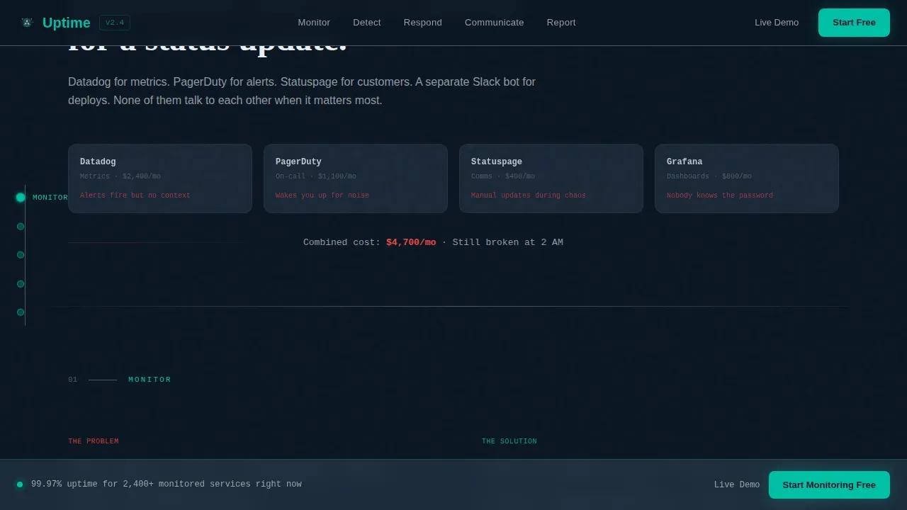
Most infrastructure SaaS landing pages describe features in isolation. They list monitoring tools, bullet capabilities, and hope engineers connect the dots. The real pain is different: alerts scatter across four tools, a customer tweets about downtime before the on-call engineer knows, and the postmortem gets assembled from memory at 9 AM. This template structures the entire page around that lived experience.
- Fragmented alert fatigue makes it hard for visitors to see how a unified status page replaces their existing tools
- No live proof on the page means skeptical engineers bounce before a support ticket is ever raised
- Conversion forms with too many fields kill free tier signups from busy DevOps leads who have no patience for friction
What you get with this template
The template delivers a fully structured, single-page layout with five content spokes, a sticky anchor navigation rail, and a conversion system designed around low-friction freemium signup. Every section is production-ready for a technical SaaS audience.
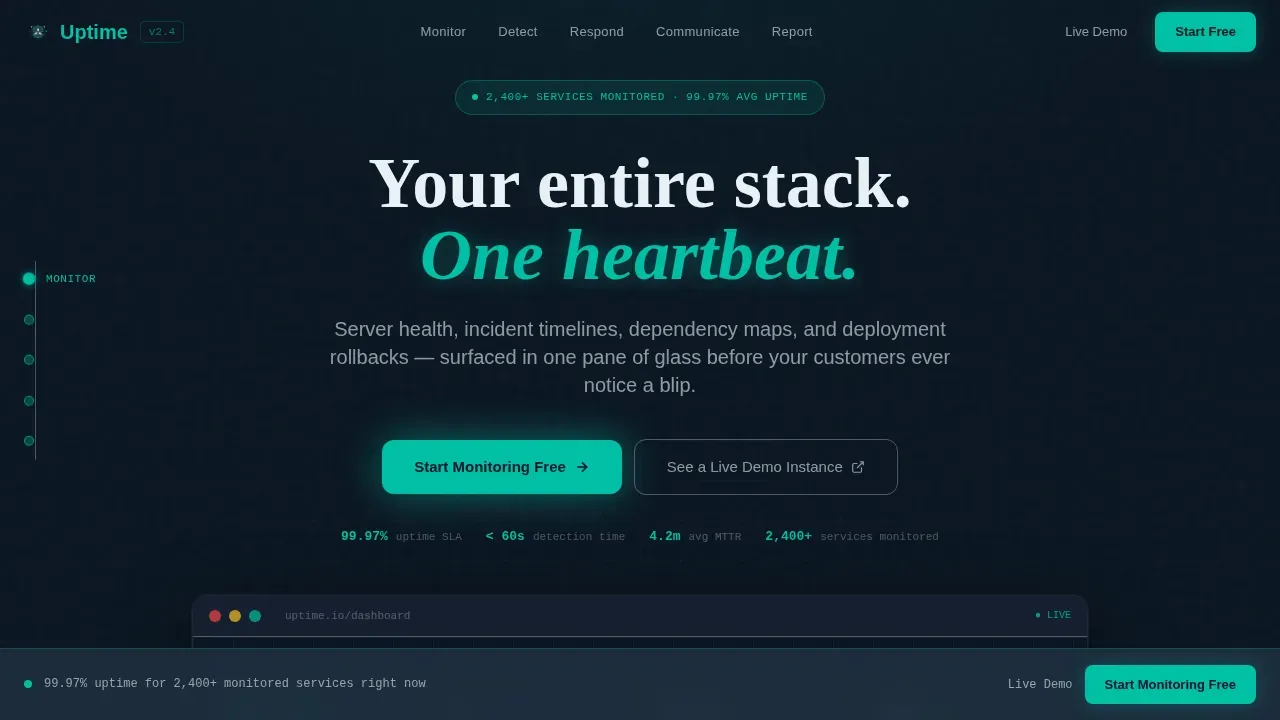
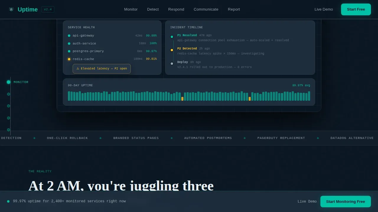
- A hero section with a floating, parallax-tilt dashboard preview showing a live uptime status at 99.97%, a resolved P1 incident timeline, and service-health nodes in green and amber
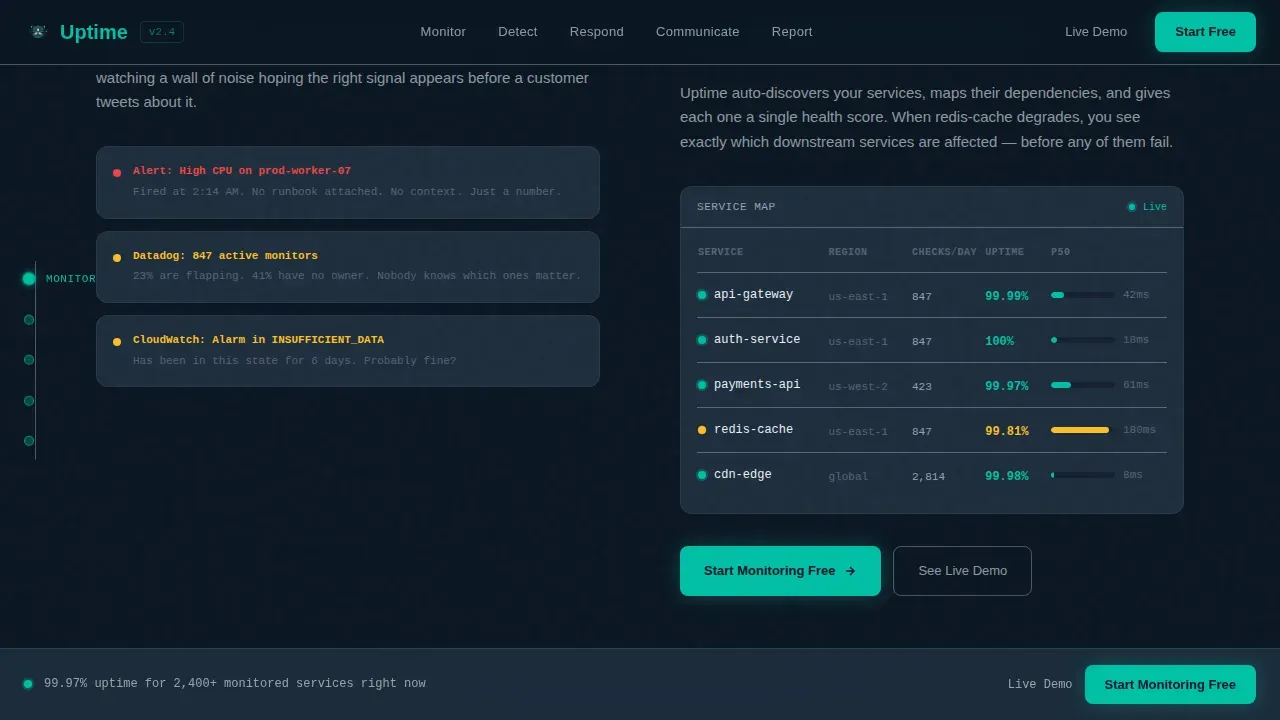
- Five hub-and-spoke content sections (Monitor, Detect, Respond, Communicate, Report) each opening with a pain vignette and resolving with a product screen and a teal-highlighted capability
- A persistent bottom conversion bar, a single-step signup modal, and a secondary "See a Live Demo Instance" path for engineers who want to troubleshoot issues in a sandbox before committing
Feature list
This template is built around a specific set of design and structural capabilities drawn directly from the source brief. Each feature below is present in the delivered template.
Anchor Navigation with Five Spokes
A sticky left-rail anchor nav links directly to each of the five content spokes: Monitor, Detect, Respond, Communicate, and Report. This user friendly interface keeps visitors oriented and lets engineers jump to the spoke most relevant to their current pain without losing context. It supports team collaboration across multiple teams reviewing the page together.
Floating Dashboard Hero with Parallax Tilt
The header renders a pixel-accurate product screenshot at 70 percent scale on a deep terminal-black canvas. The dashboard floats with a subtle cursor-driven parallax tilt and shows a real-time uptime status reading of 99.97 percent, a cascading incident timeline, three green service-health nodes, and one amber dependency with a mid-hover tooltip. This is live uptime data presented as proof, not promise.
Problem-to-Solution Spoke Architecture
Each of the five spokes opens with a specific, painful scenario rendered in slate-card vignettes, then resolves it with a product screen and a single teal-highlighted capability. The narrative tension builds through Monitor, Detect, and Respond as problems become more expensive and public, then releases through Communicate and Report. Scroll-linked status dots transition from amber to green as each spoke enters view, reinforcing the arc visually.
Freemium Signup Modal with Minimal Friction
The primary call to action reads "Start Monitoring Free" and appears on every spoke's resolution panel and in a persistent bottom bar after the second spoke. Clicking opens a single-step modal: work email, team size dropdown, and a "Connect Your First Service" button that doubles as submit. No credit card field is required, following best practices for reducing signup friction. A free status page trial path is also available via the sandbox demo link.
Scroll-Linked Micro-Interactions
Incident counters tick down, status dots animate from amber to green, and the hero dashboard preview reappears at the page bottom fully resolved. These scroll-linked animations significantly enhance the storytelling without requiring custom development work from the buyer. They are built into the template and tied to the Problem-to-Solution Arc creative direction.
Data Command Visual Identity
The Teal Catalyst color system uses deep terminal black (#0B1622) for backgrounds, live-wire teal (#00BFA6) for active states and progress indicators, cool slate (#1E2D3D) for card surfaces, and signal white (#EAF0F5) for typography and chart gridlines. JetBrains Mono handles data and code elements, DM Sans covers body copy, and Fraunces is used for display headlines. The result is a precise, dark aesthetic that feels like mission control.
Page sections overview
| Section | Purpose |
|---|---|
| Hero Dashboard Preview | Shows live uptime status, incident timeline, and service-health nodes with parallax tilt |
| Monitor Spoke | Fragmented alerts problem resolved with a unified health map and status page view |
| Detect Spoke | Customer-before-team outage scenario resolved with anomaly detection product screen |
| Respond Spoke | Two AM chaos scenario resolved with one-click rollback and incident timeline |
| Communicate Spoke | Status page chaos resolved with branded public status page and stakeholder updates |
| Report Spoke | Memory-assembled postmortem resolved with automated reliability report view |
| Persistent Bottom Bar | Sticky conversion bar with "Start Monitoring Free" call to action appearing after spoke two |
| Signup Modal | Single-step modal for work email, team size, and first service connection |
| Footer | Linear single-row footer pattern |
Design & branding system
The template uses a Data Command theme built on the Teal Catalyst color palette. Every design decision reinforces the feeling of sitting down at a mission control desk: dark enough that every lit element carries meaning, teal reserved only for moments where data moves or status changes. The intuitive interface keeps the user experience focused and precise throughout the entire scroll.
- Color system: deep terminal black (#0B1622) backgrounds, live-wire teal (#00BFA6) on active states and indicators, cool slate (#1E2D3D) card surfaces, signal white (#EAF0F5) for typography
- Typography: JetBrains Mono for system metrics and code-style data, DM Sans for readable body copy, Fraunces for high-impact display headlines
- Animation and interactivity: cursor parallax in the hero, scroll-linked status dot transitions, counter animations, marquee elements, hover tooltips on dependency nodes, and a signup modal with high interactivity
Mobile & speed optimization
The template is built desktop-first, reflecting how DevOps leads and platform engineers actually work during incidents: large monitors, multiple windows, full keyboard access. The layout priorities reflect that production environment reality rather than forcing a mobile-first compromise that would weaken the dashboard preview experience.
- Desktop-first layout optimized for large-monitor incident workflows, with the floating dashboard preview rendering at full fidelity on wide viewports
- Server Components used for static content sections, Client Components scoped to the interactive dashboard and animation-heavy spoke panels to keep load behavior lean
- Scroll-linked animations are tied to viewport entry rather than timers, keeping the experience responsive and predictable on high-DPI displays
How this template helps you convert
This template earns the click by showing the product working, not by promising it will. The conversion system is layered across the full scroll rather than relying on a single above-the-fold ask. Good status pages and good landing pages share the same principle: clarity and proof convert better than noise.
- The hero dashboard preview demonstrates uptime history, current status, and a resolved incident before any copy loads, establishing technical credibility instantly and reducing the need for a support ticket or discovery call
- The "Start Monitoring Free" call to action appears on every spoke resolution panel and in a persistent bottom bar, providing a free status page trial entry point at every moment of peak engagement without interrupting the narrative
- The sandbox demo path offers a "See a Live Demo Instance" secondary option, allowing users to explore a pre-loaded incident environment before submitting any information, which significantly improves conversion among skeptical engineers
Other information about this template
This template delivers significant value beyond layout aesthetics. It is architected around the full lifecycle of incident communication, from first detection through postmortem reporting, making it suitable for any infrastructure observability SaaS that needs a credible, conversion-optimized landing page. The section below covers additional context useful for evaluating the template before purchase.
- The status page spoke within the Communicate section models best practices for public status communication: clear system status, concise status updates, subscriber notifications via multiple notification channels, and support for custom domains
- Good status pages treat transparency as a feature, not a footnote. This template reflects that principle by giving the Communicate and Report spokes equal visual weight to the detection and response sections
- The free tier signup path requires only a work email and team size, following the principle that simplifying lead capture reduces friction and increases free status page trial starts
- Teams that want to self host their status page infrastructure can use this template to communicate that capability clearly, with the Communicate spoke providing natural placement for self host messaging
- Private status pages for internal stakeholders are a distinct use case from public status pages for customers. The template supports both communication directions through the Communicate spoke's structure, and buyers can adapt the copy to emphasize private status pages for internal audiences or public status for external ones
- The subscription option shown in the Communicate spoke reflects industry best practices: allowing users to subscribe to updates keeps status page users informed without requiring them to refresh manually, reducing inbound support ticket volume
- Uptime history and uptime data are surfaced in the Report spoke, where the automated reliability report view provides a comprehensive overview of platform's performance over time, useful for service level agreement documentation and capacity planning
- The template is localized for English, USD, and US date format out of the box
- The footer uses Pattern 1 (Linear Single-Row), keeping the bottom of the page clean and conversion-focused
- Brand-name monitoring platforms such as Datadog, PagerDuty, and Statuspage are referenced in the source brief as tools this type of product replaces. The template does not hard-code those names but leaves natural placeholder copy in the existing tools comparison section of the Monitor spoke
- Teams building for e-commerce or web app audiences will find the uptime status page and public status communication sections especially relevant, as service disruptions in those contexts carry direct revenue impact
- The template supports complete customization of colors, copy, and section order without breaking the scroll-linked animation system, as each spoke is built as an independent component
Theme
Data Command
Creative direction
Problem→Solution Arc
Color system
Teal Catalyst
Style
Hub & Spoke (Anchor Nav)
Direction
Freemium/Trial
Page Sections
Anchor Navigation with Five Spoke Sections
Floating Dashboard Hero with Parallax Tilt
Problem-to-solution Scroll Arc
Freemium Signup Modal with Minimal Fields
Scroll-linked Micro-interactions
Data Command Visual Identity System
Related questions
Does this template include the actual monitoring dashboard functionality?
Can I add or remove spokes from the hub-and-spoke layout?
Is there a conversion path for visitors who are not ready to sign up?
Does the signup modal require a credit card?
Can this template support messaging for a status page product that offers private status pages?


