IT Services & Consulting Professional Website Template
Uptime is a scroll-reveal landing page template built for IT consulting firms that fix broken infrastructure. It opens with an animated dashboard showing live metrics, then guides visitors through progressive stat reveals, pain-point bento cards, a three-phase methodology, and a three-step audit request form. The design runs on a matte carbon fiber palette with status-green accents.
by Rocket studio
Quick summary
Uptime is a single-page, scroll-reveal landing page template for IT consulting firms. It leads with an interactive infrastructure health dashboard, then escalates through oversized stat reveals and targeted pain-point sections. Every section is built around the "number-then-story" rhythm, so credibility builds before any pitch lands. The primary goal is capturing infrastructure audit leads.
Who this template is for
This template is designed for B2B IT consulting firms that serve mid-market companies. It speaks directly to the professionals who evaluate technical partners on measurable outcomes, not marketing claims.
- Mid-market CTOs dealing with years of accumulated legacy infrastructure
- Operations directors whose teams spend most of their time on reactive firefighting
- Founders who have recently discovered dangerous gaps in their production environment
What problem this template solves
Most IT consulting landing pages lead with credentials and service lists. Visitors who are already overwhelmed skip past words and scan for proof. This template flips that structure entirely.
- Prospects abandon pages that bury the evidence beneath blocks of copy
- Without a compelling first interaction, high-intent visitors leave before reaching the call to action
- Generic layouts fail to signal that a firm understands deeply technical, operational pain
What you get with this template
You get a fully structured, single-page layout that moves from live-data visualization to lead capture without a dead moment. Every section is pre-built and purpose-driven.
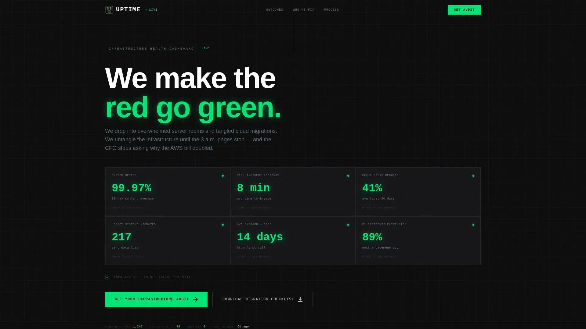
- An interactive hero dashboard with animated counters and hover-flip tiles showing before-and-after states
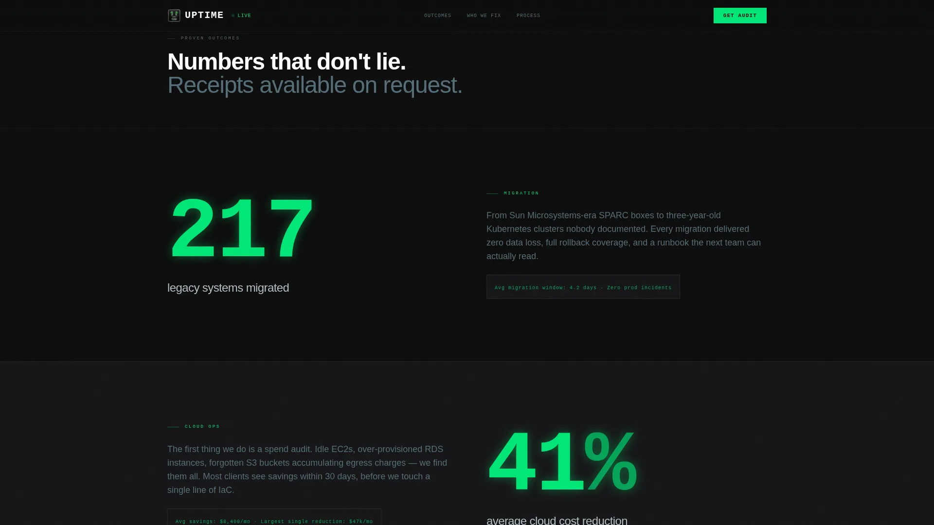
- A stats-first scroll structure with oversized number reveals followed by case context paragraphs
- A three-step progressive audit form plus a secondary checklist download path for lighter-intent visitors
Feature list
This template ships with six purpose-built components. Each one handles a distinct stage of the visitor journey, from first impression to conversion.
Interactive Infrastructure Dashboard Header
The hero fills the entire viewport with a simulated infrastructure health dashboard. Animated counters tick upward in real time, displaying metrics such as uptime percentage, mean incident response time, and cloud spend reduction. Visitors can hover individual tiles to flip them and reveal the original "before" state, complete with red warning indicators and downtime logs.
Stats-First Scroll Reveals
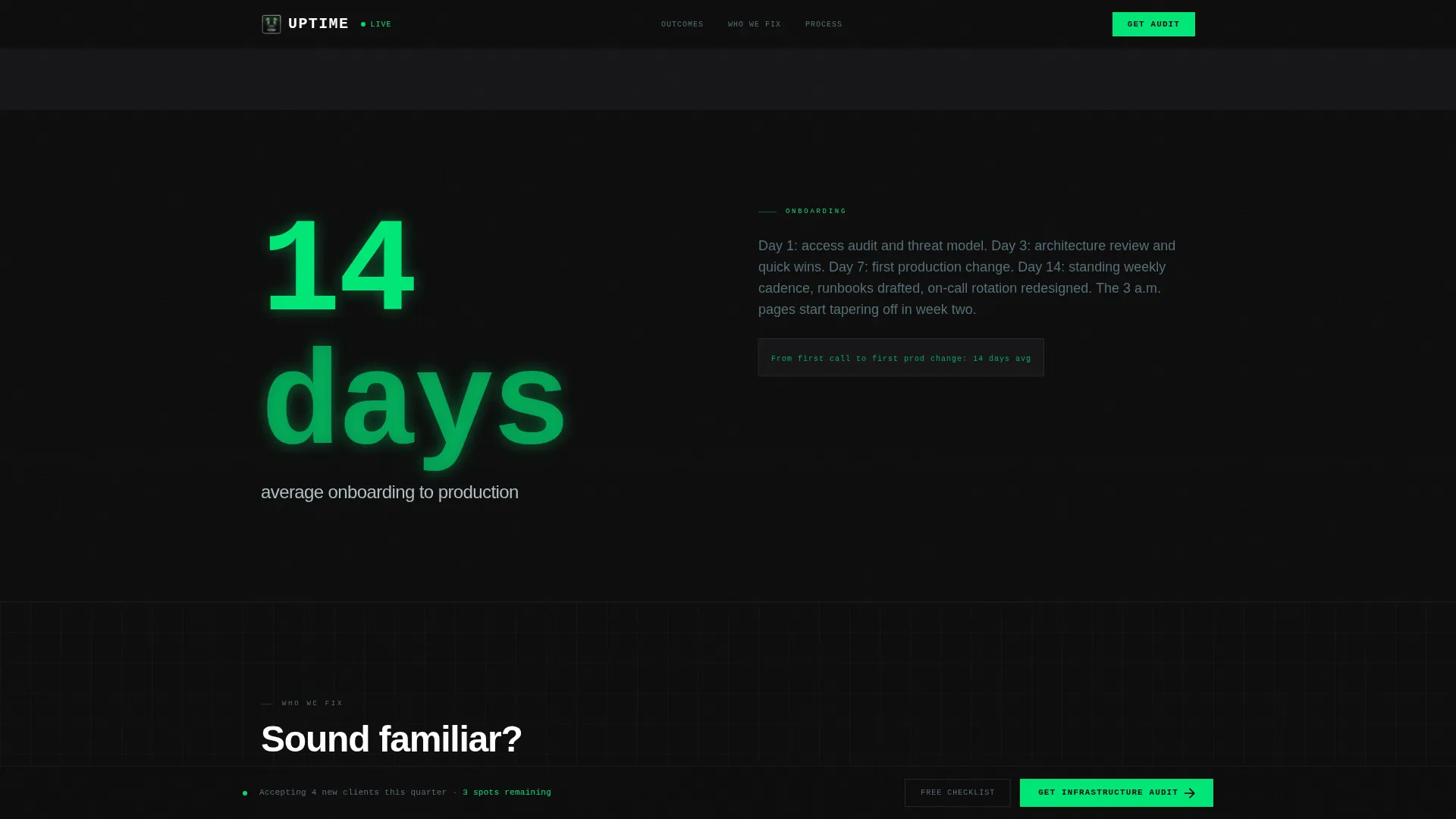
Every content section opens with a single oversized statistic that animates into view before any supporting copy appears. The rhythm trains visitors to expect a new proof point on each scroll. Figures escalate from individual incident metrics up to enterprise-wide transformation outcomes.
Pain-Point Bento Cards
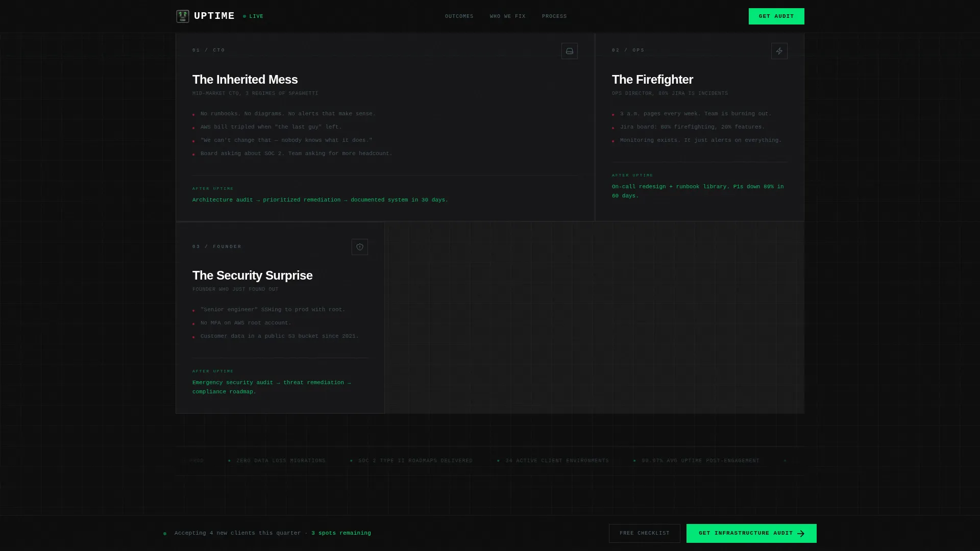
Three bento-style cards map to the three primary buyer profiles: the CTO inheriting legacy systems, the operations director firefighting daily incidents, and the founder discovering root-level security exposure. Each card names the exact situation and positions the firm as the resolution.
Three-Phase Sticky Methodology
The process section uses a sticky scroll mechanic to walk through a three-phase engagement methodology. As the visitor scrolls, each phase locks in place before the next one enters. This format keeps the process legible and reinforces a structured, repeatable approach.
Three-Step Progressive Audit Form
The primary call to action is a multi-step form that reduces friction by asking for information in stages. Step one collects company size and the visitor's primary pain point from a dropdown. Step two captures name and work email. Step three offers an optional field for a brief description or a network diagram upload.
Sticky Lead Capture Bar
A persistent bottom bar appears after the second stat reveal and stays visible for the rest of the page. It anchors the primary call to action throughout the browsing session without interrupting the reading flow.
Page sections overview
| Section | Purpose |
|---|---|
| Hero Dashboard | Opens with animated metrics and hover-flip before-and-after tiles |
| Stats-First Outcomes | Delivers oversized number reveals followed by case context |
| Who We Fix | Presents three pain-point bento cards for each buyer profile |
| Methodology Process | Walks through the three-phase engagement process with sticky scroll |
| Lead Gen Call to Action | Houses the three-step audit form and checklist download option |
| Footer | Closes the page with a clean linear layout |
Design & branding system
The visual identity follows a Data Command theme. Every design decision is made to feel like the inside of a monitored server environment: matte, structured, and purposeful. Decoration is removed entirely in favor of information density.
- Carbon black (#0D0D0D) fills the background throughout the entire page with no variation
- Gunmetal panel gray (#2B2D30) defines cards, containers, and section dividers for depth without contrast noise
- Status-green (#00E676) appears only on metrics, progress indicators, and hover states so each green element reads like a live signal on a dark monitoring wall
- Cool aluminum (#B0BEC5) handles secondary text and divider lines, keeping body copy readable without competing with the accent color
- Typography uses DM Sans for all display and body text, and JetBrains Mono for metrics and terminal-style readouts
Mobile & speed optimization
The template is built desktop-first, reflecting the real behavior of technical buyers who evaluate vendors from a workstation. That said, it includes a strong mobile fallback so the layout holds on any device.
- Counter animations, flip cards, scroll-linked reveals, and stagger entrances are handled through client-side components for the interactive dashboard
- Static structural sections use server-rendered components to keep the initial load lean
- The sticky call to action bar and three-step form are fully functional on smaller screens
How this template helps you convert
The page is engineered around a single conversion goal: getting a qualified prospect to request an infrastructure audit. Every structural decision supports that outcome.
- The interactive hero earns the first scroll by making visitors curious about what else changed, which means they reach the credibility sections with active attention rather than passive skepticism.
- The progressive stat reveals build a cumulative proof stack, so by the time the audit form appears, the visitor has already seen the evidence multiple times and in escalating scope.
- The secondary checklist download path captures visitors who are not ready to book an audit, creating a lower-commitment entry point that keeps them in the funnel.
Other information about this template
This template is a strong starting point for any IT consulting firm that needs a professional, high-trust digital presence without building from scratch. A few additional details worth knowing before you start customizing.
- The template is categorized under Technology, specifically the IT Services and Consulting subcategory, making it relevant for a focused niche audience
- All metrics shown in the hero dashboard, including the 99.97% uptime figure, the 8-minute mean incident response, and the 41% cloud spend reduction, are placeholder values included to illustrate the layout and should be replaced with your firm's actual data
- The three-step form structure is a design pattern built into the template; connecting it to a backend submission system or email tool will require your own configuration
- Color tokens are documented in the design system, so updating the palette to match an existing brand is straightforward
- The template uses DM Sans and JetBrains Mono, both of which are widely available and carry no additional licensing requirements for commercial use
Theme
Data Command
Creative direction
Stats-First Impact
Color system
Carbon Fiber
Style
Scroll Reveal (Progressive)
Direction
Lead Generation
Page Sections
Interactive Infrastructure Dashboard
Stats-first Scroll Reveals
Pain-point Bento Cards
Three-phase Sticky Methodology
Three-step Progressive Audit Form
Persistent Sticky Call to Action Bar
Related questions
Who is this landing page template designed for?
Can I replace the dashboard metrics with my own numbers?
Does the template include form submission logic?
How difficult is it to update the color scheme?
Is this template suitable for a solo IT consultant?



