Navigate - Dynamic Transit Landing Page Template
Navigate is a single-page transit and navigation landing page template built around a dashboard and data grid layout. It combines a Feature Tab Switcher header, a Spec Sheet scroll experience, and a Comparison conversion flow into one cohesive design. The AI Iridescent color system and Dynamic Motion theme give it the electric energy of a city in motion.
by Rocket studio
Quick summary
Navigate is a high-energy transit app landing page template that fuses a live-dashboard aesthetic with a data-driven conversion flow. The Feature Tab Switcher header, scrolling Spec Sheet modules, and a sticky comparison bar work together to turn curious visitors into committed app users. It is purpose-built for transit and navigation products that need to prove performance at a glance.
Who this template is for
This template fits product teams, indie developers, and transit startups that need to present a multi-modal navigation app with credibility and speed. It is built for audiences who want evidence over adjectives and expect a user interface that mirrors the product itself.
- Transit app founders launching to commuter or tourist audiences
- Consumer app teams running a head-to-head comparison campaign
- Gig-economy platforms pitching route efficiency to couriers and drivers
What problem this template solves
Most app landing pages describe features in plain text and ask visitors to trust the pitch. Transit and navigation products live or die on real-time performance, and a static page fails to communicate that. Navigate solves the credibility gap by turning the landing page itself into a live-feeling product demo.
- Visitors leave generic landing pages unconvinced because numbers are missing
- Side-by-side comparison tools are rarely embedded directly in the page flow
- Lead capture for undecided users is often an afterthought with no personalization hook
What you get with this template
You get a fully structured, single-page layout designed around a dashboard and data grid visual system. Every section has a defined role in moving the visitor from curiosity to conversion.
- A three-tab Feature Tab Switcher header with animated dashboard mockup panels
- Three scrolling Spec Sheet data modules covering transit coverage, routing speed, and real-time accuracy
- A sticky bottom comparison bar with a dropdown, a generated comparison card, and dual conversion paths
Feature list
This template delivers six tightly scoped components. Each one contributes directly to the conversion story described in the brief.
Three-Tab Header Switcher
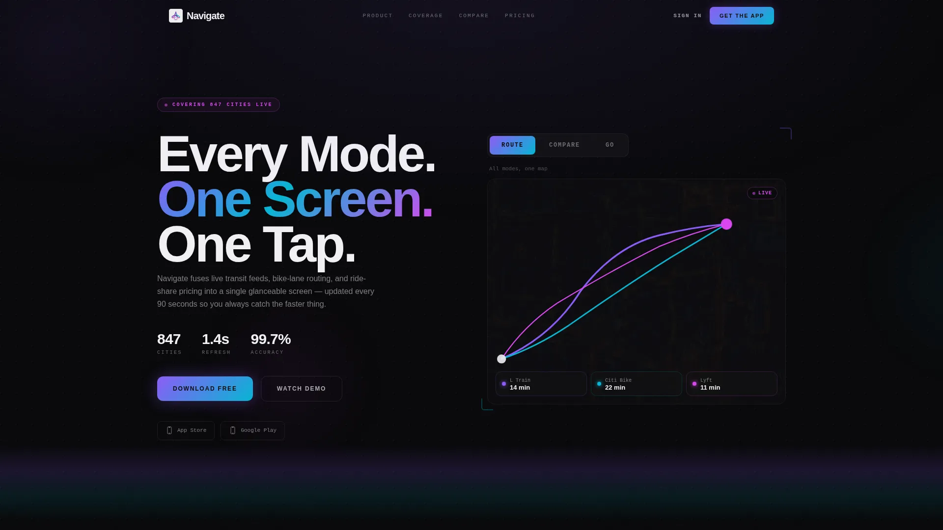
The header contains three clickable tabs labeled "Route," "Compare," and "Go." Each tab transitions the dashboard mockup using spring-physics animation, sliding and resizing panels like windows on a spatial display. The default view shows a dark-mode map with three overlapping route lines rendered in violet, cyan, and magenta.
Live-Dashboard Map Mockup
The default header state renders a dark-mode map with three color-coded route overlays converging on a single destination pin. Subway is shown in holographic violet, bike in electric cyan, and ride-share in pulsing magenta. This gives visitors an immediate visual read of the product's multi-modal logic.
Compare Tab Data Grid
Switching to the "Compare" tab reveals a side-by-side data grid. Columns display arrival time, cost, calories burned, and carbon dioxide saved, with numbers ticking to simulate live updates. The grid communicates product depth without requiring a single line of descriptive prose.
Spec Sheet Scroll Modules
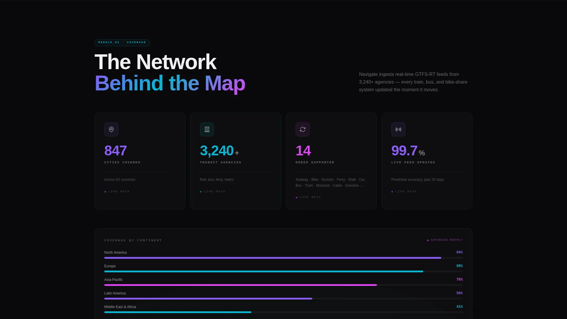
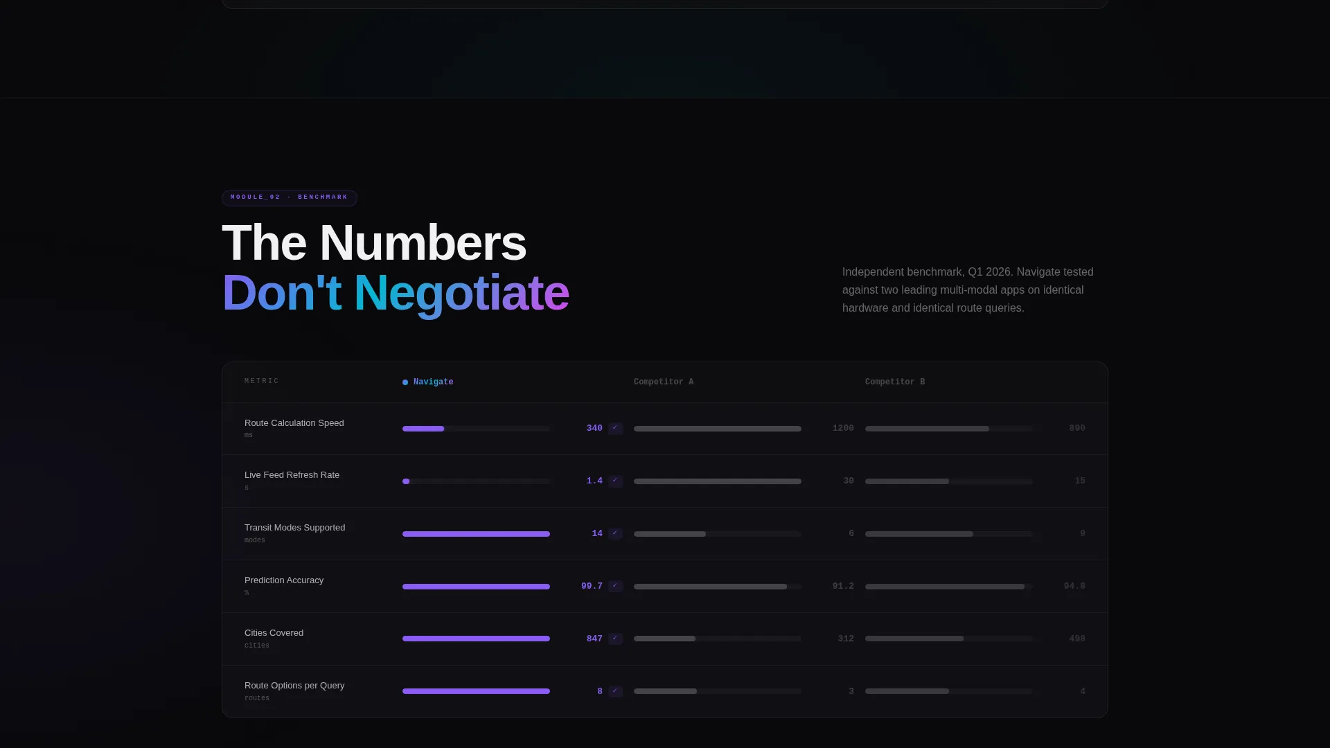
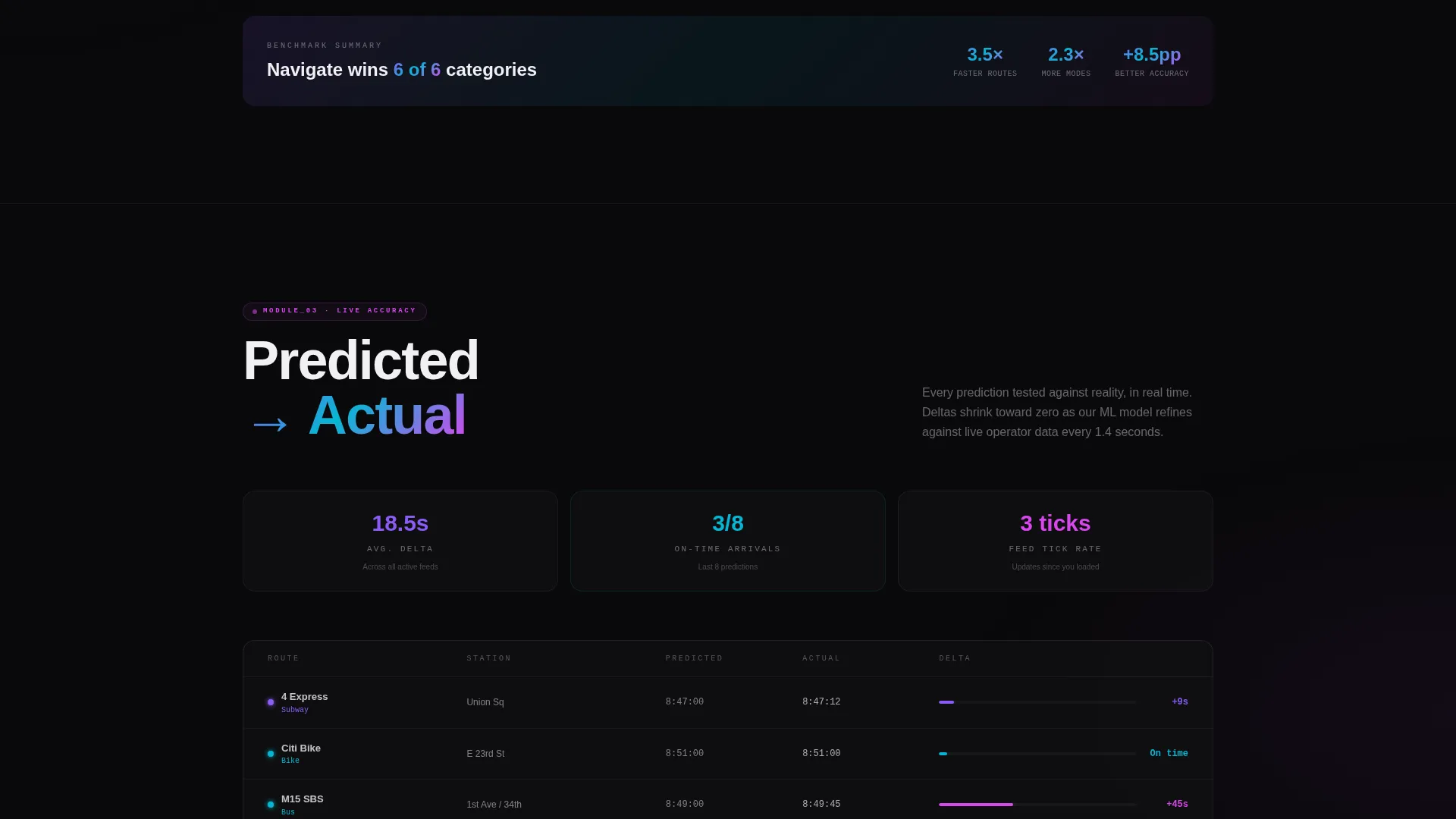
Three sequential data modules anchor the scroll experience. The first shows transit coverage as a live counter grid. The second visualizes routing algorithm speed as a benchmark race against two grayed-out competitor columns. The third renders a real-time accuracy feed of predicted versus actual arrival deltas narrowing toward zero.
Sticky Comparison Bar
A persistent bottom bar reads "See How We Beat Your Current App" and includes a dropdown listing common navigation apps. Selecting one generates a personalized comparison card that highlights Navigate's advantages in route options, refresh speed, and monthly cost. The bar stays visible throughout the scroll to reduce friction at any decision point.
Dual Conversion Paths
Below the generated comparison card, the primary call to action reads "Switch in 60 Seconds" and deep-links to the app store with pre-loaded migration. A secondary "Run My Commute" field lets visitors enter home and work addresses to receive a weekly time-saved projection by email. This dual path captures both ready-to-download users and leads who need more time.
Page sections overview
| Section | Purpose |
|---|---|
| Tab Switcher Header | Introduces the app through three animated dashboard states |
| Route Tab View | Shows multi-modal map with color-coded overlapping route lines |
| Compare Tab Grid | Side-by-side data grid with live-ticking metric columns |
| Go Tab Card | Collapses dashboard into a single turn-by-turn instruction card |
| Transit Coverage Module | Counter grid showing cities, agencies, and transport modes supported |
| Routing Speed Module | Benchmark race visualization against two competitor columns |
| Accuracy Feed Module | Live predicted-versus-actual arrival delta feed narrowing toward zero |
| Sticky Comparison Bar | Persistent call to action bar with app dropdown and personalized output card |
| Switch call to action Block | Primary app store deep-link with pre-loaded migration trigger |
| Run My Commute Field | Lead capture form delivering a free weekly time-saved projection |
Design & branding system
The template uses an AI Iridescent color system layered over a Dynamic Motion theme. Every color choice serves a functional role in the interface, making the visual language feel like a working product screen rather than a marketing page.
- Void black (#09090B) backgrounds simulate a device screen at night, keeping data cards prominent
- Holographic violet (#8B5CF6) shifting into electric cyan (#06B6D4) defines gradient data cards and route overlays
- Signal white (#F0F0F3) handles primary typography, while pulsing magenta (#D946EF) marks live-status indicators and hover states
Mobile & speed optimization
The template's layout is designed to scale across screen sizes without losing the dashboard density that makes it effective. Panel transitions and data module animations are scoped to keep the experience fluid on smaller displays.
- Spring-physics panel transitions are designed to feel smooth across both desktop and mobile viewports
- The sticky comparison bar and dual call to action block remain accessible without scrolling back to the top
- Data grid columns in the Compare tab resize to remain readable on narrower screens
How this template helps you convert
The conversion architecture is built around evidence, not persuasion. Every section gives the visitor a specific, quantifiable reason to prefer Navigate over their current app.
- The Spec Sheet scroll floods visitors with performance data across three modules, replacing adjective-heavy copy with numbers that speak for themselves and build trust progressively as the visitor scrolls.
- The sticky comparison bar and personalized comparison card create a moment of direct relevance by showing the visitor exactly what Navigate offers over the app they already use, then placing the "Switch in 60 Seconds" call to action immediately below.
Other information about this template
This template sits within the Technology category under the Consumer App and Platform subcategory, with a niche focus on transit and navigation products. It is suited for any team looking to present a multi-modal routing product with a data-forward visual identity.
- The Intersection Match Score for this template is 13, reflecting a strong alignment between the Dynamic Motion theme, AI Iridescent color system, Feature Tab Switcher header, and Comparison conversion direction
- The template style is classified as Dashboard and Data Grid, making it well suited for products like transit apps, routing tools, and real-time information platforms
- The creative direction follows a Spec Sheet model, meaning each scroll section functions as a row in a product benchmark sheet rather than a narrative story
- Teams building products that compete with established navigation tools will find the comparison-first conversion flow especially useful for communicating differentiated value
Theme
Dynamic Motion
Creative direction
Spec Sheet
Color system
AI Iridescent
Style
Dashboard/Data Grid
Direction
Comparison/Versus
Page Sections
Three-tab Feature Header Switcher
Multi-modal Map Overlay
Live-ticking Compare Data Grid
Scrolling Spec Sheet Modules
Sticky Comparison Bar with Personalized Card
Dual Conversion Path Design
Related questions
Can I customize the tab labels and dashboard mockup content?
Does the sticky comparison bar require a backend to generate comparison cards?
Who is the Run My Commute lead capture field designed for?
Is this template suitable for a transit product that covers only one city?
What makes the Dynamic Motion theme distinct from a standard dark user interface template?



