Navigate — Fleet Operations Landing Page Template
Fleet is a single-page, comparison-table landing page template built for financial services fleet management platforms. It presents a bold side-by-side view of the old way versus a unified dashboard, guides visitors from a trust-building logo bar through an animated data simulation, and closes with a friction-free app download call to action. No forms. No friction. Just clarity.
by Rocket studio
Quick summary
Fleet is a dark-themed, glassmorphic landing page template designed for fleet management software platforms. It opens with a scrolling partner logo bar, moves into a live comparison table that exposes the cost of the old approach, and ends with a direct app download push. The template targets fleet controllers, CFOs, and operations directors who manage vehicle costs at scale.
Who this template is for
This template is built for companies that sell fleet management software to mid-market and enterprise buyers. It speaks directly to the people making real operational decisions every day.
- Fleet controllers at mid-market logistics firms managing anywhere from 200 to 2,000 vehicles
- CFOs at pharmaceutical distribution companies reconciling multiple vendor invoices each month
- Operations directors at last-mile delivery startups tracking down invisible cost inefficiencies
What problem this template solves
Fleet management teams are buried in fragmented data. Fuel cards live in one portal, maintenance records in another, compliance scores in a spreadsheet, and depreciation models in a finance tool that nobody updates. This template makes that exhausting reality visible and then positions the platform as the obvious fix.
- Scattered vehicle cost data spread across multiple logins and delayed reporting tools
- No single view connecting fuel management, maintenance scheduling, compliance tracking, and total-cost-of-ownership modeling
- Enterprise buyers who need a demo path before procurement approval, with no lightweight conversion option for self-serve users
What you get with this template
The template delivers a complete, single-page layout built around three conversion moments. Every section earns the next scroll with purposeful visual and copy sequencing.
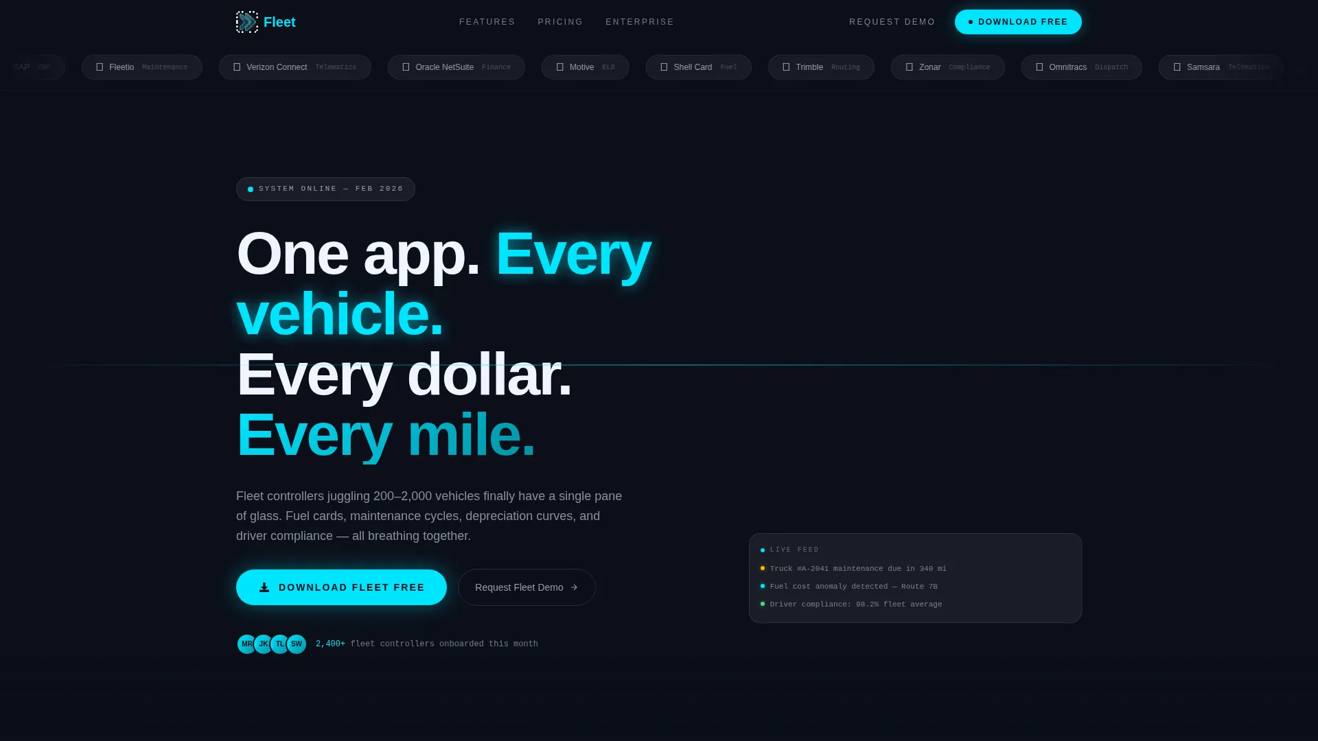
- A horizontal logo bar with frosted pill containers scrolling recognizable fleet and financial partner logos
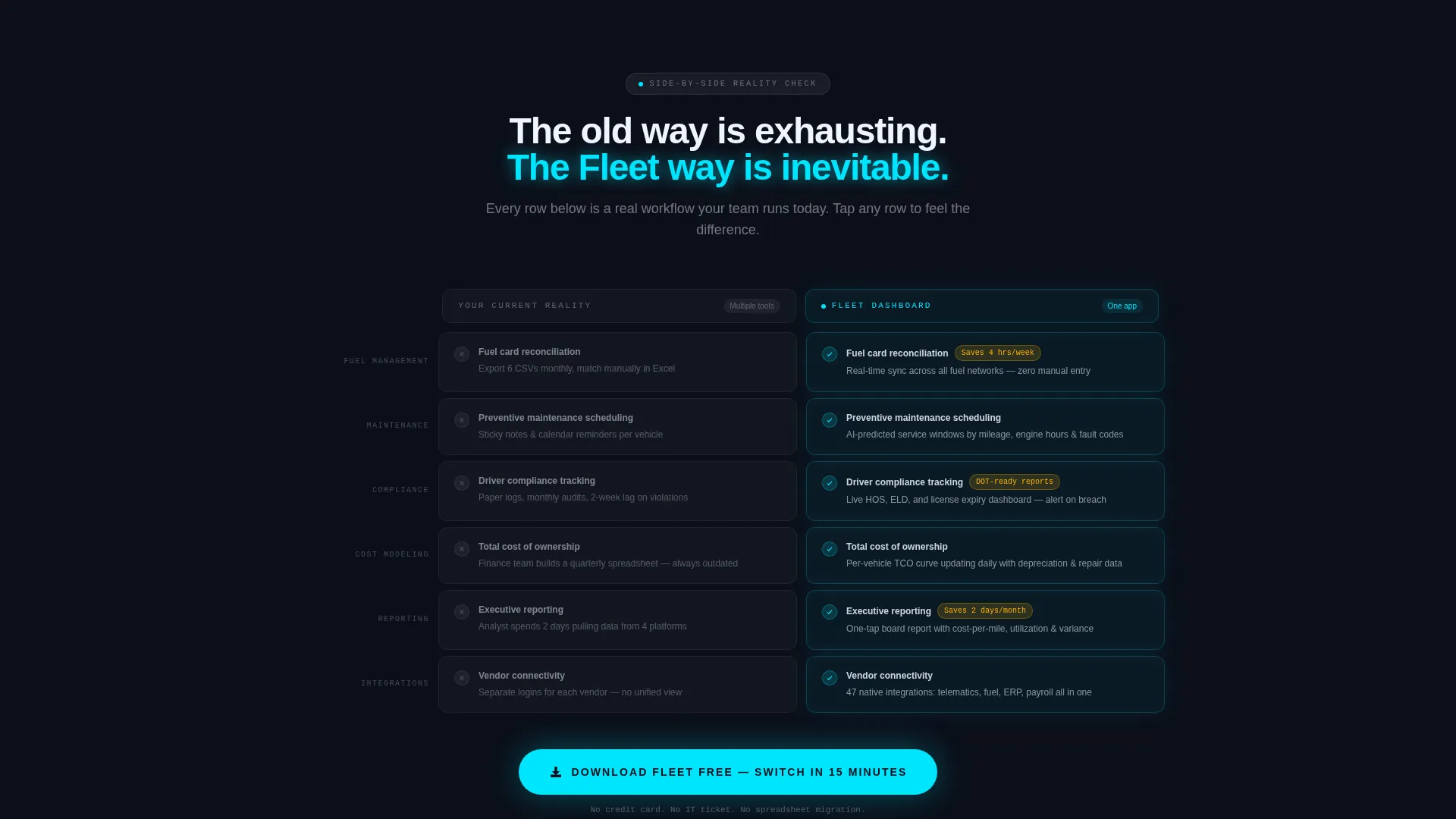
- A side-by-side comparison table contrasting the current fragmented workflow against the platform's unified dashboard
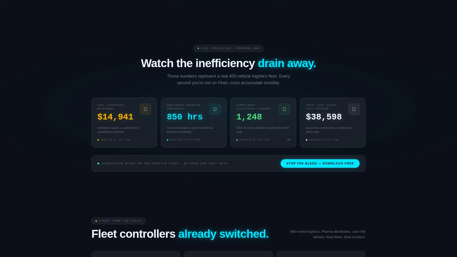
- A live-data simulation block where numbers tick and cost savings accumulate in real time
- Three placements of the primary call to action: sticky mobile bar, inline after the table, and a closing full-width card
- A secondary enterprise path capturing only work email and fleet size for demo requests
Feature list
This template is built around five core design and structural capabilities drawn directly from the brief.
Side-by-Side Comparison Table
The comparison table is the centerpiece of the page. It places the visitor's current reality in a muted frosted column and lights the platform's unified dashboard column in telemetry cyan. Each row covers a key capability: fuel management, maintenance scheduling, compliance tracking, and total-cost-of-ownership modeling. Rows animate in like systems coming online.
Live Data Simulation Block
Below the comparison table, a simulated data feed auto-plays. Numbers tick forward and cost savings accumulate in visible real time. This section creates urgency without a single line of marketing copy, letting the implied math do the persuasion.
Scrolling Partner Logo Bar
The header opens with a horizontal ribbon of fleet and financial partner logos. Each logo sits inside a frosted pill that catches ambient cyan light. The bar scrolls at a deliberate pace, establishing integration credibility before the headline even registers.
Triple Call-to-Action Placement
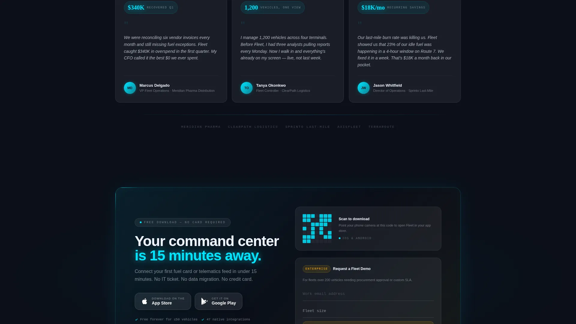
The primary download action appears three times across the page layout. It shows as a sticky bar on mobile screens, inline directly after the comparison table, and as the closing full-width glassmorphic card. Each placement pairs App Store and Google Play badges with a QR code for desktop visitors.
Dual Conversion Paths
The template supports two distinct buyer journeys. Self-serve users tap straight to an app download with no form fields. Enterprise buyers who need procurement approval follow a secondary path labeled "Request a Fleet Demo," which collects only work email and fleet size.
Data Command Visual Theme
The entire page follows a heads-up display aesthetic. Frosted glass cards float over a deep cockpit black background, edges catch electric telemetry cyan light, and warning amber appears exclusively on cost-alert badges and upgrade nudges. The visual language reinforces the platform's promise of total visibility.
Page sections overview
| Section | Purpose |
|---|---|
| Logo Bar Header | Build trust with partner and integration logos before the headline |
| Hero Headline | Deliver the core promise in a single punchy line |
| Comparison Table | Show the painful old way alongside the unified new way |
| Live Data Simulation | Make cost savings feel tangible and immediate |
| Inline Download call to action | Capture self-serve users right after the comparison lands |
| Demo Request Form | Convert enterprise buyers needing procurement sign-off |
| Closing call to action Card | Final full-width push to app download or demo request |
Design & branding system
The visual identity is built on a Data Command theme with a glassmorphic color system. The result feels like a heads-up display projected onto a rain-streaked windshield at night, with data glowing through semi-transparent surfaces.
- Deep cockpit black (#0B0F19) as the primary background, keeping data elements front and center
- Translucent panel frost (white at 8% opacity with a 12-pixel blur) forming the frosted glass card surfaces throughout the page
- Electric telemetry cyan (#00E5FF) highlighting the platform's advantage column, active states, and edge accents
- Warning amber (#FFB300) used exclusively for cost-alert badges and upgrade nudge elements, never as a primary brand color
Mobile & speed optimization
The template is structured with a mobile-first conversion hierarchy. The sticky bottom bar ensures the primary call to action is always one tap away on smaller screens.
- Sticky mobile bar keeps the "Download Fleet Free" action visible during the entire scroll journey
- QR code included alongside App Store and Google Play badges so desktop visitors can hand off to their phone instantly
- Minimal form friction on both conversion paths: no fields on the download call to action, and only two fields on the demo request path
How this template helps you convert
The page is engineered as a countdown sequence. Each section builds pressure until the download or demo action feels like the natural next step.
- The scrolling logo bar earns immediate credibility, so the headline lands with weight rather than skepticism
- The animated comparison table makes the old workflow look exhausting and the new dashboard look inevitable, shifting the visitor's emotional frame before the call to action appears
- The live data simulation closes the logical gap by showing real numbers accumulating, turning abstract cost savings into a felt experience that drives the final tap
Other information about this template
This template sits at the intersection of financial services software and fleet management technology. It is designed for companies operating in the vehicle fleet management software space, where buyers are sophisticated and skeptical of vague promises.
- The template style is a comparison table layout, a format proven to reduce buyer hesitation by externalizing the status-quo cost
- The creative direction follows a Launch Energy sequence, meaning every scroll feels like momentum building toward an inevitable action rather than a passive read
- The header concept is a Logo Bar, which front-loads social proof and integration credibility before any product claim is made
- The landing page direction targets app download as the primary conversion goal, with a demo request as a secondary enterprise path
- This template is built for teams who want a polished, on-brand page they can launch quickly without starting from a blank canvas
Theme
Data Command
Creative direction
Launch Energy
Color system
Glassmorphic
Style
Comparison Table
Direction
App Download
Page Sections
Animated Comparison Table
Live Data Simulation Block
Scrolling Partner Logo Bar
Triple Call to Action Placement
Dual Conversion Paths
Glassmorphic Data Command Theme
Related questions
Who is this landing page template designed for?
Does the template include both a download call to action and a demo request path?
What makes the comparison table section effective?
Can I adapt the color system to match a different brand palette?
Is the live data simulation included as a built-in component?



