Dispensary & Retail Professional Website Template
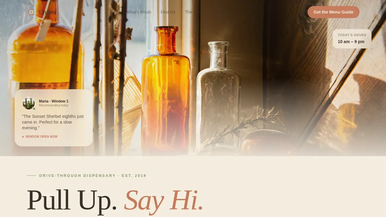
Cruiser is a single-column cannabis landing page tailored for drive-through dispensaries with a neighborhood soul. It pairs a cinematic golden-hour hero shot with scroll-driven sections covering weekly specials, budtender profiles, regional growers, and a gated First-Timer's Menu Guide. The design uses a warm Sunset Mesa palette to keep every visitor relaxed and ready to pull up to the window.
by Rocket studio
Quick summary
Cruiser is the Cruiser warm neighborhood cannabis drive through landing page template built for dispensaries that lead with community, not commerce. It flows through a single-column layout from a half-page magic-hour photograph down to a downloadable menu guide gated behind one email field. Every section breathes with generous whitespace, warm terracotta calls to action, and rounded serif headlines that feel like a hand-painted sign on a two-lane road.
Who this template is for
This cannabis landing page is designed for independent drive-through dispensaries that want their website to feel as familiar as the neighborhood it serves. If your regulars are off-shift nurses, retired couples managing joint pain, or weekend gardeners reaching for a low-dose edible, this layout speaks directly to them. The page is equally useful for operators launching their first online presence or refreshing an existing site that has lost its local warmth.
- Neighborhood-first drive-through dispensaries launching a content-driven web presence
- Dispensary owners who want to reach first-time customers with approachable, educational cannabis landing content
- Cannabis retailers whose brand story centers on small regional growers and community trust
What problem this template solves
First-time dispensary customers often arrive at a cannabis landing page with hesitation. They have common questions about strains, dosage, and what actually happens at the drive-through window. Most cannabis pages answer none of those questions before asking for something in return. Cruiser flips that sequence: it teaches first and asks second, earning the visitor's trust before the email field ever appears.
- Drive-through pages often bury location, hours, and product details instead of surfacing them immediately for mobile users who are already on the way
- Generic dispensary websites fail to highlight the human side of the store, making it hard for customers to connect with the brand before they visit
- First-timers bounce from pages that lead with a shop button before offering any product education or context
What you get with this template
You get a fully structured, single-column cannabis landing page that is ready to customize with your own photography, product list, and budtender profiles. The layout handles everything from the hero image down to the footer in one coherent scroll experience. Every section is purposeful, and the page layout is designed so that visitors never have to hunt for the information they need.
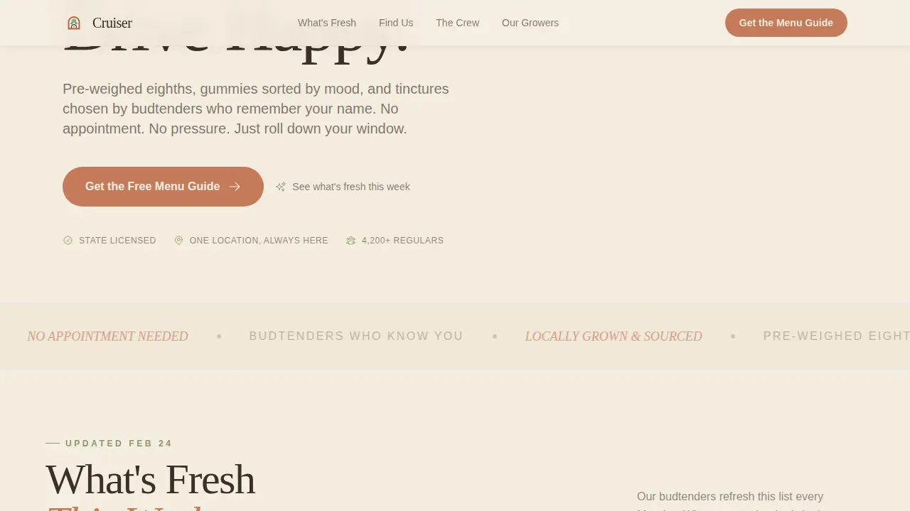
- Hero section with a cinematic half-page photograph, rounded serif headline, and floating budtender card
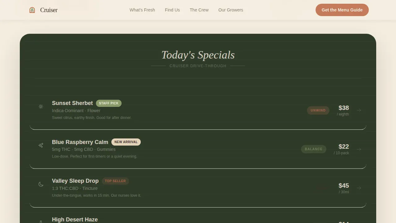
- Chalkboard-styled product carousel for weekly specials, budtender profile cards, a neighborhood map section, a regional growers sourcing block, a gated email capture form for the First-Timer's Menu Guide, three supporting blog entry links, and a split footer
- Sunset Mesa color system applied across all sections, with terracotta buttons, sage accents, cream backgrounds, and arroyo shadow body text
Feature list
This template is built around a clear set of design and content capabilities drawn directly from the source brief. Each feature below reflects what is actually built into the layout.
Cinematic Hero with Email-Gated Guide
The hero section opens with a half-page horizontal photograph shot at magic hour. A rounded serif headline anchors the cream panel beside the image. Below the fold, the primary conversion point is a single email field paired with a terracotta "Send Me the Guide" button. Visitors gain access to the downloadable First-Timer's Menu Guide covering strain types, dosage suggestions, and what to expect at the window. This structure keeps the primary goal simple: teach, then capture.
Chalkboard Product Carousel
The "What's Fresh This Week" section is styled like a chalkboard specials list. It showcases pre-weighed eighths, gummies sorted by mood, and tinctures. The carousel format lets you update weekly without redesigning the page, giving regulars a reason to scroll back and check in across weeks.
Budtender Profile Cards with Hover States
Three budtender profile cards appear mid-page, each showing a first name, favorite strain, and years in town. Hover states on the cards surface a short personal note. This section is one of the most effective community-building elements on the page. Successful cannabis landing pages that highlight real staff consistently build more trust than those that do not.
Neighborhood Map and Landmark Callouts
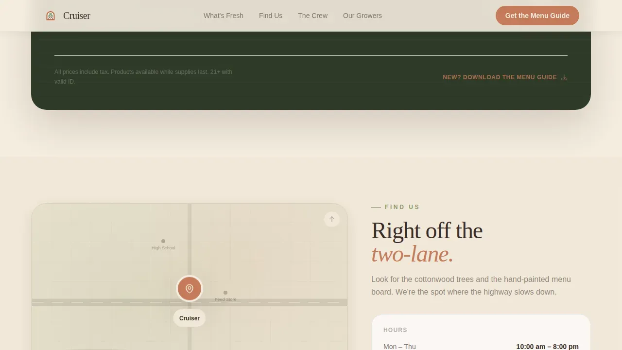
A dedicated section displays the drive-through's location relative to familiar community anchors: the high school, the feed store, and the river trail. Address, hours, and an "Open Now" status slot are all surfaced here. Providing immediate, easy-to-scan location and hours detail serves mobile users who are already navigating toward the store.
Regional Grower Sourcing Block
The "Our Growers" section pairs field photography of small regional partners with brief sourcing context. This block protects the brand's credibility by showing rather than telling. Visitors who review the sourcing story before they visit arrive with a stronger sense of the dispensary's commitment to quality.
Three Supporting Blog Entry Links
Three short blog entries live below the email capture section. Titles include "Edibles versus. Flower: A Plain-English Comparison," "What Our Budtenders Wish You'd Ask," and "How We Pick Our Growers." Each entry ends with a soft text link back to the guide, reinforcing conversions without adding pressure.
Page sections overview
| Section | Purpose |
|---|---|
| Hero Photo Panel | Establishes golden-hour brand atmosphere and surfaces the headline |
| Weekly Specials Carousel | Highlights current eighths, gummies, and tinctures in chalkboard style |
| Neighborhood Map | Shows drive-through location relative to local landmarks and lists hours |
| Budtender Profile Cards | Builds trust through named staff with favorite strains and tenure |
| Regional Growers Block | Showcases sourcing partners with field photography for brand credibility |
| Email Capture Form | Gates the First-Timer's Menu Guide behind a single email field |
| Blog Entry Links | Provides three educational articles that link back to the guide |
| Split Footer | Displays logo and tagline left, navigation links right |
Design & branding system
The visual design follows a Pastoral Calm theme rooted in the Sunset Mesa color system. Every color choice connects to a real-world material: sun-bleached clay, dried sage, open sky, and packed earth. The typography pairing of Fraunces for headlines and DM Sans for body copy keeps the page readable and warm without feeling rustic or rough. Headlines are set in a rounded serif to reinforce the unhurried, neighborhood brand personality.
- Cream (#F5EDE0) dominates the background; terracotta (#C47B5A) warms all call-to-action buttons and pull-quotes; sage (#8A9A6B) marks section transitions and icons; arroyo shadow (#3B2F2A) grounds all body text
- The chalkboard carousel, budtender cards, and grower photography sections each use whitespace generously so that no single block of content feels crowded or rushed
- Bold terracotta is used to highlight key offers and calls to action, drawing the eye naturally through the scroll without competing colors fighting for attention
Mobile & speed optimization
This landing page is built mobile-first. Drive-through customers frequently visit the page on their phones while already in the car or parked nearby. The responsive design ensures that the hero photograph, product carousel, map section, and email capture form all reflow cleanly across devices. Text remains legible, buttons remain tappable, and the page layout does not collapse into hard-to-navigate columns on smaller screens.
- Server Components handle static sections including the hero, grower block, and footer to keep client-side JavaScript minimal and support fast initial load across devices
- Scroll reveal animations use a cubic-bezier easing curve, the product carousel uses a marquee pattern, and budtender cards use a stagger entrance, all tuned to feel smooth on both desktop and mobile
- The sticky header approach keeps the order and location links visible while visitors scroll, reducing friction for users who are ready to act immediately
How this template helps you convert
A well-structured landing page guides visitors seamlessly through the information they need before asking them to commit to anything. Cruiser is designed around that principle. The page earns trust through scroll-driven storytelling, human faces, and plain-language education before the email field ever appears. Each section is optimized to push visitors one step closer to pulling into the lane.
- The hero section surfaces the brand's warmth and local identity immediately, setting an emotional tone that makes first-time visitors feel safe exploring the page further rather than bouncing to a competitor's site.
- The educational blog entries and downloadable guide serve the audience's real needs first, which measurably improves conversion rates on the email capture by making the exchange feel fair and genuinely useful rather than transactional.
- Staff profiles, grower sourcing, and neighborhood map details collectively function as social proof, building the kind of credibility that turns a passive visitor into a customer who drives to the window and comes back the following week.
Other information about this template
This section covers additional practical details about building with and customizing the Cruiser template, including platform context and optimization practices worth knowing before you launch.
- The template is structured for no-code customization: users can update colors, swap photography, edit copy, and revise the product carousel without writing a line of code, making it accessible to dispensary owners with no technical background
- Many no-code landing page builders offer drag-and-drop functionality, and this template's single-column flow is well-suited to that kind of editing experience; the layout is modular enough to iterate section by section across weeks without breaking the overall design
- Page-level SEO is supported by the template's clean heading hierarchy and descriptive section copy; adding local SEO keywords such as neighborhood name and city into headlines and the map section helps the page rank for phrases like "cannabis drive-through near me" on search engines including Google
- For dispensaries using WordPress or similar platforms, the design system and color tokens can be translated into a theme with minimal effort, and the page layout's single-column structure maps cleanly to most block editors
- Compliance with cannabis marketing regulations is the operator's responsibility; the template does not include age-gate or legal-copy components by default, so dispensaries should review local and national laws before launch to protect their brand and avoid costly penalties
- The email capture form and featured categories of cannabis products (flower, edibles, concentrates, and tinctures) can be updated as new seasonal inventory arrives, keeping the page content fresh without a full redesign
- Feedback from customers who access the guide can inform future product carousel updates, and A/B testing different headlines or button copy on the email form is a straightforward way to report on what drives the best conversion rates over time
- The template's warm, minimalist design aligns naturally with cannabis landing page design best practices: a clean layout, friendly typography, welcoming photography, and a single clear call to action are all present and easy to maintain as the business grows and needs to connect with more customers across the region
Theme
Pastoral Calm
Creative direction
Local & Neighborhood
Color system
Sunset Mesa
Style
Single Column Flow
Direction
Content/Resource
Page Sections
Cinematic Hero with Gated Menu Guide
Chalkboard Weekly Specials Carousel
Budtender Profile Cards
Neighborhood Map and Hours Block
Regional Growers Sourcing Section
Three Educational Blog Entry Links
Related questions
Can I update the product carousel each week without redesigning the page?
Is the email capture form the only conversion point on this landing page?
How does this template help first-time cannabis customers feel comfortable?
Does the page layout support a dispensary focused on local sourcing?
Can I adapt this template to meet cannabis marketing compliance requirements?