Vocational & Trade School Professional Website Template
Flux is a hub-and-spoke landing page built for plumbing and electrical trade shops ready to ditch whiteboard dispatch. It showcases a live stats dashboard, a four-step onboarding guide, and a freemium call-to-action that asks only for an email and company name. The design runs on deep charcoal, electric violet, and hot coral, rendered in a Corporate Precision style that speaks directly to operations managers and owner-operators.
by Rocket studio
Quick summary
Flux is a single-page, anchor-nav landing page template built for field service dispatch software in the plumbing and electrical trade. It opens with a billboard-scale live stats dashboard and walks visitors through four spoke sections that mirror the onboarding journey. Every design choice, from the monospace numbers to the scroll-progress nav bar, is built to move an operations manager from curious to signed up.
Who this template is for
This landing page is made for founders, product teams, designers, and developers who need to launch a B2B SaaS dispatch application fast. It is not a generic web design starting point. It is purpose-built for the trade services world.
- Operations managers running fifteen or more vans across multiple counties who need to show their team a better way to manage jobs.
- Owner-operators and office coordinators at mid-size trade shops who are still toggling between browser tabs to schedule a single work order.
- Designers and developers at SaaS companies who want a production-ready landing page they can edit, extend, and share with stakeholders without starting from scratch.
What problem this template solves
Mid-size trade shops lose revenue every day to whiteboard-and-group-text dispatch chaos. The real problem is not a lack of tools. It is that the right idea never gets presented in a way that converts a skeptical operations manager into a paying user. A landing page that feels like a dashboard, talks in dispatch language, and removes every point of friction at signup is the missing piece.
- Visitors land on a page that looks like a live dispatch board, so they immediately recognize the product's value without reading a paragraph of marketing copy.
- The anchor nav and scroll-progress bar guide each client through the four-step onboarding story, reducing drop-off before the call-to-action appears.
- The freemium offer is stated in one clear line, five techs, unlimited jobs, no card required, so there is no error in the visitor's mind about what signup costs.
What you get with this template
This template is a complete, section-led landing page with every component pre-built and ready to open in your project. You get a focused design system, high-animation user interface sections, and a conversion flow that follows field service buyer psychology from the first scroll to the final click.
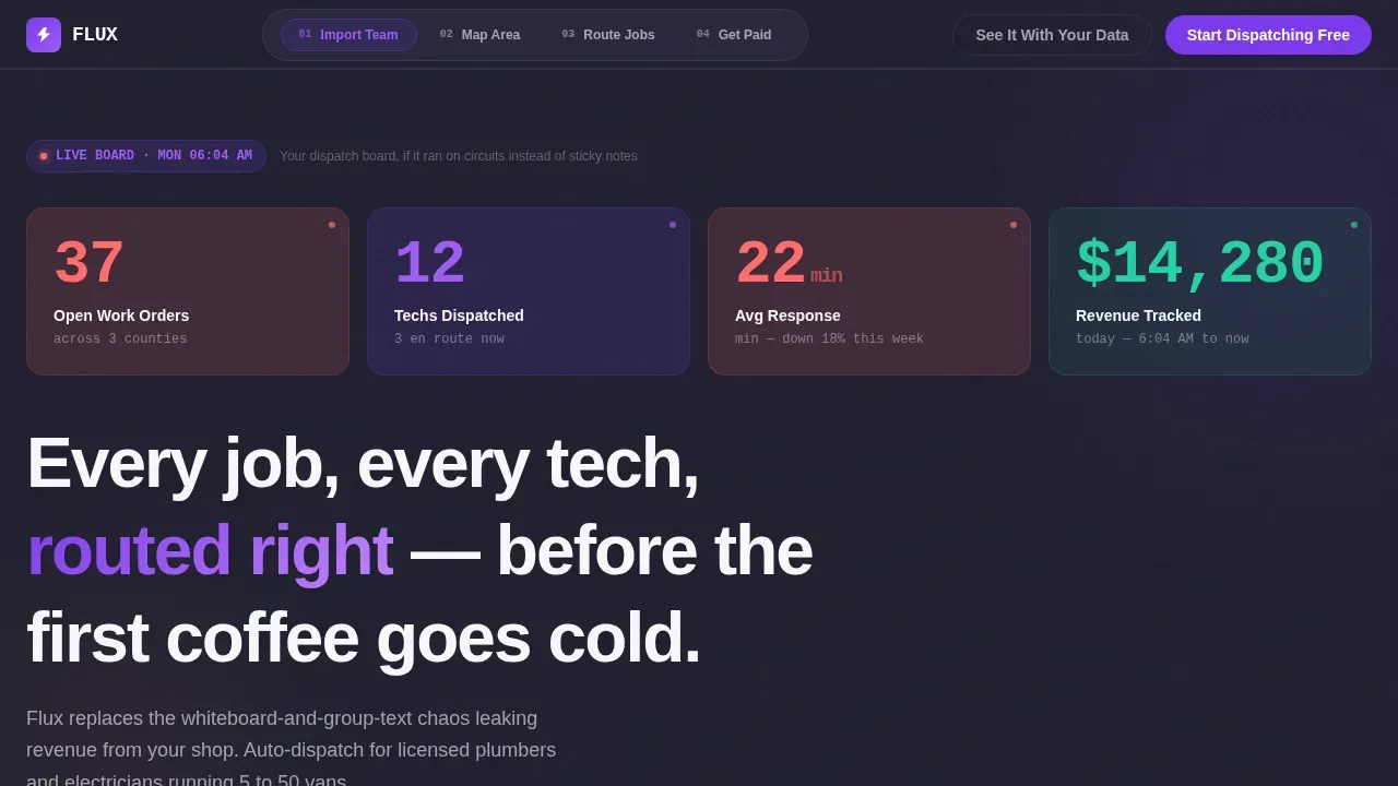
- A hero section with billboard-scale monospace stats shown in coral and violet, pulsing on load to simulate a live dispatch board.
- Four spoke sections covering team import, service area mapping, automated job routing, and invoice generation, each closing with a pinned call-to-action.
- A sticky anchor nav with a scroll-fill progress bar, step cards with hover state effects, and a secondary demo-booking path that captures crew size in a single field.
Feature list
This landing page is built around components that serve a specific purpose in the conversion flow. Each feature below is grounded in the design brief and reflected in the template file.
Billboard Stats Hero
The hero section renders four live-style metrics in oversized JetBrains Mono type: open work orders, techs dispatched, average response time, and revenue tracked today. The coral and violet numbers pulse once on load, giving the page the feel of a pro-grade multimeter display. No stock photography is used. The numbers do all the work.
Anchor Nav with Scroll Progress
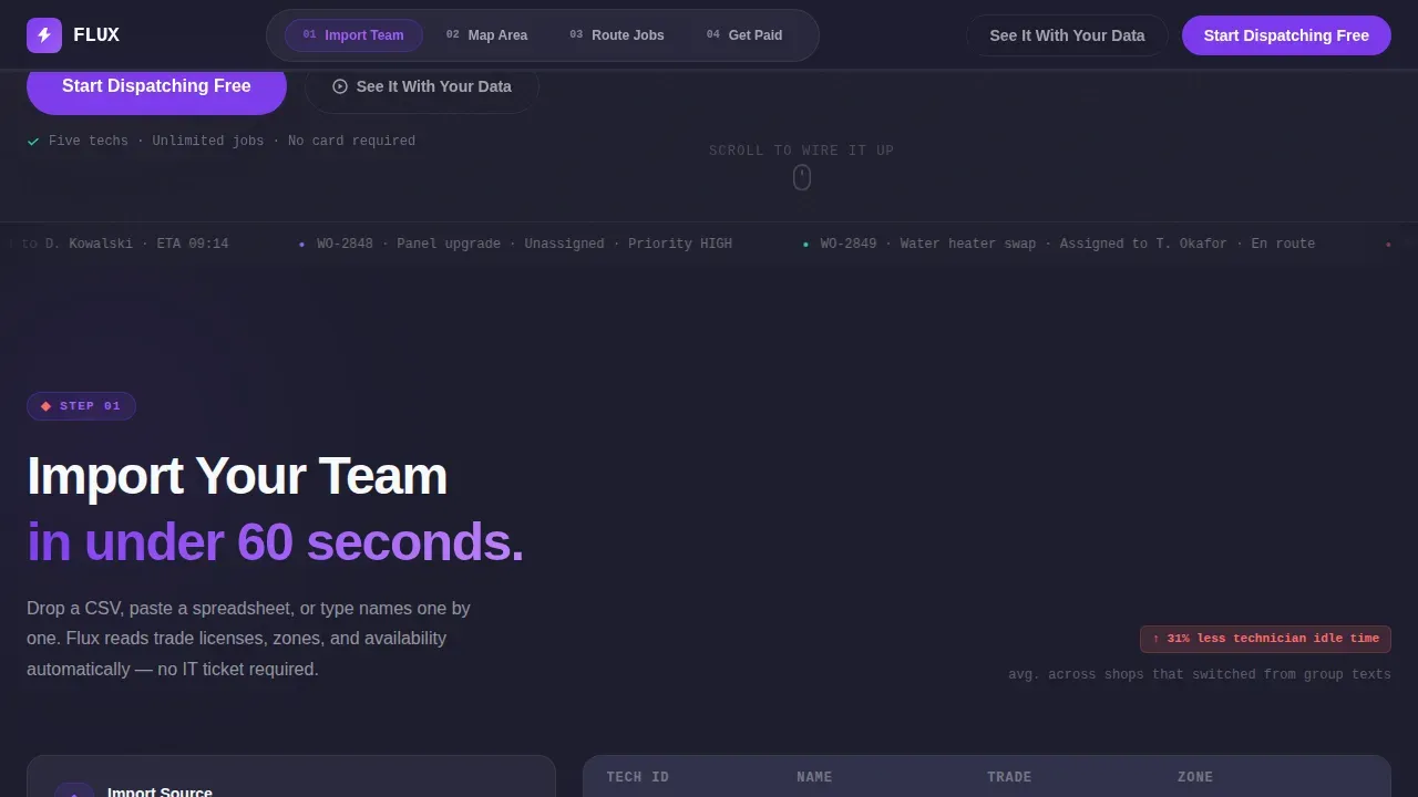
A sticky navigation bar sits at the top of the page after the first scroll. As the visitor moves through each spoke section, a progress bar fills in, turning the page into a visual completion loop. This user interface pattern mirrors the onboarding experience the product is selling, which reinforces the message at a subconscious level.
Four-Step Spoke Sections
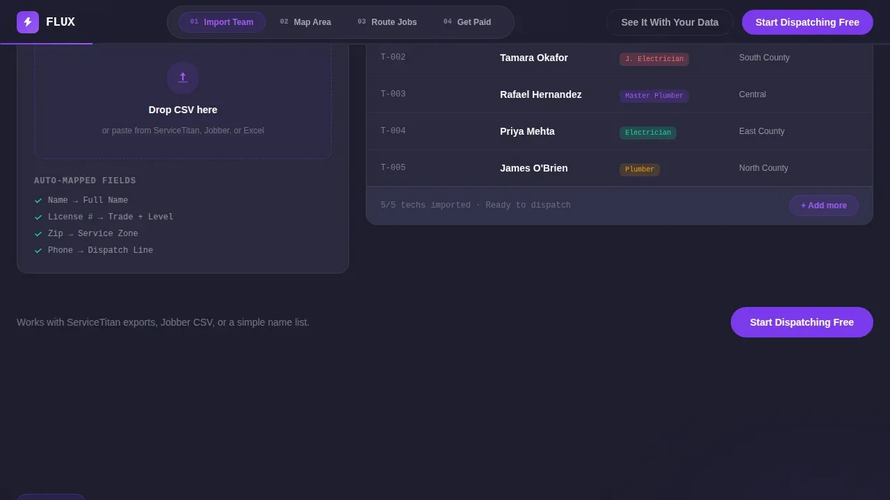
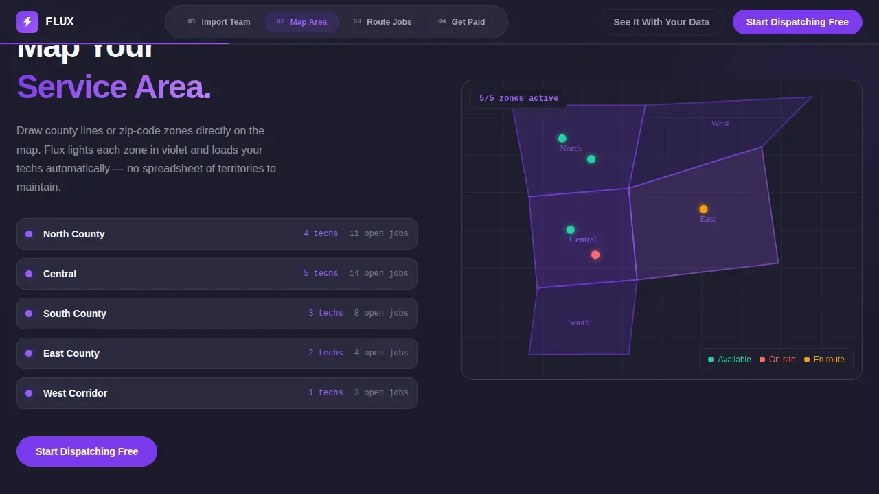
Each spoke section builds on the last, following a wiring-diagram logic. Step 1 shows a CSV crew list auto-populating. Step 2 shows a zone map lighting up in violet. Step 3 shows an animated dispatch sequence with pins finding the nearest available tech. Step 4 shows an invoice auto-generated from a completed work order. Together, these sections let users follow the full application journey without leaving the landing page.
Pinned Freemium Call-to-Action
The primary call-to-action, "Start Dispatching Free," appears in electric violet and is pinned to the nav bar after the first scroll. It repeats at the close of each spoke section. A secondary path, "See It With Your Data," links to a demo booking form with one field: number of techs on your crew. The freemium tier is stated plainly so visitors never forget the offer before they sign.
Corporate Precision Design System
The design follows a Corporate Precision theme built on the Dopamine Pop color system. Charcoal, violet, and coral work together to create a palette that feels like serious field equipment, not a generic SaaS website. Plus Jakarta Sans handles body text and headings, while JetBrains Mono carries every stat and data readout.
Responsive Layout and Mobile Components
The template is built desktop-first to match how operations managers check their dispatch boards, but all components respond to smaller screens. Routing visualizations, stat cards, and call-to-action buttons are all usable on mobile. Fast loading is supported by using Server Components for static sections and Client Components only where animations are needed.
Page sections overview
| Section | Purpose |
|---|---|
| Hero Stats Dashboard | Show live dispatch metrics at billboard scale to establish immediate product credibility |
| Anchor Nav Bar | Provide sticky navigation with scroll-fill progress to guide visitors through the spoke sections |
| Step 1: Import Team | Demonstrate CSV crew import animation to show how fast setup begins |
| Step 2: Map Service Area | Display interactive zone map lighting up in violet to show geographic coverage control |
| Step 3: Auto Job Routing | Animate dispatch pins finding the nearest available tech to prove the core routing value |
| Step 4: Get Paid Faster | Show auto-generated invoice from a completed work order to close the value loop |
| Footer | Provide a linear single-row footer with navigation links and signup entry point |
Design & branding system
The Flux landing page uses a Corporate Precision visual identity layered over a Dopamine Pop color system. The result is a design that reads like a professional instrument panel, not a marketing brochure. Every color choice carries a function: charcoal recedes, violet commands action, and coral flags the numbers that matter most.
- Color palette: deep charcoal (#1E1E2E) as the primary background, electric violet (#7C3AED) on buttons and active nav indicators, hot coral (#FF6B6B) for alert badges and metric highlights, and clean white (#F8F9FC) for card surfaces and body text.
- Typography: Plus Jakarta Sans is used for all headings and body copy, while JetBrains Mono is reserved for monospace stat readouts and data-level information, keeping the technical aesthetic consistent across every section.
- Animation style: high-motion, purposeful, and non-decorative. Stat numbers pulse once on load. Dispatch pins animate on scroll. Spoke section cards reveal in staggered sequences. Every motion has a job to do.
Mobile & speed optimization
A landing page for dispatch software has to work on every screen, even if the primary audience is at a desk. Over 63% of users may access a page like this from a mobile device at some point. The Flux template is built with that in mind, following a desktop-first layout that scales down without losing its visual impact.
- Routing visualizations and stat cards are built to remain legible and tappable on smaller screens, so the landing page does not lose its authority on a phone.
- Server Components handle all static sections of the page, while Client Components are used only where animations run, keeping the overall page load lean and responsive.
- Every second of delay in page loading can cut conversions. The template's component architecture reflects this by separating static and dynamic rendering from the start.
How this template helps you convert
A high-converting landing page for a dispatch routing application must combine a clear value proposition with visible proof of efficiency. Flux is designed to do exactly that, moving each visitor through a logical, emotionally resonant sequence from the first stat they see to the moment they type their email address.
- The hero dashboard opens with numbers a shop owner checks before anything else, creating instant recognition and trust before any marketing copy appears. Minimalist design with a strong visual hierarchy keeps focus on those core messages.
- The four spoke sections build a complete mental model of the product, letting visitors understand the full application flow without needing a demo, while the scroll-progress nav reinforces that they are making progress toward a decision.
- The freemium call-to-action removes every remaining barrier. The offer is clear, the ask is minimal, and the secondary demo path with a single crew-size field gives high-intent visitors a lower-stakes way to engage before they commit.
Other information about this template
This template sits at the intersection of field service web design and SaaS landing page development. It is built for teams who need to create a polished, high-motion landing page without investing weeks in custom development. The design language, component library, and conversion architecture can all be adapted for related trade service applications.
- Designers and developers can open the template file, follow the existing design system, and apply their own branding with minimal redesign effort. The component structure is modular, so individual sections are easy to edit, reorder, or rebuild.
- The template supports the kind of learning that comes from working with a real production-level project. Teams new to field service SaaS design will find the four-step spoke layout a useful course in how to structure a freemium conversion flow.
- Resources for understanding the Flux architecture pattern are widely available. Flux is an architectural pattern that enforces unidirectional data flow, and in the context of React applications it allows for predictable state management. The main components of Flux architecture are the Dispatcher, Stores, and Views. Actions are dispatched to the Dispatcher, which then updates the Stores, and the Stores emit a change event causing the Views to re-render. Developers who want to build on this template will find that Flux helps in building large-scale applications by providing a clear and predictable pattern for managing state. Flux can be used with any library or framework that can interact with JavaScript objects, and it integrates well with GitOps workflows where Flux enables application deployment and progressive delivery through automatic reconciliation.
- The Flux community is active and well-documented, with resources shared across GitHub repositories and educational videos published on YouTube. Developers who want to go deeper into deployment patterns will find that GitOps provides a way to manage Kubernetes applications using Git as the single source of truth, with auditable changes through Git history. Continuous Delivery automates the deployment process, allowing teams to release application updates quickly and reliably.
- No-code development resources are also relevant here. No-code platforms can empower non-technical users to create production-ready applications, and courses on no-code development often provide hands-on projects to help learners apply their skills. AI-powered no-code tools can help users go from idea to live application quickly. Learning no-code development can significantly reduce the time it takes to launch a product, and AI tools can enhance the process by automating backend integrations and code generation.
- The template is appreciated by teams who want a starting point that does not require them to redesign every component from the ground up. Feedback from early users tends to focus on the anchor nav progress bar and the stat hero as the sections that most clearly communicate the product's value. The opinion shared most often is that the landing page feels like a real dispatch board, not a sales page, which is exactly the point.
- Digital Proof of Delivery captures photos and signatures to reduce disputes and speed up invoicing, a concept shown in Step 4 of the spoke layout. Real-time fleet tracking allows dispatchers to monitor driver locations and status continuously, which informs the animated dispatch pin sequence shown in Step 3.
Theme
Corporate Precision
Creative direction
Step-by-Step Guide
Color system
Dopamine Pop
Style
Hub & Spoke (Anchor Nav)
Direction
Freemium/Trial
Page Sections
Billboard Stats Hero Dashboard
Anchor Nav with Scroll-progress Bar
Four-step Spoke Section Layout
Pinned Freemium Conversion Path
Corporate Precision Design System
Modular, Editable Component Library
Related questions
Who is the Flux landing page template built for?
Can I edit the sections and components without starting from scratch?
Does the template include the freemium signup flow?
Is this landing page responsive to mobile screens?
What makes this different from a generic SaaS landing page template?



