NetInventory - Powerful Telecom Landing Page Template
Netinventory is a scroll-reveal landing page template built for telecommunications inventory management platforms. It opens with animated asset counters, leads directly into an interactive ROI calculator, and builds its case through progressive versus-comparison panels. The Carbon Fiber color system and Dynamic Motion theme give it a sharp, engineered look suited to technical buyers.
by Rocket studio
Quick summary
Netinventory is a single-page, scroll-reveal landing page template designed for telecom inventory management platforms. It skips lifestyle imagery entirely and opens on a metrics wall with animating counters. A built-in ROI calculator engages visitors before any sales pitch, and progressive comparison panels build a compelling case as the visitor scrolls.
Who this template is for
This template is built for teams selling or presenting telecommunications inventory management software to technical and operational buyers. It speaks directly to the people who feel the cost of poor asset visibility every day.
- Network operations managers who track assets across multiple sites
- Procurement leads dealing with duplicate orders and missing equipment records
- Chief Technology Officers at regional carriers watching budget disappear into untracked stock
What problem this template solves
Telecom networks contain thousands of physical assets: small form-factor pluggable transceivers (SFPs), patch cords, chassis units, and line cards spread across dozens of sites. Most teams still track these in spreadsheets or rely on institutional memory. That approach creates blind spots that cost real money.
- Asset location takes hours to confirm, slowing down fault response and maintenance
- Redundant procurement happens when teams reorder parts they already own in a remote warehouse
- End-of-life planning is reactive rather than scheduled, creating unplanned outages and emergency spend
What you get with this template
You get a fully structured, single-page landing page template that leads with data and earns trust through interaction. Every section is designed to advance the visitor's decision rather than just describe the product.
- An animated stats wall that surfaces uncomfortable industry numbers before any pitch begins
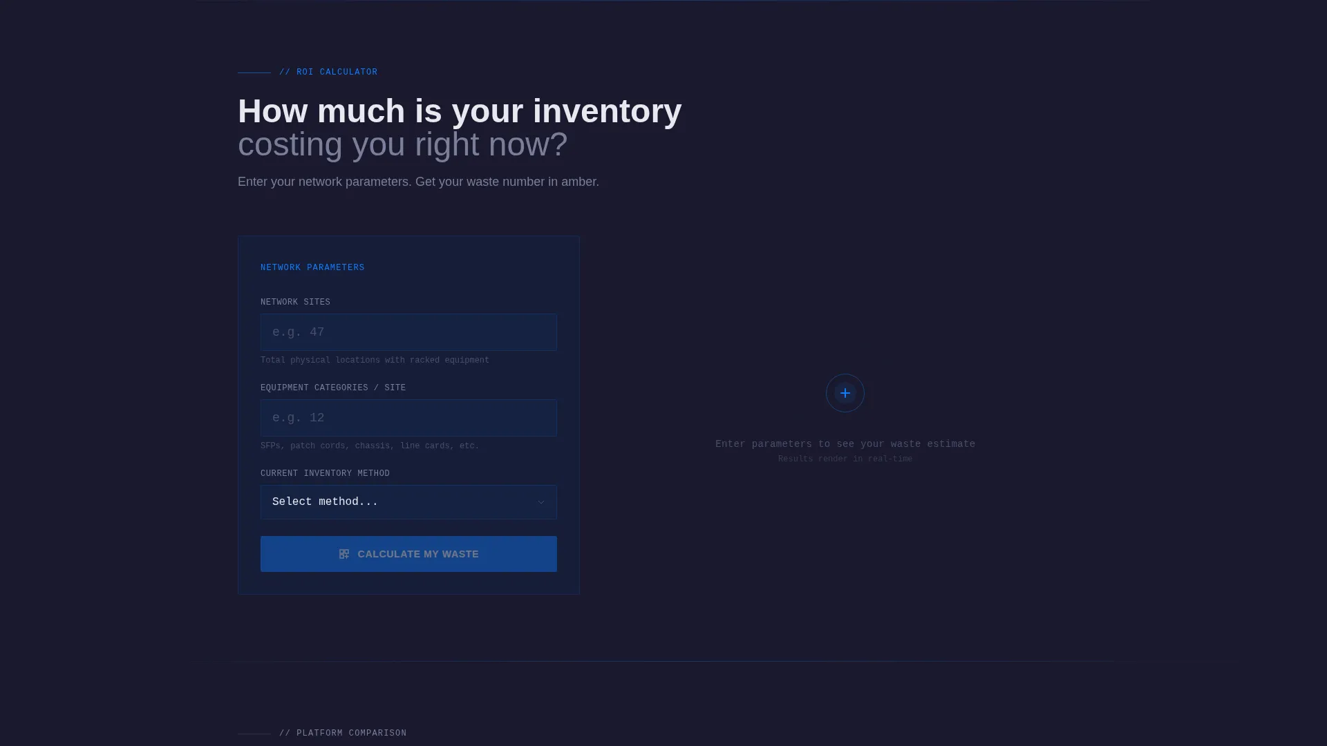
- A live ROI calculator section where visitors input their own network details and receive personalized waste and savings estimates
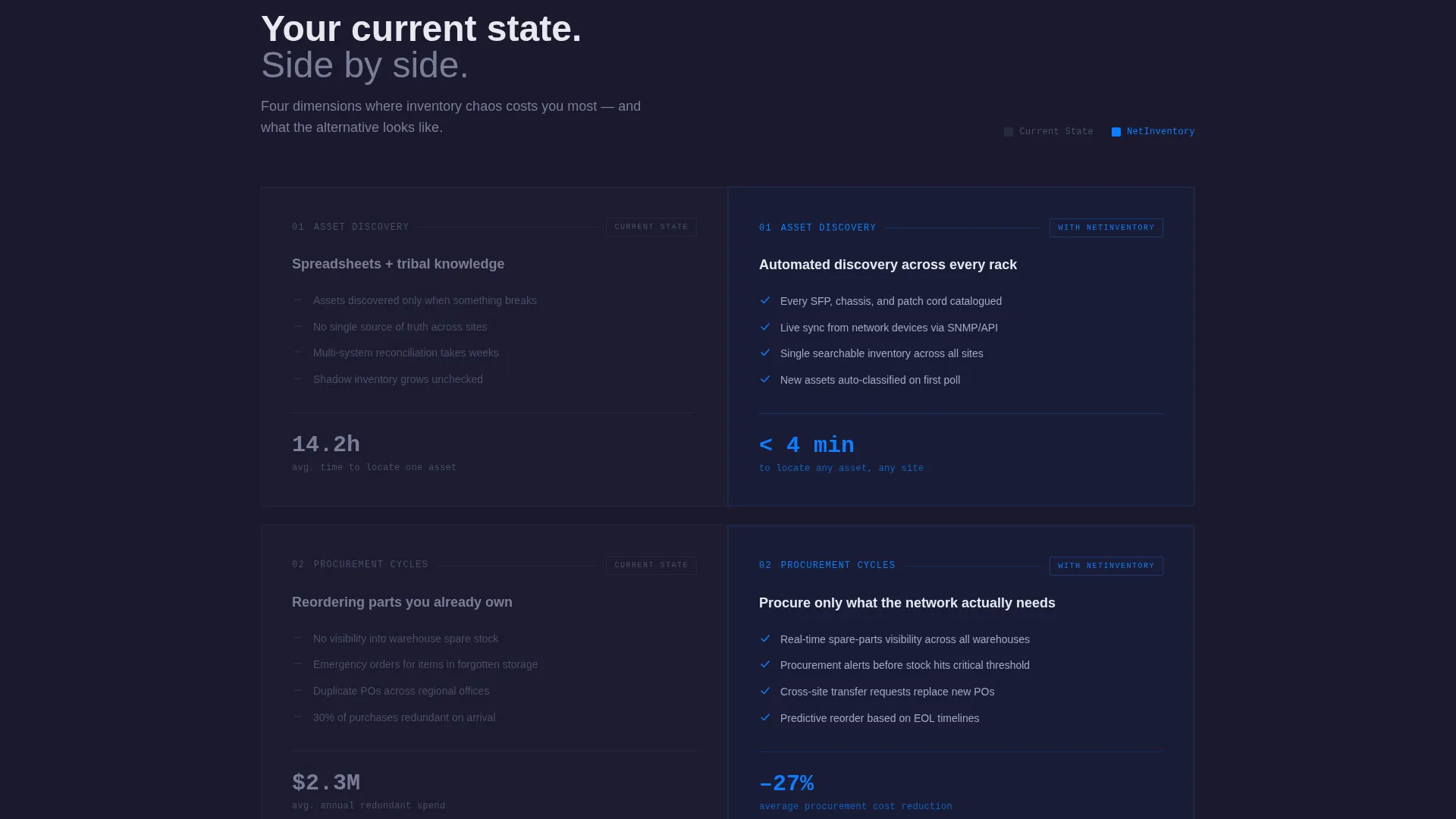
- A series of scroll-triggered versus-comparison panels covering asset discovery, procurement cycles, end-of-life forecasting, and audit compliance
Feature list
This template is built around a specific conversion logic: show the problem in numbers, let the visitor calculate their own exposure, then progressively reveal why the platform solves it better than the current approach.
Animated Metrics Header
Three large counters animate upward on page load against a carbon black background. Each counter surfaces a different dimension of inventory pain: blind spots per network, annual redundant spend, and mean time to locate a specific asset. The numbers settle after a short tick animation, followed by a single line of white copy.
Interactive ROI Calculator
The first full content section is a working calculator, not a product pitch. Visitors enter the number of network sites, average equipment categories per site, and their current inventory method from a dropdown. The tool instantly returns estimated annual waste, hours lost to manual audits, and projected return on investment from automated tracking, all rendered with motion-eased number reveals.
Scroll-Reveal Comparison Panels
After the calculator results, each subsequent section slides in as the visitor scrolls. Every panel shows the visitor's current state on the left in titanium gray and the platform alternative on the right in signal blue. Topics covered include asset discovery speed, procurement cycle length, end-of-life forecasting accuracy, and audit compliance readiness.
Persistent Audit Call to Action
The primary call to action, "Run a Full Network Audit," appears immediately after the calculator output and again as a persistent bottom bar once the visitor passes the third comparison panel. This placement ties the action to the visitor's personalized data, making it feel like a logical next step rather than a generic button.
Secondary Competitor Comparison Path
A secondary call to action offers visitors a detailed feature matrix comparing the platform against named alternatives. This path is positioned for buyers who are already evaluating multiple tools and need side-by-side feature clarity before committing.
Page sections overview
| Section | Purpose |
|---|---|
| Animated Stats Wall | Opens with three industry counters to surface inventory pain immediately |
| ROI Calculator Tool | Lets visitors calculate their own annual waste and projected savings |
| Calculator Results Display | Shows personalized waste, audit hours, and return on investment figures |
| Asset Discovery Panel | Compares current versus platform speed for locating network assets |
| Procurement Cycle Panel | Contrasts manual reorder processes against automated procurement insight |
| End-of-Life Forecast Panel | Shows reactive versus scheduled end-of-life planning approaches |
| Audit Compliance Panel | Highlights current compliance gaps versus structured audit readiness |
| Primary Audit call to action | Anchors the main conversion action after personalized results |
| Persistent Bottom Bar | Repeats the audit call to action after the third comparison section |
| Competitor Matrix Link | Offers a secondary path for buyers evaluating multiple platforms |
Design & branding system
The visual identity follows a Dynamic Motion theme built on a Carbon Fiber color system. Every color choice is intentional and functional: backgrounds anchor, type informs, blue activates, and amber alerts.
- Carbon black (#1A1A2E) dominates all backgrounds and section divides, creating the dense, engineered feel of a server room after hours
- Titanium mid-gray (#4A4E69) carries body text and the "current state" side of every comparison panel, visually communicating stagnation
- Signal-trace blue (#0F7DFF) lights up active data states, the calculator output, and the platform's side of every comparison, like fiber optic light traveling through dark conduit
- Fault-alert amber (#F0A500) is reserved exclusively for savings figures, warning callouts, and interactive highlights, drawing the eye directly to the numbers that matter most
Mobile & speed optimization
The scroll-reveal and animation-heavy structure of this template is built with progressive disclosure in mind. Sections load as they enter the viewport, which keeps the initial page render focused and manageable on smaller screens.
- Comparison panels are structured to reflow vertically on mobile, preserving the left-versus-right logic in a stacked format
- The calculator inputs and animated results are designed for touch interaction, with clear labels and a responsive dropdown for inventory method selection
How this template helps you convert
Every structural choice in this template is built to reduce friction and accelerate the moment a visitor decides to take action.
- The ROI calculator makes the conversion personal. Once a visitor sees their own estimated waste figure rendered in amber against black, the "Run a Full Network Audit" request becomes triage, not a sales form.
- The progressive scroll structure means each section earns its place by building on the last. Visitors who reach the fourth comparison panel have already invested time and seen their own numbers, which makes the persistent bottom-bar call to action feel earned rather than pushy.
Other information about this template
This template is categorized under Technology, specifically within the Telecommunications Software and Software as a Service (SaaS) subcategory. It is purpose-built for the telecommunications inventory management niche, where the buying audience is technically literate and skeptical of generic marketing claims.
- The template style is Scroll Reveal (Progressive), meaning sections animate into view as the visitor scrolls rather than loading all at once
- The header concept is Stats and Metrics, a deliberate choice to lead with data instead of photography or abstract illustrations
- The creative direction is Calculator and Tool First, positioning the interactive element as the primary trust-building mechanism before any feature list or pricing
- The landing page direction is Comparison and Versus, meaning the core persuasion structure is built around contrast between the visitor's current state and the platform's alternative
- This template is well suited to product-led growth presentations, sales enablement decks converted to web format, and regional carrier procurement pitches where decision-makers want numbers before narratives


Theme
Dynamic Motion
Creative direction
Calculator/Tool First
Color system
Carbon Fiber
Style
Scroll Reveal (Progressive)
Direction
Comparison/Versus
Page Sections
Animated Stats Wall Header
Interactive ROI Calculator
Scroll-triggered Comparison Panels
Persistent Audit Call to Action Bar
Competitor Feature Matrix Link
Carbon Fiber Motion Theme
Related questions
Who is the primary audience for this landing page template?
Does the ROI calculator require a backend or live data connection?
Can I customize the calculator fields and comparison panel topics?
How does the persistent bottom bar call to action work?
Is this template suitable for a SaaS demo request or free trial flow?



