Instant Analytics Mobile App Landing Page Template
Byline is a hub-and-spoke mobile app landing page template built for media and publishing analytics tools. It uses a forge-black and electric-cyan Dashboard Pro visual system to present live readership metrics, revenue-per-article data, and audience sentiment in a Stats-First Impact layout. Every scroll delivers a headline number before context, guiding editors, newsletter operators, and media CFOs toward downloading the app.
by Rocket studio
Quick summary
Byline is a single-page, anchor-nav mobile app landing page template designed for real-time newsroom analytics products. It opens with a glowing phone mockup on a full-bleed dark canvas, then walks visitors through audience data, revenue breakdowns, distribution performance, and integration proof before delivering a clear download call to action. The result is a focused, metrics-led page that earns the install before asking for it.
Who this template is for
This template is built for publishers and media technology teams who need a conversion-ready app landing page without starting from scratch. The layout, tone, and data-forward structure are aligned to a specific editorial audience.
- Digital editors-in-chief who need a page that speaks directly to newsroom decision-makers refreshing analytics between meetings.
- Independent newsletter operators tracking subscriber churn and looking for a credible, professional mobile app landing page to present their tool.
- Media group chief financial officers who need content return on investment translated into board-ready numbers and want a landing page that reflects that standard.
What problem this template solves
Most generic app landing page templates are built for consumer apps like a fitness tracker or wellness app. They miss the specific trust signals, data density, and editorial tone that news and media professionals respond to. A mobile app landing page for a real-time newsroom analytics tool must emphasize speed, actionable insights, and editorial impact. Byline solves that gap directly.
- Editors and publishers visit an app landing page and see fluffy lifestyle copy instead of the clear metrics and revenue proof they need to make informed decisions.
- Without strong headlines, a compelling value proposition, and social proof from recognized newsrooms, potential users leave before reaching the download buttons.
- Generic landing pages bury essential information below the fold, while Byline leads every section with an oversized stat so visitors get the key benefits immediately at the top fold.
What you get with this template
This template delivers a complete, well structured hub-and-spoke app landing page with four anchor-nav spoke sections. Each section is purpose-built for a media analytics product and ready to receive your own screenshots, copy, and metrics.
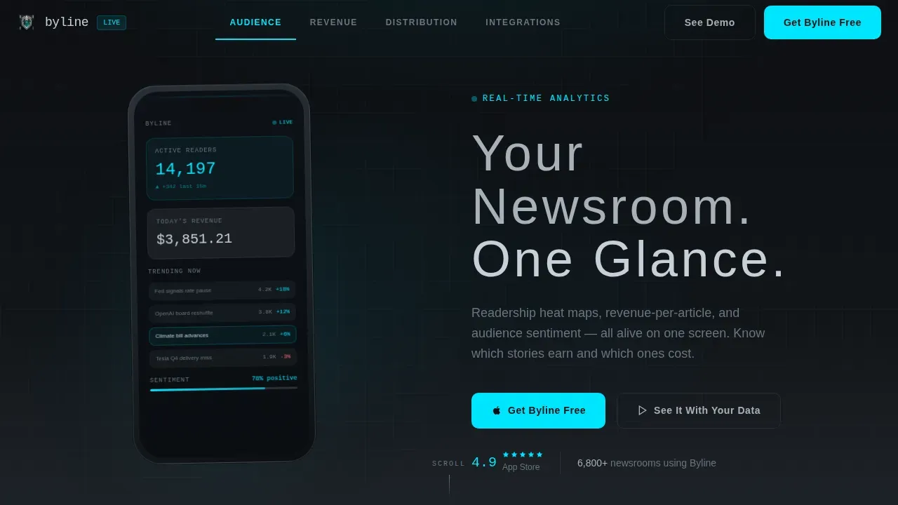
- A dark full-bleed header with a photorealistic phone mockup, a glowing live-data screen, and the headline "Your Newsroom. One Glance." placed in wide-tracked brushed-steel type.
- Four named spoke sections, Audience, Revenue, Distribution, and Integrations, each opening with an oversized hero stat before the supporting feature description and interface screenshot appear.
- A primary "Get Byline Free" call to action beneath the header and a floating mobile bottom bar, both using the electric-cyan call to action button on a gunmetal surface, plus a secondary "See It With Your Data" path leading to a sixty-second interactive demo.
Feature list
This app landing page template includes purpose-designed components that support a Stats-First Impact editorial product. Each feature reflects what is described in the source brief and nothing more.
Stats-First Hero Header
The header section is a pure forge-black full-bleed viewport. A photorealistic phone mockup floats center-frame with its screen lit, casting a soft cyan glow into the surrounding darkness. The on-screen dashboard displays 14.2K active readers, a trending-articles leaderboard, and a revenue ticker. After two seconds, the headline fades in: "Your Newsroom. One Glance." This top fold moment creates a lasting impression before a single word of body copy is read.
Anchor Navigation Rail
A minimal horizontal anchor nav pins to the top of the page as users scroll. The four labels, Audience, Revenue, Distribution, and Integrations, act as spokes that jump visitors to the section most relevant to their role. Active nav states use the electric-cyan accent exclusively, reinforcing the color scheme logic of the design system. This structure keeps the page well structured and lets users understand the full scope of the app at a glance.
Hero-Stat Section Rhythm
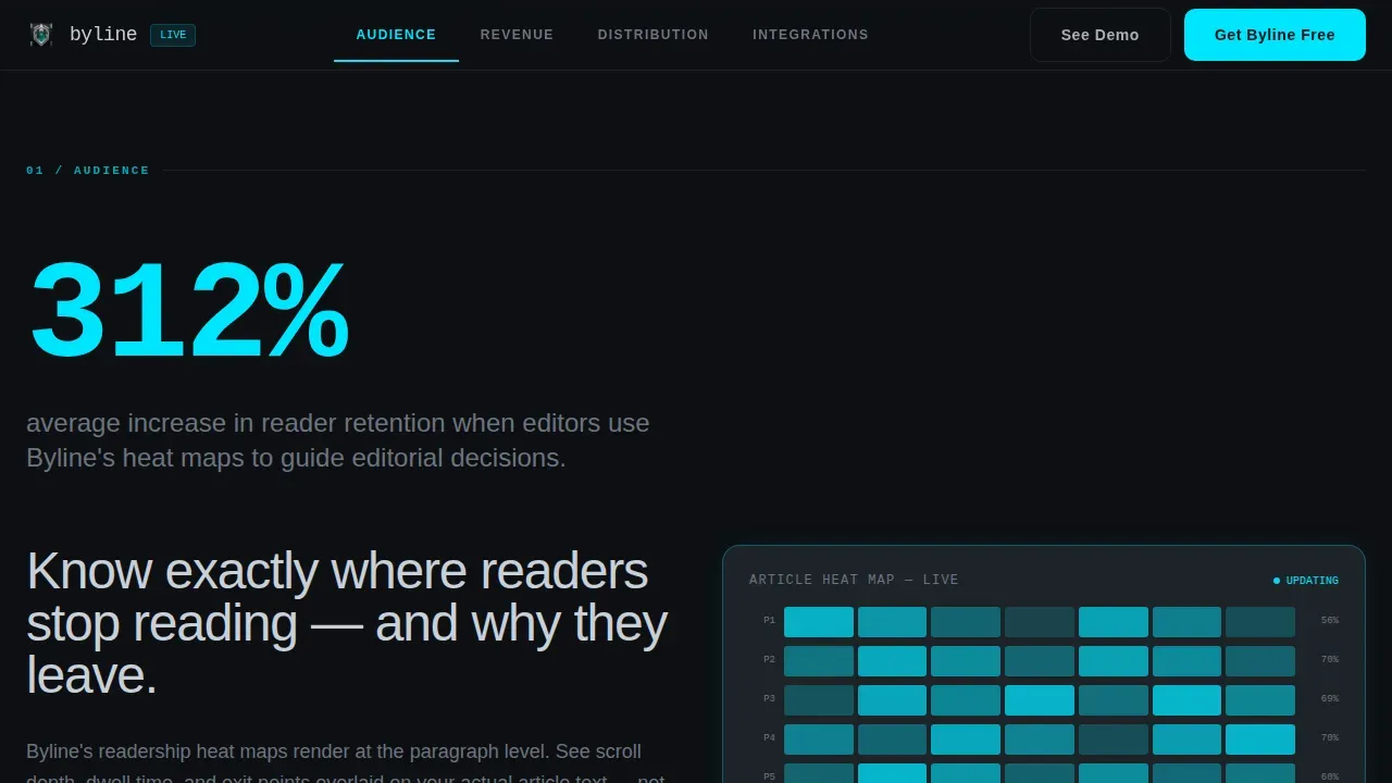
Each of the four spoke sections opens with a single oversized metric in electric cyan before any explanatory text appears. The stat lands first, then the supporting feature description and interface screenshot fade in around it. This Stats-First Impact approach means visitors experience the app works before they read about it, creating a rhythm that mirrors flipping through a real-time earnings report.
Dual call to action Conversion Path
The page features two conversion paths. The primary call to action, "Get Byline Free," appears first beneath the header and then persists as a floating bottom bar on mobile viewports. Tapping the call to action button opens a smart-route interstitial that detects the operating system and routes to the correct app store. A secondary text link, "See It With Your Data," leads to a sixty-second interactive demo pre-loaded with sample newsroom metrics.
Social Proof Block
The template includes a dedicated social proof area designed to hold editor and reporter quotes alongside logos of recognized news organizations. Quotes from editors or reporters demonstrate how the tool improved their workflow, encouraging users to trust the product before they tap the download link. This block follows best practice for app landing pages: surface real voices before asking for the install.
Integrated Demo Sign-Up Form
A lightweight sign-up path allows potential customers to request a demo with minimal friction. The form is intentionally simple, matching the best practice of a one-to-three field sign-up that does not interrupt the scrolling experience. This path exists alongside the primary app download route, giving potential users a lower-commitment option before committing to a full app download.
Page sections overview
| Section | Purpose |
|---|---|
| Dark Header Hero | Introduces the app with a glowing phone mockup, live-data screen, and the core headline at the top fold |
| Anchor Nav Rail | Pins four spoke labels to the top so users can jump to the section matching their role |
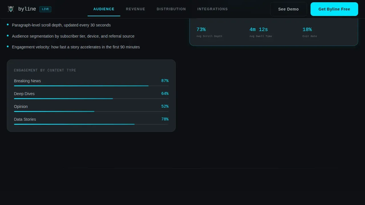
| Audience Spoke | Opens with an oversized reader-retention stat, then presents readership heat map features |
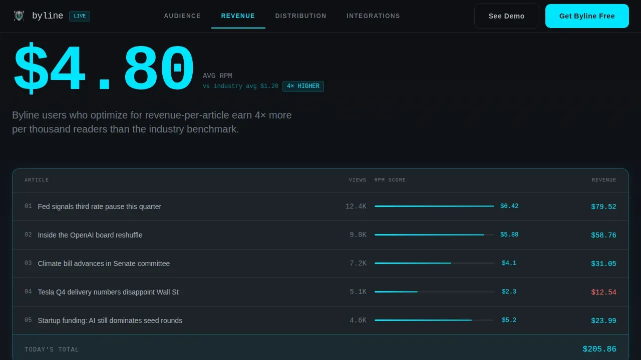
| Revenue Spoke | Leads with a revenue-per-article metric, then explains how the app translates data into informed decisions |
| Distribution Spoke | Shows a distribution performance stat first, then covers reach and traffic context |
| Integrations Spoke | Opens with an integration count or uptime stat before listing compatible platforms |
| Social Proof Strip | Holds editor quotes and news organization logos to build trust near the conversion point |
| Demo Sign-Up Form | Offers a short one-to-three field form for visitors who want to see it with their own data |
| Primary call to action Block | Houses the "Get Byline Free" download buttons with smart OS routing |
| Floating Mobile Bar | Persists the call to action button at the bottom of mobile viewports throughout the scroll journey |
Design & branding system
Byline uses a Dashboard Pro theme built on a Monochrome Steel color system. The palette is described in the brief as feeling like the inside of a server rack at midnight: metallic, temperature-controlled, and intentional. Every color choice signals function, not decoration.
- The four palette values are forge-black (#0D0F12) for page backgrounds, gunmetal chassis (#1E2328) for card and surface layers, brushed-steel (#A8B0B8) for body copy and readable fonts in body text, and electric cyan (#00E5FF) reserved exclusively for live data points, active nav states, and call to action surfaces.
- Backgrounds run in subtle forge-black-to-gunmetal gradients; the brand colors are applied consistently so users instantly associate cyan with action and data, never with decoration or eye candy.
- White space is used deliberately between stat blocks and feature descriptions, giving the eye more space to land on each number before the supporting copy appears.
Mobile & speed optimization
The template is built mobile-first. The entire layout follows a vertical orientation aligned with natural scrolling behavior, and all interactive elements are sized for one-handed navigation. A mobile app landing page that targets busy news professionals must load quickly. Slow load times cause high bounce rates, and this template is structured to keep page weight low.
- The floating bottom bar keeps the call to action button visible at all times on mobile devices, so visitors never lose the download link while scrolling through spoke sections.
- High-quality screen mocks are positioned to show key dashboards on a mobile device while maintaining a clean, uncluttered layout across different devices and screen sizes.
- The page structure adapts across mobile and desktop viewports, ensuring a seamless user experience whether a media CFO opens it on a phone at 6 AM or on a desktop app browser in the office.
How this template helps you convert
A good app landing page does more than display features: it moves a visitor from curiosity to confidence to action. This template is designed so that by the time someone reaches the download buttons, they have already experienced the product's intelligence through the page itself.
- Every spoke section leads with a hero stat, so the clear value proposition lands before any body copy asks for trust. Visitors are convincing themselves as they scroll, which is a more effective approach than asking them to believe a headline first.
- The dual-path conversion model, a primary call to action button routing to the correct app store and a secondary demo path, means the page is driving conversions from two directions simultaneously, capturing both the ready-to-download visitor and the potential customer who wants proof first.
- Social proof from editor quotes and newsroom logos, combined with a clear call to action and concise copy throughout, builds the kind of compound credibility that boost conversions on media-focused landing pages more effectively than feature lists alone.
Other information about this template
This section covers additional context that supports practical decisions around using, customizing, and launching this template.
- The template is a hub-and-spoke anchor-nav landing page, not a full website or a multi-page site. It functions as a single focused page built around one conversion goal: the app download.
- App landing page examples from well-known products offer useful reference points for what works. Nike's app landing page is action-oriented and uses a QR code for direct store access. Fetch Rewards uses a sticky QR code alongside playful imagery. Headspace's landing page leans on white space and minimal design. Calm's page asks personalized questions to draw visitors in. Rocket Money leads with a catchy headline and concise copy. Monarch Money and QuickBooks both use social proof prominently, with logos and testimonials. Steady's page and YNAB's page show how quotes and conversational body copy build trust in financial tools. Spotify reduces friction with a free trial offer. These app landing page examples are useful for understanding how the Byline template fits into a broader landscape of high-converting mobile app landing page design.
- The Byline real time newsroom analytics mobile app landing page template is identified in this marketplace by the template title: Byline real time newsroom analytics mobile app landing page template.
- The Stats-First Impact creative direction means the page structure rewards fast readers. Each hero stat functions like a blog post headline: it tells you the result before the story explains how.
- The smart-route interstitial on the call to action handles iOS and Android detection, so a single download link sends each visitor to the right store without extra steps.
- Push notifications for breaking news or when a story goes viral are part of the analytics app's feature set, and the template's spoke sections can be used to surface this capability clearly.
- The page can also reference how the app empowers users on social media platforms by tracking which stories generate the most referral traffic.
- The desktop app use case can be noted in the Integrations spoke, clarifying that a desktop app version exists alongside the mobile build.
- App downloads are the primary conversion goal, and app benefits should be stated with clear metrics throughout each spoke section for maximum impact.
- A well-designed app landing page can significantly enhance online traffic, lead retention, and brand visibility, making it a powerful tool for user acquisition from search results and referral traffic alike.
- The template structure makes it straightforward to add bullet points to feature descriptions, use strong headlines at each spoke, and apply the best practice of keeping all essential information visible without requiring a visitor to visit the home page of a full website first.
- Key takeaways from top-performing landing pages confirm that encouraging users with personalized recommendations, clear metrics, and low-friction demo paths consistently improves conversion rates and user engagement.
Theme
Dashboard Pro
Creative direction
Stats-First Impact
Color system
Monochrome Steel
Style
Hub & Spoke (Anchor Nav)
Direction
App Download
Page Sections
Stats-first Hero Header with Glow Effect
Anchor Navigation with Active State Signaling
Hero-stat Section Rhythm Across All Spokes
Dual-path Call to Action with Smart OS Routing
Social Proof and Editorial Credibility Block
Lightweight Demo Sign-up Form
Related questions
Who is the Byline template designed for?
Can I use this template before my app launches?
How does the dual call to action conversion path work?
Does this template include a working analytics dashboard?
What makes this a good app landing page for a news product?



