API-First Enterprise Software Specialist Cost Calculator Website Template
Endpoint is a hub-and-spoke landing page template built for an API-first warehouse management system. It opens with a live integration estimator, anchors navigation to performance metrics, and stacks comparison tables through every spoke section. The Tech Glass visual system and glassmorphic design give it a precise, data-center aesthetic that resonates with technical buyers immediately.
by Rocket studio
Quick summary
Endpoint is a single-page, anchor-nav landing page template designed for an API-first warehouse management system. It leads with a working calculator that outputs real integration estimates before a visitor scrolls. Every spoke section frames a core performance metric as the hero, backed by comparison tables and architecture diagrams. The result is a page that persuades through stacked evidence, not narrative alone.
Who this template is for
This template is built for technical and operational buyers who evaluate software on proof, not promises. It speaks directly to people who have outgrown legacy systems and want a WMS that fits their existing stack.
- Integration engineers at mid-market third-party logistics providers tired of maintaining SOAP wrappers and brittle middleware
- Operations directors at direct-to-consumer brands whose order volume has broken a spreadsheet-based WMS
- Chief technology officers at logistics startups who need a warehouse management system that fits a microservices architecture
What problem this template solves
Legacy warehouse management systems create friction at every layer. They require dedicated desktop clients, heavyweight middleware, and multi-week implementation cycles that stall modern fulfillment operations.
- Technical buyers cannot quickly compare API response times, webhook reliability, and sync frequency against their current system in one place
- Marketing pages built on narrative copy fail to qualify high-intent engineers who need data before they book a demo
- Traditional landing pages bury the integration value proposition behind feature lists instead of surfacing it at the top of the page
What you get with this template
You get a fully structured, glassmorphic hub-and-spoke landing page that puts measurable proof front and center. Every section is designed to qualify technical leads and move them toward a free integration audit.
- A live calculator header that estimates API call volume, pick-accuracy delta, and integration time in hours based on visitor inputs
- Four metric-labeled spoke sections, each anchored by a comparison table contrasting the API-first WMS against legacy alternatives
- A three-field audit form placed at the calculator output and repeated at the final spoke, with a sticky secondary call to action in the anchor nav
Feature list
This template packs deliberate, purpose-built components into a single cohesive page. Each element earns its place by supporting the conversion goal.
Live Integration Estimator Header
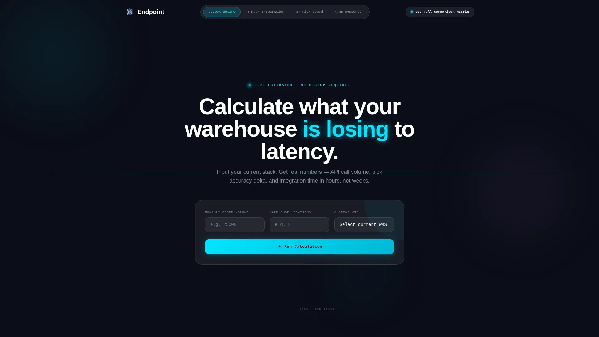
A frosted-glass calculator panel sits centered on the void-black background at the top of the page. Visitors enter monthly order volume, number of warehouse locations, and their current WMS from a dropdown. On submission, three output cards animate into view showing estimated API calls per month, projected pick-accuracy improvement, and integration time in hours.
Metric-Anchored Navigation Bar
The anchor nav is a frosted pill bar fixed to the top of the viewport. Its spoke labels read as performance stats: "99.98% Uptime," "4-Hour Integration," "3x Pick Speed," and "47ms Response." Clicking any label glides the visitor to the matching spoke section, keeping the page scannable without full-page scrolls.
Spoke Sections with Comparison Tables
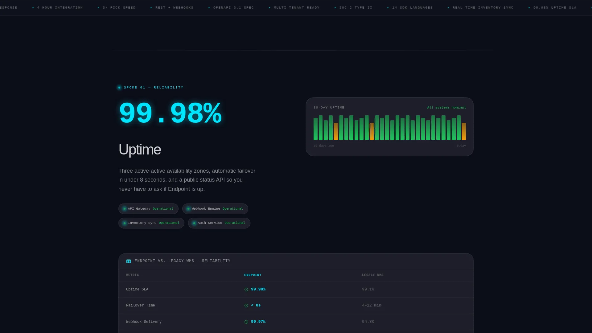
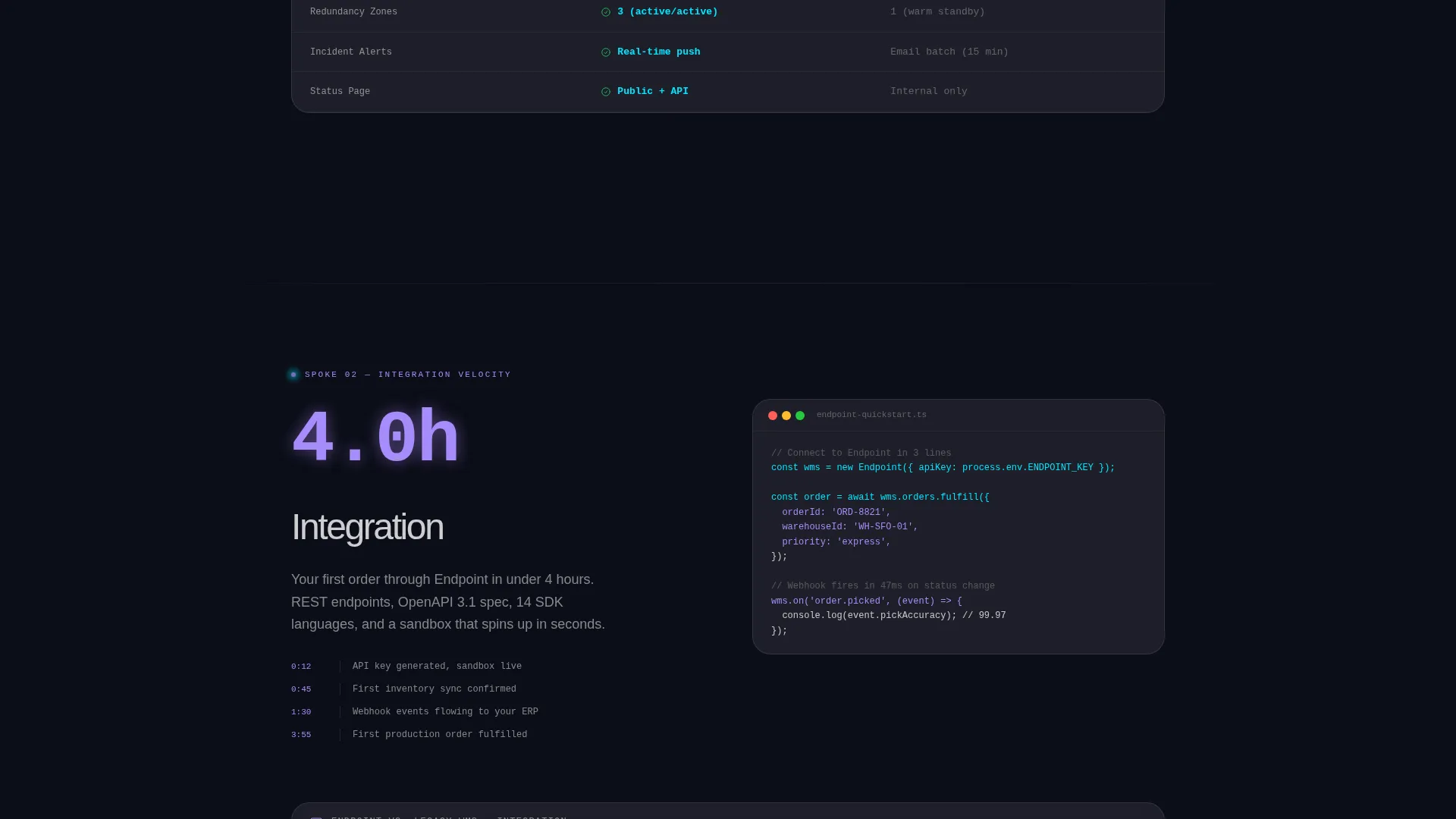
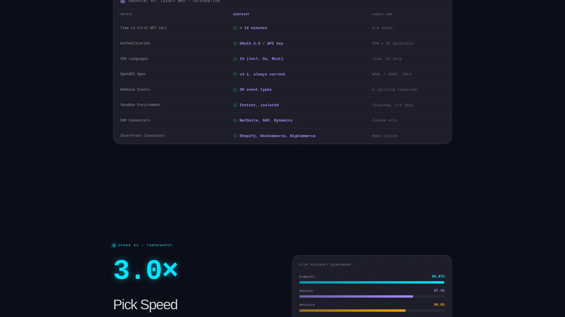
Each spoke section leads with its headline metric as the visual hero. Beneath it, a versus table compares the API-first WMS against a legacy WMS across named, specific metrics such as API response time, webhook reliability, inventory sync frequency, and software development kit language support.
Three-Field Integration Audit Form
The primary call to action is "Run a Free Integration Audit." The form asks only for current WMS name, primary integration type, and monthly order volume. A single line beneath the submit button reads: "Average audit turnaround: 22 minutes. No call required."
Sticky Secondary Call to Action
A persistent "See Full Comparison Matrix" button lives inside the fixed anchor nav. It remains visible throughout the entire scroll, giving visitors a low-friction second conversion path alongside the primary audit form.
Glassmorphic Card System
Every card surface uses frosted panel white at 8% opacity with a 1-pixel rgba white border. Backgrounds blur the layer beneath them so each surface appears to float. Signal cyan highlights live data and interactive elements, while soft lavender marks differentiation callouts throughout the page.
Page sections overview
| Section | Purpose |
|---|---|
| Calculator Header | Estimate integration value before scrolling |
| Anchor Nav Bar | Jump to any metric-led spoke section |
| 99.98% Uptime Spoke | Prove reliability with architecture diagrams |
| 4-Hour Integration Spoke | Show speed advantage over legacy onboarding |
| 3x Pick Speed Spoke | Compare accuracy metrics against old WMS |
| 47ms Response Spoke | Benchmark latency with live comparison table |
| Integration Audit Form | Qualify and convert technical leads |
Design & branding system
The visual identity follows a Tech Glass theme built on a glassmorphic color system. Every element is calibrated to feel precise, data-driven, and credible to a technical audience.
- Core palette: void black (#0B0D17) as the deep background, frosted panel white (#FFFFFF at 8% opacity) for card surfaces, signal cyan (#00E5FF) for live data and interactive accents, and soft lavender (#A78BFA) for differentiation callouts
- Surface treatment: 1-pixel rgba white borders, background blur on all card layers, and a floating depth effect that makes each panel appear to sit a millimeter above the layer behind it
- Accent logic: signal cyan drives attention to live outputs and interactive states; soft lavender marks secondary highlights so the two colors never compete
Mobile & speed optimization
The layout is structured to remain clear and functional across screen sizes. The frosted-glass panel system adapts to narrower viewports without losing the layered depth effect.
- The fixed anchor nav collapses gracefully on smaller screens so metric labels remain tappable without crowding the viewport
- Comparison tables are designed for horizontal scrolling on mobile, keeping all versus columns intact and readable rather than collapsing them into stacked text
How this template helps you convert
The page is engineered around a Comparison/Versus conversion strategy. Proof accumulates with every scroll, reducing the need for a prospect to leave the page in search of validation.
- The estimator at the top delivers personalized output before a visitor has scrolled, creating immediate investment in the page and reducing early bounce.
- Metric-labeled spoke sections let technical buyers self-navigate to the data point most relevant to their evaluation criteria, increasing time on the section that matters most to them.
- The three-field audit form removes qualification friction by asking only the minimum information needed, and the "22 minutes, no call required" line directly addresses the most common objection from time-constrained engineers.
Other information about this template
This template is purpose-built for the API-first enterprise software category and fits naturally within the warehouse management system and logistics technology market. It can support product teams presenting RESTful application programming interface capabilities to integration engineers and operations leaders.
- The hub-and-spoke anchor navigation structure makes it straightforward to add or reorder spoke sections if your product roadmap evolves
- The comparison table layout is flexible enough to swap in different metric rows without breaking the visual system
- The template is designed inside a Tech Glass theme that positions the product as modern infrastructure rather than off-the-shelf software
Theme
Tech Glass
Creative direction
Stats-First Impact
Color system
Glassmorphic
Style
Hub & Spoke (Anchor Nav)
Direction
Comparison/Versus
Page Sections
Live Integration Estimator
Metric-anchored Anchor Nav
Versus Comparison Tables
Three-field Audit Conversion Form
Glassmorphic Card System
Sticky Secondary Call to Action
Related questions
Can I customize the calculator inputs and output cards?
Do I need to wire up a real backend for the estimator to work?
How many spoke sections does this template include?
Can the comparison tables be updated without redesigning the page?
Is this template suitable for a SaaS product that is not a warehouse management system?



