Nexus — API Integration Landing Page Template
Endpoint is a hub-and-spoke API reference landing page built for developers who need a fast, scannable portal covering routes, methods, and webhooks. The Tech Glass visual identity uses void black, electric chartreuse, and phosphor cyan to create a heads-up-display feel. Interactive spoke cards, a live dashboard preview header, and a clear SDK download flow make this template immediately useful.
by Rocket studio
Quick summary
Endpoint is a single-page API reference landing page designed for developer-facing products. It organizes every route, method, and webhook into anchor-navigated spoke sections. The Tech Glass aesthetic, Acid Digital color system, and Stats-First layout earn technical trust before asking for anything. A prominent SDK download flow and sandbox link complete the conversion path.
Who this template is for
This template is built for technical builders who need a professional, fast-to-read API reference page. It suits projects where clarity and developer confidence matter as much as visual polish.
- Indie developers building commerce plugins who need a clean reference they can keep open while coding
- Agency engineers syncing inventory to external fulfillment systems and juggling multiple API calls daily
- SaaS founders piping order data into custom dashboards who want to share clear documentation with their team
What problem this template solves
Most API documentation pages are either too plain to inspire confidence or too cluttered to navigate quickly. Developers lose time hunting for the right endpoint or decoding poorly formatted response examples. This template solves that by giving every route its own glass card, every method its own visual badge, and every section its own anchor link.
- No more walls of text: collapsible request and response examples keep the page skimmable without hiding detail
- No more ambiguous method labels: color-coded badges make GET, POST, and DELETE instantly recognizable at a glance
- No more lost conversions: a sticky bottom bar and a clear SDK download section keep the call to action visible throughout the scroll
What you get with this template
You get a fully structured, single-page developer portal laid out as a hub-and-spoke architecture. The hub is the anchor navigation bar. The spokes are themed glass card sections covering Authentication, Commerce, Inventory, Webhooks, and Profiles.
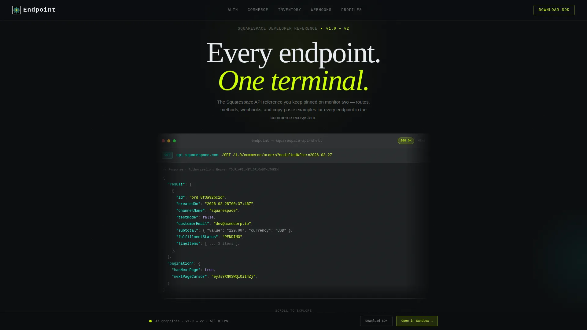
- A full-viewport Dashboard Preview header with a syntax-highlighted JSON mock, a pulsing status badge, and a latency counter
- Five spoke sections, each with method badges, collapsible code examples, and copy-to-clipboard buttons
- An SDK download block with platform toggle pills for npm, pip, and gem, plus a single email field for API key delivery
Feature list
This template ships with a focused set of components drawn directly from the brief. Each one serves a clear function in the developer-portal experience.
Interactive Dashboard Preview Header
The header renders a full-viewport mock of a developer console showing a live-formatted JSON response. A pulsing chartreuse status badge and a latency counter reading 43ms communicate speed and reliability before a visitor reads a single line of copy. A blinking cursor in the request bar invites interaction from the first second on the page.
Stats-First Impact Section
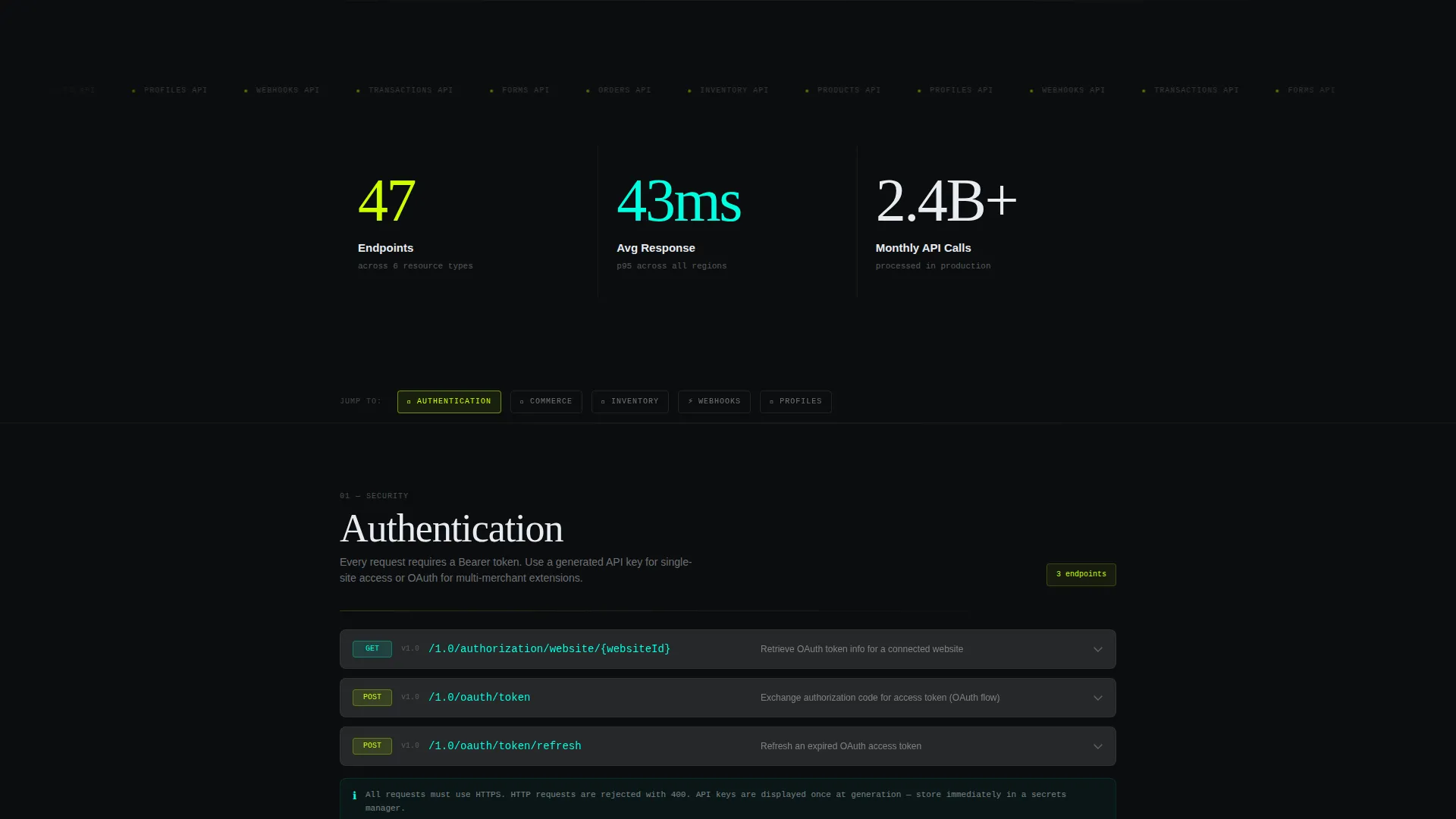
Three large animated counters sit immediately below the fold. They display endpoints available, average response time, and monthly API calls processed. The counters animate upward on scroll, landing like a data-driven argument for using the API before any prose explanation is needed.
Hub and Spoke Anchor Navigation
A persistent anchor navigation bar links to each spoke section by name. Developers can jump directly to Authentication, Commerce, Inventory, Webhooks, or Profiles without scrolling through unrelated content. This structure rewards purposeful navigation and suits users who already know what they are looking for.
Glass Card Spoke Sections
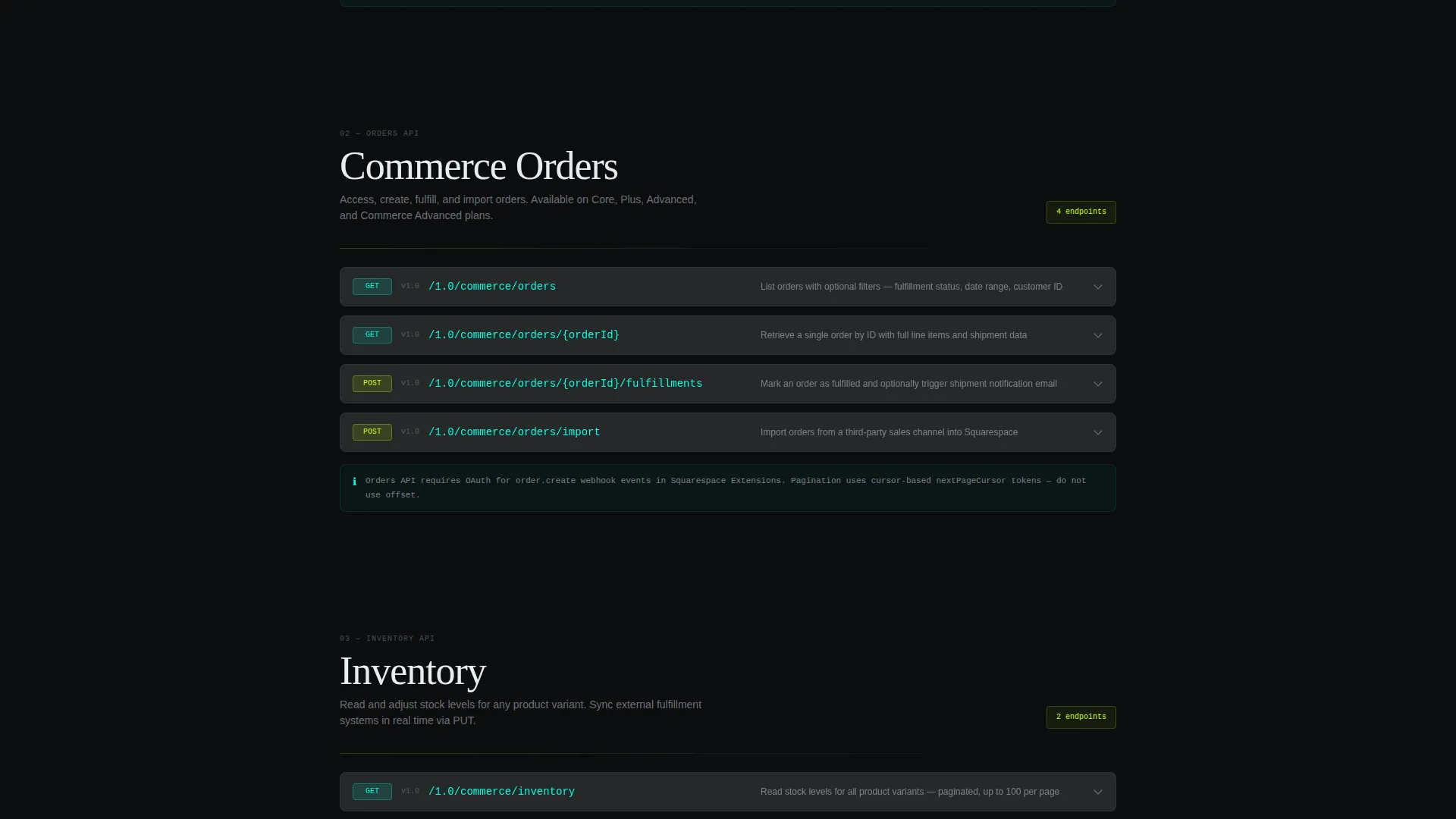
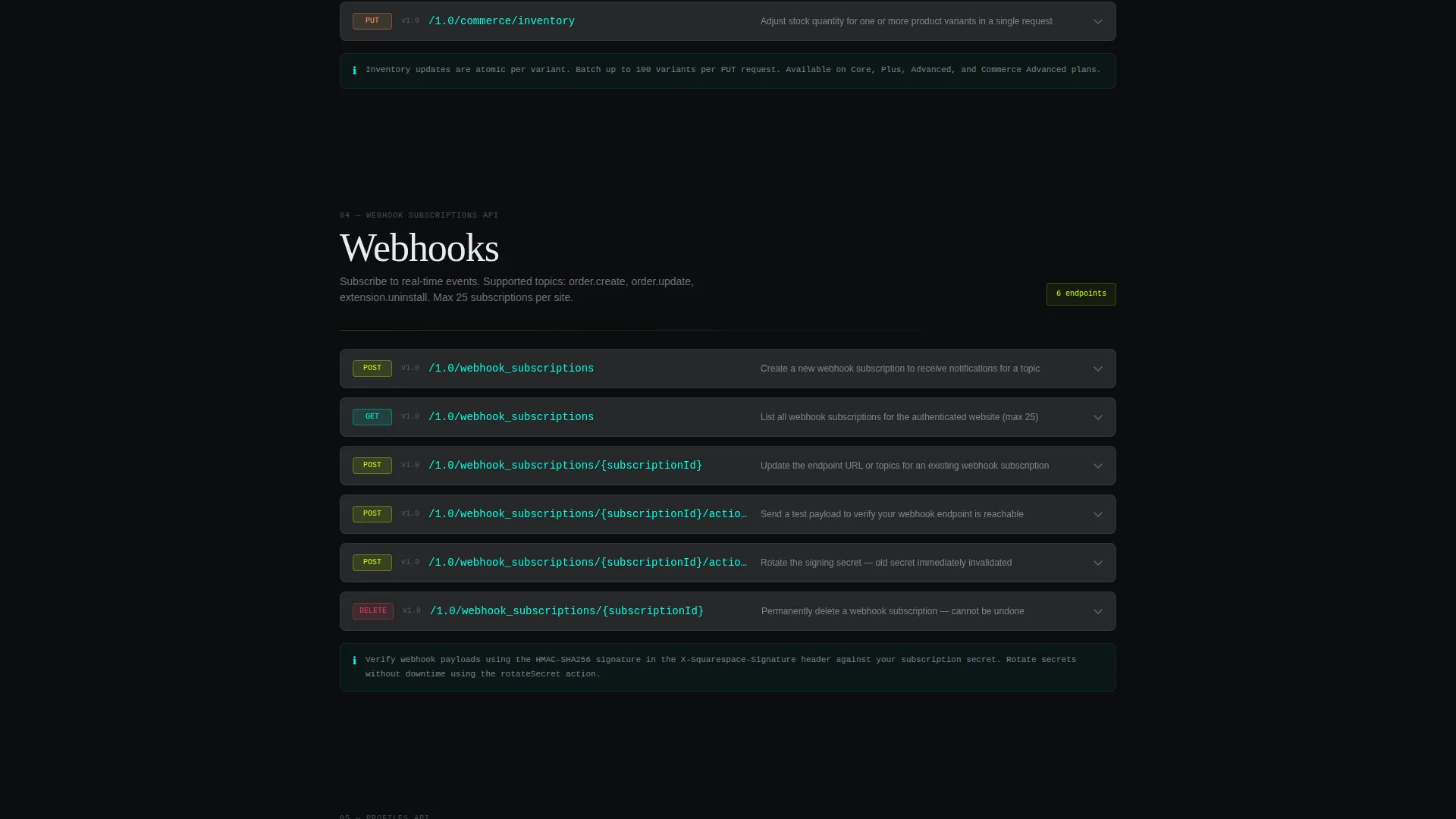
Each spoke opens as a frosted glass card with method badges color-coded by type. GET badges appear in phosphor cyan, POST badges in electric chartreuse, and DELETE badges in a vivid warning red. Collapsible request and response blocks keep the card clean while still exposing full code detail on demand.
SDK Download and API Key Flow
The primary call-to-action block presents an SDK download prompt with platform toggle pills for npm, pip, and gem. A single email field labeled "Send me the API key" sits directly below. This pairing reduces friction by letting a developer grab the tool and request credentials in one focused interaction.
Sticky Sandbox call to action Bar
After the second spoke section, a sticky bottom bar reappears carrying a secondary call to action labeled "Open in Sandbox." The bar persists as the visitor scrolls deeper into the documentation, keeping a low-friction next step visible without interrupting the reading flow.
Page sections overview
| Section | Purpose |
|---|---|
| Dashboard Preview Header | Full-viewport JSON mock with status badge and latency counter |
| Stats Impact Row | Three animated counters proving speed and scale |
| Anchor Navigation Hub | Sticky nav linking to each spoke section by name |
| Authentication Spoke | Glass card covering auth routes and methods |
| Commerce Spoke | Glass card covering order and commerce endpoints |
| Inventory Spoke | Glass card covering inventory sync routes |
| Webhooks Spoke | Glass card covering webhook event types and payloads |
| Profiles Spoke | Glass card covering profile and user-data endpoints |
| SDK Download Block | Platform pills, email field, and primary download call to action |
| Sticky Sandbox Bar | Persistent secondary call to action linking to the interactive playground |
Design & branding system
The visual identity follows a Tech Glass theme powered by an Acid Digital color system. The palette is built to feel like a heads-up display projected onto a dark windshield, with information floating in luminous layers against a near-black background.
- Void black (#0B0D0F) serves as the primary background, keeping the interface immersive and distraction-free
- Electric chartreuse (#CCFF00) marks active states, POST badges, and syntax highlights, while phosphor cyan (#00FFE0) handles hover trails, GET badges, and secondary accents
- Frosted panel white (#E8ECF1) at 12% opacity creates the glass-card surface effect, giving each spoke section a sense of physical depth
Mobile & speed optimization
The layout is designed to stay readable and navigable on smaller screens. The anchor navigation and sticky call to action bar adapt to the vertical scroll pattern that mobile developers use when referencing documentation on a second device.
- Glass cards reflow cleanly so collapsible code examples remain usable on narrow viewports
- The stats row and dashboard preview header scale proportionally without losing the visual impact that earns initial trust
- Platform toggle pills and the email field are large enough for comfortable tap interaction on touchscreens
How this template helps you convert
The conversion path is built around earning trust with data before presenting any request. The template sequences the experience so that every section moves a developer one step closer to downloading the SDK or opening the sandbox.
- The dashboard preview header and animated stats counters establish credibility immediately, showing the API is fast and already handling real scale before the visitor sees any marketing language
- The spoke sections let developers self-qualify by exploring only the endpoints relevant to their project, which builds confidence and reduces the cognitive load that typically kills sign-up momentum
- The sticky sandbox call to action and the SDK download block remove the gap between interest and action by keeping a clear next step visible at every scroll depth
Other information about this template
This template is purpose-built for the Squarespace API reference use case and fits naturally within the Documentation and Support category. It is a strong fit for teams publishing Squarespace documentation for third-party developers or partner integrations.
- The template is categorized under Squarespace Documentation and is designed specifically for the Squarespace API reference niche
- It supports a hub-and-spoke anchor navigation structure, which is well suited to reference content with multiple parallel topic areas
- The Endpoint template is built on the Tech Glass theme and uses the Acid Digital color system, making it visually distinct from generic documentation layouts
Theme
Tech Glass
Creative direction
Stats-First Impact
Color system
Acid Digital
Style
Hub & Spoke (Anchor Nav)
Direction
App Download
Page Sections
Interactive Dashboard Preview Header
Stats-first Animated Counters
Hub and Spoke Anchor Navigation
Color-coded Method Badges
SDK Download with Platform Toggle
Sticky Sandbox Call to Action Bar
Related questions
What type of page is this template?
Can I change the spoke section topics?
What does the SDK download block include?
Is the dashboard preview header a live API connection?
Who is this template best suited for?



