Nexus — Carrier Connectivity Landing Page Template
Uplink is a comparison-focused landing page template built for telecommunications training platforms. It pairs a cinematic Tech Glass visual identity with a structured side-by-side comparison table, scroll-triggered animations, three carrier case study blocks, and a two-step pilot capture modal, giving L&D decision-makers everything they need to evaluate and act.
by Rocket studio
Quick summary
Uplink is a single-page comparison landing page template designed for telecom training platforms. It opens with a browser-frame product screenshot, moves through an industry-report narrative, and centers on a twelve-dimension comparison table. Scroll-triggered frosted-glass animations, a persistent call to action, and a two-step modal make evaluation and conversion feel effortless for enterprise buyers.
Who this template is for
This template is built for teams selling or positioning a telecommunications training platform to enterprise and mid-market buyers. It speaks directly to the people who evaluate training tools and justify budget decisions.
- Learning and development directors at regional carriers or national mobile network operators managing large, distributed technical workforces
- Product marketers and sales engineers who need a polished competitive asset that works in outbound campaigns and live demos
- Platform founders or product leads at telecom software companies launching a new training solution into a crowded market
What problem this template solves
Telecom training buyers are skeptical. They have seen generic learning management system demos before, and they need hard evidence before they move budget. A standard feature-list page does not close that gap. This template frames the problem at an industry level and then answers it with structured, scannable comparison data.
- Decision-makers struggle to justify switching costs without a direct, credible comparison against familiar alternatives
- Generic landing pages fail to reflect the technical depth that network operations center technicians and field engineers expect
- Sales cycles stall when evaluators cannot extract a clear business case to share internally
What you get with this template
You get a fully structured, single-page layout that guides a technical buyer from problem awareness to pilot sign-up. Every section is purposeful, and the visual system reinforces platform credibility at every scroll point.
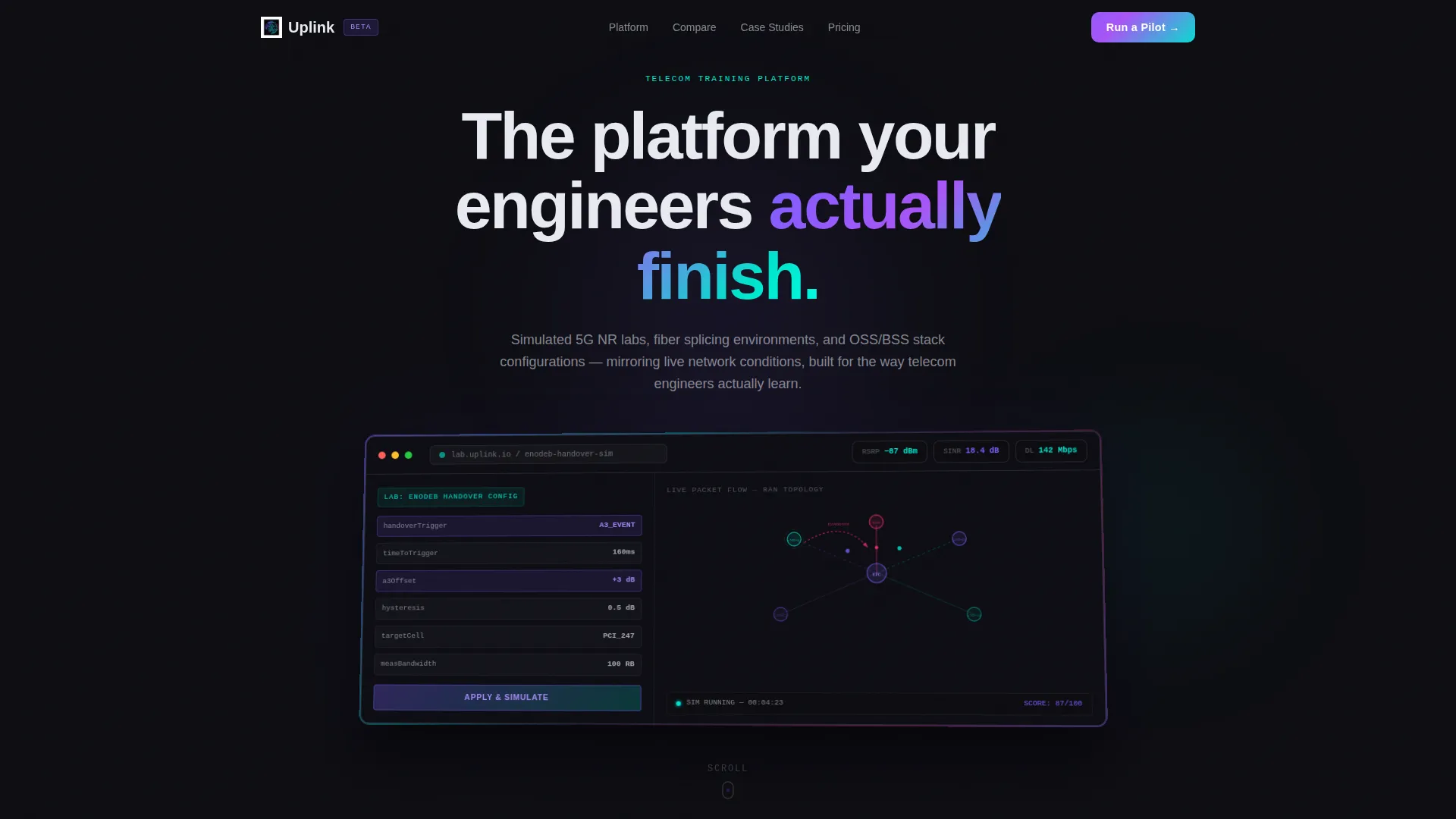
- A full-width product screenshot header showing a live lab simulator session with key performance indicator gauges and a network topology map
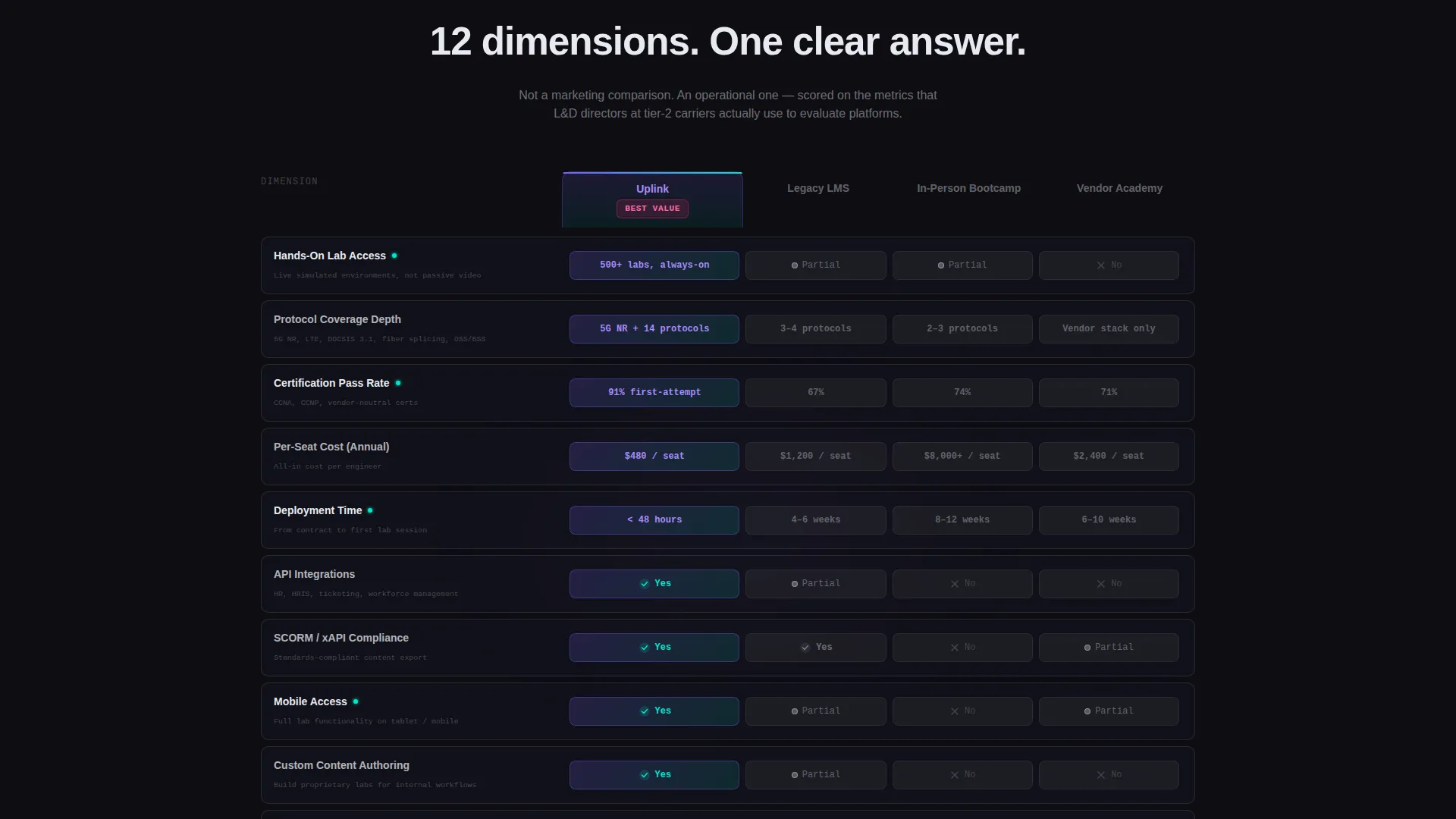
- A twelve-dimension comparison table scored across hands-on lab access, protocol coverage depth, certification pass rates, per-seat cost, deployment time, API integrations, SCORM compliance, mobile access, custom content authoring, reporting granularity, learner NPS, and enterprise single sign-on
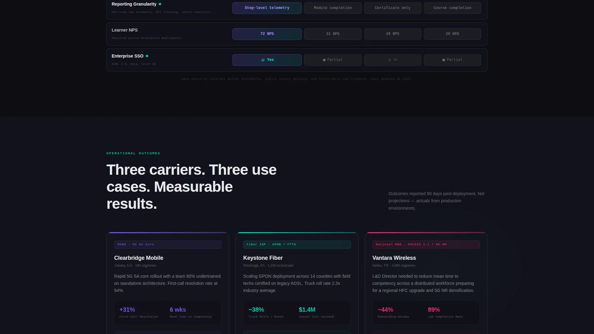
- Three mini case studies grounded in real carrier types, a mobile virtual network operator, a regional fiber internet service provider, and a national mobile network operator, with operational outcomes tied to each
Feature list
This section describes the core built-in components and interaction patterns included in the Uplink template.
Cinematic Product Screenshot Header
The header displays a full-width browser frame on a slight three-dimensional tilt against an obsidian background. A live lab simulator scene fills the frame: an engineer configuring a handover parameter on the left panel, a packet-flow topology map animating on the right, and RSRP, SINR, and throughput gauges glowing across the top rail. A soft iridescent light leak runs along the frame edges, and the headline fades in above the screenshot on load.
Scroll-Triggered Comparison Table
The template's centerpiece is a twelve-row comparison table pitting the platform against legacy learning management systems, in-person bootcamps, and vendor-specific academies. Each row slides in with a frosted-glass reveal animation as the visitor scrolls. Competitor cells render in muted gray while platform cells pulse with the prismatic violet-to-teal gradient, making advantages instantly readable without requiring any text explanation.
Persistent Pilot call to action Bar
Once a visitor scrolls past the third table row, a "Run a Side-by-Side Pilot" call-to-action button pins to the bottom of the viewport. The button glows with the violet-to-teal gradient and remains visible throughout the rest of the page, reducing the distance between intent and action at any scroll depth.
Two-Step Pilot Capture Modal
Clicking the primary call-to-action opens a two-step modal. Step one collects company name, workforce size, and current training solution via a dropdown. Step two asks for a direct email address and preferred pilot start window. The two-step structure reduces friction by separating qualification from commitment.
Gated PDF Lead Capture
A secondary text link below the main call-to-action reads "Download the full comparison as PDF." This link gates a detailed comparison report behind a single email field, converting evaluators who are researching internally but are not ready to book a pilot. It extends the page's reach into the buyer's internal business case process.
Three Carrier Case Study Blocks
Below the comparison table, three mini case studies anchor competitive claims in real operational outcomes. Each block maps to a distinct carrier type and highlights a specific result, reduced truck rolls, faster first-call resolution, or shortened onboarding windows. These blocks translate feature comparisons into business impact language that budget holders understand.
Page sections overview
| Section | Purpose |
|---|---|
| Screenshot header | Establishes platform credibility with a live lab simulator visual and a strong opening headline |
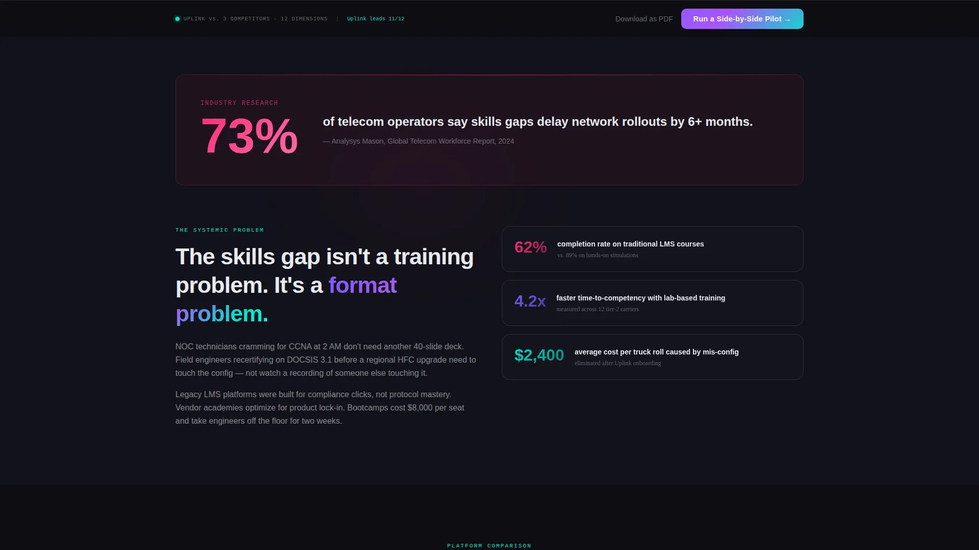
| Industry stat block | Opens the narrative with a systemic skills-gap finding to frame the problem at scale |
| Comparison table | Scores the platform against three alternatives across twelve training dimensions |
| Case study trio | Grounds table claims in carrier-specific operational outcomes for three buyer personas |
| Persistent call to action bar | Keeps the pilot sign-up action visible from table row three through the end of the page |
| PDF lead capture | Converts research-stage evaluators with a low-friction single-email gated download |
| Pilot capture modal | Qualifies and captures pilot intent through a two-step form with dropdown segmentation |
Design & branding system
The visual language is built around a Tech Glass theme powered by an AI Iridescent color palette. The result feels like light traveling through a fiber optic strand: nearly invisible at rest, then vivid and directional when activated.
- Base palette: deep obsidian (#0D0D12) backgrounds with subtle noise grain, frosted glass panel white (#E8EAF0) for cards and table rows at 12% opacity borders, prismatic violet (#7B5EFF) shifting to holographic teal (#00E5CC) on hover and gradient elements, and signal-pulse magenta (#FF2D78) reserved for competitive advantage callouts
- Interaction system: the iridescent gradient lives on scroll-triggered row highlights and the primary call-to-action button, creating the visual sensation that the interface is transmitting data as the user moves through it
- Table styling: frosted-glass cards with translucent borders keep competitor rows visually recessed while platform cells draw the eye through gradient pulsing, making the comparison scannable without requiring a legend
Mobile & speed optimization
The template is structured so that the comparison table and modal convert effectively on smaller screens, where many field engineers and network operations center technicians will encounter it during off-hours study or recertification research.
- The frosted-glass table cards reflow cleanly for narrow viewports, keeping the twelve comparison dimensions readable without horizontal scrolling
- The persistent call to action bar is sized and positioned to remain usable on mobile without obscuring key table content
- The two-step modal is designed to fit a single screen height on common mobile device sizes, reducing the need for the user to scroll inside the modal to complete both steps
How this template helps you convert
The template is built specifically for the comparison-and-pilot conversion flow. Every design decision supports moving a skeptical technical buyer from awareness to a signed pilot agreement.
- The industry-report opening stat ("73% of telecom operators say skills gaps delay network rollouts by 6+ months") reframes the conversation from product features to business risk, which is the language procurement and finance teams respond to.
- The scroll-triggered comparison table and persistent call-to-action work together to eliminate the gap between reading a convincing data row and taking action, the button is always visible the moment a visitor reaches a point of conviction.
- The two-track conversion architecture captures both ready buyers through the pilot modal and research-stage evaluators through the PDF gate, so the page generates pipeline from the full spectrum of buyer readiness.
Other information about this template
This template is designed as a standalone competitive asset that works equally well as a paid traffic destination, a sales enablement URL shared in outbound sequences, or a leave-behind linked from a proposal document.
- The dropdown in step one of the pilot modal pre-segments leads by current training solution, giving sales teams immediate context before the first follow-up call
- The case study section is built to support content updates over time, as new carrier customer stories become available, the three blocks can be replaced without restructuring the page layout
- The template style is a Comparison Table format, and the creative direction follows an Industry Report narrative structure, making it a strong fit for product-led growth motions where data credibility drives conversion
- The header concept uses a Product Screenshot approach, which signals platform maturity and reduces abstract positioning in favor of tangible, interface-level proof
Theme
Tech Glass
Creative direction
Industry Report
Color system
AI Iridescent
Style
Comparison Table
Direction
Comparison/Versus
Page Sections
Scroll-triggered Comparison Table
Cinematic Product Screenshot Header
Persistent Pilot Call to Action Button
Two-step Pilot Capture Modal
Gated PDF Lead Capture
Carrier Case Study Blocks
Related questions
Who is the primary audience for this landing page template?
Can I update the comparison table rows to match my platform's actual differentiators?
What does the two-step pilot modal collect?
Is the PDF download a separate page?
How does the persistent call to action bar behave on the page?



