Nonprofit Email Marketing Directory Website Template
Beacon is a split-screen nonprofit promotional email landing page built on a Dashboard Pro theme with an AI Iridescent color system. It gives nonprofit teams a cockpit-style command center to compose, segment, and track donor emails, all from one focused interface. The design is data-dense yet luminous, purpose-built for development directors, volunteer coordinators, and lean executive directors who need results fast.
by Rocket studio
Quick summary
Beacon is a single-page, split-screen landing page template for a nonprofit promotional email app. It pairs bold mission-driven copy with interactive demo panels so visitors feel the tool working before they ever tap download. The layout is built around a Feature Tab Switcher header and an Interactive Explorer flow that ends at a clear app download call to action.
Who this template is for
This template is designed for small to mid-size nonprofit teams who run their donor communications with limited staff and limited time. It speaks directly to people who carry the full weight of outreach on their own.
- Development directors managing multiple fundraising campaigns and donor relationships at once
- Volunteer coordinators who need fast signups and clear audience targeting before a hard deadline
- Executive directors at small nonprofits who handle marketing, outreach, and donor engagement solo
What problem this template solves
Nonprofit teams often stitch together emails using disconnected tools, with no clear view of what is working and no time to learn a complicated platform. This template solves the credibility and clarity problem that stops potential users from downloading a new app.
- Visitors arrive skeptical and leave without acting because no page ever showed them the product in motion
- Coordinators and directors cannot judge a tool from screenshots alone and need to feel it working
- A plain feature list fails to communicate simplicity, so hesitation wins over curiosity
What you get with this template
You get a fully structured, single-page landing page that puts the app experience front and center before the download ask. Every section earns visitor trust through interaction rather than assertion.
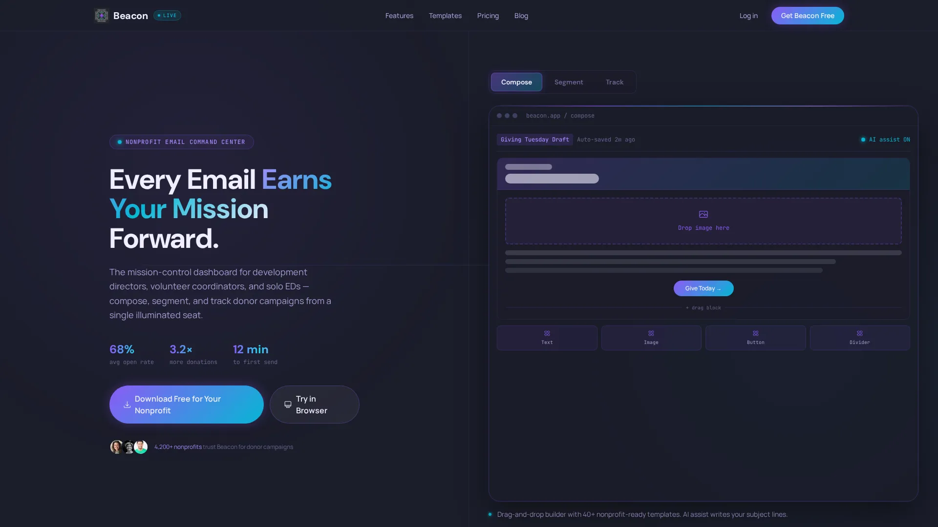
- A 50/50 split-screen layout with a Feature Tab Switcher that swaps live screenshots across Compose, Segment, and Track views
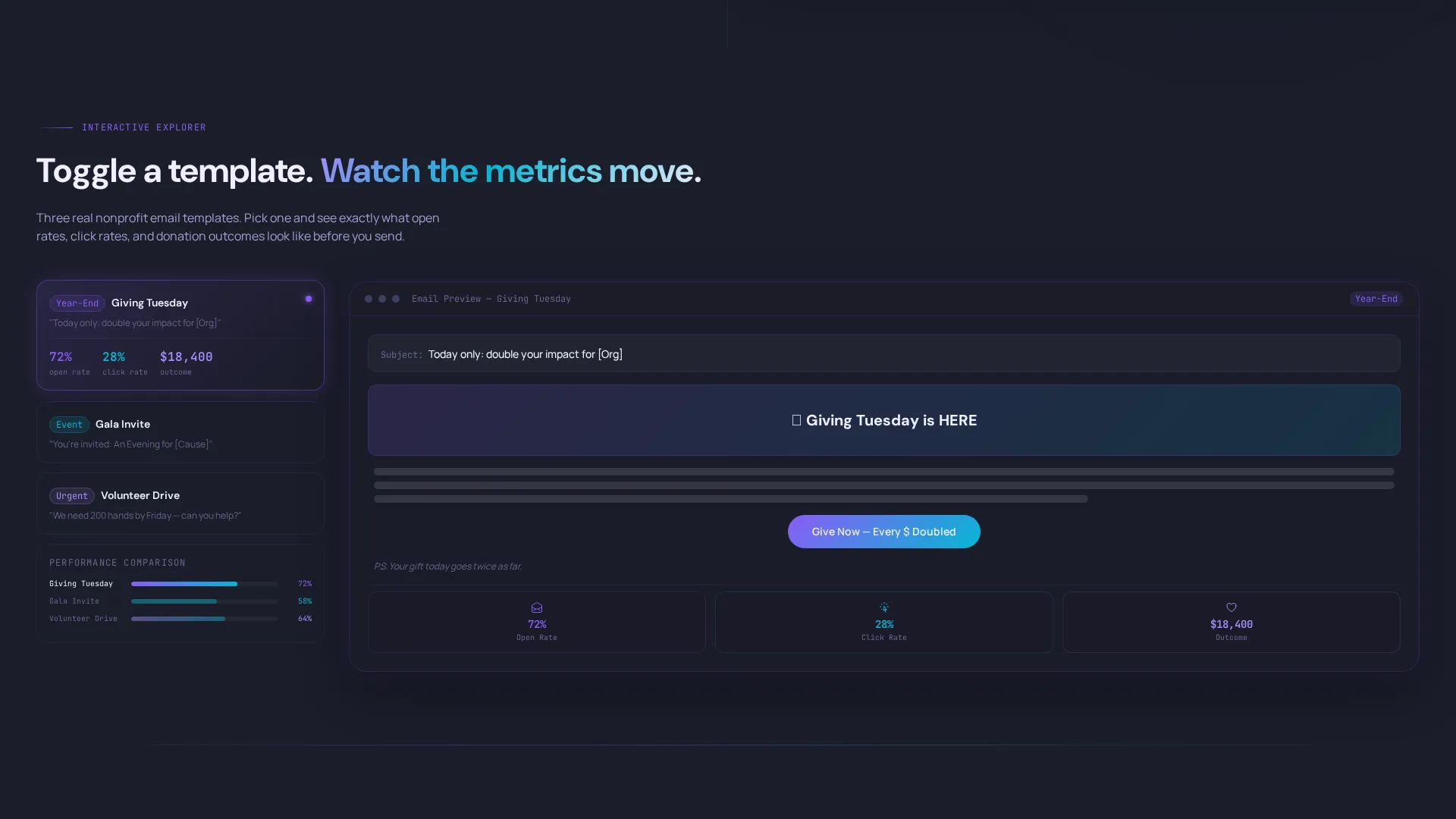
- Interactive Explorer panels where visitors toggle email templates and drag donor segments to see projected metrics change in real time
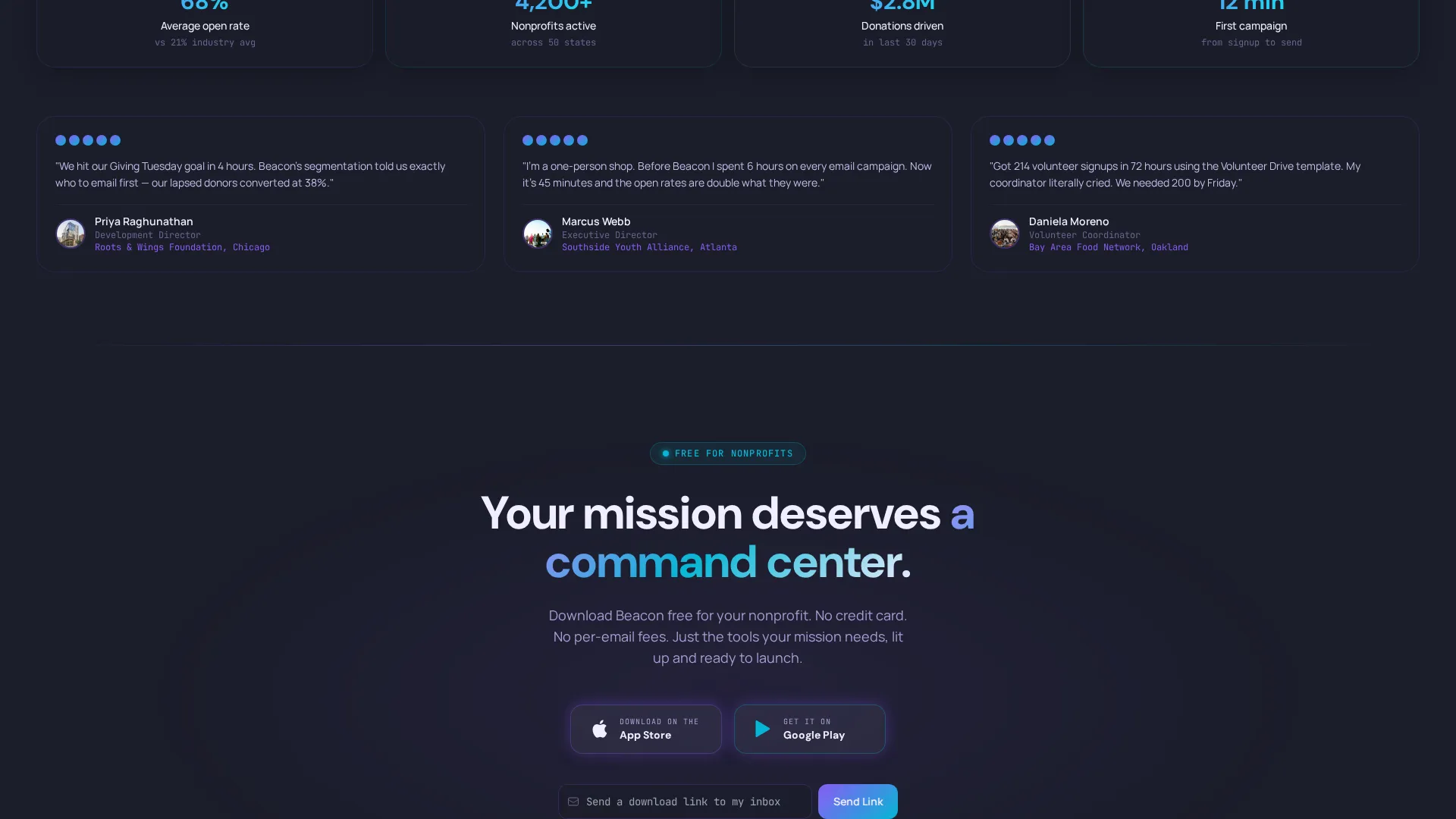
- A conversion-focused footer section with App Store and Google Play download badges, an email capture field, and a secondary "Try in Browser" path for desktop visitors
Feature list
This template includes six core building blocks that work together to move a visitor from curious to committed.
Feature Tab Switcher Header
Three clickable tabs labeled "Compose," "Segment," and "Track" sit across the top of the right panel. Each tab swap animates with a soft prismatic wipe and reveals a different product screenshot, giving visitors a guided tour without a single scroll.
Split-Screen Hero Layout
The left panel holds the bold headline "Every Email Earns Your Mission Forward" alongside primary messaging. The right panel serves as a live product preview zone. The 50/50 split keeps copy and proof side by side at all times.
Interactive Email Template Explorer
A sandbox panel lets visitors toggle between three real nonprofit email templates. As they switch, relevant metrics update alongside the preview, making the value of each template format immediately tangible.
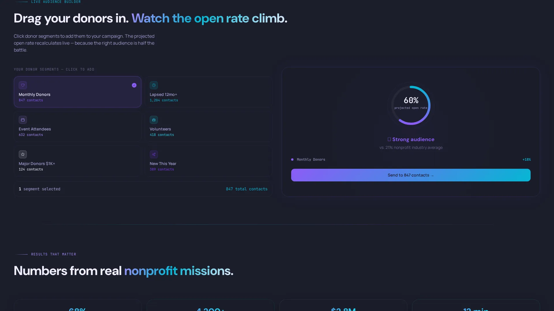
Live Audience Segment Builder
Visitors can drag donor segments into an audience builder panel and watch a projected open rate recalculate in real time. This interaction builds hands-on confidence before the download ask.
Donation Conversion Funnel Display
The Track tab surfaces a live open-rate dashboard with a donation-conversion funnel glowing teal at the bottom. It gives development directors a preview of the reporting view they will use after download.
App Download call to action Section
The primary call to action reads "Download Free for Your Nonprofit" and is paired with App Store and Google Play badges. A single email field lets visitors send a download link to themselves, and a "Try in Browser" option keeps desktop visitors in the flow.
Page sections overview
| Section | Purpose |
|---|---|
| Split-Screen Hero | Headline and product preview side by side |
| Feature Tab Switcher | Compose, Segment, Track tab navigation |
| Email Template Explorer | Toggle three nonprofit email formats |
| Audience Segment Builder | Drag-and-drop projected open rate panel |
| Track Dashboard Preview | Donation funnel and live metrics view |
| App Download call to action | Download badges, email capture, browser path |
Design & branding system
The visual identity follows a Dashboard Pro theme powered by an AI Iridescent color system. The palette feels like light refracting through a prism onto a matte-black desk: technical and luminous without ever feeling cold.
- Core colors include deep mission-control charcoal (#1B1D2A) for backgrounds, holographic violet (#8B5CF6) and shifting teal (#06B6D4) for interactive elements, and soft pearl white (#F0EEFF) for card surfaces
- Interactive elements shimmer between violet and teal on hover, mimicking the appearance of oil on water
- Donor tier audience maps use iridescent color gradients, and the conversion funnel glows teal to draw the eye toward the key metric
Mobile & speed optimization
The template is built with a mobile-first audience in mind since the primary conversion goal is an app download tap on a phone screen. Every interactive panel is designed to feel responsive and natural on smaller displays.
- The split-screen layout adapts to a stacked single-column format on mobile without losing the tab-switcher or demo panel functionality
- App Store and Google Play badges are prominently placed and tap-friendly, reducing friction at the final conversion step
- The email capture field is minimal by design, with a single input to lower the barrier for mobile visitors
How this template helps you convert
Beacon earns the download by letting visitors build something before they ever see the call to action. By the time a visitor reaches the download section, they have already invested time inside the demo panels.
- The Feature Tab Switcher turns passive scrolling into active exploration, so visitors understand the product through use rather than description.
- The Interactive Explorer panels create a sense of growing competence, and that feeling of "I can do this" is what drives the final tap on the download badge.
- The secondary "Try in Browser" path catches desktop visitors who are not yet ready to download, keeping them engaged and inside the funnel.
Other information about this template
Beacon was built specifically for the nonprofit promotional email niche, where urgency is real and resources are tight. It is part of a broader Technology category of app landing page templates designed around interactive credibility-building.
- The template sits in the Nonprofit Email Templates subcategory, making it a focused fit for organizations running donor outreach, volunteer recruitment, and campaign fundraising communications
- The Dashboard Pro theme and AI Iridescent color system are paired intentionally to signal that the app is both mission-serious and technically capable
- The Interactive Explorer creative direction was chosen because nonprofit users are often skeptical of new tools and respond better to hands-on proof than feature lists
- This template is a single-page format and works as a standalone promotional landing page for the app, not a multi-page website
Theme
Dashboard Pro
Creative direction
Interactive Explorer
Color system
AI Iridescent
Style
Split Screen (50/50)
Direction
App Download
Page Sections
Feature Tab Switcher Header
Split-screen Hero Layout
Interactive Email Template Explorer
Live Audience Segment Builder
Donation Conversion Funnel Display
App Download Call to Action Section
Related questions
Who is this landing page template designed for?
Can I customize the headline, tab labels, and copy?
What do the Interactive Explorer panels show visitors?
Does this template include both App Store and Google Play download options?
Is Beacon a single-page template or a multi-page website?



