Franchise Vertical SaaS Booking Website Template
Nexus is a franchise CRM landing page template built for enterprise operators who need total visibility across every location. The split-screen layout puts legacy tools side by side with Nexus's commanding interface, making the performance gap undeniable. Bold Brutalist design, iridescent visual accents, and a two-step demo form turn high-intent visitors into booked demos.
by Rocket studio
Quick summary
Nexus is a single-page franchise CRM template designed for franchise development directors and operations leaders. It uses a 50/50 split-screen format to compare legacy franchise tools against the Nexus platform, section by section. Each comparison row builds a sharper case for switching, ending in a two-step demo booking form and a PDF comparison gate.
Who this template is for
This template is built for B2B SaaS teams selling complex franchise operations software to senior buyers. It speaks directly to the people managing large, multi-location portfolios where small inefficiencies become large losses.
- Franchise development directors overseeing 200-unit expansion pipelines
- Multi-unit operators managing five or more brands under one holding company
- Operations VPs who need location-level risk visibility before it reaches the profit and loss report
What problem this template solves
Managing hundreds of franchise locations with traditional CRM tools creates dangerous blind spots. Royalty leakage, franchisee churn, and compliance gaps often go undetected until they appear in financial statements. This template gives your sales and marketing team a landing page that speaks to those exact pain points, using data-backed comparisons to prove the platform's superiority rather than just claiming it.
- Legacy franchise CRMs scatter data across tabs, leaving directors without a real-time picture
- Multi-brand operators lose time switching between systems that were never built for portfolio-level control
- Standard onboarding timelines stretch to three weeks, slowing rollout and increasing churn risk
What you get with this template
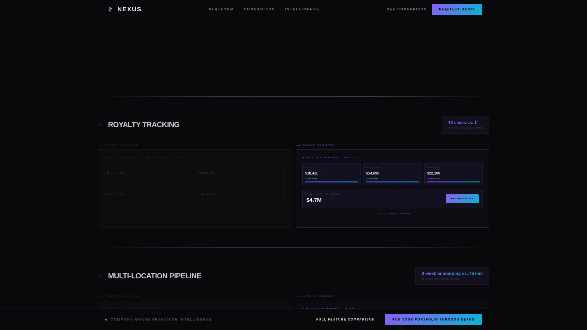
You get a fully structured, conversion-focused landing page built around a Feature Matrix creative direction. Every scroll section is a side-by-side battlefield. The left panel shows the industry-standard approach in muted chrome wireframes. The right panel shows the Nexus equivalent in full iridescent detail.
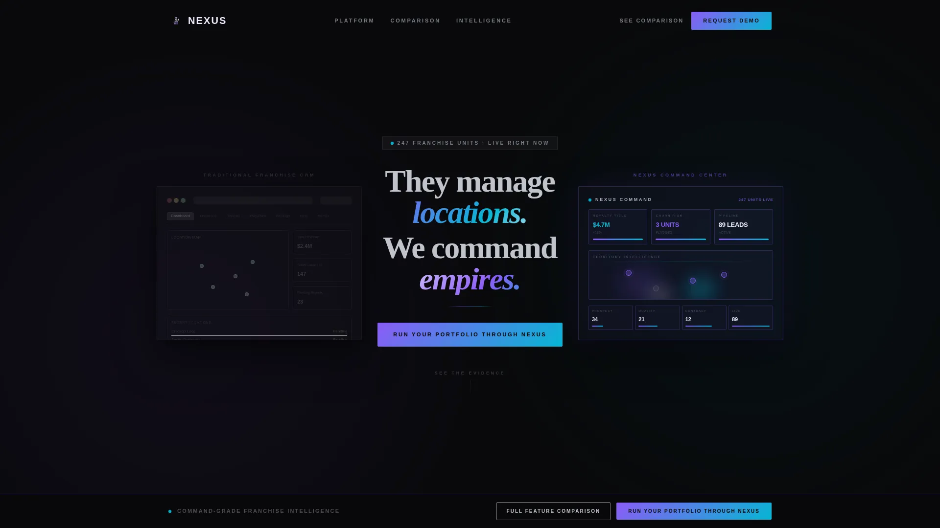
- A hero split-screen with dual frosted-glass dashboard panels and a parallax tilt effect on mouse movement
- Five escalating comparison sections covering royalty tracking, pipeline management, AI health scoring, compliance workflows, and territory intelligence
- A two-step demo form modal and a secondary PDF gate for visitors at different stages of the buying decision
Feature list
This template includes the following built-in design and interaction features, all grounded in the source brief.
Split-Screen Hero with Parallax Glass Panels
The viewport opens with two frosted-glass panels floating over a void black field. The left panel shows a legacy competitor interface. The right shows the Nexus command view. Both panels tilt subtly on mouse movement using GSAP-powered parallax, creating the physical sensation of glass cards hovering in space.
Feature Matrix Comparison Rows
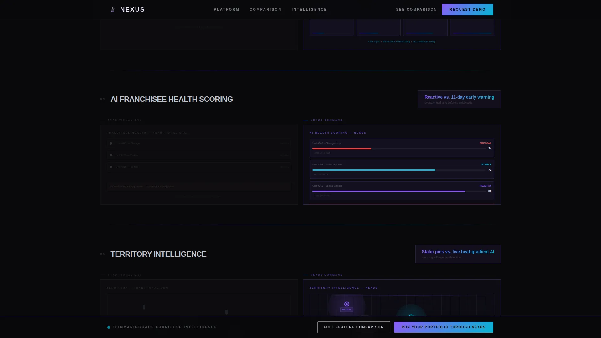
Each scroll section pairs a muted chrome wireframe of the traditional franchise CRM approach against the full iridescent Nexus equivalent. A brutalist horizontal rule separates each pair, and a single performance stat anchors the comparison. Stats include callouts like "12 clicks versus. 1" and "3-week onboarding versus. 45 minutes."
Two-Step Demo Booking Form
The primary call to action triggers a two-step modal. Step one collects franchise unit count via a slider from 10 to 1,000 and above, current CRM via a competitor dropdown, and biggest pain point via multi-select chips. Step two captures name, work email, and phone number. The form qualifies leads before capturing contact details.
Sticky Conversion Bar
After the third comparison row, the primary call to action pins to the bottom of the viewport for the remainder of the scroll. It stays visible without interrupting the content, keeping the conversion path accessible at every decision moment.
PDF Comparison Gate
A secondary conversion path labeled "See the Full Feature Comparison" triggers a modal that gates a downloadable PDF behind an email address only. This captures mid-funnel visitors who have been persuaded by the comparison but are not yet ready for a live demo.
Pulsing Metric Callouts
Key data points render in iridescent white and are animated with pulsing motion to draw attention to the performance gap. These callouts are designed to create the impression of a live mission control environment, reinforcing the platform's real-time intelligence positioning.
Page sections overview
| Section | Purpose |
|---|---|
| Hero Split Screen | Establishes side-by-side positioning with glass panel dashboards and chrome headline |
| Royalty Tracking Row | Compares 12-click legacy process against single-action Nexus royalty visibility |
| Pipeline Management Row | Contrasts three-week CRM onboarding with the 45-minute Nexus setup |
| AI Health Scoring Row | Shows reactive legacy churn detection versus Nexus predictive franchisee scoring |
| Compliance Workflow Row | Highlights automated compliance handling against manual legacy processes |
| Territory Intelligence Row | Compares static pin maps with Nexus heat-gradient 3D territory mapping |
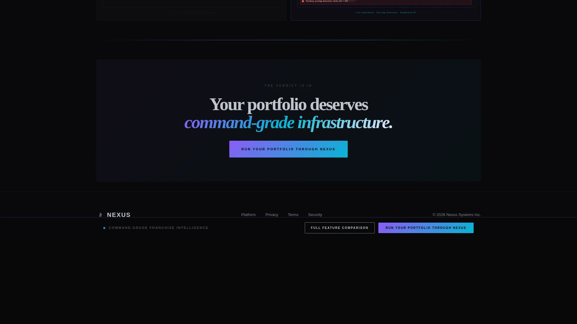
| Primary call to action Block | First full appearance of the "Run Your Portfolio Through Nexus" call to action |
| Demo Form Modal | Two-step qualification and contact capture form triggered by primary call to action |
| PDF Gate Modal | Email-only gate for the downloadable full feature comparison document |
| Footer Bar | Single-row linear footer on void black background |
Design & branding system
The visual identity follows a Bold Brutalist theme paired with an AI Iridescent color system. The palette feels like a concept car showroom at midnight: matte black surfaces absorbing everything around them, with chrome and iridescence living only on borders, data highlights, and interactive elements.
- Void black (#09090B) dominates all backgrounds; chrome (#C0C4CC) structures typography and dividers; holographic violet (#8B5CF6) shifts into electric cyan (#06B6D4) on gradients and hover states; iridescent white (#F0EAFF) marks key data callouts
- Typography uses DM Sans for structural body text and Fraunces italic for accent headlines; all text renders in white or chrome, never soft gray
- Animations are high-intensity and GPU-accelerated, including GSAP ScrollTrigger reveals, mousemove parallax tilt on hero panels, magnetic call-to-action behavior, and pulsing metric elements
Mobile & speed optimization
The template is built desktop-first, reflecting the work environment of its primary audience. Franchise operations directors and development VPs typically review dashboards and make platform decisions at a workstation. A mobile-responsive fallback is included for completeness.
- Desktop layout takes priority; the split-screen hero and comparison rows are optimized for large viewport widths
- GPU-accelerated CSS transforms are used exclusively for animation to avoid layout thrash during scroll-triggered sequences
- Static sections use server-rendered components; interactive elements including modals and sticky bars use client-side rendering to keep the initial load lean
How this template helps you convert
Every structural decision in this template serves one goal: moving a skeptical senior buyer from awareness to a booked demo. The comparison format does the persuasive work so your sales team does not have to repeat it in the first call.
- The Feature Matrix format stacks evidence across five comparison rows, making the performance gap between legacy tools and the Nexus platform progressively harder to dismiss before the call to action appears.
- The two-step demo form qualifies leads by portfolio size and pain point before capturing contact details, so every form submission arrives with context that helps your sales team personalize the follow-up conversation.
- The PDF gate creates a second conversion path for buyers who need more time, capturing their email without requiring a full demo commitment and keeping them in the funnel.
Other information about this template
This template is classified under the Technology category with a Franchise Vertical SaaS subcategory and a Franchise CRM Platform niche focus. It is designed for teams building demo pipelines for enterprise-grade, multi-location franchise operations software. The Intersection Match Score for this template is 13, indicating strong alignment between the design system, creative direction, and the intended audience.
- The template is built in English with United States dollar formatting and US date conventions
- The lp_direction is Comparison/Versus, meaning the entire page architecture is built around proving superiority over named competitor categories rather than describing features in isolation
- The header concept is Dark Glass Panels, and the creative direction is Feature Matrix, both of which are executed through the GSAP animation system and the split-screen section structure
Theme
Bold Brutalist
Creative direction
Feature Matrix
Color system
AI Iridescent
Style
Split Screen (50/50)
Direction
Comparison/Versus
Page Sections
Split-screen Hero with Glass Panel Parallax
Feature Matrix Comparison Rows
Two-step Lead Qualification Form
Sticky Conversion Bar
PDF Comparison Gate
Pulsing Iridescent Metric Callouts
Related questions
Who is the primary audience for this landing page template?
What conversion paths does this template include?
How does the comparison format work across the page?
Is this template suitable for a team without a dedicated developer?
Can the comparison stats and form fields be customized?



