Curated Plugin Ecosystem | Free Website Template | Rocket
The WixPlug curated plugin discovery directory landing page template is a dark-themed, scroll-reveal landing page built for Wix ecosystems. It helps freelancers, small business owners, and agency teams find the exact plugin they need through curated collections, a side-by-side comparison tool, and problem-first filtering. Stop guessing. Start building with confidence.
by Rocket studio
Quick summary
This template is a single-page, scroll-reveal landing page designed to match Wix users with the right plugin every time. It features a Feature Tab Switcher hero, a Problem-to-Solution scroll arc, a plugin comparison tool, and a problem-first filter flow. The landing page uses a void-black and electric-violet visual style that feels sharp, focused, and modern.
Who this template is for
This landing page template serves anyone who builds or manages Wix sites and needs a faster, cleaner way to find and compare plugins. It is built for people who ship real work under real time pressure and cannot afford to guess wrong on a plugin choice.
- Freelance web designers managing multiple client sites who need speed and reliability from every app they recommend.
- Small business owners who taught themselves Wix and need a clear, confidence-building way to evaluate plugin options before committing.
- Agency teams that need vetted, compatible, fast-loading plugins and want a client onboarding resource hub that lists recommended plugins with full context.
What problem this template solves
Generic app store listings create decision paralysis. Vague descriptions, conflicting reviews, and no side-by-side comparison leave visitors stuck. Every wrong plugin choice costs time, money, and client trust. An effective landing page solves this by organizing the chaos into a guided, confident discovery flow.
- Visitors land on disorganized plugin lists with no clear way to compare features, pricing, or compatibility.
- There is no fast path from "I have a problem" to "here is the best plugin that solves it."
- Freelancers and agency teams waste hours researching other plugins across scattered sources with no single source of truth.
What you get with this template
This template gives you a fully structured, interactive landing page that guides every visitor from confusion to confident choice. You can install it in a single click and start customizing right away. Prebuilt templates like this one speed up deployment time and can be easily tweaked to match your needs. Landing pages are crucial to the success of your product, and this one is purpose-built to deliver results.
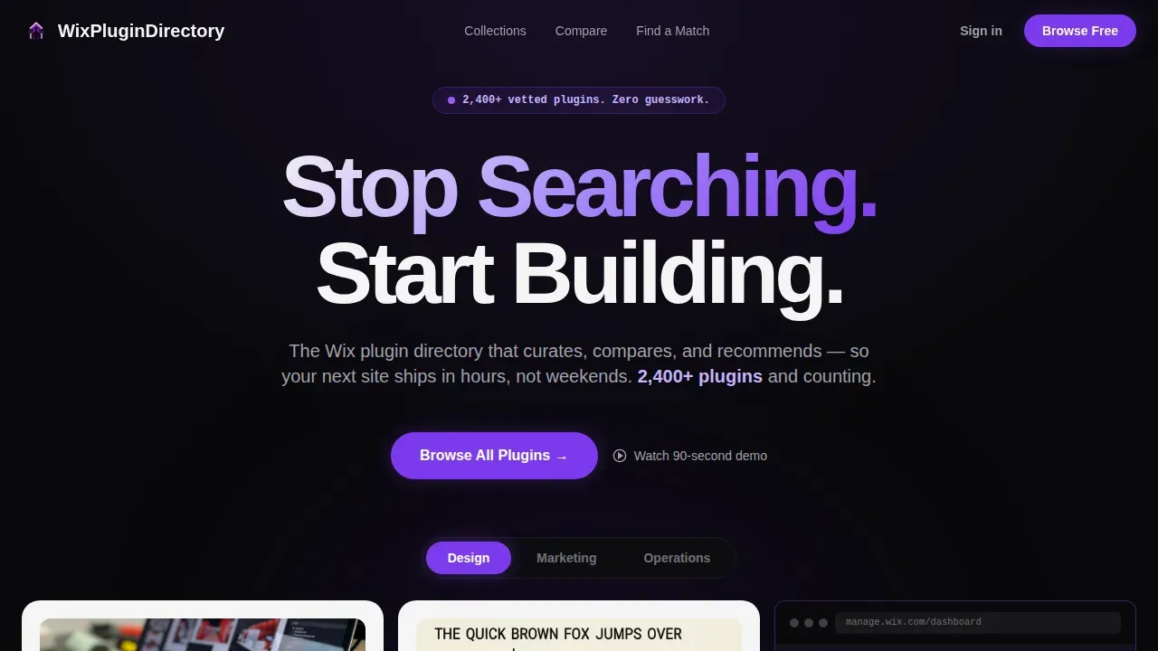
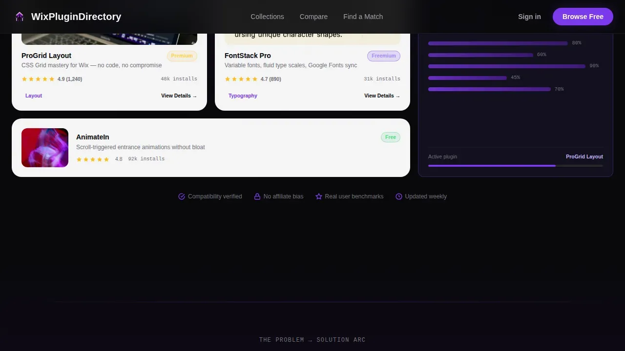
- A Feature Tab Switcher hero section with three clickable tabs labeled Design, Marketing, and Operations, each revealing live plugin cards, ratings, and integration badges.
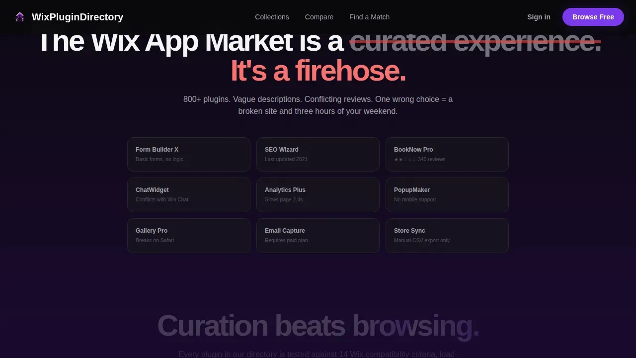
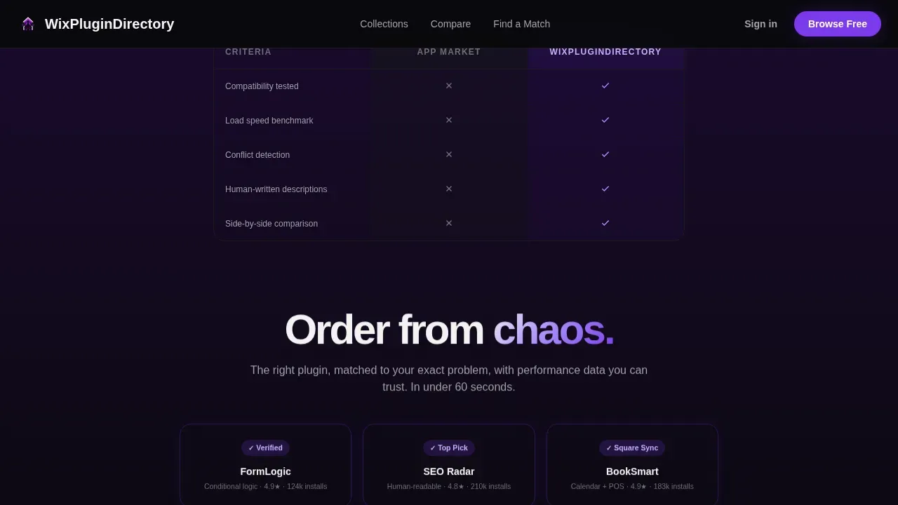
- A Problem-to-Solution scroll arc with three escalating beats that dissolve chaotic app listings and reveal curated collections, comparison tables, and verified compatibility badges.
- A sticky comparison bar that tracks up to three selected plugins and slides open a side-by-side feature grid, pricing table, load-speed benchmarks, and user ratings.
Feature list
This landing page template is loaded with purpose-built components. Each one is designed to reduce decision fatigue and move visitors toward a confident choice. The features below are grounded in what the template actually delivers.
Feature Tab Switcher Hero
The hero section opens with three clickable tabs: Design, Marketing, and Operations. Each tab swaps the visible plugin cards, ratings, integration badges, and a mini-preview showing the plugin running inside a Wix site mockup. The active tab glows in electric violet, while inactive tabs recede into the void black background. This gives visitors an immediate, organized view of what the directory covers.
Problem-to-Solution Scroll Arc
As visitors scroll, the page reveals a three-beat narrative arc. The first beat shows the mess of generic app store listings and vague descriptions. The second beat dissolves the chaos and introduces curated collections with verified compatibility badges. The third beat surfaces real performance benchmarks and side-by-side comparison tables. Each scroll trigger builds the case for curation over browsing.
Plugin Comparison Tool
Every plugin card includes a Compare checkbox. A sticky bottom bar tracks selected plugins, up to three at a time, with a violet call-to-action reading "Compare Side by Side." The comparison view slides up to show a full feature grid, a pricing table, load-speed benchmarks, and user ratings in clean columns. This is the point where visitors move from browsing to deciding.
Problem-First Filter Flow
A secondary path lets visitors filter by problem rather than by category. Options like "I need better search engine rankings" or "I need online booking" narrow the plugin results. The filter ends with a "Show Me the Best Match" button. This flow reduces decision fatigue by doing the choosing for the visitor and helping them capture leads or take action faster.
Dynamic Search and Category Browsing
The template features a prominent search bar alongside category links. This search-centric design helps visitors locate the exact plugin they need without scrolling through all the pages manually. Real-time filtering by category, price, or rating is supported through the template's structure. Each plugin listing includes a concise description, user rating, and key features for quick assessment.
Scroll-Reveal Progressive Animation
The entire landing page is built as a scroll-reveal experience. Static sections load server-side for speed, while interactive components use client-side rendering for smooth tab switching, filter transitions, and comparison bar animation. Every layer of content appears with intent, keeping visitors engaged from the hero all the way to the footer.
Page sections overview
| Section | Purpose |
|---|---|
| Hero Tab Switcher | Introduces the directory through Design, Marketing, and Operations tabs with live plugin previews |
| Problem Arc Scroll | Reveals chaos-to-order narrative in three scroll-triggered beats |
| Curated Collections Grid | Displays plugin collections in a bento grid with compatibility badges and benchmarks |
| Plugin Comparison Tool | Sticky bar and slide-up grid for side-by-side plugin comparison |
| Filter by Problem | Problem-first filtering flow ending with a best-match call to action |
| Single-Row Footer | Clean linear footer with links and directory branding |
Design & branding system
The visual style channels a dark code-editor aesthetic. The palette is built around void black, deep interstellar purple, electric violet, and clean interface white. Cards and plugin tiles surface in white against the darkness, each one a small window of clarity. The typography uses Plus Jakarta Sans with bold weight and tight tracking throughout all the pages. This modern style creates a lasting impression that feels intentional, not generic.
- Color system: void black (#09090B), deep purple (#1A0A2E), electric violet (#7C3AED) for buttons and hover states, and interface white (#F4F4F5) for card surfaces and body text.
- Typography: Plus Jakarta Sans at bold weight with tight letter-spacing, used consistently across headlines, card labels, tab text, and comparison column headers.
- Visual rhythm: scroll-reveal animation, violet glow on active states, card hover transitions, and sticky bar pulse all reinforce the Startup Velocity theme across every section.
Mobile & speed optimization
The template is designed with a desktop-first layout that reflects the agency and freelancer workflow. It is also mobile friendly and easily navigable on all devices. Touch-friendly buttons and readable text sizes are built into the mobile layouts. Static sections render server-side for fast initial load, while interactive components like the tab switcher and comparison bar use client-side rendering.
- Mobile-friendly layouts with touch-friendly buttons, readable text, and responsive plugin card grids that reflow cleanly on smaller screens.
- Performance split: server-rendered static sections for fast page load, client-rendered interactive elements for smooth tab switching and filter transitions.
- The template supports dynamic slots to insert custom widgets into predefined areas without breaking the mobile layout.
How this template helps you convert
Landing pages are designed to make sales or capture leads, and this template is built with that goal at its core. The average conversion rate from a landing page is 9.7%, and an effective landing page increases that chance by removing friction and focusing on a single goal. This template keeps visitors moving through a clear path from discovery to decision.
- The tab-switching hero immediately segments visitors by need, Design, Marketing, or Operations, so they see only relevant plugins from the first second. This relevance captures attention and keeps potential customers engaged longer.
- The sticky comparison bar and problem-first filter combine to eliminate guesswork. Visitors who use the filter to generate leads or find a match are guided to the best option without leaving the page, which keeps conversions high and bounce rates low.
Other information about this template
This landing page template is built on Wix's specialized landing page builder and connects to a Wix CMS collection to automatically populate plugin listings. You can customize it via the Wix Editor, adjusting colors, fonts, and layouts without any coding knowledge required. It is a professional landing page solution that works equally well whether you are on a tight budget or operating at agency scale.
- The template is suited for anyone who wants to build landing pages for a plugin directory, a curated app marketplace, or a client-facing resource hub, all without needing coding knowledge.
- You can use landing pages built on this template to run a marketing campaign, pre-sell access to a curated plugin collection, or capture leads by offering exclusive access to high-quality plugin picks.
- Teams on a tight budget can start creating with the free landing page structure and add a pro plan upgrade when they need advanced features.
- The wix landing page builder underlying this template supports customization options for fonts, colors, and section layouts, so you can match any brand identity.
- Wix landing page tools let you connect google analytics to track visitor behavior, measure conversions, and refine your pages over time.
- A wordpress landing page plugin like Beaver Builder or Thrive Architect follows a similar philosophy: a good wordpress landing page plugin should include prebuilt templates, ease of use, and integration with third-party tools. Beaver Builder is one of the easiest wordpress plugins for building landing pages, and Thrive Architect is a responsive wordpress landing page plugin known for conversion-focused design. Tools like Yoast SEO and other wordpress landing page plugin options also follow this model, offering yoast seo-style documentation and friendly support alongside their builder features.
- The wordpress repository hosts free wordpress landing page builder tools, but this wix landing page template delivers a focused, single-page experience tailored specifically to the Wix ecosystem. The concept of a free wordpress landing page builder and a free landing page template for Wix share the same goal: help users create landing pages without starting from scratch.
- The drop editor approach used in many general page builders differs from this template's purpose-built landing page plugin philosophy. Purpose-built landing page plugins are more focused on landing pages and building sales funnels than general page builder plugins.
- Plugins like Thrive Architect and OptimizePress offer landing page templates designed for full sales funnels. Similarly, this template is purpose-designed so that every section works together toward a single conversion goal.
- Documentation, tutorials, and friendly support resources help users get comfortable with a new plugin or a new way of working. The availability of good documentation and support is an important factor when selecting any landing page plugin.
- Landing pages can work wonders for your business. Almost 10% of businesses reported conversions of up to 70% using a landing page, making this template a worthwhile addition to any business plan.
- Agencies can use this template to create a client onboarding resource hub that lists recommended plugins, giving clients a clear, curated starting point instead of a raw app store search.
- The template is also a practical example of how modern landing page design can boost conversions by keeping the visitor's attention on one goal across all the pages within the scroll experience.
Theme
Startup Velocity
Creative direction
Problem→Solution Arc
Color system
Void & Violet
Style
Scroll Reveal (Progressive)
Direction
Comparison/Versus
Page Sections
Feature Tab Switcher Hero Section
Problem-to-solution Scroll Arc
Sticky Plugin Comparison Bar
Problem-first Filter Flow
Dynamic Search and Directory Browsing
Scroll-reveal Progressive Animation
Related questions
Do I need coding knowledge to use this template?
Can I use this template to capture leads as well as showcase plugins?
How does the comparison tool work inside the template?
Is this template mobile friendly?
Can agencies use this template for client projects?


