Nexus — DevSecOps Platform Landing Page Template
Pipeline is a bold, brutalist DevSecOps landing page template built for platforms that catch vulnerabilities mid-deploy. It features a live dashboard header, head-to-head comparison grids, and stats-first typography. Designed for platform engineering leads, CISOs, and DevOps teams, it turns hard security metrics into a compelling, evidence-stacked case for action.
by Rocket studio
Quick summary
Pipeline is a single-page DevSecOps landing page template built around a dashboard-first, data-heavy visual experience. It uses a Bold Brutalist design system with a Void and Violet color palette to communicate urgency and precision. Every section is structured to stack evidence, letting scan metrics and head-to-head comparisons do the persuading.
Who this template is for
This template is built for security-forward software teams who need to communicate platform value fast. It speaks directly to technical buyers who respect numbers over narrative.
- Platform engineering leads managing growing CVE (Common Vulnerabilities and Exposures) backlogs
- CISOs defending audit timelines and compliance posture to executive stakeholders
- DevOps teams at Series B startups navigating their first SOC 2 (System and Organization Controls 2) requirement
What problem this template solves
Most DevSecOps landing pages bury the proof. They lead with marketing language instead of the metrics that actually move technical buyers. Pipeline flips that entirely.
- Visitors land directly inside a live-looking scan interface, not a hero image
- Comparison grids replace vague feature lists with direct, numbered evidence
- The page removes hesitation by front-loading every key metric before the first call to action
What you get with this template
You get a single-page layout that feels like a real product running in production. Every section is purpose-built to convert a skeptical technical audience.
- A full-width dashboard header showing a live pipeline run with real scan data
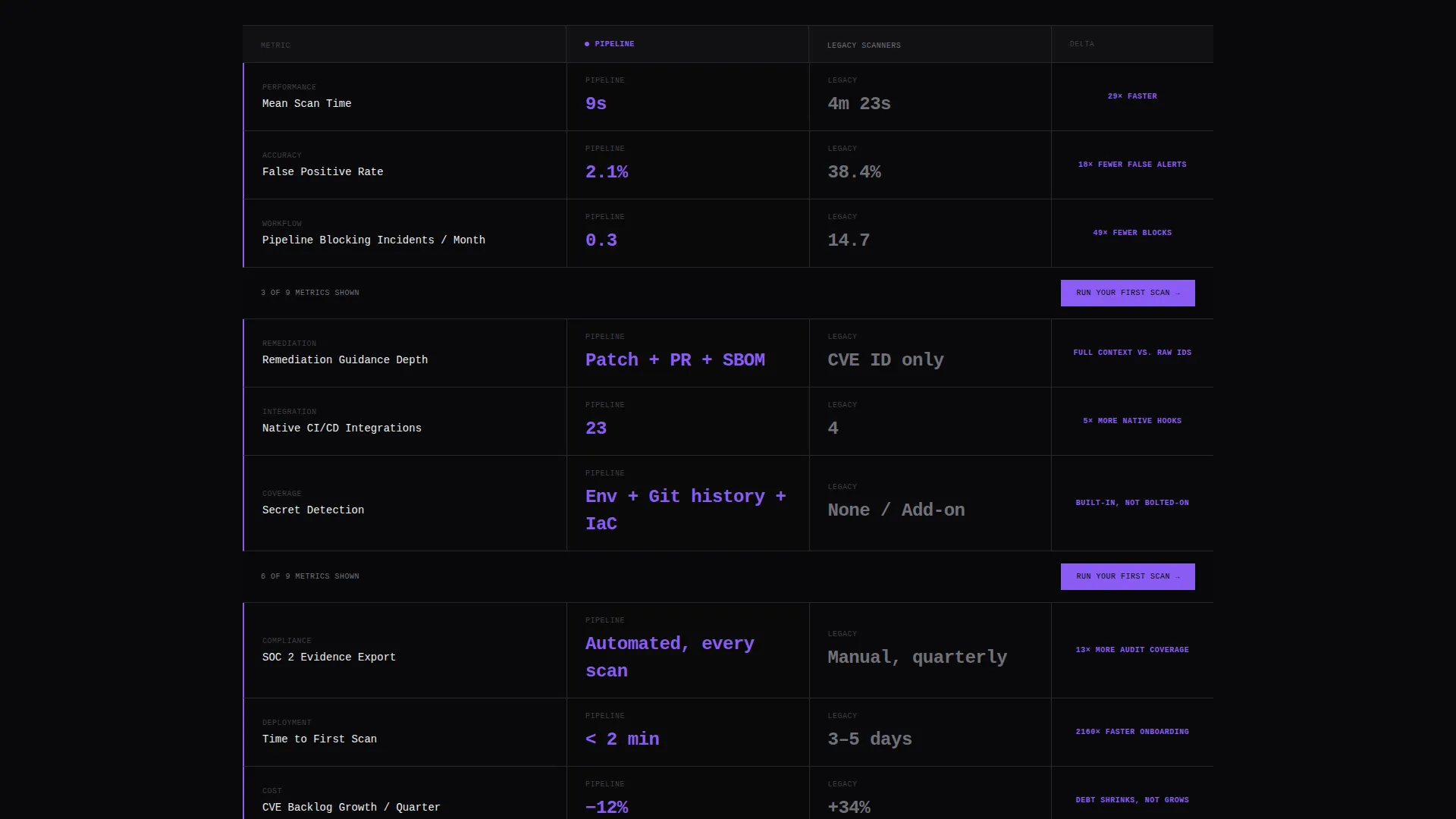
- Scrolling versus grids comparing nine head-to-head metrics against legacy scanners
- Strategically placed primary and secondary calls to action throughout the page flow
Feature list
This template is built around a small number of high-impact components. Each one is designed to carry specific conversion weight.
Live Dashboard Header Block
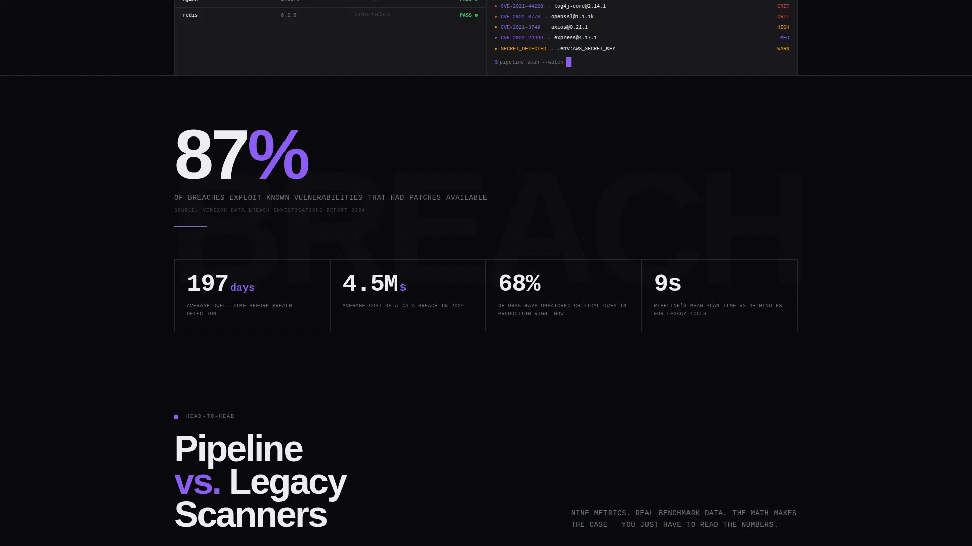
The header is a pixel-accurate recreation of the platform's scan interface. It shows 14 dependencies scanned, 3 critical CVEs caught, 1 secret detected in environment variables, and a mean-time-to-remediation counter running at 4 minutes 12 seconds. Container image layers are listed on the left, severity heat bars glow violet-to-red on the right, and a commit SHA appears in monospace at the top.
Stats-First Impact Typography
The first content section below the fold opens with a massive brutalist stat set at 120 pixels: "87% of breaches exploit known vulnerabilities that had patches available." This typographic confrontation is set in white on void black and signals immediately that the page runs on evidence, not pitch.
Comparison Versus Grid
Each subsequent section presents two data columns: the platform against legacy scanners. Metrics covered include scan speed (9 seconds versus 4 minutes or more), false positive rate (2.1% versus 38%), pipeline-blocking frequency, remediation guidance depth, and native integration count. Numbers are enormous, differences are highlighted in violet, and each row loads with a hard cut on scroll.
Repeating Conversion calls to action
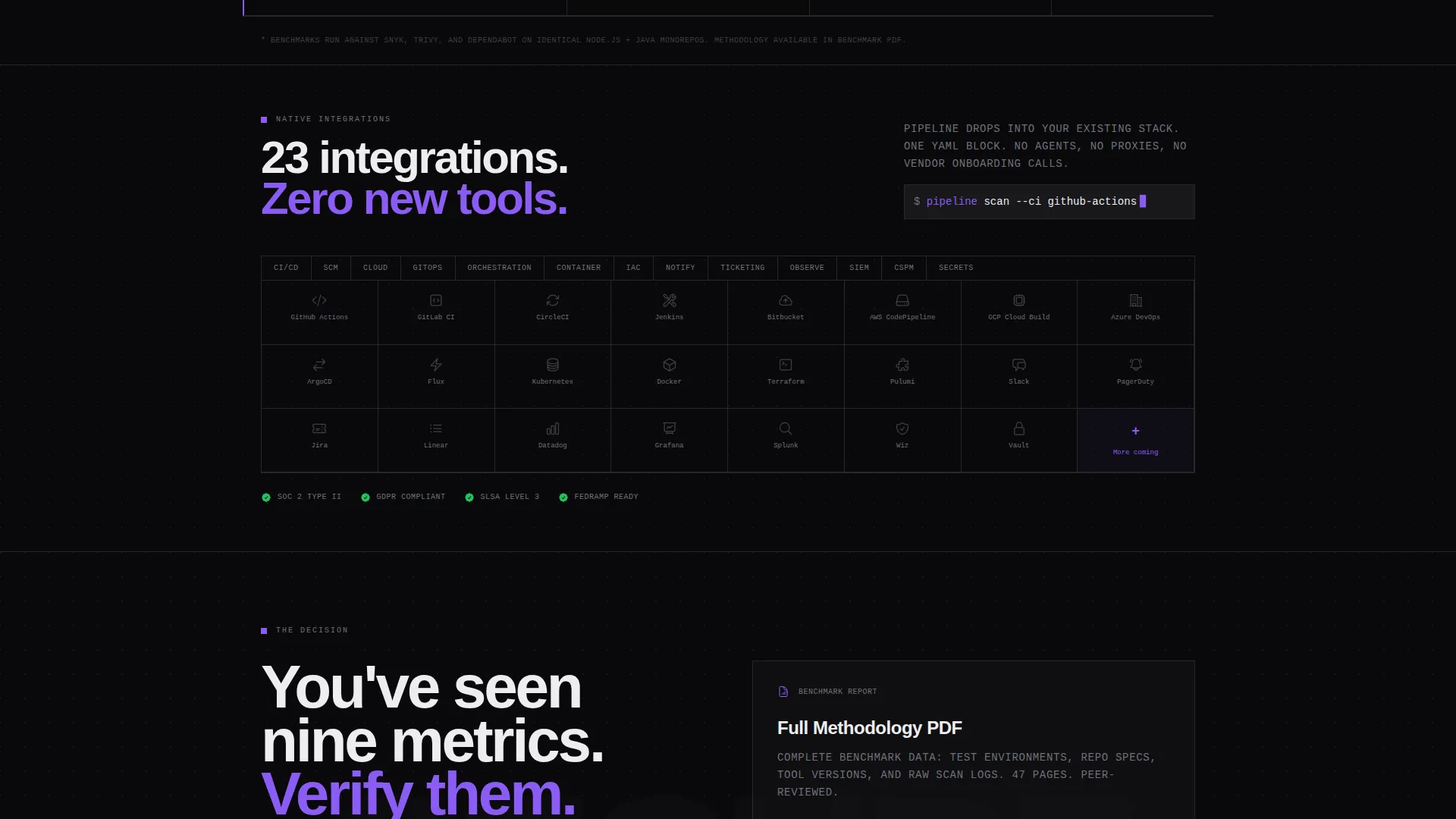
The primary call to action, "Run Your First Scan," appears at the header and repeats after every third comparison row. It is always rendered in violet on void with a monospace label. A secondary path offers "See How We Compare" linking to a gated benchmark PDF behind a single work-email field.
Brutalist Data Grid Layout
Backgrounds stack in absolute void black and deep terminal gray, separated by single-pixel borders. Every data cell uses right-angle edges. No gradients, no rounded corners, no decorative softness. The layout is dense with signal and designed to feel like a war-room monitor flipping indicators from red to green.
Page sections overview
| Section | Purpose |
|---|---|
| Dashboard Header | Simulate a live pipeline scan run |
| Impact Stat Block | Confront visitors with a key breach statistic |
| Versus Grid Row 1 | Compare scan speed head-to-head |
| Versus Grid Row 2 | Compare false positive rates |
| call to action Block 1 | Prompt first scan after early proof |
| Versus Grid Row 3 | Compare pipeline-blocking frequency |
| Versus Grid Row 4 | Compare remediation guidance depth |
| Versus Grid Row 5 | Compare native integration count |
| call to action Block 2 | Repeat primary call to action mid-page |
| Benchmark PDF Gate | Capture work email for detailed comparison |
| Final call to action Block | Close with the strongest evidence summary |
Design & branding system
The Void and Violet color system is built to feel like a production terminal running in a pitch-dark server room. Every design decision prioritizes clarity of data over visual decoration.
- Core palette: absolute void black (#09090B), deep terminal gray (#18181B), electric violet (#8B5CF6) for interactive elements and data highlights, and caustic ultraviolet white (#EDEDF0) for all typography
- Violet is used sparingly on scan-pass badges, graph spikes, hover states, and call-to-action pulses to preserve its signal weight
- Typography is set in monospace for interface elements and brutalist slab for impact headlines, with zero gradients and all edges at right angles
Mobile & speed optimization
The template is structured to maintain data density and readability across screen sizes without sacrificing the brutalist aesthetic.
- Data grid rows reflow vertically on smaller screens so comparison columns remain legible
- Monospace and slab typefaces are sized responsively so impact statistics stay dominant at mobile viewport widths
- Single-pixel borders and flat color fills keep visual complexity low, supporting clean rendering across device types
How this template helps you convert
Every structural decision in this template is built to reduce friction for a skeptical technical buyer. The conversion path is mathematical, not emotional.
- The dashboard header immerses visitors in the product before any marketing copy appears, establishing credibility in the first three seconds of the visit.
- The versus grids stack nine metrics in sequence, each one making the alternative look less viable, so by the time a call to action appears the visitor is already convinced.
- The gated benchmark PDF creates a secondary conversion path that captures qualified leads who want deeper proof before committing to a scan trial.
Other information about this template
Pipeline is categorized under the Technology and DevSecOps Technology niche, with an intersection match optimized for DevSecOps platform use cases. The template style is Dashboard and Data Grid, the theme is Bold Brutalist, and the creative direction is Stats-First Impact.
- This template is a strong fit for CI/CD (Continuous Integration and Continuous Delivery) pipeline security platforms positioning against older, slower scanning tools
- The Comparison/Versus landing page direction is particularly effective for buyers who are already evaluating multiple tools and need structured proof to finalize a decision
- The header concept is classified as Dashboard Preview, making it suitable for any security or developer tooling product that can show real interface data upfront

Theme
Bold Brutalist
Creative direction
Stats-First Impact
Color system
Void & Violet
Style
Dashboard/Data Grid
Direction
Comparison/Versus
Page Sections
Live Pipeline Dashboard Header
Brutalist Impact Stat Section
Head-to-head Comparison Grids
Repeating Violet Call to Action Blocks
Void and Violet Data Grid Layout
Related questions
Who is this landing page template designed for?
Can I adapt the dashboard header to show my own product data?
Does this template include the benchmark PDF or gated content system?
Is the versus grid limited to the five metrics shown in the brief?
What makes this template different from a standard SaaS landing page?



