AI for Higher Education Directory Website Template
The Enroll Instant Answer AI Higher Education Landing Page Template is a split-screen landing page built for enrollment management teams, registrar offices, and university IT directors. It uses a head-to-head comparison layout to show exactly what institutions lose without an AI chatbot and what they gain with one. Deep indigo visuals, frosted glass panels, and escalating scenario rows make the case before visitors even reach the call to action.
by Rocket studio
Quick Summary
This is a purpose-built education landing page for higher education AI chatbot products. It uses a 50/50 split-screen layout and a "Without / With" spec-sheet format to guide enrollment leaders through five escalating scenarios. Every section is designed to communicate value clearly, generate qualified leads, and move decision-makers toward a live demo request.
Who This Template Is For
Enrollment management teams face seasonal surges, staff burnout, and a flood of repetitive questions every August. This landing page template was built specifically for the people responsible for solving those problems. It speaks their language and addresses their pressure points before asking for anything in return.
This template is a strong fit for:
- Enrollment management vice presidents and registrar offices managing high inquiry volume from new students, parents, and prospective students during admission cycles
- IT directors at mid-size state universities evaluating AI tools for campus-wide deployment
- EdTech businesses selling AI chatbot or student support software to higher education institutions
What Problem This Template Solves
Higher education institutions lose enrollment yield every year to slow response times. Students and parents do not wait. Research shows that 78% of students enroll with the first institution that responds, and responding within one minute can increase conversions by nearly 400%. A confusing website and a 45-minute hold queue are not just inconveniences, they are missed opportunities that cost real enrollment numbers.
This template addresses:
- The gap between what prospective students and parents expect and what outdated frequently asked question pages actually deliver
- The staff burnout caused by answering the same repetitive questions about the admission process, financial aid, and dorm assignments across every channel
- The inability to qualify leads and guide students to the right next steps when no one on the team is available overnight or on holidays
What You Get With This Template
This landing page gives you a structured, visually compelling framework to present your AI chatbot product to university decision-makers. The page is built around evidence, not adjectives. Every scroll section earns the next click by making the pain of the current system visible before revealing the solution.
Included in this template:
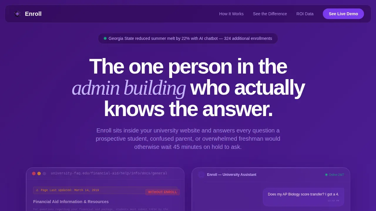
- A split-screen hero section with two frosted Dark Glass Panels showing a broken legacy frequently asked question page versus a live AI chat interface mid-conversation
- Five escalating "Without / With" comparison rows that progress from individual student inconvenience to institutional enrollment yield data
- A primary call to action for a live demo and a secondary lead generation form gated behind three fields to download an ROI report
Feature List
This template includes the following built-in design and content features drawn directly from the source brief.
Split-Screen Comparison Layout
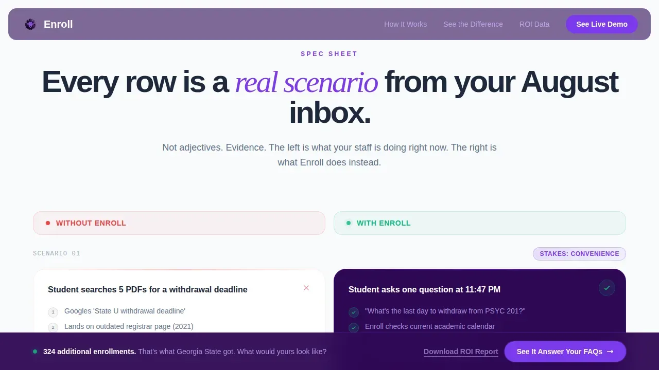
Each scroll section pairs a "Without" panel and a "With" panel side by side. The format escalates across five scenarios, from a student searching five PDFs for a withdrawal deadline to an advisor team reviewing a morning summary after the AI handled overnight volume. This structure lets visitors feel the problem before they see the solution, making the call to action feel earned rather than forced.
Dark Glass Panel Hero
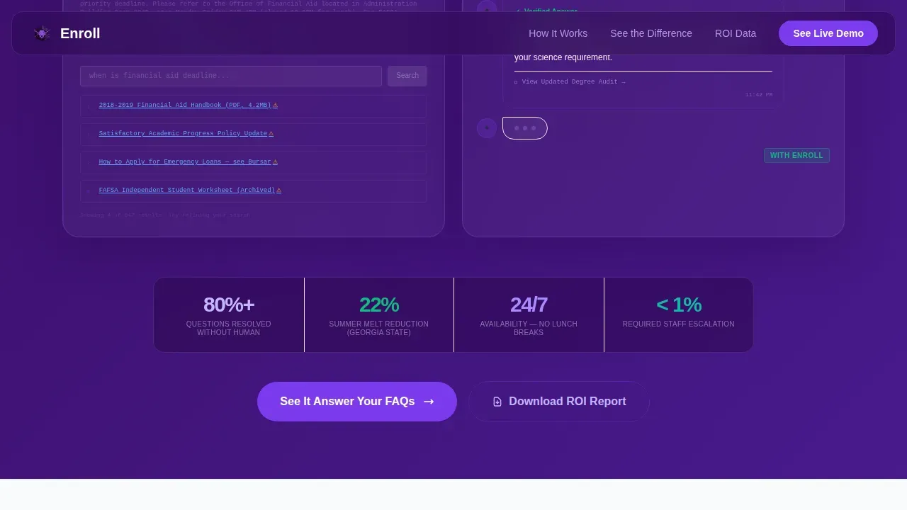
The header uses two frosted, translucent cards floating over a deep indigo gradient background image. The left panel shows a legacy university frequently asked question page with tiny text, broken links, and a "Page Last Updated 2019" timestamp. The right panel shows a sleek chat interface where the bot has just answered a transfer credit question, with a typing indicator pulsing below. The contrast between panels communicates the product's value instantly.
Dual Conversion Path Design
The primary call to action, "See It Answer Your frequently asked questions," links to a live demo pre-seeded with the visitor's institution data. It appears after the third comparison row and again as a sticky bar after the fifth. A secondary path lets visitors download an ROI report by completing a short form with just three fields: institution name, role title, and enrollment size. This approach helps qualify leads at two different funnel stages without demanding an email address upfront.
Stats and Social Proof Bar
A statistics bar sits beneath the hero panels and presents real university outcome data to build trust. Accreditation badges and institutional logos can be placed above the fold to reinforce credibility. Social proof is woven into the ROI evidence section rather than isolated at the bottom of the page, so it supports every comparison row that follows.
Sticky Call to Action Bar
After the fifth comparison row, a sticky bar anchors to the page and repeats the primary call to action for visitors who have scrolled past the first placement. This ensures that users who need more evidence before they act still have a clear, always-visible path to engage. The bar uses the electric violet accent color to maintain visibility against the deep indigo background.
Lead Capture Form with Minimal Friction
The ROI report download form is intentionally short. It limits fields to institution name, role title, and enrollment size, three inputs that help the sales team understand context without asking visitors to fill in an email address before they are ready. This approach mirrors best practices for reducing form friction and improving lead quality over raw lead volume.
Page Sections Overview
| Section | Purpose |
|---|---|
| Hero Glass Panels | Show broken legacy frequently asked question versus live AI chat to create immediate contrast |
| Stats Evidence Bar | Present real outcome data to anchor credibility early on the page |
| Comparison Row One | Student searches PDFs for a deadline versus asks one question instantly |
| Comparison Row Two | Parent navigates a phone tree versus gets an instant tuition breakdown |
| Comparison Row Three | Advisor answers emails at 11 PM versus AI handles overnight volume |
| Primary Demo call to action | Invite visitors to see the AI answer their institution's own questions |
| ROI Evidence Section | Present university retention and melt data in a focused block |
| Comparison Rows Four and Five | Escalate stakes to enrollment yield and institutional retention numbers |
| Sticky call to action Bar | Repeat the demo call to action after the fifth comparison row |
| ROI Report Gate | Three-field form to download brochure and receive the ROI report |
| Footer Row | Single linear row with links and legal information |
Design & Branding System
The visual identity follows a Directory and Discovery theme built around an Electric Indigo color system. The palette is described in the brief as feeling like a campus at night lit by the glow of laptop screens in every dorm window, intelligent, always-on, and quietly electric. Typography uses Plus Jakarta Sans for interface text and Instrument Serif for editorial headings.
Key design details include:
- Deep terminal indigo (#2E0854) anchors all background panels and dark surfaces, while luminous electric violet (#7C3AED) is used for interactive elements and hover states
- Cool slate (#1E293B) is applied to body text panels and crisp enrollment white (#F8FAFC) is used for contrast surfaces, creating deliberate white space that keeps the layout breathable and readable
- Glass morphism frosted panels, edge lighting effects, and a terminal-screen aesthetic give the page a premium, technology-forward feel that matches the product's positioning in the higher education AI space
Mobile & Speed Optimization
This template is designed desktop-first, reflecting the reality that business-to-business buyers in higher education evaluate software on desktop during the workday. The layout is built to be mobile responsive for visitors who explore after hours or on campus via smartphone.
Mobile considerations include:
- The split-screen comparison rows adapt to vertical stacking for smaller screens, preserving the "Without / With" contrast without requiring horizontal scrolling
- The sticky call to action bar and lead capture form remain accessible on all screen sizes, so visitors on any device can act without friction
- Touch-based interactions are supported for the live chat demo simulation, ensuring that Gen Z students and younger staff members who access the page on mobile have a smooth experience
How This Template Helps You Convert
This landing page is built around one principle: make visitors feel the cost of inaction before showing the solution. Every design and content decision supports that goal.
- The "Without / With" comparison rows create a cumulative argument. Each row escalates from individual inconvenience to institutional enrollment yield loss, so by the fifth row the conclusion is obvious without a single adjective doing the persuading.
- The dual call to action placement, once after row three and again as a sticky bar after row five, means visitors encounter the conversion point at exactly the moment the evidence is most compelling, whether they are fast readers or careful evaluators.
- The gated ROI report form asks for only three fields, which helps the page generate leads that are already self-qualified by role and institution size, reducing wasted outreach time for the sales team while giving serious buyers a clear next step.
Other Information About This Template
This template is built for B2B software sales specifically in the higher education sector. The content structure, visual design, and conversion flow are all calibrated for enrollment management buyers who evaluate tools carefully before requesting a demo. The following notes provide additional context for teams customizing or deploying this template.
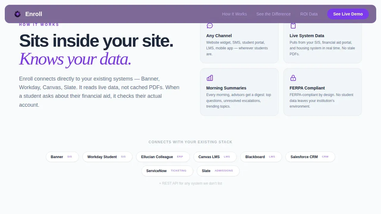
- The page is designed to communicate effectively with multiple buyer personas in parallel. Enrollment VPs respond to yield and retention data; IT directors respond to integration clarity and security context; registrar offices respond to the reduction in repetitive questions and overnight volume. The comparison rows address all three audiences as the scroll progresses.
- The Enroll Instant Answer AI Higher Education Landing Page Template is built on a split-screen structure that can support programme highlights, degree-level overviews, and admission process details as editable content blocks. Teams serving specific programs, such as a data science degree or a transfer pathway for military personnel, can swap in relevant scenario content without rebuilding the layout.
- The top right corner of the header is reserved for a navigation link or a persistent "Request a Demo" button, giving visitors a way to act from the very first moment they land on the page. This placement follows standard conversion patterns for B2B education landing page design.
- Accreditation badges and partner institution logos can be added to the social proof bar below the hero. Placing trust signals above the fold helps visitors from unfamiliar institutions assess credibility before they engage with the comparison rows.
- The download brochure path (the ROI report gate) is intentionally separated from the demo path. Visitors who are not yet ready to request a demo can still enter the lead funnel by completing the short form. This creates two distinct lead generation streams from a single landing page without adding page complexity.
- The template supports outreach campaigns where institutions want to link paid media or email traffic to a dedicated enrollment page. Because the page has no external navigation, all visitors stay focused on a single conversion goal, which improves visibility into which traffic sources generate the most qualified leads.
- The design system uses intentional white space throughout the layout to prevent visual overload. Clean surfaces between comparison rows give the reader's eye room to process each scenario before the next one begins, which supports retention of the key evidence being presented.
Theme
Directory & Discovery
Creative direction
Spec Sheet
Color system
Electric Indigo
Direction
Comparison/Versus
Page Sections
Split-screen Without/with Comparison Rows
Dark Glass Panel Hero Header
Dual Conversion Path with Sticky Bar
ROI Evidence and Social Proof Section
GSAP Animation and Interactive Chat Simulation
Minimal Friction Lead Capture Form
Related questions
Who is this landing page template designed for?
Can I customize the comparison rows for a specific program or audience?
How does the dual call to action structure work?
What does the ROI report form ask for?
Is this template suitable for mobile users?



