Banking Vertical SaaS Professional Website Template
Ledger is a bento grid landing page template built for banking CRM platforms. It combines animated stat cards, scroll-linked micro-animations, and a progressive lead capture form into one high-converting page. Designed for regional banks, credit unions, and digital banking teams, it turns fragmented data stories into a single, compelling pitch that moves enterprise visitors toward a demo request.
by Rocket studio
Quick summary
The Ledger template is a dark fintech landing page built for enterprise banking SaaS products. It opens with a living metrics wall, escalates through pain-point proof sections, and closes with a three-step demo qualifier form. Every element is oriented around one goal: converting a skeptical bank CTO into a qualified lead.
Who this template is for
This template is built for fintech and banking technology teams that need to communicate complex platform value quickly. The page is desktop-first by design, because the primary buyers review vendor pages on workstations, not phones. It speaks directly to the decision-makers who control the budget and feel the pain of siloed legacy systems every day.
The target audience includes:
- Regional bank CTOs evaluating replacements for siloed core banking integrations
- Credit union vice presidents managing member attrition and missed product alerts
- Digital banking heads who need to prove mobile return on investment to leadership
What problem this template solves
Most banking SaaS landing pages bury the proof. They lead with feature lists and stock photography while the visitor is still asking whether the platform actually works. This template flips that order. It leads with animated metrics, then explains the services behind each number, so visitors arrive at the form already convinced.
Key problems this template is designed to address:
- Prospects cannot visualize how a banking CRM unifies teller, wire, and mobile data without seeing it in motion
- Enterprise bank landing pages often fail to qualify leads before the demo, wasting sales team time
- Generic fintech pages lack role-specific social proof, so CTOs and credit union VPs feel unaddressed
What you get with this template
You get a fully structured, single-page layout with every section pre-built and ready to customize. The template ships with animated bento grid components, a progressive three-step lead form, and a secondary gated download path. You do not need to design from scratch or determine page hierarchy on your own.
Included in the template:
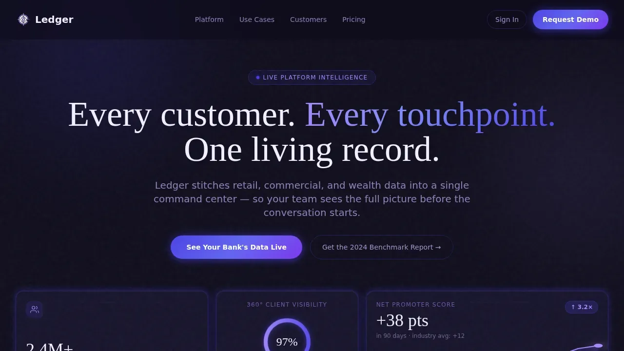
- Animated hero section with counting stat cards, a sparkline, a radial gauge, and a morphing before-and-after metric card
- Five content sections covering pain points, platform capabilities, social proof, and lead generation, plus a linear footer
- A floating indigo call-to-action button that appears after the second scroll section
Feature list
This template includes purpose-built features that focus on banking SaaS conversions. Each feature below reflects a deliberate design or structural decision grounded in how enterprise finance buyers evaluate tools.
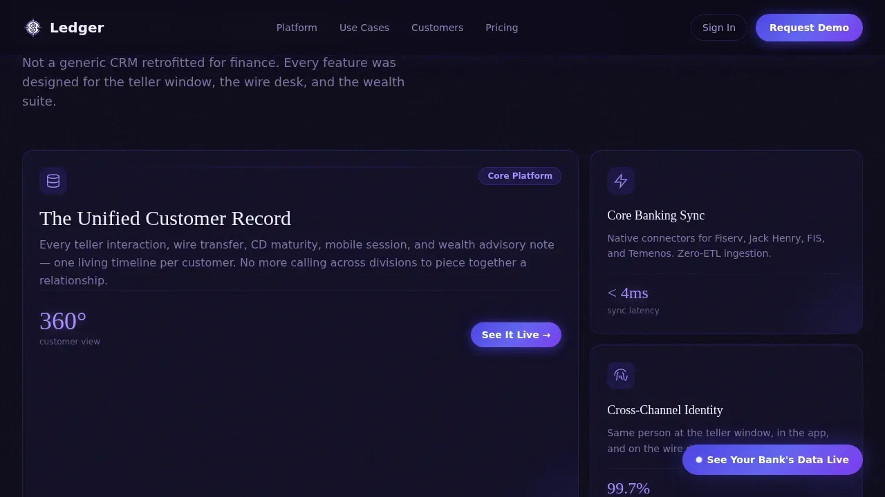
Animated Bento Metrics Wall
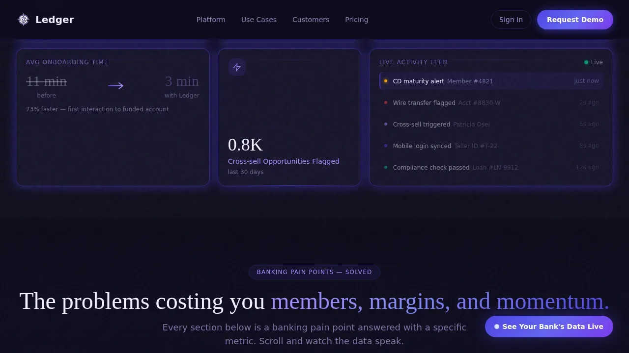
The hero section opens as a living dashboard. Stat cards count upward on load: a radial gauge fills to show 360-degree client visibility, a sparkline draws itself across the card, and a number morphs between two values to show onboarding time collapsing from eleven minutes to three. No stock photography. The product data is the visual, and it signals platform credibility before the visitor reads a single headline.
Scroll-Linked Pain Point Sections
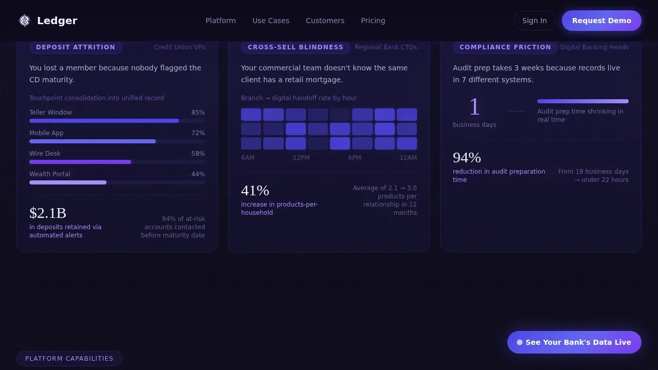
Below the hero, each bento block isolates one banking pain point and answers it with a specific metric paired with a micro-animation. A Sankey diagram shows customer journey consolidation. A heatmap displays branch-to-digital handoff rates. A compliance audit timer shrinks from weeks to hours. Numbers animate into view only when they enter the viewport, so each scroll delivers a new proof point and keeps visitors engaged deeper into the page.
Progressive Three-Step Lead Form
The lead capture flow is split into three focused steps. Step one captures institution type and asset size. Step two asks for the visitor's role and biggest integration pain point, drawn from a dropdown of five specific options. Step three requests a work email and preferred demo window. This structure keeps individual form fields minimal per step, which reduces friction and improves completion rates for high-intent banking leads.
Secondary Gated Benchmark Download
A parallel conversion path offers a downloadable benchmarking report gated behind a single email field. This captures visitors who are comparing vendors but are not yet ready to book a demo. It widens the top of the sales funnel without adding complexity to the primary form flow.
Role-Specific Social Proof Section
The social proof section displays testimonials organized by institution type and role: a CTO, a credit union vice president, and a digital banking head. Each testimonial includes a quantified before-and-after outcome. Customer logos appear alongside institution types to reinforce credibility. Dynamic social proof matched to the visitor's own role dramatically increases the relevance of each data point on the page.
Floating Indigo Call-to-Action Button
A sticky call-to-action button appears after the visitor scrolls past the second section. It stays pinned and visible as users move through the page, keeping the primary conversion action available at every moment. The button uses the electric indigo accent color to maintain high contrast against the deep vault black background, drawing attention without disrupting the reading flow.
Page sections overview
| Section | Purpose |
|---|---|
| Hero Metrics Wall | Opens with animated stat cards to establish platform credibility immediately |
| Pain Points Bento | Pairs each banking pain point with a specific metric and micro-animation proof |
| Platform Capabilities | Asymmetric bento grid displaying core CRM features with visual depth |
| Social Proof | Role-specific testimonials with institution logos and quantified outcomes |
| Lead Generation | Three-step demo qualifier form plus gated benchmark report download |
| Footer | Linear single-row footer with navigation links and contact details |
Design & branding system
The visual identity uses an Electric Indigo color system built on a dark fintech aesthetic. The palette is deliberately composed to signal stability and data precision. Deep vault black creates the primary background, while electric indigo pulses through active states. Phosphor lilac softens secondary metrics and hover glows into something readable under sustained focus. The overall feel is a mainframe terminal rebuilt for the future.
Design system details:
- Colors: deep vault black (#0D0B1A) background, electric indigo (#4F46E5) for active states and highlights, phosphor lilac (#A78BFA) for secondary metrics and hover glows, ledger white (#F0EEFF) for typography and card surfaces
- Typography: DM Sans for body text and Fraunces for display headings, with oversized bold headers and a readable body size that keeps the page easy to scan
- Motion: cursor parallax on the hero grid, indigo border glow pulsing like a heartbeat on every card, and scroll-linked reveals throughout the page
Mobile & speed optimization
The template is desktop-first because regional bank CTOs and enterprise buyers primarily review vendor pages on workstations. However, the layout is fully responsive so that mobile visitors receive a complete, usable experience. Roughly 80 percent of banking users access content on mobile at some point, so responsiveness is not optional.
Mobile and performance considerations:
- Responsive layout adapts the bento grid gracefully to smaller screens and each device size
- Server Components handle static sections while Client Components manage animations, keeping the page optimized for fast initial load
- Animations are scroll-linked and viewport-triggered, so they do not run unnecessarily before a visitor reaches each section
How this template helps you convert
This template is engineered around the specific psychology of enterprise banking buyers. Every structural decision is aimed at reducing skepticism and increasing qualified lead flow.
- Trust is established above the fold before any feature is explained. Animated real-data metrics signal that the platform is live and functional. Compliance-adjacent visual cues and a focused layout protect the visitor's attention by removing standard site navigation and keeping every element focused on the conversion offer.
- The progressive form structure qualifies leads without overwhelming them. Each step collects one layer of context, so the sales team receives a scored, segmented lead rather than a bare email address. Integrating this data flow with marketing automation tools enables targeted nurturing after the visitor leaves the page.
- The secondary download path captures mid-funnel visitors. Not every enterprise buyer is ready to book a demo on first contact. The gated benchmarking report gives hesitant visitors a low-commitment reason to share their email, expanding the total pool of leads available for follow-up campaigns.
Other information about this template
This template is built to support the full workflow of launching a banking SaaS landing page without starting from zero. Teams can customize colors, copy, and section order directly within the component structure. The template uses Tailwind CSS for styling, which makes it straightforward for developers to adjust spacing, color tokens, and layout utilities without rewriting core styles.
Additional context for teams evaluating this template:
- Google Analytics integration is supported at the page level, enabling teams to track form completion rates and measure landing page effectiveness over time. Google tag events can be added to each form step to determine lead drop-off points.
- The template is a strong fit for fintech startups as well as established banking institutions. Startups launching a first SaaS landing page and larger teams relaunching an existing bank landing page both benefit from the pre-structured section flow.
- Customer logos are positioned in the social proof section with space for five to eight institution marks. Logo display reinforces credibility for visitors who are still in the vendor comparison stage.
- The template can support videos or embedded dashboard previews inside the capabilities section if your team wants to show the platform in motion beyond the static bento grid.
- Because the page removes standard site navigation, visitors interact with only the content and the conversion flow. This focus on a single path is a proven approach for increasing conversions on high-intent SaaS landing pages.
- The ledger unified banking crm platform landing page template is well-suited for teams that serve regional banks, community banks, and credit unions across the United States using US banking terminology and USD-denominated proof points.
- Pricing section components are not included by default but the layout can accommodate a pricing block if your sales motion requires it.
- The template stores no visitor data itself. Any data capture depends on the form integrations and marketing automation tools your team connects to the page.
Theme
Dynamic Motion
Creative direction
Stats-First Impact
Color system
Electric Indigo
Style
Bento Grid
Direction
Lead Generation
Page Sections
Animated Bento Metrics Wall Hero
Scroll-linked Pain Point Proof Sections
Progressive Three-step Demo Qualifier
Gated Benchmark Report Download
Role-specific Social Proof with Institution Logos
Floating Sticky Call-to-action Button
Related questions
Can I customize the colors and typography in this template?
Does this template work for credit unions and community banks, not just regional banks?
How does the progressive lead form improve lead quality?
Is this template suitable for a fintech startup launching its first banking SaaS product?
What animations are included and how are they triggered?


