Intelligent API Integration Landing Page Template
The Warehouse Headless API Command Center landing page template is built for developer-first infrastructure teams that need a pure API pitch, no interface fluff, just callable endpoints. It uses a void-black and electric violet Data Command aesthetic, a modular card grid layout, live-code header panels, and an interactive versus comparison tool to convert integration architects, ops directors, and technical CTOs.
by Rocket studio
Quick summary
This is a single-page, section-led landing page designed for a headless warehouse management system sold entirely on API merit. It opens with three floating dark glass panels displaying real API payloads, then escalates through a capability card grid, a sticky versus frame, and an integration mosaic. The layout targets technical buyers who evaluate through documentation depth and side-by-side comparisons, not sales decks.
Who this template is for
This landing page speaks directly to the people making integration decisions inside logistics and retail operations. It does not assume a general audience. The copy, layout, and interactive elements are engineered for buyers who open terminals, not brochures.
- Integration architects at mid-market third-party logistics providers (3PLs) untangling webhook complexity across multiple systems
- Operations directors at direct-to-consumer (DTC) brands who have outgrown packaged fulfillment apps and need warehouse orchestration at scale
- Chief technology officers (CTOs) at enterprise retailers managing inventory across dozens of nodes without a full system replacement
What problem this template solves
Most warehouse management software pages bury engineers in enterprise marketing language. This landing page cuts through that. It proves the product is code by making code the centerpiece of the page. It is built for a buyer who will ghost a sales call but reply to a well-structured technical email, and it converts that buyer through documentation depth and honest comparison, not hype.
- Legacy warehouse management systems bundle configuration bloat that integration teams must work around, and this page exposes each discrete callable service as the alternative
- Technical evaluators burn time trying to understand how a headless system connects to existing ERP, OMS, and TMS stacks, and this page resolves that with live endpoint examples and real latency data
- Traditional sales forms ask for phone numbers that engineers ignore, so this landing page collects only current WMS vendor, monthly order volume, and work email
What you get with this template
This template gives you a complete, production-ready landing page structure with five major sections, an interactive comparison tool, and a three-field conversion form. Every component is included. Nothing needs to be built from scratch.
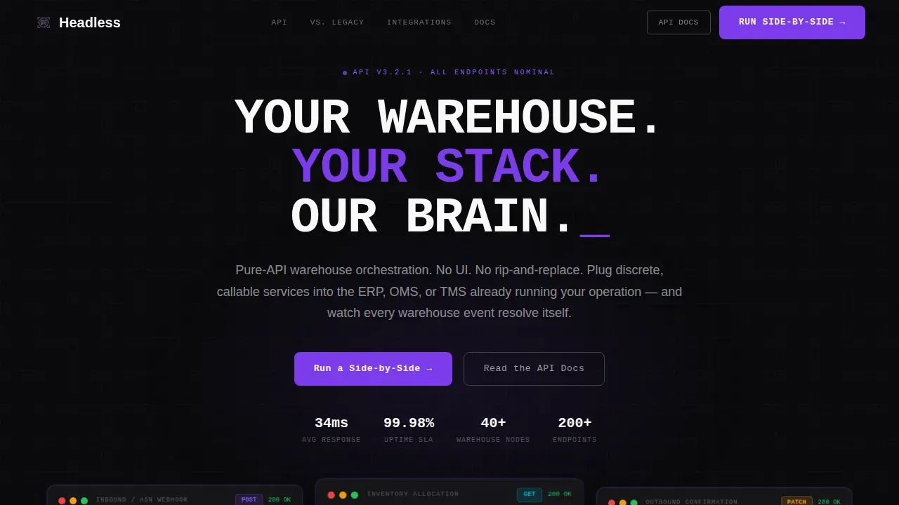
- A hero section with three frosted dark glass panels displaying syntax-highlighted API payloads in three-dimensional floating positions, with a void black background and electric violet edge glows
- A full-scroll modular card grid that reorganizes from a capability view into a sticky two-column headless versus legacy WMS versus frame, ending in an integration mosaic with real endpoint URLs and latency stats
- A primary Call to Action (call to action) of "Run a Side-by-Side" that opens an interactive comparison tool with a WMS vendor dropdown, a secondary call to action of "Read the API Docs" for documentation-led conversion, and a three-field lead form
Feature list
This landing page is built around a set of core design and functional capabilities drawn directly from the project brief. Each feature below reflects a real, included component.
Dark Glass Panel Hero Section
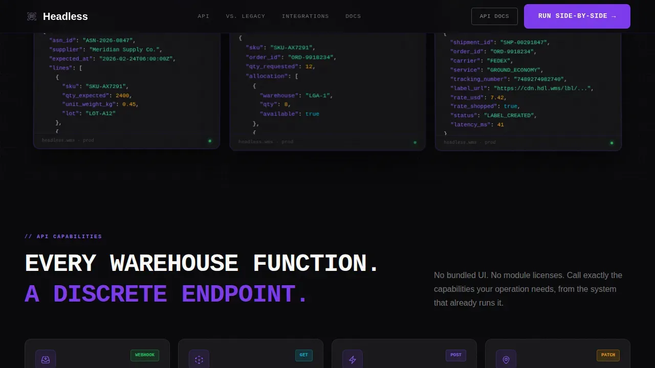
The hero section is the first thing users see when landing on the page, and here it functions as a live product demo. Three translucent cards float over a void black background, each rendered with a frosted-glass effect and a faint violet edge glow. The left panel shows an inbound ASN webhook payload, the center shows real-time inventory allocation across three warehouses, and the right renders an outbound shipment confirmation. Panels are slightly rotated on the z-axis to create a three-dimensional hover effect. A tight uppercase monospaced headline sits above: "YOUR WAREHOUSE. YOUR STACK. OUR BRAIN."
Modular Capability Card Grid
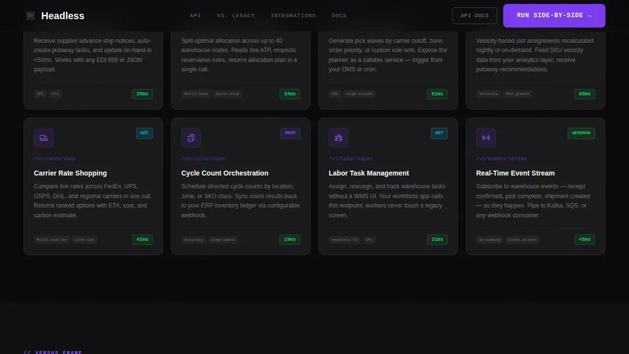
The capability grid is the core of the landing page layout. Eight API capability cards lay out in a neutral grid, each representing a discrete, callable service. Cards display capabilities such as inventory sync, wave planning, slotting optimization, and carrier rate-shopping. This section is built as a component-based layout, making it straightforward to add or reorder cards. The modular structure also means developers can edit content and rearrange the grid without disrupting the overall page layout or data flow.
Sticky Versus Frame Comparison
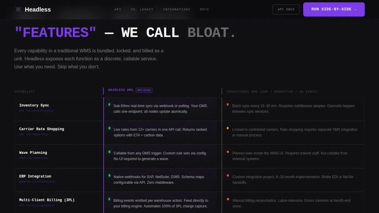
This is the page's most persuasive structural element. As the user scrolls, the page introduces a sticky two-column comparison where headless WMS capability cards slide left and a traditional WMS column materializes on the right. Each row contrasts what the legacy system bundles as configuration overhead versus what the API exposes as a clean, callable endpoint. The versus frame makes the business value of the headless approach immediately legible to a technical evaluator who already knows the pain points of bundled legacy systems.
Integration Mosaic with Live Endpoints
The integration mosaic closes the "what it connects to" arc of the page. Cards display individual platform integrations alongside a real endpoint URL and a latency stat. This section communicates that the system can reach data sources across multiple systems without a rip-and-replace migration. The mosaic demonstrates a genuine api first architecture at a glance, reinforcing the decoupled nature of the product for buyers already running existing stacks.
Interactive Side-by-Side Comparison Tool
The primary call to action opens an interactive tool directly on the landing page. A visitor selects their current WMS from a dropdown and the page dynamically populates a comparison card grid specific to that vendor. This is the highest-conversion interactive element on the page. It meets the technical user where they already are in their evaluation, replacing a generic demo request with a vendor-specific, structured data comparison they can act on immediately.
Three-Field Conversion Form
The lead form collects exactly three fields: current WMS vendor, monthly order volume as a banded range selector, and work email. No phone number field. This form design is deliberate. The buyer here is an engineer who evaluates asynchronously. A shorter form with a specific context field such as order volume lets the sales team send a well-structured technical follow-up rather than scheduling a call that will never happen.
Page sections overview
| Section | Purpose |
|---|---|
| Dark Glass Hero | Display floating API payload panels with violet edge glows and monospaced headline |
| Capability Card Grid | Show eight discrete API services as modular, rearrangeable cards |
| Sticky Versus Frame | Compare headless WMS endpoints against legacy system bundled bloat |
| Integration Mosaic | Present platform-specific endpoint URLs and latency stats per integration |
| call to action and Form | Capture WMS vendor, order volume, and email via three-field lead form |
| Linear Footer | Close with single-row footer pattern |
Design & branding system
The visual identity follows a Data Command theme built around a Void and Violet color system. Every design decision reinforces the idea that this product is infrastructure, not software with a pretty face. The aesthetic is a production monitoring dashboard at three in the morning.
- Color palette: absolute void black (#09090B) for the primary background, deep graphite (#18181B) for all card surfaces, electric violet (#7C3AED) as the signature accent on API method badges and hover states, and phosphor white (#FAFAFA) for monospaced type
- Typography: JetBrains Mono for all code blocks and endpoint displays, DM Sans for body text; the combination reinforces the terminal-first user experience without sacrificing readability in explanatory copy
- Violet is used sparingly as an accent, appearing on API method badges, card hover glows, and the active comparison column border, so everything else recedes into the void and the data architecture itself becomes the visual focal point
Mobile & speed optimization
This landing page is designed desktop-first. The primary buyer is an engineer at a workstation, often in a late-night evaluation session. That said, the page is built with performance-conscious frontend technologies that keep the experience fast and responsive across screen contexts.
- Server Components handle all static sections of the landing page, including the hero, capability grid, and integration mosaic, keeping initial load light and compatible with static site generation patterns
- Client Components handle only the interactive comparison tool and any counter animations, so the heavier interactive logic is loaded on demand rather than blocking the initial page render
- Implementing a content delivery network (CDN) for static assets significantly improves content delivery speed during traffic spikes when the page is linked from high-volume campaigns or newsletters
How this template helps you convert
Landing pages are designed with conversion in mind, and every structural decision in this template is tied to a specific conversion behavior for a technical buyer. The page guides users toward one of two primary actions: running a side-by-side comparison or reading the API documentation.
- The versus frame and interactive comparison tool lower the barrier to evaluation by replacing a generic demo request with a vendor-specific, structured data view the buyer can act on immediately, improving conversion rates among engineers who distrust form-heavy pages
- The secondary call to action "Read the API Docs" captures technical evaluators who convert through documentation depth rather than sales forms, and the three-field lead form closes the loop with only the context fields an engineering-led sales team actually needs to send a relevant follow-up
Other information about this template
This section covers additional context about the technical ecosystem this landing page template is designed to operate within, including compatible tools, content management patterns, and implementation considerations relevant to teams building or customizing this page.
This warehouse headless api command center landing page template is built for a developer-first sales motion where the landing page itself acts as a product demonstration. A landing page in this category needs to prioritize real-time data visualization and API flexibility above all other design goals. The layout is a standalone web page that visitors land on after clicking from emails, ads, or technical newsletters, so the content structure must immediately communicate value to a reader who arrived with a specific integration problem in mind.
Because the product being marketed is itself headless, the template makes the concept of a headless approach legible through design. A headless cms separates content from the presentation layer, and this page models that same principle visually: the data is the product, the interface just surfaces it. This is different from a traditional cms setup where the content management layer and the presentation layer are tightly coupled. A traditional cms bundles both concerns together, which is exactly the pain point the versus frame section calls out explicitly.
In a headless cms, developers build the presentation layer using preferred technologies such as React, Vue.js, Next.js, or Angular, and use the headless cms api to deliver content to frontend applications. The same decoupled architecture principle applies to how this landing page can be built and maintained. Developers can use a frontend framework of their choosing to implement the page, connect it to a headless cms for content management, and edit content independently of the page layout. This keeps the content layer and the presentation layer cleanly separated, which is especially useful for dev teams that need to push updates quickly without breaking the page structure.
Crafting dynamic landing pages in this niche requires more than a static layout. Using a component picker approach allows teams to create dynamic pages by selecting from an array of reusable components that can be rearranged. The modular card grid in this template is designed with that flexibility in mind. Teams can create content types for each capability card, each integration mosaic entry, and each versus row, then edit content in a structured content model without touching the underlying frontend technologies.
The headless cms approach also matters for content delivery across multiple channels. A headless cms uses APIs to deliver content to frontend applications, which means the same content can serve web pages, mobile apps, desktop applications, and IoT devices without duplication. For a logistics platform with multiple buyer touchpoints, this means you can maintain a single content database and deliver content to a web application, a mobile-optimized view, and potentially voice assistants or IoT devices using the same structured content source. A content delivery network placed in front of the deployment layer further improves content delivery speed and handles traffic spikes without degrading user experience.
From a technical implementation perspective, this landing page is designed to support server side rendering and static site generation patterns. Next.js is a popular frontend framework for exactly this kind of build, enabling React-based web applications with server side rendering and static site generation support. Gridsome offers an alternative for developers who prefer statically generated web applications. Both approaches help pages perform well for search engines, since crawlable server-rendered or statically generated pages are more discoverable than client-only rendered pages. Optimizing your content for search engines is a practical concern when the landing page is the primary inbound channel for a technical product with a long evaluation cycle.
For teams choosing a headless cms to power this template, evaluating content needs, scalability requirements, and integration capabilities with existing tools is essential. DatoCMS allows you to define reusable components for creating dynamic templates for landing pages. ButterCMS separates the content management layer from the presentation layer, allowing developers to shape front-ends according to their preferred frameworks. Hybrid headless cms platforms such as Sitefinity can enable personalized user experiences based on presentation-neutral content delivered across multiple channels. The api first approach of these platforms means developers can fetch data from the content database using restful apis or GraphQL, making it straightforward to build new landing page variants or create solutions for different audience segments without rebuilding the whole page.
The api first architecture behind this page also supports marketing automation integration. Because the content layer and the data layer are separate, a marketing automation system can update landing page content, swap out copy for different audience segments, or trigger new landing page variants using api calls, without requiring a frontend deploy. This is practical business value for growth teams that need to move fast without waiting on engineering cycles.
The active community around modern frontend frameworks and headless cms platforms means that teams adopting this approach have access to extensive documentation, open source tooling, and established patterns for building web applications at scale. The decoupled nature of the architecture also provides tighter security by reducing the attack surface. Because the presentation layer runs on a different server from the content database and data sources, there are fewer direct exposure points for the backend. Role-based access control remains essential for templates handling sensitive logistics data, and the decoupled architecture makes it easier to enforce those boundaries at the api layer rather than at the presentation layer.
This template is designed as a starting point. Teams can extend the layout, add new content types, create content for additional integration partners, or swap in preferred tools for animation and interactivity. GSAP scroll triggers power the card hover glows, counter animations, and panel float effects specified in the brief. The high interactivity level means the page itself functions as a following command: each scroll triggers the next layer of the argument, moving the user from "what it does" to "what it replaces" to "what it connects to" in a single, uninterrupted session.
- This template is compatible with api first platforms and supports server side rendering, static site generation, and client-side hydration patterns depending on the frontend framework chosen by the dev team
- The page layout uses structured content models that content editors can update without modifying code, keeping content creation and page maintenance accessible to non-engineering team members once the initial build is complete
- Templates designed for this niche should prioritize high-density data display and modern web capabilities, and this layout delivers both through the modular card grid, the versus frame, and the integration mosaic with real endpoint data
Theme
Data Command
Creative direction
Feature Matrix
Color system
Void & Violet
Style
Card Grid (Modular)
Direction
Comparison/Versus
Page Sections
Dark Glass Panel Hero with Live API Payloads
Modular Capability Card Grid
Sticky Versus Frame for Legacy Comparison
Integration Mosaic with Endpoint Data
Interactive Side-by-side Comparison Tool
Three-field Engineering-friendly Lead Form
Related questions
Who is the primary buyer this landing page targets?
Does the interactive comparison tool require a backend integration to work?
Can the modular card grid sections be customized or extended?
What frontend technologies does this template support?
How does the three-field form improve lead quality compared to longer forms?



