Minimalist Interior Design Academy Landing Page Template
Atelier is a bold brutalist interior design course landing page template built on a bento grid architecture with a Void & Violet color system. It guides career-changing designers, real estate stagers, and self-taught decorators from pain-point recognition to syllabus download through scroll-triggered card flips, confrontational typography, and a sticky lead-capture bar that activates after the first scroll fold.
by Rocket studio
Quick summary
Atelier is a single-page landing page built for an interior design academy that turns gut-feel decorators into technically credentialed professionals. The template uses a brutalist bento grid layout, a dark void-black and bruised violet palette, and a Problem to Solution scroll arc that reorganizes the grid as visitors move down the page. Every design decision serves one goal: converting a curious visitor into a confirmed lead.
Who this template is for
This landing page template speaks directly to the people building or selling interior design education online. It is purpose-built for a very specific audience, and it knows it.
- Course creators and digital academies who teach interior design, spatial theory, or material literacy and need a landing page that communicates credibility before a visitor reads a single word of copy.
- Interior design training platforms targeting career-changers, real estate stagers, and self-taught decorators who are ready to invest in a credential that commands higher fees.
- Creative agency studios and independent educators who want a one page website that feels as serious and intentional as the work they teach, without needing coding skills to launch it.
What problem this template solves
Most course landing pages look like every other course landing page. Generic layouts, stock photography of smiling students, and vague value propositions produce low-converting sites that fail to earn trust. For an interior design academy selling credibility, that sameness is fatal.
- Lack of differentiation is the core problem. A dark, immersive design with bold typography and confrontational pain-point cards separates Atelier from every pastel-toned competitor landing page on the market.
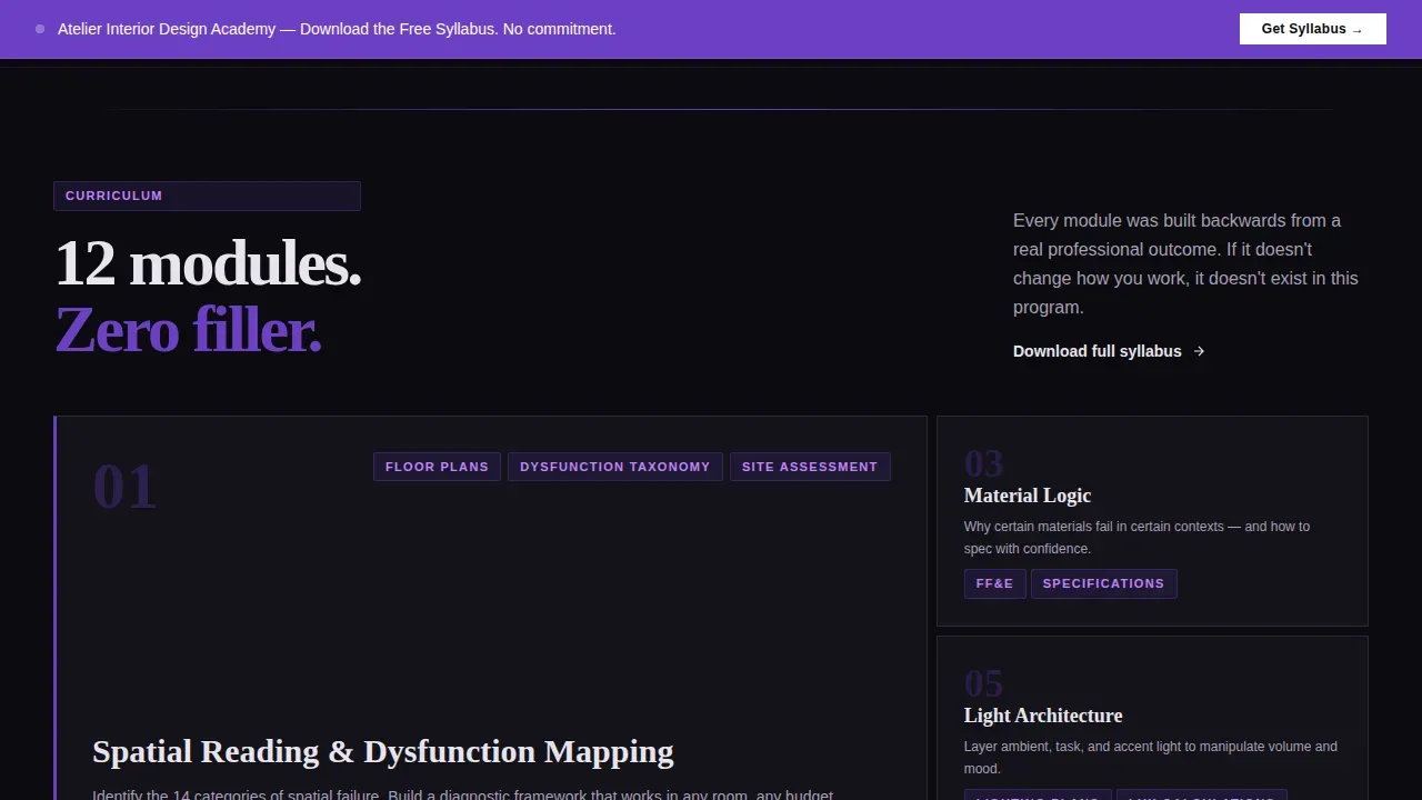
- Weak lead capture strategy costs course creators enrollments. Atelier structures the customer journey so the syllabus download call to action appears only after three curriculum preview cards have already demonstrated depth, making the conversion feel earned rather than pressured.
- Low visitor trust kills course sales before they start. The template answers this with graduate transformation cards, outcome metrics displayed in oversized numerals, and video testimonial placeholders inside expandable grid cells, because effective landing pages rely on social proof to build confidence in potential students.
What you get with this template
Atelier delivers a fully structured, visually complete landing page ready for an interior design course or training platform. The design is desktop-first with full mobile parity, and every section is crafted to carry the visitor from pain recognition to lead conversion.
- A complete bento grid landing page with six distinct section zones: a hero with product screenshot, a pain-to-solution flip grid, curriculum preview cards, graduate social proof, a lead capture form, and a footer following the horizontal flow pattern.
- Scroll-triggered animations and card flip transforms that visually reorganize the grid as visitors scroll, turning a static design into a storytelling experience that unfolds in real time.
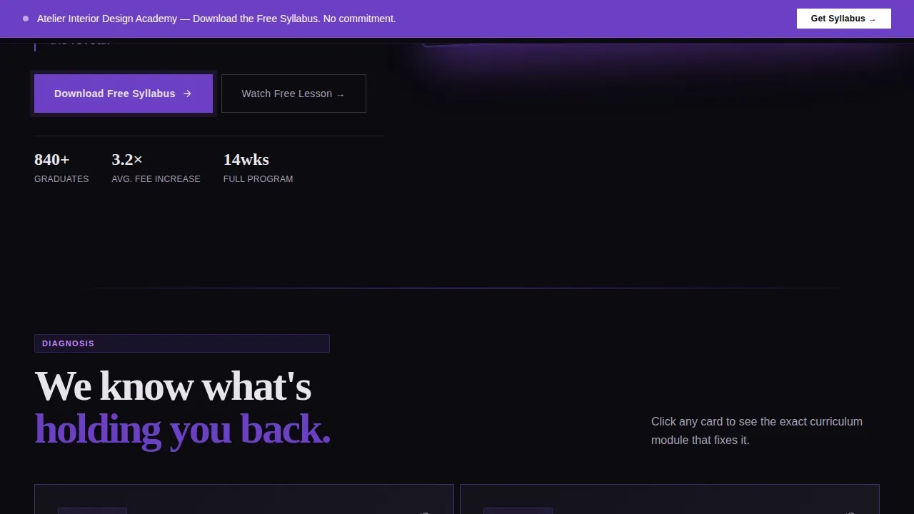
- A sticky violet call-to-action bar that activates after the first scroll fold, keeping the "Download the Free Syllabus" prompt visible throughout the landing page without interrupting the reading flow.
Feature list
Atelier is built around a precise set of features drawn directly from its brief. Each one serves the landing page's core purpose: convert design-curious visitors into qualified leads for an interior design course.
Confrontational Pain-Point Bento Grid
The landing page opens with a grid of stark typographic cards. Each card states a real problem in blunt, direct language: "You have taste but no technical language." The bold typography is set in heavy oversized sans-serifs that slam into grid edges with zero apology. This approach draws from neo-brutalist design principles, where bold typography and a raw aesthetic challenge traditional design norms to create an immediate emotional reaction in visitors.
Scroll-Triggered Grid Reorganization
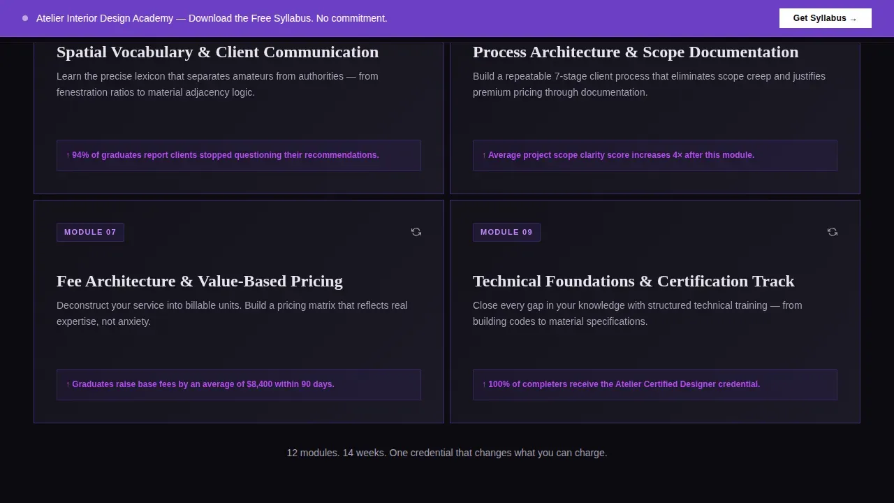
As visitors scroll, the bento grid transforms. Violet floods in, cards flip from pain points to curriculum modules, and graduate metrics appear in oversized numerals. The animations are scroll-triggered, meaning the visual architecture of the grid itself tells the story of disorder becoming structure. This kind of interactive storytelling is what separates a high-converting landing page from a brochure that users scroll past without engaging.
Product Screenshot Hero Section
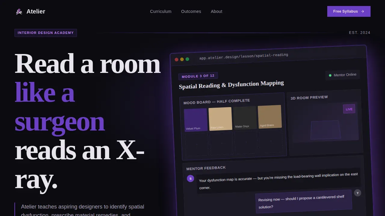
The hero section uses the platform's lesson dashboard rendered at full scale inside a brutalist browser frame. It shows a half-completed mood board module with fabric swatches, a three-dimensional room preview, and a mentor feedback thread mid-conversation. The screenshot sits slightly rotated on a void-black field, casting a violet drop shadow. No lifestyle photography, no smiling faces: the product is its own proof, and high-quality visuals like this are essential for engaging visitors on interior design landing pages.
Sticky Lead-Capture Bar with Qualifying Form
A violet bar anchors the primary call to action for the entire landing page. It activates after the first scroll fold and stays visible throughout the visit. The form captures first name, current career field, and one open-text qualifying question. A secondary path offers a free twenty-minute lesson module via email gate. Clear calls to action are essential for guiding visitors toward desired actions, and this two-path structure gives users two distinct entry points into the funnel.
Expandable Video Testimonial Grid Cells
Graduate transformation cards live inside bento grid cells that expand on click. Video testimonial placeholders load inside the expanded cells, and before-and-after fee data appears alongside real outcome metrics. Landing pages that feature social proof and case studies consistently build stronger trust with potential students. The grid cell expansion uses smooth animations so the interaction feels effortless and does not interrupt the page's visual rhythm.
Dark Mode Void and Violet Color System
The entire landing page operates in dark mode. Absolute black dominates the grid cells. Bruised violet bleeds through borders and dividers. Pale ash provides breathing room for typography. Electric orchid is reserved exclusively for hover effects and call-to-action states. This color discipline gives the landing page a gallery-warehouse atmosphere, similar to an art gallery in a converted warehouse space, where every element earns its place or gets cut.
Page sections overview
| Section | Purpose |
|---|---|
| Hero Bento Grid | Displays product screenshot and confrontational pain-point cards side by side |
| Pain to Solution | Scroll-triggered grid flips from problem cards to curriculum module answers |
| Curriculum Preview | Module cards with depth proof and student outcome metrics in large numerals |
| Graduate Social Proof | Transformation cards with outcome data and expandable video testimonial cells |
| Lead Capture Form | Syllabus download form and free lesson email gate with qualifying question |
| Footer Flow | Horizontal footer pattern with brand links and secondary navigation |
Design & branding system
Atelier's design language is deliberate and confrontational. The visual identity follows a Bold Brutalist theme that draws from the raw materiality and structural honesty central to brutalist design education. Courses on bold, brutalist interior design emphasize these same principles: raw materiality, structural honesty, and sculptural forms. The template applies those principles to web design by treating the grid itself as exposed architecture.
- Void and Violet color system built on four values: absolute black (#0B0B0F) as the dominant field, bruised violet (#6C3FC5) for borders and dividers, pale ash (#E8E4EC) for body typography, and electric orchid (#B24BF3) reserved strictly for hover effects and call-to-action elements. The palette creates a gallery-warehouse atmosphere where every color carries weight.
- Fraunces display serif paired with DM Sans for body and user interface text. Bold typography is used not just for readability but as a central design element that conveys brand identity and emotion. Oversized headings slam into grid edges. Body copy in DM Sans stays clean and readable against the dark mode background.
- Bento grid layouts with broken-grid architecture that evokes a sense of experimentation. Neo-brutalism embraces a chaotic layout with oversized text and deliberate asymmetry to create striking visual experiences. The grid reorganizes on scroll, making the design itself a storytelling medium.
Mobile & speed optimization
The landing page is built desktop-first, designed for designers and course researchers reviewing content on large screens. Full mobile parity is included so that every section, animation, and form works correctly across screen sizes. The design of a landing page should align with the overall brand, and Atelier achieves this consistency from desktop down to the smallest device.
- Responsive bento grid layouts that reflow correctly on smaller screens without losing the brutalist aesthetic. The grid cells stack and resize while preserving the typographic scale and dark mode palette.
- Client-side animations with server component architecture where static sections use server components for faster initial load and animated sections use client components. Scroll-triggered bento reveals and card flip transforms use smooth animations that feel intentional rather than decorative, contributing to a better user experience across every device type.
How this template helps you convert
Atelier is built around a conversion strategy, not a visual exercise. Every design decision moves the visitor one step closer to downloading the syllabus or accessing the free lesson. Landing pages should be designed with a focus on conversion, and Atelier demonstrates this principle in its architecture from the very first scroll.
- The pain-point grid earns attention before asking for anything. Confrontational typographic cards name real problems that career-changing designers recognize immediately. The visitor does not feel sold to; they feel seen. This emotional connection primes them for the solution reveal as the grid flips.
- The syllabus call to action appears only after curriculum depth has been demonstrated. Three curriculum preview cards load before the sticky bar becomes prominent. By the time visitors reach the lead capture form, they are not hoping the course is good. They are confirming what they have already seen, which produces a fundamentally different and more committed conversion mindset.
Other information about this template
Atelier sits at the intersection of bold creative design principles and practical lead generation architecture. It is one of the more focused landing page templates available for the interior design education niche, and its design system can be adapted for adjacent creative agency or portfolio use cases without breaking its core visual logic.
- Neo-brutalist design principles in practice: Neo-brutalist landing pages can effectively convey a brand's personality through their unique and bold visual language. Neo-brutalism is a design trend characterized by raw, unrefined aesthetics that challenge traditional web design norms, and Atelier applies those principles to the specific context of an interior design course landing page. Designers often use neo-brutalism to create memorable user experiences, and the template is designed to deliver exactly that.
- Relevant web design and ui ux context: Bold typography is a significant trend in modern web design, emphasizing clarity and visual impact. The template's ui design decisions follow current ui ux best practices: dark mode for immersive aesthetics, easy navigation through a single scroll flow, and hover effects that reward exploration without confusing users. The page website architecture keeps visitors oriented at all times through a clear visual hierarchy.
- Design education context: Specialized design institutions offer programs focusing on Advanced Interior Design or Industrial/Raw Aesthetics including brutalism topics. Courses on brutalist design typically follow a module-based approach, transitioning from theory to practical application. Modules in a brutalist design course can include history and philosophy, material palette and texture, spatial design and lighting, furniture and curation, and project application. Atelier's curriculum preview section is designed to surface exactly this kind of structured module depth to prospective students.
- Brand design and marketing use cases: The template's brand design system is self-contained and opinionated. Its brand identity communicates authority and creative seriousness from the first pixel. For a small business or independent course creator, this level of visual authority is difficult to achieve without a template this purpose-built. The landing page's marketing strategy follows a clear customer journey from awareness through pain recognition to conversion, and the design reinforces each stage visually.
- Template style and creative direction details: The atelier bold brutalist interior design course landing page template uses the Problem to Solution Arc creative direction, a Product Screenshot header concept, and a Lead Generation landing page direction. The color system is Void and Violet. The template style is Bento Grid. The theme is Bold Brutalist. These are the intersection match context fields that define the template's identity across the platform's design catalog.
- Broader creative and portfolio applications: While the template is purpose-built for an interior design academy, its bento grid layouts, dark mode aesthetics, and scroll-triggered animations make it a strong reference for creative agency landing page projects, portfolio showcase sites, and one page website builds in adjacent creative fields. Visitors to any site built on this template encounter bold visuals, intentional typography, and a creative process that feels designed rather than assembled.
- Web design and ui ux inspiration: Bold Brutalist courses are rare in the design education space; the style is typically taught through specialized modules and masterclasses at design institutions. UCLA Extension, for example, offers a course exploring major twentieth-century architectural movements from Bauhaus to Brutalism. Atelier brings that same spirit of creative rigor into web design, applying brutalist design aesthetics to a landing page that must also perform as a functional lead generation tool. The result is a site that is as architecturally honest as the interior design philosophy it teaches.
- Additional design and usability notes: The template's usability is built on a one page structure with easy navigation through scroll. Visitors never lose their place. The page website layout uses illustrations within grid cells, visuals that reinforce the curriculum preview, and bold typographic storytelling throughout. Photography is intentionally absent from lifestyle sections; instead, the product screenshot and design visuals do the work. The landing page can support own websites built on modern front-end frameworks, and no coding skills beyond basic configuration are needed to launch it. For anyone building a creative design presence in the interior design education space, this template provides immediate depth and authority.
Theme
Bold Brutalist
Creative direction
Problem→Solution Arc
Color system
Void & Violet
Style
Bento Grid
Direction
Lead Generation
Page Sections
Confrontational Pain-point Bento Grid
Scroll-triggered Card Flip Animations
Product Screenshot Hero with Brutalist Frame
Sticky Lead Capture Bar and Dual Conversion Paths
Expandable Video Testimonial Grid Cells
Dark Mode Void and Violet Color System
Related questions
Who is this landing page template built for?
Do I need coding skills to use this template?
What makes this template different from a standard course landing page?
Can this template be adapted for other creative design niches?
How does the lead generation flow work in this template?



