Nexus — Point of Sale Landing Page Template
Terminal is a bento grid landing page template built for SaaS point-of-sale systems. It combines a Tech Glass visual identity with a spec-sheet creative direction, putting a pixel-perfect product screenshot front and center. The layout guides multi-location restaurant owners, boutique retailers, and franchise operators through a tile-by-tile capability showcase, ending at a feature-by-feature competitor comparison table.
by Rocket studio
Quick summary
Terminal is a single-page bento grid template designed for a SaaS point-of-sale product. It uses a Slate & Sky color system and a spec-sheet scroll to walk buyers through every capability. The page builds confidence tile by tile, then closes with a direct competitor comparison table and a sticky sign-up bar.
Who this template is for
This template is built for SaaS point-of-sale companies whose buyers need evidence, not emotion. It works best when your product serves business operators who evaluate tools against a checklist.
- Multi-location restaurant owners managing lunch rush volumes and labor costs
- Boutique retail managers who reorder inventory directly from the sales floor
- Franchise operators who need every register synchronized before the morning meeting
What problem this template solves
Most SaaS landing pages lean on lifestyle photography and vague benefit statements. Buyers who run real operations do not have time for that. They arrive with a specific question and leave if they cannot find a direct answer fast.
- Generic hero sections fail to show what the actual product interface looks like in use
- Competitor comparisons buried in blog posts force buyers to leave your page to find answers
- Single-column layouts make dense spec information feel overwhelming instead of scannable
What you get with this template
You get a fully structured bento grid landing page ready to showcase a SaaS point-of-sale system. Every section is purpose-built to match how technical buyers actually scan a product page.
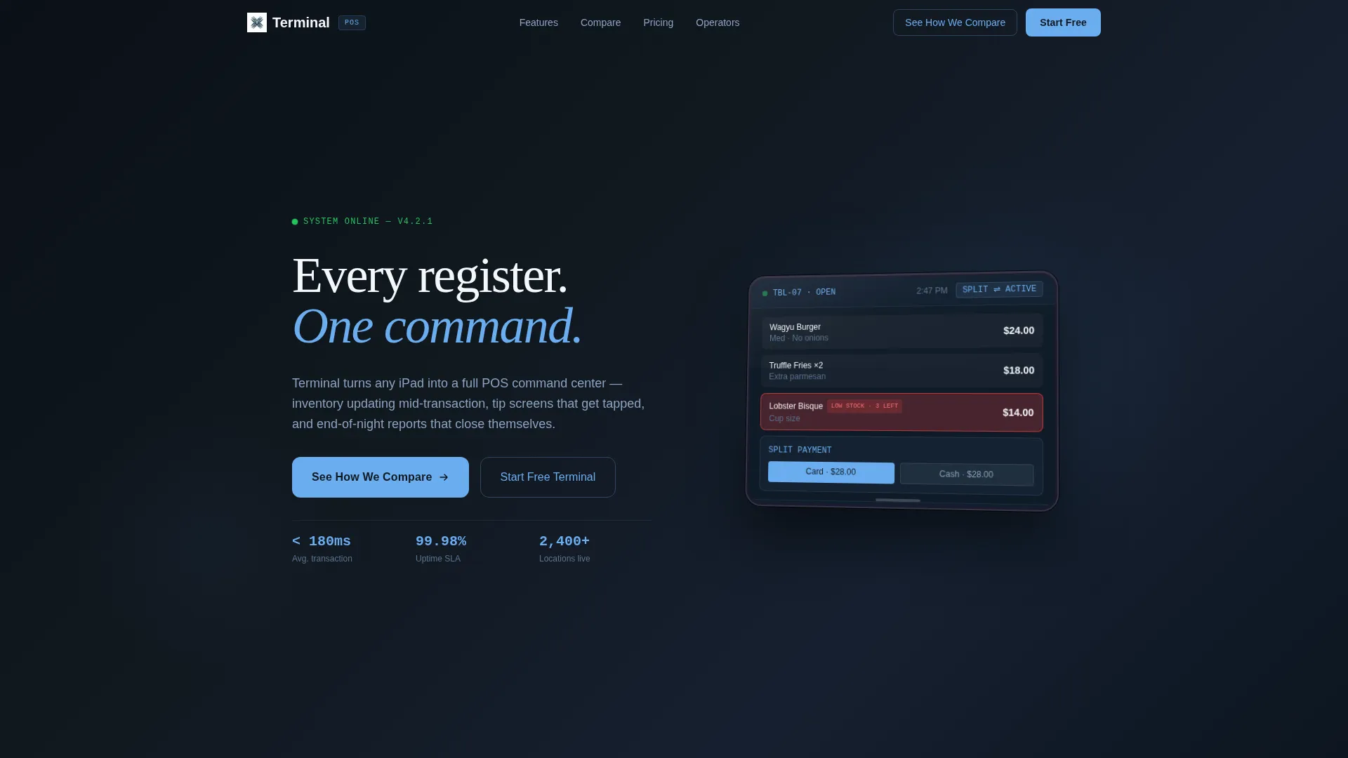
- A pixel-perfect product screenshot header showing a live transaction mid-flow on a tablet
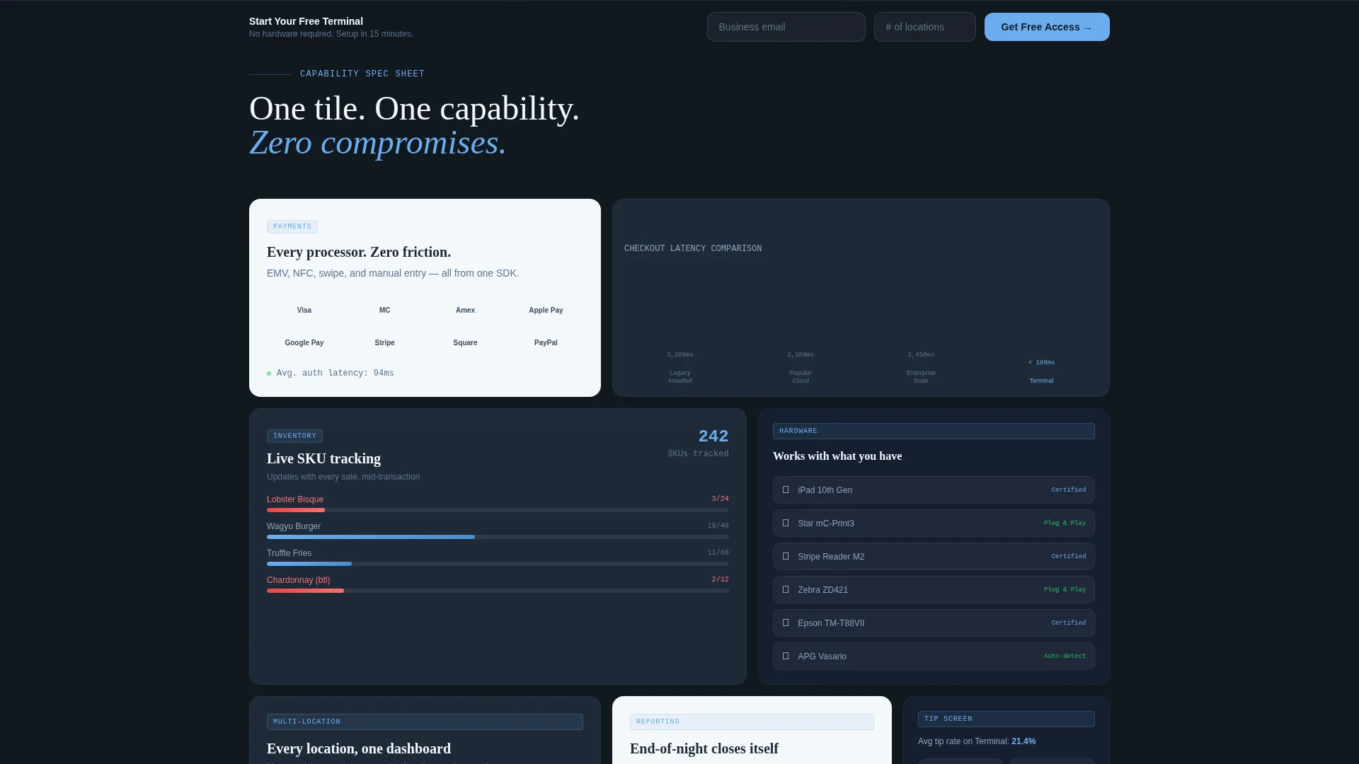
- Bento tiles that each isolate a single capability, including payment integrations, checkout speed charts, and hardware compatibility
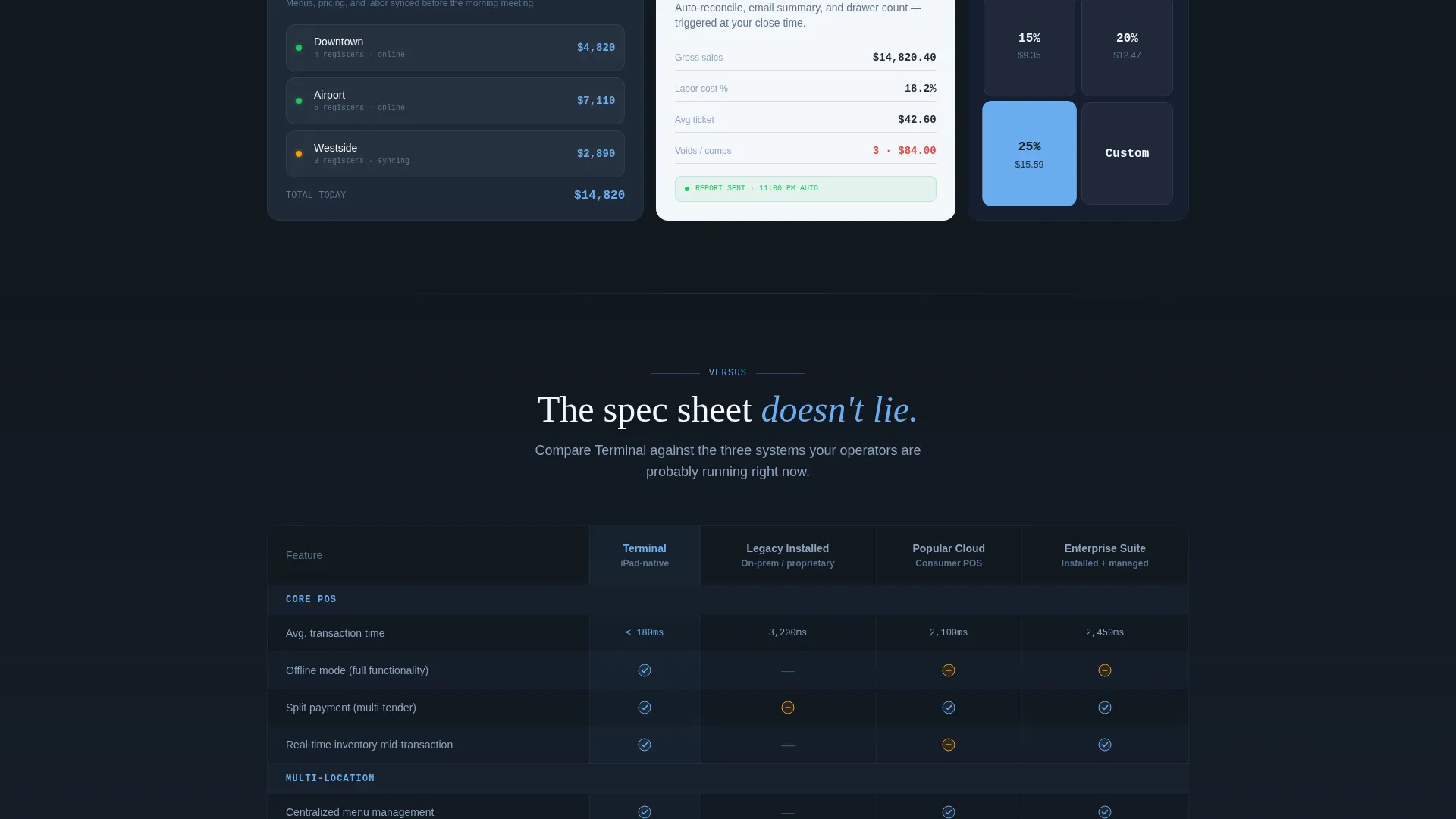
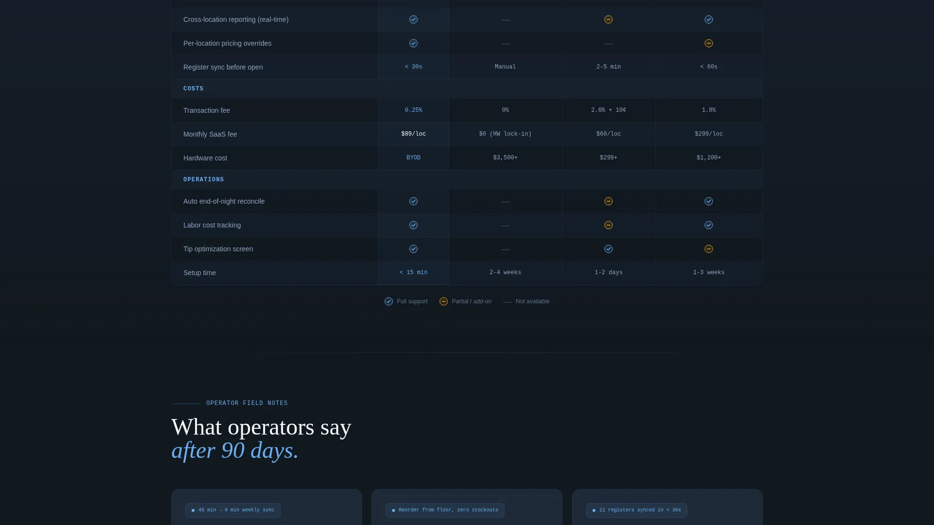
- A feature-by-feature competitor comparison table with checkmarks, dash marks, and specific metric callouts
- A sticky bottom bar with a two-field sign-up form capturing business email and number of locations
Feature list
This template ships with a focused set of layout components. Each one is grounded in the spec-sheet creative direction described in the brief.
Bento Grid Capability Tiles
Each tile isolates one product capability the way a technical data sheet breaks down a single specification. Tiles include payment integration logo grids with latency numbers, an animated checkout speed bar chart, and a narrow vertical tile stacking hardware compatibility icons. Every tile contains a micro-screenshot or user interface fragment, never an illustration.
Product Screenshot Hero Header
The header centers a pixel-perfect render of the point-of-sale dashboard on a sleek tablet, angled to catch a simulated glass reflection across the top bezel. The screen displays a live transaction with three line items, a split-payment toggle active, and a real-time inventory flag on one product. A gunmetal-to-black gradient sits behind the device.
Competitor Comparison Table
The comparison table measures the product against three competitor categories: Legacy Installed, Popular Cloud, and Enterprise Suite. Rows use checkmarks, dash marks, and specific metric callouts such as transaction fees and offline mode capability. This section anchors the primary call to action, "See How We Compare."
Sticky Sign-Up Bar
A persistent bottom bar follows the visitor through the entire scroll. It carries the secondary call to action, "Start Your Free Terminal," which opens a two-field form asking for business email and number of locations.
Tech Glass Visual System
The Slate & Sky palette uses deep gunmetal (#1E2A38) for backgrounds, polished slate (#3B4D61) for text, atmosphere blue (#6AADF0) for every interactive surface, and clean panel white (#F4F7FA) for bento card surfaces. The result reads as enterprise-grade without feeling cold or inaccessible.
Page sections overview
| Section | Purpose |
|---|---|
| Product Screenshot Header | Establishes product credibility with a live transaction view |
| Payment Integration Tile | Shows compatible payment methods and latency data |
| Checkout Speed Tile | Animated bar chart comparing transaction speed |
| Hardware Compatibility Tile | Stacks supported device icons in a narrow vertical format |
| Competitor Comparison Table | Side-by-side feature and metric breakdown against three competitor categories |
| Sticky Sign-Up Bar | Persistent two-field form driving free trial sign-ups |
Design & branding system
The Tech Glass theme treats the interface itself as the hero. Dark backgrounds make every element pop, and the single accent color pulls the eye to every interactive moment without visual clutter.
- Backgrounds use deep gunmetal (#1E2A38) fading to black behind the hero device render
- Bento card surfaces float on clean panel white (#F4F7FA) against the dark background
- Atmosphere blue (#6AADF0) marks every clickable surface and active state throughout the page
Mobile & speed optimization
The bento grid layout is structured to reflow naturally at smaller viewport widths. Tiles that sit side by side on desktop stack vertically on mobile without losing their individual focus.
- Each bento tile maintains its micro-screenshot or interface fragment at any screen size
- The sticky sign-up bar remains anchored at the bottom of the viewport on all devices
- The product screenshot header scales down while keeping the dashboard legible on smaller screens
How this template helps you convert
The page is built on a deliberate evidence-stacking logic. Each scroll step adds one more reason to trust the product, so by the time a visitor reaches the comparison table, the decision already feels made.
- The product screenshot header answers the first question immediately: what does the product actually look like, and does it look professional enough to trust with my business?
- The bento tile sequence lets each visitor find the specific capability that matters most to them, whether that is payment speed, hardware support, or inventory behavior mid-transaction.
- The competitor comparison table removes the need to leave the page for research, and the sticky bar keeps the sign-up action available the entire time.
Other information about this template
This template is built as a single landing page, not a multi-page website. It is designed specifically for the SaaS point-of-sale niche and works best when paired with a real product dashboard screenshot rather than a placeholder image.
- The template style is Bento Grid, which suits dense product specifications without overwhelming the reader
- The creative direction follows a Spec Sheet approach, meaning every visual element carries functional information
- The header concept is a Product Screenshot, so no lifestyle photography or illustrated graphics are expected or needed
- The landing page direction is Comparison/Versus, meaning the competitive table is a core structural element and not an optional add-on
- This template sits within the Technology category under the SaaS Software and SaaS subcategory
Theme
Tech Glass
Creative direction
Spec Sheet
Color system
Slate & Sky
Style
Bento Grid
Direction
Comparison/Versus
Page Sections
Bento Grid Capability Tiles
Product Screenshot Hero Header
Competitor Comparison Table
Sticky Sign-up Bar
Tech Glass Visual Identity
Related questions
What kind of product is this template built for?
Can I adapt this template for a single-location business?
Does the template include the competitor comparison table content?
What makes the bento grid layout suitable for a SaaS product page?
Is this a single landing page or a multi-page website?



