Rapid Community Builder Landing Page Template
The Huddle instant community launch platform landing page template is a split-screen, single-page layout built for teams who need groups running fast. It pairs a live-feeling dashboard preview with a focused free-trial call to action. Developer advocates, SaaS teams, and open-source maintainers will find it immediately relevant and conversion-ready.
by Rocket studio
Quick summary
This huddle landing page template delivers a 50/50 split-screen design with a mission-control glassmorphic aesthetic. It shows a fully animated group dashboard on one side and a headline-driven call-to-action panel on the other. The page is structured to move visitors toward a free-trial signup with zero form fields on the page itself.
Who this template is for
This huddle landing is built for people who launch and manage communities at speed. The page speaks directly to operators who know what they need and want proof before they commit.
- Developer advocate managers running regional meetups across multiple cities at once
- SaaS product teams seeding power-user councils and structured user groups
- Open-source maintainers replacing multi-tool chaos with a single, organized platform
What problem this template solves
Managing a community across disconnected tools creates friction. Spreadsheets, unanswered threads, and stitched-together workflows slow every group launch to a crawl. This huddle landing page addresses that directly.
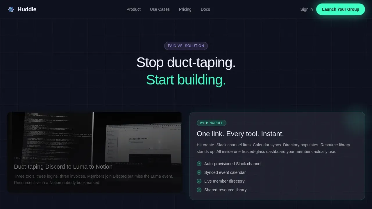
- Visitors see the messy reality of scattered tools placed against a resolved, glowing platform view
- The page removes exit points and keeps the audience focused on one action: starting a free trial
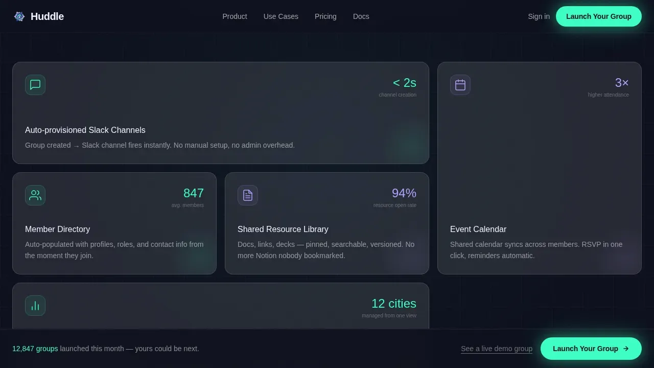
- Every scroll section reinforces the value of having channels, calendars, directories, and resources in one place
What you get with this template
This is a complete, single-page layout ready for your project. All visual sections, animations, and call-to-action placements are included out of the box.
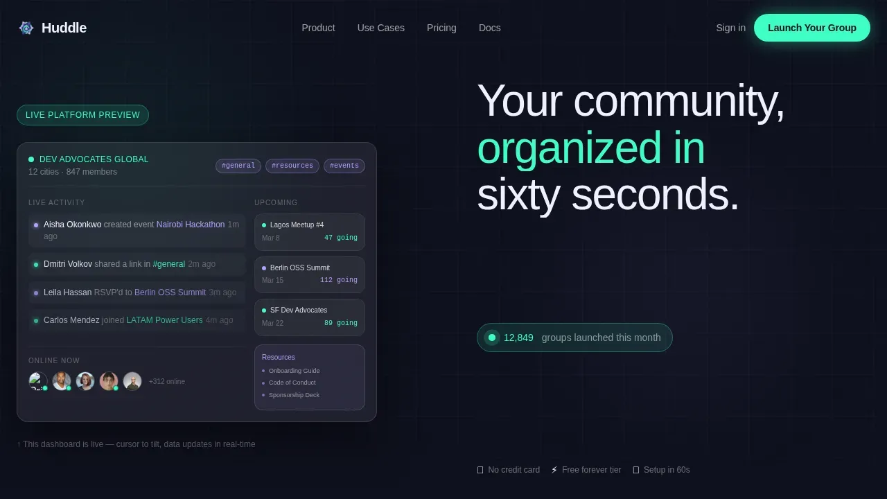
- A cursor-reactive 50/50 hero with a live-feeling dashboard and a pulsing mint call-to-action button
- Alternating feature blocks pairing pain-point screenshots with glassmorphic platform resolutions
- A marquee logo ticker, live group counter, and a three-click group creation proof card at the close
Feature list
This huddle landing page template includes the following built-in design and layout features.
Animated Split-Screen Hero
The hero section divides the page dead-center. The left panel renders a populated group dashboard inside a frosted glass card with cursor-driven parallax tilt. The right panel holds the headline, a ticking group counter, and the primary call-to-action button. The section visible before any scrolling is the most critical real estate for conversions, and this template treats it accordingly.
Pain-Versus-Solution Alternating Sections
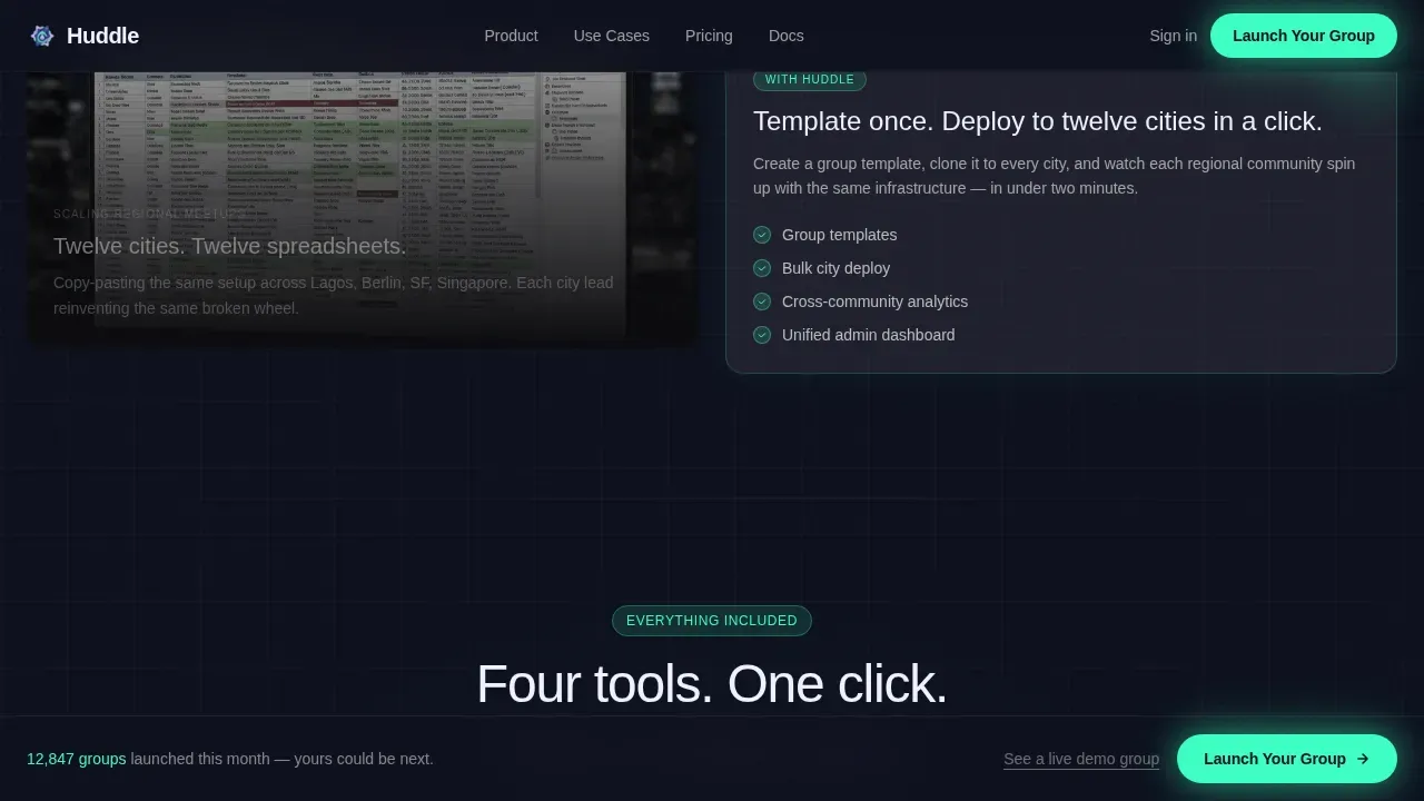
Scroll sections pair a muted, static pain-point image on one side with an animated platform resolution on the other. This layout uses alternating feature blocks to build momentum as the page progresses. Each block gets shorter and snappier, and the electric mint accent intensifies with scroll depth.
Social Proof Ticker and Live Counters
A horizontal marquee of company logo images breaks the scroll rhythm mid-page. Animated counters accelerate as visitors scroll, reinforcing community activity with specific data points. Highlighting the number of active groups and member interactions demonstrates real community value without requiring words to do all the work.
Sticky and Anchored Call-to-Action System
The primary "Launch Your Group" button appears in the hero, repeats as a sticky bottom bar after the second section, and anchors the final full-width closing block. No form fields appear on this page. A secondary text link beneath each call to action gives hesitant visitors one more layer of proof before clicking through.
Three-Click Group Creation Proof Card
The final section zooms into a single frosted glass card showing a group created in three steps: name, invite link, first event. This collapses all prior sections into one moment of proof. It is structured to make not clicking feel like leaving real value on the table.
Glassmorphic Design System
Every frosted panel, badge, and container is built on a cohesive visual language. Deep space indigo backgrounds, layered frosted glass cards, electric mint action states, and soft lilac accent tags work together as a complete, consistent system across the full page.
Page sections overview
| Section | Purpose |
|---|---|
| Split-Screen Hero | Dashboard preview paired with headline and primary call to action |
| Pain versus. Solution | Alternating split comparisons showing messy tools resolved by the platform |
| Features Bento Grid | Asymmetric grid showcasing channels, calendar, directory, and resources |
| Social Proof Marquee | Logo ticker and accelerating group counters mid-page |
| Final Proof Card | Three-click group creation card and full-width closing call-to-action block |
| Single-Row Footer | Linear footer row with minimal links and brand mark |
Design & branding system
The visual identity runs on a Startup Velocity theme expressed through a glassmorphic color system. Every surface is built to feel like a translucent tablet held in a dark mission-control room, where each layer implies depth without weight.
- Background color: deep space indigo (#0D0F1C) with frosted glass panels at 12 to 15 percent white opacity
- Electric mint (#3DFFC4) drives every action state, live counter pulse, and call-to-action button glow
- Typography uses a bold geometric sans-serif font family for headings and a clean secondary face for body text, both set in crisp interface white (#F0F2FF) with careful font size and font weight choices for hierarchy
Mobile & speed optimization
This template is built desktop-first for power users, with responsive behavior scaled down through CSS. The layout uses Flexbox, with flex direction and justify content rules controlling panel stacking at each device width. CSS media queries handle the transition from the two-column hero to a single-column mobile view.
- Border radius, padding, margin top, margin left, and margin right values are adjusted per breakpoint to maintain an optimal layout at every screen size
- The background image, background size, and background position are set to scale cleanly across viewports without layout breakage
- Just-in-time loading is applied to interactive client components, keeping static server-rendered sections fast while animations load on demand
How this template helps you convert
This huddle landing is structured as a focused click-through page with one goal: push visitors into the free-trial signup flow.
- The above-the-fold hero section captures attention immediately, with a live dashboard and a glowing call-to-action that communicates value before any scrolling happens
- Alternating pain-versus-solution blocks build trust through honest contrast, so visitors can see real-life improvement rather than abstract promises
- The sticky call-to-action bar and the final proof card ensure the commit moment is always one tap away, regardless of how far a visitor has scrolled
Other information about this template
This template also serves as a strong learning reference for developers working on front-end skill development through realistic projects.
- Frontend Mentor challenges help improve coding skills by building realistic projects, and this huddle landing page is a meaningful challenge to replicate or extend
- The page can be built using HTML and CSS; developers can open the HTML file in a live server environment and use starter code as a foundation, adjusting basic styling details like text align, text decoration, max width, and container padding to match the design
- The challenge was constructed mobile-first, using Flexbox and Grid, with media queries handling larger screen styles; align items, justify content, and flex direction values shift naturally to serve each breakpoint
- Huddle re-imagines how teams build the community experience: the template's app's authentication solution placeholder and feedback form section can be connected when you integrate Huddle into a live product environment
- A sans serif font family, background color layers, curved sections with smooth border radius, and careful margin top and margin left spacing give the page its natural flow and visual polish
- Fans will love how quickly they can start chatting immediately after joining; the page is designed to help audience members engage in genuine discussion and build meaningful discussions from day one
- This template supports a loyal community model: it helps you create connections, build communities, and foster insightful conversations through an organized, single introductory section that sets the voice and mission of every group
- The single introductory section is intentionally lean: it removes exit points, sets a clear single introductory section purpose, and makes connections with your users feel immediate and real
Theme
Startup Velocity
Creative direction
Launch Energy
Color system
Glassmorphic
Style
Split Screen (50/50)
Direction
Click-Through
Page Sections
Cursor-reactive Split-screen Hero
Alternating Pain-versus-solution Blocks
Social Proof Marquee and Live Counters
Sticky Call-to-action System
Three-click Group Creation Proof Card
Glassmorphic Component Design System
Related questions
What page type is this template?
Can I customize the colors and branding?
Is this a good reference for a Frontend Mentor challenge project?
Does the page include a signup form?
How does the sticky call-to-action behave on smaller screens?



