Advanced Software & SaaS Comparison Website Template
Endpoint is a dark-themed API management landing page built for engineering teams that need to govern every service in one place. It features a terminal-style hero, a sticky feature comparison table, and a two-step audit signup form. The design feels like a well-configured IDE: sharp, structured, and built to turn API sprawl into a clean, auditable inventory.
by Rocket studio
Quick summary
Endpoint is a single-page landing page template for API management platforms. It opens with a live-style terminal hero showing a real discovery request and response, then leads visitors through a sticky comparison table that builds a clear business case row by row. Two conversion paths, a free audit signup and a gated PDF download, capture leads at every stage of the buying journey.
Who this template is for
This template is designed for software and SaaS teams that sell or present API management tools to a technical audience. It speaks directly to people who evaluate platforms by evidence, not marketing copy.
- Platform engineering leads managing sprawl across dozens of internal microservices
- Engineering leaders preparing for compliance audits who need clear API ownership records
- Developer experience teams fielding constant questions about which endpoint does what
What problem this template solves
Engineering organizations scale fast, and API inventories grow faster. Without a structured control plane, teams lose track of who owns which service, which APIs expose sensitive data, and which endpoints are quietly deprecated. This template solves the presentation problem: how do you make that chaos legible to a buyer in under sixty seconds?
- No clear way to show feature superiority over manual spreadsheets or legacy tools
- Buyers need evidence, not narrative, before they forward anything to a VP of Engineering
- Technical visitors leave before calls to action because the page doesn't speak their language
What you get with this template
You get a complete, dark-themed single-page layout built around structured comparison and technical credibility. Every section is pre-designed and ready to fill with your platform's real data.
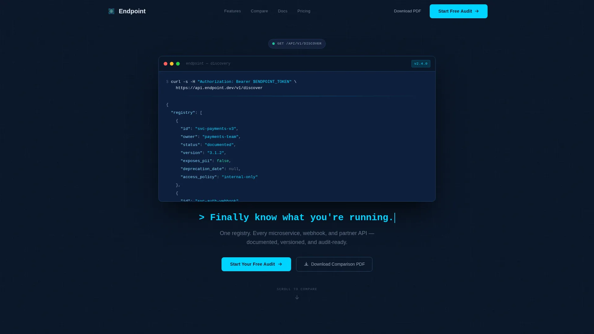
- A full-viewport terminal hero with a syntax-highlighted API discovery response as the hero content
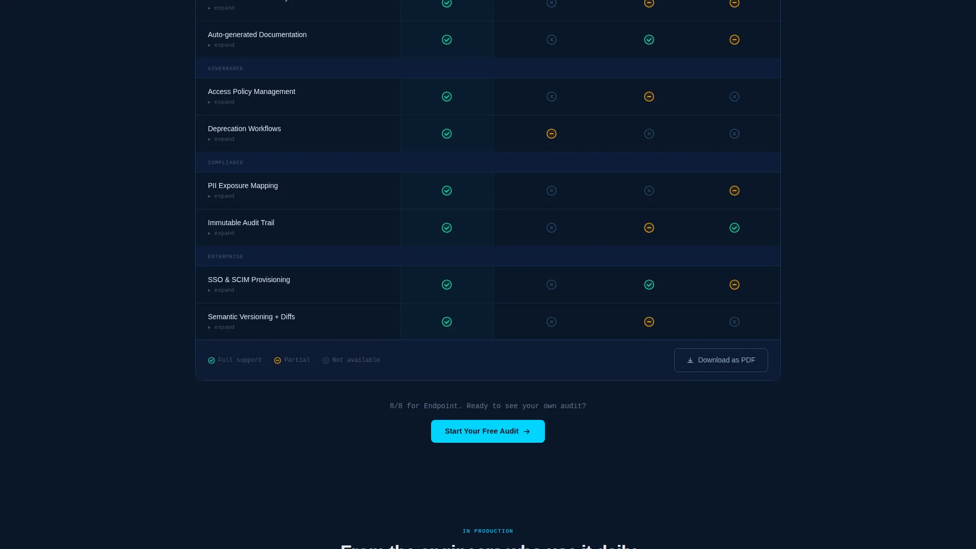
- A sticky multi-column comparison table with expandable row explainers and clear checkmark states
- Two distinct conversion paths: a two-step audit form and a gated PDF download for downstream leads
Feature list
This template ships with a focused set of components built specifically for technical SaaS positioning.
Terminal Hero with Live Code Snippet
The header fills the full viewport with a dark terminal frame. It displays a real curl request and a streaming JSON response, with each API object syntax-highlighted in cyan and slate. The headline types itself below the snippet as a terminal prompt, creating immediate product clarity without a single stock photo.
Sticky Comparison Table
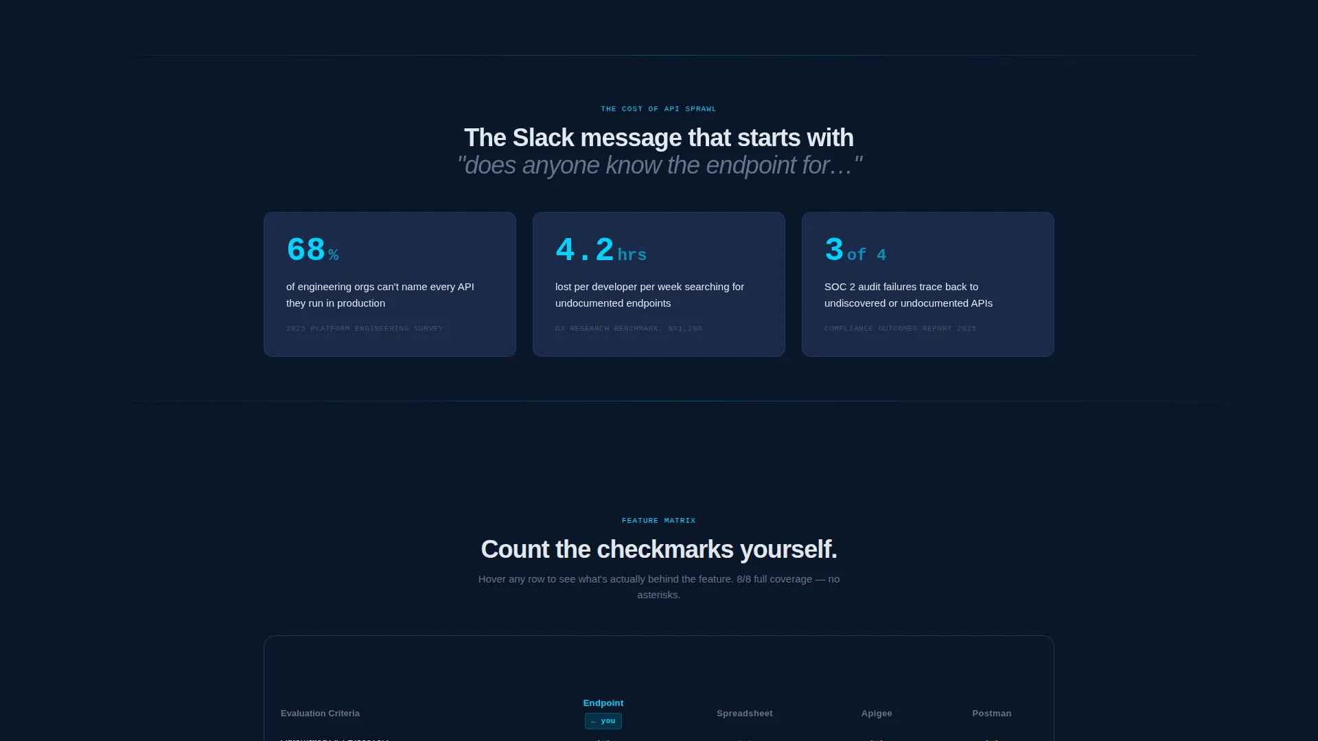
A structured feature matrix locks into view as visitors scroll. It compares the platform against manual spreadsheet tracking and two named competitors across six evaluation rows: API discovery, automated documentation, access policy management, deprecation workflows, audit trail depth, and single sign-on integration. Each cell uses cyan checkmarks, partial-support dashes, or empty states.
Expandable Row Explainers
Hovering any row in the comparison table expands a one-sentence explainer. This gives technically curious visitors the context they need without cluttering the table surface. It keeps the layout clean while rewarding deeper engagement.
Two-Step Audit Signup Form
The primary call to action opens a two-step form. Step one collects a work email. Step two presents a dropdown for estimated API count (1 to 50, 51 to 200, or 200 and above) and a radio group for primary pain point: discovery, governance, deprecation, or compliance. This segmentation helps teams qualify and route leads immediately.
Gated PDF Download Path
A secondary conversion block invites visitors to download a comparison PDF. It is gated behind an email field only, making it a lower-friction option for leads who need to share evidence with a decision-maker before committing to a signup.
Pinned Navigation Call to Action
The top navigation bar stays visible throughout the scroll and carries the primary "Start Your Free Audit" button. This ensures the conversion option is always one click away, whether the visitor is at the hero or the final table row.
Page sections overview
| Section | Purpose |
|---|---|
| Terminal Hero | Hook visitors with a syntax-highlighted API discovery response and a typed headline |
| Sticky Comparison Table | Let visitors build their own business case by scanning feature rows side by side |
| Expandable Row Context | Deliver one-sentence explainers on hover without cluttering the table layout |
| Primary Audit call to action | Capture qualified leads through a two-step form with segmentation fields |
| PDF Download Block | Offer a low-friction email gate for leads not yet ready to sign up |
| Pinned Navigation Bar | Keep the primary call to action visible and clickable throughout the entire scroll |
Design & branding system
The visual identity follows a Directory and Discovery theme built entirely around the Midnight Blue color system. Every color decision reinforces the feeling of a well-configured development environment viewed at midnight.
- Deep terminal navy (#0A1628) as the primary background, with desaturated slate (#1B2A4A) for card surfaces and table rows
- Cold white (#E2E8F0) for body text to maintain legibility against dark backgrounds across all sections
- Electric cyan (#00D4FF) reserved exclusively for interactive elements: hover states, toggle switches, and the blinking cursor in the header
Mobile & speed optimization
The template is structured to remain functional and legible across screen sizes. The sticky comparison table and terminal hero are the two most layout-intensive components, and both are designed with responsiveness in mind.
- The sticky table adapts for smaller viewports so evaluation rows remain readable on mobile devices
- The two-step form flow is optimized for thumb-friendly interaction, keeping input fields and radio buttons appropriately sized
How this template helps you convert
The page is built around a Comparison and Versus conversion strategy. Every design decision moves a skeptical technical buyer closer to a decision.
- The terminal hero creates instant product comprehension by showing real API response data rather than abstract marketing language, establishing credibility before the visitor reads a single headline.
- The sticky comparison table turns passive scrolling into active evaluation, letting visitors count checkmarks and build their own internal business case as they move down the page.
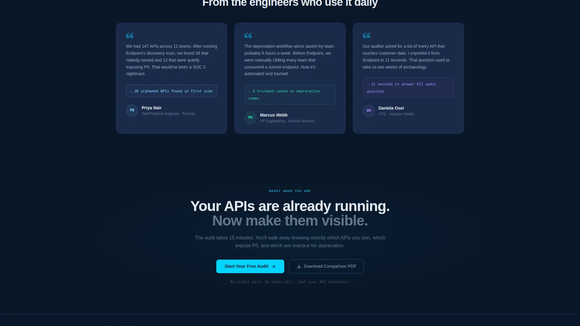
- Two conversion paths accommodate different buyer stages: the audit form captures decision-ready leads, while the PDF download path captures leads who need one more step before they can commit.
Other information about this template
This template is categorized under Technology, specifically the Software and SaaS subcategory, with a niche focus on API management platforms. It is well suited for teams building or marketing tools in the API governance, API catalog, and developer portal space.
- The template style is a Comparison Table layout, making it a strong fit for any API management tool competing against legacy or manual alternatives
- The header concept is a Code Snippet frame, which immediately signals technical depth to platform engineering and developer experience audiences
- The creative direction is a Feature Matrix, meaning the scroll structure is built to persuade through structured evidence rather than storytelling
- The landing page direction is Comparison and Versus, a pattern proven to resonate with buyers who are already evaluating multiple tools
Theme
Directory & Discovery
Creative direction
Feature Matrix
Color system
Midnight Blue
Style
Comparison Table
Direction
Comparison/Versus
Page Sections
Terminal Hero with Code Snippet
Sticky Feature Comparison Table
Expandable Row Explainers on Hover
Two-step Lead Qualification Form
Gated PDF Comparison Download
Pinned Navigation with Call to Action
Related questions
Can I customize the comparison table rows and competitors?
What does the two-step audit form collect?
Is the PDF download path separate from the main signup?
Who is the terminal hero section designed for?
Can this template work for a SaaS product outside API management?



