Nexus — Scalable Mobile Development Landing Page Template
This Flutter landing page template is built for developers who need a production-ready starting point fast. It uses a modular card grid layout, a dark terminal aesthetic with neon accents, and a Feature Matrix structure that lets visitors scan seven capability modules and jump directly into the one that matters most. No forms, no friction, just code, context, and a clear path forward.
by Rocket studio
Quick summary
This is a single-page Flutter getting started guide built as a modular card grid. It covers seven core capability areas, from widget basics to deployment, and presents each as a scannable, hoverable card with real code. The design runs on void black backgrounds, neon accents, and a sticky call-to-action bar. Developers land here, find their entry point, and click through immediately.
Who this template is for
This landing page is designed for teams and individuals building developer-education products around Flutter. It works equally well for tutorial platforms, documentation hubs, and interactive guide environments targeting a technical audience.
- Junior developers and bootcamp graduates who know React and need to ship a mobile app fast
- Senior engineers evaluating whether to migrate an existing native codebase to a cross-platform app built with Flutter
- Developer educators and content teams who want a polished, code-forward landing page to showcase Flutter modules
What problem this template solves
Most developer landing pages either read like marketing copy or dump raw documentation at visitors. Neither approach works for a technically sophisticated audience who wants to evaluate a tool quickly and start building. This template closes that gap.
- It replaces vague feature lists with real, hoverable code snippets, proving practical value before the visitor commits to anything
- It removes email gates and forms entirely, sending every click directly to the relevant interactive module
- It gives senior engineers enough technical signal to evaluate Flutter seriously, while staying approachable enough for a junior dev on their first cross-platform assignment
What you get with this template
You get a complete, single-page layout built around a Feature Matrix grid. Every section is purpose-built for a developer audience. The design system, copy structure, and interactive elements all ship together.
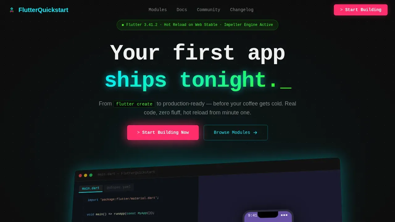
- A pixel-perfect hero section with a split-pane product screenshot, isometric tilt, cyan glow, and a monospace headline
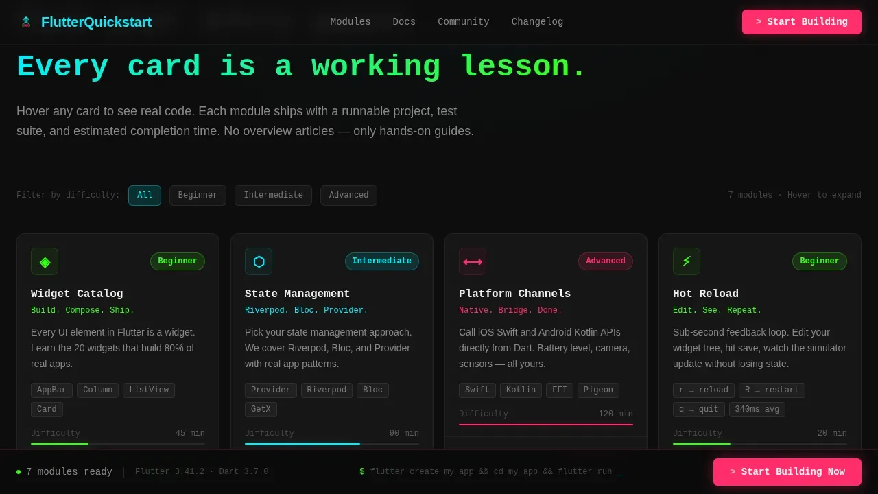
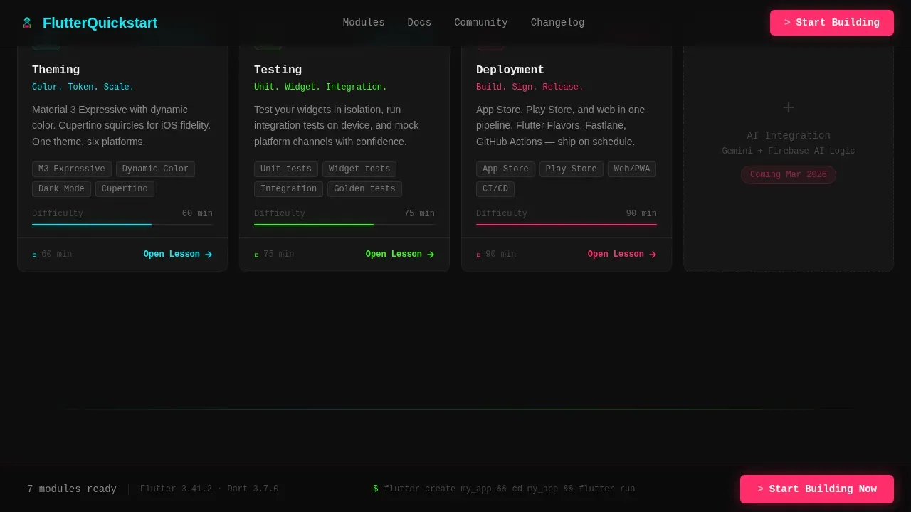
- Seven capability cards covering Widget Catalog, State Management, Platform Channels, Hot Reload, Theming, Testing, and Deployment, each with hover-expanded code snippets and difficulty badges
- A sticky bottom bar with the primary call-to-action, a Stats Bar section, a social proof marquee, and a GitHub-minimal footer
Feature list
This section describes each major functional block included in the template, matched directly to the source brief.
Hero Section with Split-Pane Product Screenshot
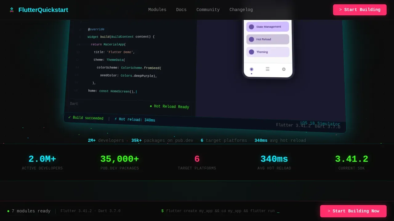
The hero leads with a cinematic split-pane screenshot: a dart file open in the editor on the left, and an iOS simulator rendering a Material 3 interface on the right. The image sits on a subtle isometric tilt with a soft electric cyan glow behind it. Above it, a single monospace headline reads: Your first app ships tonight. There are no stock photos and no illustrations, just the tool itself, already running.
Feature Matrix Card Grid
The core of the landing page is a uniform card grid with seven module cards. Each card shows a micro-screenshot, a three-word label, and a color-coded difficulty badge, terminal green for beginner, electric cyan for intermediate, and hot magenta for advanced. Hovering a card expands it to reveal a four-line code snippet and an estimated completion time. This turns the grid into a living, self-directed syllabus. Visitors scan, compare, and self-select their entry point without scrolling through narrative copy.
Sticky Call-to-Action Bar
After the visitor scrolls past the hero, a sticky bottom bar appears and stays fixed in view. It carries the primary call-to-action button labeled "Start Building Now," rendered in hot magenta. The bar does not interrupt reading, it simply stays present. Each individual card also carries a secondary call-to-action, "Open Lesson," routing directly to the specific module. No form, no email gate, the click leads immediately to the interactive guide environment.
Stats Bar Section
Below the hero, a Stats Bar presents live-style platform statistics: supported platforms, available packages, and hot reload latency figures. This section establishes technical credibility in a single glance. It signals to engineers that the content is current and grounded in real Flutter runtime behavior, not marketing approximations.
Social Proof and Ecosystem Marquee
The social proof section includes a scrolling marquee of company logos and developer testimonials with GitHub handles attached. Testimonials from real developers build trust with users who are evaluating the platform. The marquee keeps the section visually active without requiring interaction, and the GitHub handles add authenticity that generic quote blocks cannot replicate.
Dark Terminal Footer
The footer follows a GitHub Developer Minimal pattern. It sits on a void black background and strips away everything non-essential. Links are clean, spacing is generous, and the terminal aesthetic carries through without decoration.
Page sections overview
| Section | Purpose |
|---|---|
| Hero split-pane | Establish immediate visual credibility with a live-looking product screenshot and monospace headline |
| Stats bar | Surface platform stats to validate technical depth at a glance |
| Feature Matrix grid | Present seven capability modules as scannable, hoverable cards with code |
| Social proof marquee | Build trust with users through developer testimonials and company logos |
| Call-to-action section | Reinforce conversion with a dark terminal block and the primary magenta button |
| Sticky call to action bar | Keep the primary action visible throughout the entire scroll session |
| GitHub minimal footer | Close cleanly with essential links and zero visual noise |
Design & branding system
The visual identity runs on an Acid Digital color system built for a developer audience. Every design decision reinforces the feeling of a live terminal environment, precise, synthetic, and immediately legible.
- Void black (#0D0D0D) dominates every background surface; terminal green (#39FF14) marks code snippets and success states; electric cyan (#00F0FF) highlights interactive card borders on hover
- Hot magenta (#FF2D6B) is reserved strictly for the primary call-to-action and alert states, ensuring the eye always finds the most important action without scanning
- Typography uses JetBrains Mono for code elements and headlines, and DM Sans for body copy and user interface labels, a combination that balances technical precision with reading comfort
Mobile & speed optimization
The template is desktop-first, built for developers working on laptops and monitors. That said, it includes a solid mobile fallback so the experience does not break on smaller screens. The design uses adaptive layouts to handle varying screen sizes gracefully.
- GPU-accelerated transforms handle all animations, including GSAP scroll reveals, card hover expansions, terminal cursor blink effects, and the social proof marquee
- Intersection Observer drives scroll-triggered reveals, so only visible elements animate, reducing unnecessary work during idle scroll periods
- Card components follow the principle of small, single-purpose const widgets, which keeps rebuild cycles minimal and the interface responsive even on mid-range devices
How this template helps you convert
This landing page is engineered for click-through, not form submission. Every design and copy decision works toward a single outcome: getting the visitor to press "Start Building Now" or "Open Lesson" without hesitation.
- The hero section earns attention immediately by showing a real, running app rather than abstract marketing language, visitors see the output before they read a single word of explanation
- The Feature Matrix grid lets visitors self-qualify by scanning difficulty badges and reading four lines of real code per card, so the click that follows is confident and intentional rather than exploratory
- The sticky call-to-action bar ensures the primary button is always one tap away, no matter how deep into the grid the visitor has scrolled
Other information about this template
This template is designed specifically as a flutter build production ready cross platform app landing page template for the Flutter documentation and getting started niche. The sections below cover additional technical and contextual details relevant to developers using or adapting this template.
- Flutter is Google's user interface toolkit for building applications for mobile, web, and desktop from a single codebase. Flutter dramatically speeds up cross-platform development while reducing costs compared to building separate native apps for each platform.
- Flutter applications are developed using Dart, an object-oriented programming language introduced by Google in 2013. Dart supports asynchronous operations and isolates, enabling concurrently running code with isolated memory heaps. Dart's ahead-of-time (AOT) compiler transforms code into fast, predictable, and native outputs.
- Flutter allows developers to write code once in Dart, which compiles to native code across multiple operating systems, including android and ios platforms. This single codebase approach covers android app development, ios application targets, and web apps without maintaining separate repositories.
- The flutter sdk must be installed and your development environment configured before you start creating your new flutter project. You can open a flutter project using visual studio code or android studio, both are fully supported editors for flutter development.
- A well-structured flutter application template built with Clean Architecture principles provides authentication, navigation, and state management out of the box. The project structure follows a layered approach that promotes separation of concerns, testability, and maintainability. A clear project structure following the DRY principle also enhances scalability.
- The pubspec.yaml dart file specifies your flutter app's version, dependencies, and assets. You can update build and version numbers in pubspec.yaml before releasing to the app store. Run
flutter build ipato create a build archive and upload it to App Store Connect. - To release your ios app, you must enroll in the Apple Developer Program and use a macOS machine with Xcode installed. Every ios application is associated with a Bundle ID registered with Apple. Flutter supports ios platforms running ios 13 and later.
- After uploading, internal testers on TestFlight typically receive build validation within 30 minutes. Apple then notifies you when the app review process is complete.
- For android app releases, the google play store requires a signed APK or App Bundle. Once submitted, you can manage releases through the play store console and distribute to internal testers before a public rollout.
- Flutter web renders to an HTML canvas, which can affect search engine visibility. Meta tags should be manually added to the HTML since search engines cannot crawl the Flutter canvas easily. For this reason, building the main marketing or landing page using traditional, SEO-optimized HTML is recommended for high-traffic scenarios.
- The HTML renderer is preferred for more static web content to improve First Contentful Paint and search engine visibility. For high-traffic landing pages, a separate HTML page for indexing that links to the main flutter application can be beneficial.
- Responsive layouts should use LayoutBuilder and MediaQuery to adapt to different screen sizes. Define screen width ranges and apply different adaptive layouts accordingly to implement breakpoints. Use adaptive breakpoints for responsive apps to ensure compatibility across a range of devices.
- Flutter's widget-based user interface system offers a reactive approach, ensuring instant updates to the interface with state changes. Creating small, single-purpose const widgets improves readability and performance by minimizing unnecessary rebuilds.
- The text widget, padding widget, and other widgets like Icon widgets contribute to the ui components system. Custom widgets extend these foundations to create reusable ui components that fit a specific app's design language. Icons are built into the Material library and can be used across android and ios without separate asset management.
- State management is central to most apps. This template's card grid and hover-expansion behavior require robust state management patterns to handle widget build cycles cleanly. Patterns like
class MyApp extends StatelessWidgetandclass MyHomePage extends StatelessWidgetestablish the foundational widget tree. Thevoid mainentry point,buildcontext contextpassed through eachwidget buildmethod, andclass MyHomePagescaffold definitions follow standard flutter conventions.class MyAppserves as the root widget, andclass MyHomePage extends StatelessWidgetdefines the home screen. - Error handling and local storage patterns are important for production flutter applications. Secure storage libraries protect sensitive user data. Backend services for authentication and data sync can be connected to a flutter application following standard Dart async patterns. Automated tests, including unit and widget tests, help verify that core logic and ui components behave correctly. Run tests regularly to catch regressions before shipping to the app store.
- The following code pattern is a standard entry point for a new flutter project:
void main() => runApp(class MyApp());. From there, a single screen or multi-screen app grows outward using the widget tree. Most apps begin with a single screen before expanding to multi-tab or multi-route navigation. Building applications this way, from a single codebase, is how flutter achieves real world cross platform coverage without sacrificing native code performance. - Write code once, ship to android and ios, web, and desktop. Flutter's hot reload lets you see changes instantly without restarting the app, keeping the development target feedback loop tight throughout mobile development.
- This template was built under the Dashboard Pro theme using the Acid Digital color system with the Feature Matrix creative direction. It uses a Product Screenshot header concept and is optimized for click-through landing page performance. The template style is a Card Grid (Modular) layout.
Theme
Dashboard Pro
Creative direction
Feature Matrix
Color system
Acid Digital
Style
Card Grid (Modular)
Direction
Click-Through
Page Sections
Feature Matrix Card Grid with Hover Code
Cinematic Hero with Product Screenshot
Sticky Bottom Call-to-action Bar
Stats Bar and Social Proof Marquee
Acid Digital Neon Design System
GSAP Animations and High-interactivity Layer
Related questions
Does this template work for both Android and iOS targets?
Can I adapt the card grid to add or remove capability modules?
Is this landing page suitable for a team that is new to Flutter?
What development environment do I need to use this template?
How does the sticky call-to-action bar behave?



