Nexus — Service Coordination Landing Page Template
Dispatch is a dark-themed, glassmorphic home services booking landing page built around a live-feel scheduling dashboard. It gives plumbing, electrical, HVAC, and cleaning businesses an interactive estimator, a glowing weekly calendar grid, and data panels that show real numbers, turning passive visitors into trial signups before they scroll past the fold.
by Rocket studio
Quick summary
Dispatch is a single-page, click-through landing page template designed for home services booking and scheduling businesses. It leads with a glowing calendar interface and an interactive cost estimator, then walks visitors through data panels that reflect their own numbers back at them. By the time they reach the call to action, they have already experienced the product.
Who this template is for
This template is built for home services operators who need to replace phone-tag workflows with instant online bookings. It speaks directly to the people managing schedules across multiple crews and service zones.
- Owner-operators running small fleets who rely on a whiteboard and missed-call callbacks to manage their day
- Regional franchise managers drowning in voicemail backlogs and needing confirmed time slots at scale
- Property managers handling maintenance requests across dozens of rental units simultaneously
What problem this template solves
Home services businesses lose revenue every time a booking happens over the phone instead of online. Potential customers move on, technicians sit idle, and no single view shows where the gaps are.
- Missed calls and manual estimate scribbles mean confirmed jobs slip through the cracks
- No real-time visibility into technician availability, service zones, or open time slots
- Visitors arriving on a generic page see no proof of capability and leave before converting
What you get with this template
Dispatch delivers a fully designed, single-page layout built around dashboard-style data panels and an interactive booking estimator. Every section is crafted to show rather than tell.
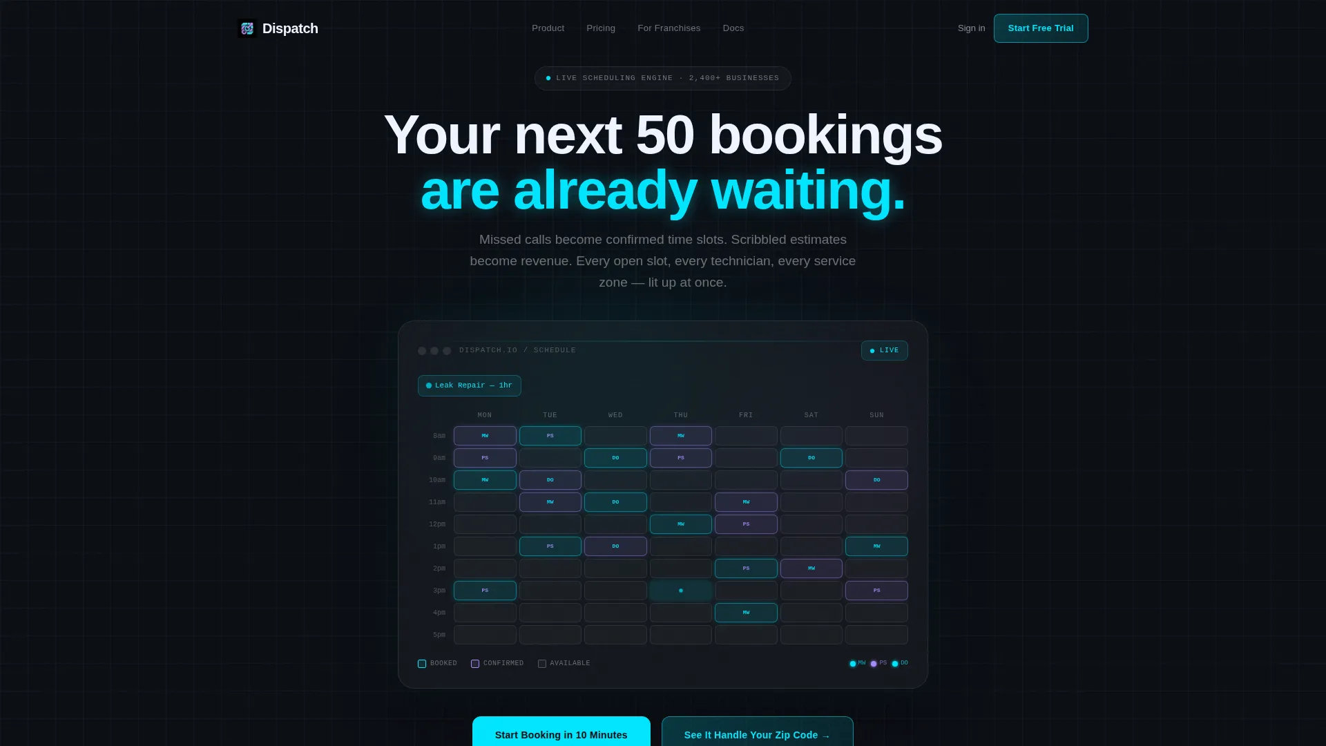
- A dark full-bleed header with a glowing, animated weekly calendar grid as the centerpiece
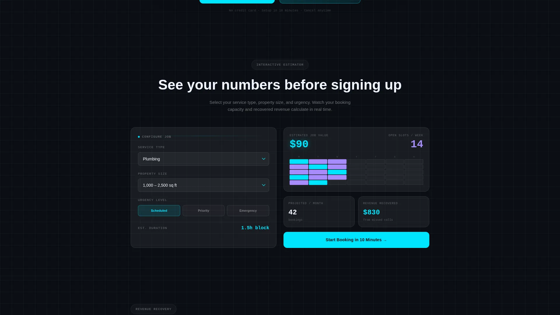
- An interactive booking cost and time estimator that recalculates live as visitors adjust inputs
- Scroll-triggered data panels including a revenue-recovered counter, a technician utilization heat map, and a customer satisfaction score tracker
Feature list
A short paragraph opens this section: each feature below is directly drawn from the template brief and represents a real, delivered component of the Dispatch landing page.
Animated Scheduling Calendar Header
The header places a live-feel weekly calendar grid at center screen on a void black background. Time slots illuminate in cyan as the page loads, technician avatars slide into confirmed appointments, and a service-type pill auto-populates with a soft glow animation. No stock photography is used, the product interface is the hero.
Interactive Booking Cost Estimator
Immediately below the header, visitors land on an estimator tool. They select a service category, square footage range, and urgency level. The dashboard grid recalculates live, showing estimated duration, technician availability across a sample week, and a projected monthly booking volume.
Live Data Panel Sections
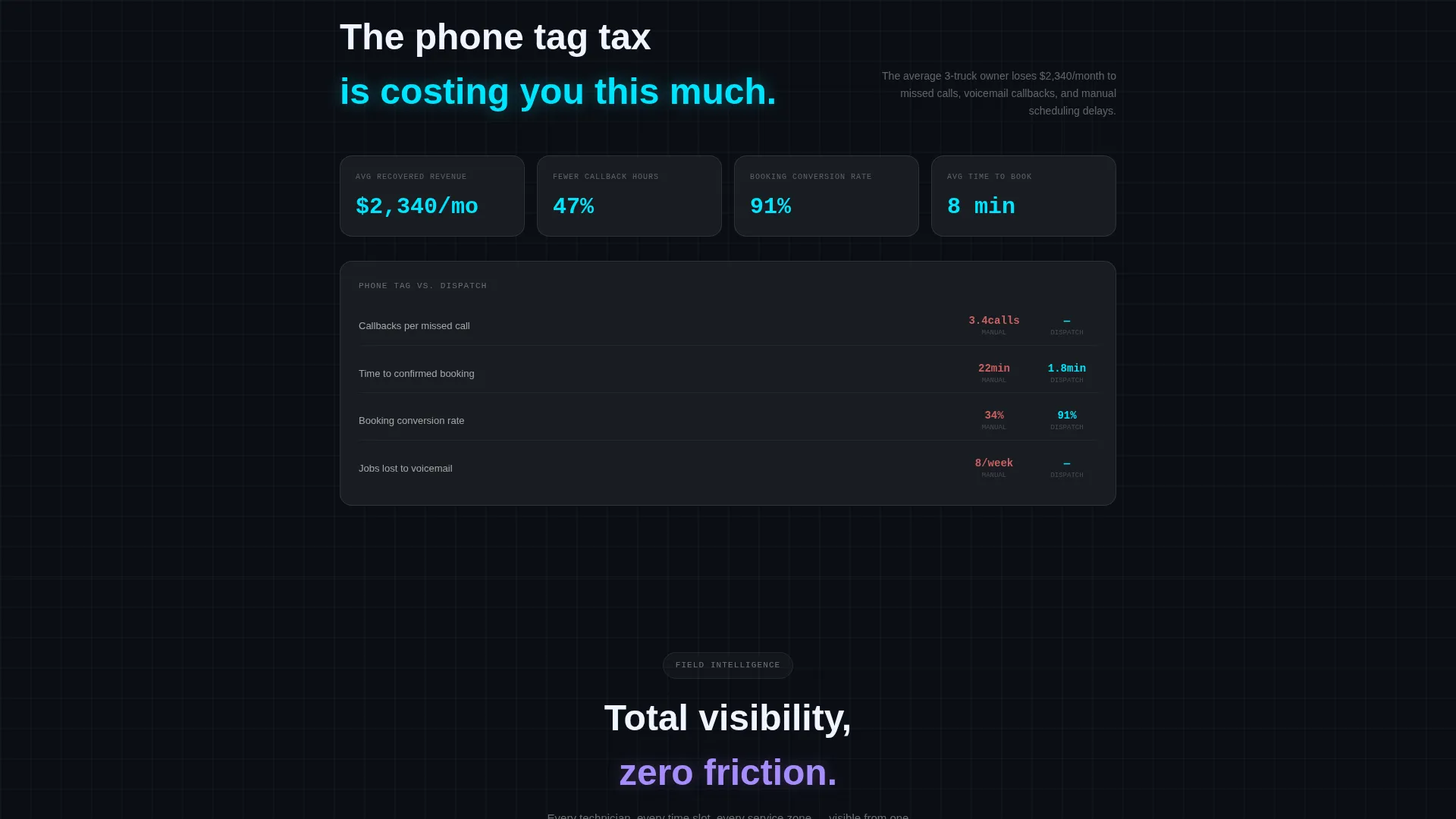
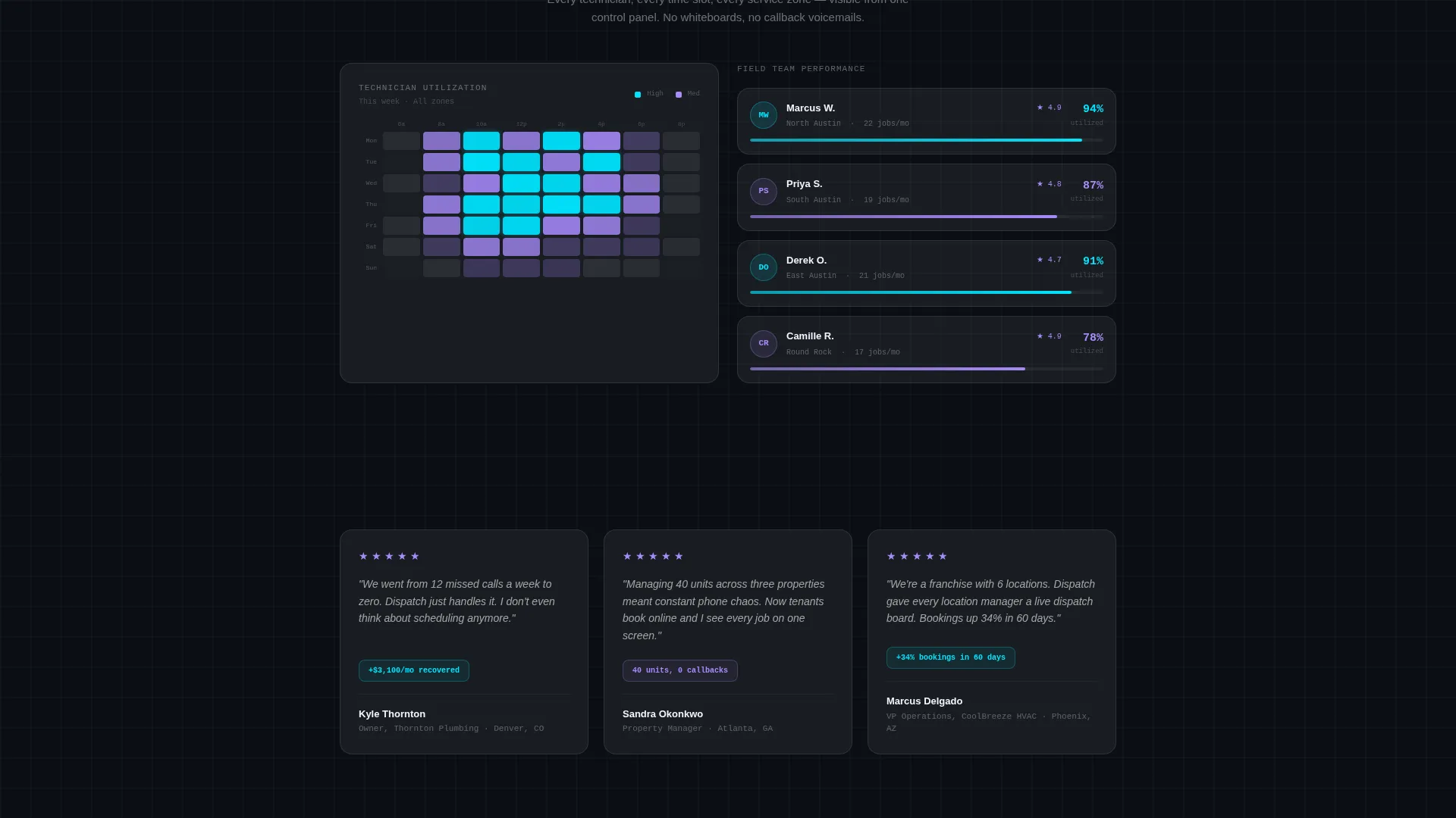
Each scroll section reveals a new data panel. A revenue-recovered counter compares phone-tag hours to instant bookings. A technician utilization heat map shows capacity at a glance. A customer satisfaction score tracker rounds out the data story.
Persistent Floating Call-to-Action Bar
The primary call-to-action button appears first as a glowing cyan element pinned to the estimator tool. After the second scroll section, it reappears as a persistent floating bar that stays visible as the visitor continues reading.
Service Area Modal
A secondary conversion path labeled "See It Handle Your Zip Code" opens a quick modal. Visitors enter their service area and see a simulated booking density map, giving them a personalized preview before committing to the trial.
Glassmorphic Component System
Every card, panel, and interactive element is built using the Tech Glass visual system. Frosted panel surfaces, 1-pixel translucent borders, 12-pixel backdrop blur, and cyan halo hover states create a cohesive, high-contrast design language throughout the page.
Page sections overview
| Section | Purpose |
|---|---|
| Dark Header Grid | Showcases animated scheduling calendar as the product hero |
| Booking Cost Estimator | Lets visitors calculate duration, availability, and volume live |
| Revenue Recovery Panel | Compares phone-tag losses to instant-booking gains with a counter |
| Technician Heat Map | Visualizes crew utilization across a sample service week |
| Satisfaction Score Tracker | Displays a customer satisfaction metric panel |
| Floating call to action Bar | Keeps the primary signup action visible after second scroll |
| Service Area Modal | Simulates booking density for the visitor's own zip code |
Design & branding system
Dispatch uses a Tech Glass theme built on a glassmorphic color system. The palette is designed to feel like a smartphone screen glowing in a dark room, dark, luminous, and immediately legible.
- Core colors: void black (#0B0E14) for the background, frosted panel white (white at 8% opacity) for card surfaces, electric cyan (#00E5FF) for active states and data highlights, and soft lavender (#A78BFA) for confirmations and completed states
- Card construction: 1-pixel translucent white borders, 12-pixel backdrop blur on all card surfaces, and a faint cyan halo that pulses on every interactive element hover state
- Typography and layout follow a dark-first, high-contrast approach, every headline, data label, and status pill is designed to stay legible against the deep background at all viewport sizes
Mobile & speed optimization
The Dispatch template is structured for clean rendering across screen sizes. Its dark-first design and component-based layout translate well from desktop to smaller viewports without losing the dashboard aesthetic.
- Data panels and the estimator tool are built in a grid layout that adapts to narrower screens, keeping inputs and outputs visible without horizontal scrolling
- The persistent floating call-to-action bar is positioned to remain accessible on mobile without obscuring key content
- Glassmorphic card components use fixed blur and opacity values that maintain visual clarity across modern mobile browsers
How this template helps you convert
Dispatch earns the click by letting visitors use the product before they commit. The conversion flow is built around progressive engagement rather than a single ask.
- The interactive estimator on the first scroll gives visitors a live preview of their own scheduling data, so the value is felt before any pitch is made
- The revenue-recovered counter and heat map panels hand visitors concrete numbers they can bring to an internal decision, lowering the friction of saying yes
- The persistent floating call-to-action bar and the service area modal create two clear paths to the trial signup, capturing both ready-to-act visitors and those who need one more proof point
Other information about this template
Dispatch is a click-through landing page template, meaning its single goal is to move qualified visitors to a free trial signup on the next page. It is not a multi-page website or a back-end booking system.
- The template is built under the Dashboard and Data Grid style category, making it well suited for home services businesses that want to present scheduling complexity as something manageable and modern
- It sits within the Home Services Digital Presence subcategory and is designed for the Home Services Booking and Scheduling niche, covering use cases across plumbing, electrical, HVAC, and residential cleaning
- The Tech Glass theme and glassmorphic color system are consistent design choices, not decorative additions, they reinforce the idea that the scheduling tool itself is the differentiator
- The creative direction is Calculator and Tool First, which means the estimator is not a secondary feature; it is the primary engagement hook and the reason a visitor stays past the header
Theme
Tech Glass
Creative direction
Calculator/Tool First
Color system
Glassmorphic
Style
Dashboard/Data Grid
Direction
Click-Through
Page Sections
Animated Scheduling Calendar Header
Interactive Booking Cost Estimator
Scroll-triggered Data Panels
Persistent Floating Call to Action Bar
Service Area Booking Modal
Glassmorphic Component System
Related questions
What type of businesses is this template built for?
Is this a full booking system or a landing page?
Can I customize the service categories shown in the estimator?
What makes the header different from a standard hero image?
What is the secondary conversion path on this page?



