Nexus — Smart Franchise Network Landing Page Template
Dispatch is a franchise help desk and ticketing landing page template built for operations teams managing dozens or hundreds of locations. It combines a live-simulated interactive header, a modular spec-card grid, and a head-to-head comparison table to show exactly how centralized ticket routing replaces fragmented communication tools across a franchise network.
by Rocket studio
Quick summary
Dispatch is a single-page franchise help desk and ticketing platform template. It opens with an interactive preview of a live ticket queue, then builds a persuasive case through spec cards pinned with hard numbers. A full-width comparison table and two conversion paths work together to capture both demo-ready buyers and leads still comparing options.
Who this template is for
This template is built for teams selling franchise software to operations-heavy organizations. If your buyers spend their days coordinating fixes across dozens or hundreds of locations, this page speaks their language directly.
- Franchise operations directors managing multi-location support queues
- Regional managers replacing spreadsheet trackers with a centralized system
- IT leads inheriting overloaded shared inboxes across a franchise network
What problem this template solves
Franchise support teams lose time every day switching between Slack threads, email inboxes, and manual trackers. There is no single place to see which unit has a problem, who owns the fix, and whether it was resolved. This template presents a platform that changes that.
- Fragmented communication tools creating missed tickets and delayed responses
- No visibility into resolution times or open issues across all locations
- Compliance flags and equipment failures falling through the cracks between tools
What you get with this template
The template delivers a complete, conversion-focused landing page structured around evidence and direct comparison. Every section is purposeful, and the layout guides a skeptical operations buyer from curiosity to commitment.
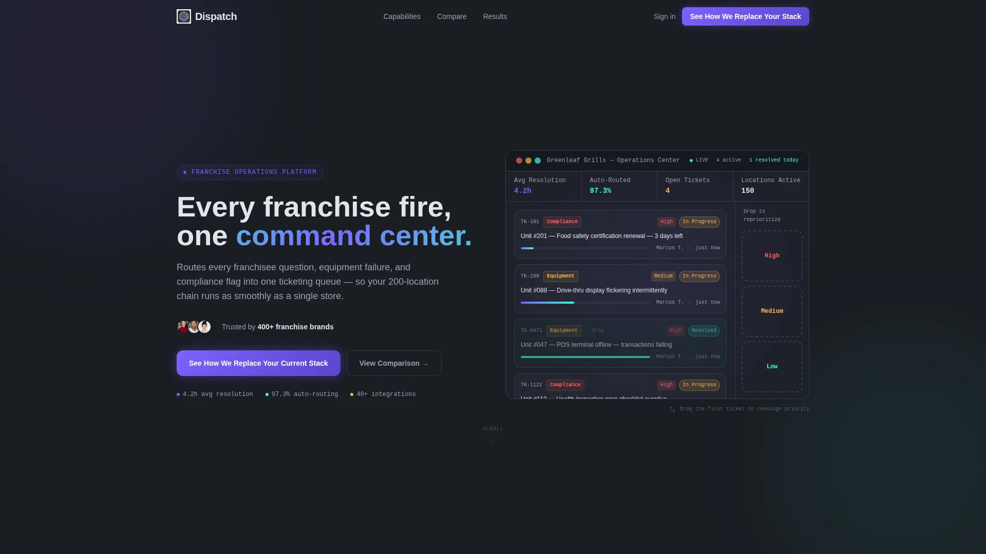
- An interactive header previewing a live-simulated ticket queue for a fictional 150-unit franchise
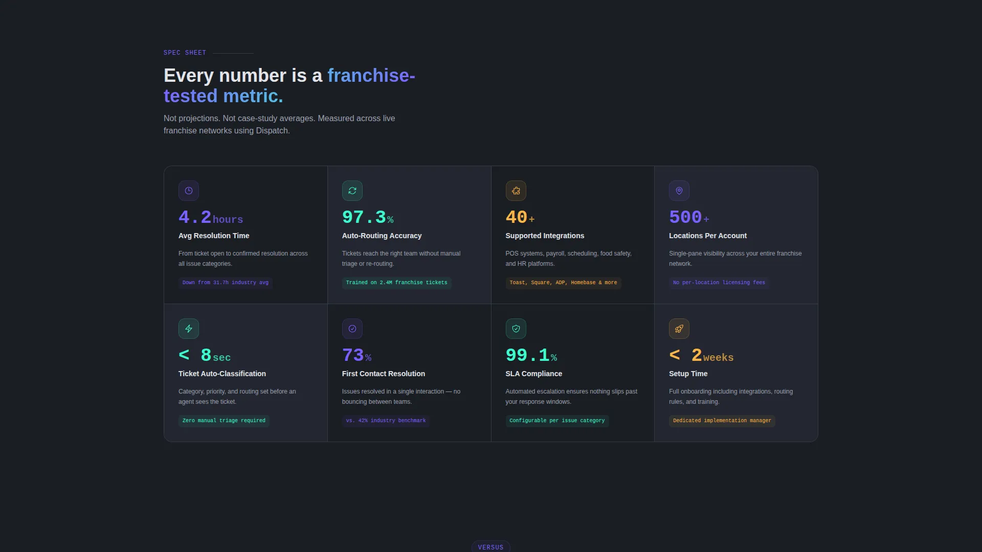
- A modular card grid displaying hard-number spec cards with metrics like 4.2-hour average resolution time and 97.3% auto-routing accuracy
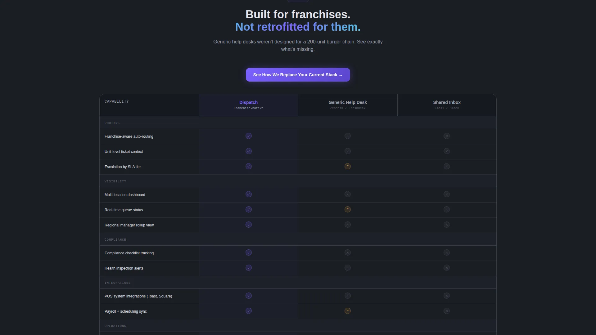
- A full-width comparison table, a primary floating call-to-action bar, and a secondary gated PDF lead capture path
Feature list
This section breaks down the core capabilities built into the Dispatch landing page template.
Interactive Ticket Queue Header
The header embeds a functioning miniature dashboard showing a simulated live queue for a fictional franchise called "Greenleaf Grills." Visitors watch tickets animate from intake through assignment to resolution. A draggable ticket lets them reassign priority level themselves, making the product feel tangible before they read a single line of body copy.
Spec Card Grid Layout
Below the header, the page presents a modular card grid where each card isolates one capability and displays a hard metric alongside it. Cards alternate between dark-on-light and light-on-dark to create visual rhythm without breaking grid uniformity. The layout reads like spec sheets laid side by side on a conference table.
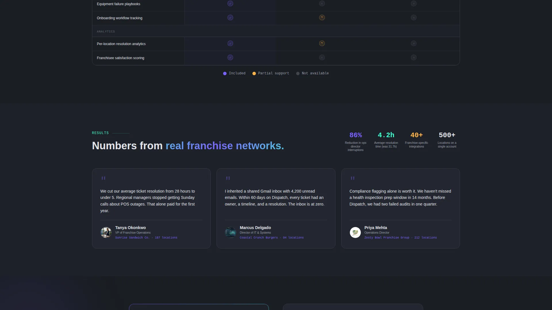
Full-Width Comparison Table
A dedicated comparison table sits midway down the page, stacking Dispatch against generic help desks and shared inboxes. Checkmarks appear in iridescent violet and empty competitor cells display in muted gray. The gaps in competing tools become physically visible at a glance.
Floating Primary Call-to-Action Bar
After a visitor scrolls past 40% of the page, a pinned bar appears with the primary call to action: "See How We Replace Your Current Stack." This keeps conversion intent present throughout the browsing session without interrupting the reading flow earlier.
Two-Step Personalized Intake Form
Clicking the primary call to action opens a two-step form. The first step asks visitors which tool they currently use, offering options like Zendesk, Freshdesk, shared inbox, nothing, or other. The second step collects work email and franchise unit count, allowing personalized follow-up based on the buyer's existing stack.
Gated PDF Secondary Conversion Path
A secondary path offers visitors the option to download a Franchise IT Buyer's Checklist as a gated PDF. This captures leads who are still in the benchmarking phase and are not yet ready to request a demo, widening the top of the funnel without diluting the primary conversion goal.
Page sections overview
| Section | Purpose |
|---|---|
| Interactive Dashboard Header | Simulates a live ticket queue to demonstrate product feel immediately |
| Spec Card Grid | Presents individual capabilities with pinned performance metrics |
| Platform Stats Row | Highlights key numbers: resolution time, routing accuracy, integrations |
| Comparison Table | Contrasts Dispatch against generic help desks and shared inboxes |
| Primary call to action Section | Drives demo requests with the "Replace Your Current Stack" message |
| Floating call to action Bar | Keeps conversion action visible after 40% scroll depth |
| Gated PDF Offer | Captures benchmarking leads with a downloadable buyer checklist |
| Two-Step Intake Form | Personalizes follow-up based on current tooling and franchise size |
Design & branding system
The template uses the Dashboard Pro theme with an AI Iridescent color system. The visual identity feels like a cockpit instrument panel at night: dark backgrounds, precise status colors, and a subtle prismatic quality where each hue carries meaning.
- Deep graphite (#1A1D23) as the primary background, holographic violet (#7B61FF) for active-state accents and progress indicators, spectral teal (#3CFFD0) for resolved-ticket success states, and pale silver (#E2E4EA) for card surfaces and secondary text
- Cards alternate between dark-on-light and light-on-dark layouts to establish visual rhythm across the modular grid
- Each color in the palette functions as a status signal, keeping the design readable and purposeful rather than decorative
Mobile & speed optimization
The modular card grid is built to reflow cleanly across screen sizes. The floating call-to-action bar and interactive header are designed with focused, lightweight interactions that work on touch devices.
- The card grid adapts to narrower viewports without losing the alternating dark and light rhythm
- The floating call-to-action bar remains accessible on mobile scroll without obscuring critical content
- Interactive elements like the draggable ticket and the two-step form are sized for touch-friendly use
How this template helps you convert
The Dispatch landing page is built around a comparison-driven buyer journey. Every structural decision pushes a skeptical franchise operations buyer closer to taking action.
- The interactive header lets visitors experience the product before reading any copy, lowering resistance and building immediate credibility through direct product simulation.
- The spec card grid and comparison table stack evidence progressively, so by the time a visitor reaches the call-to-action, the case for switching has already been made visually and numerically.
- The dual conversion paths, a demo request form and a gated PDF download, ensure the page captures both sales-ready buyers and leads still in the evaluation stage.
Other information about this template
This template is designed specifically for the franchise software category within the broader technology niche. It is a strong fit for teams positioning a franchise help desk and ticketing platform against category incumbents.
- The page direction is Comparison/Versus, making it ideal for campaigns targeting buyers actively evaluating alternatives to their current support stack
- The template style is a Card Grid with modular sections, which makes it easy to swap in real metrics, update card copy, or reorder sections without restructuring the full layout
- The fictional demo brand "Greenleaf Grills" in the interactive header can be replaced with a prospect's brand name or a relevant industry example to personalize sales demos
- The gated PDF path and the two-step intake form together support a tiered lead qualification strategy without requiring separate landing pages
Theme
Dashboard Pro
Creative direction
Spec Sheet
Color system
AI Iridescent
Style
Card Grid (Modular)
Direction
Comparison/Versus
Page Sections
Live-simulated Interactive Header
Modular Spec Card Grid
Head-to-head Comparison Table
Floating Call-to-action Bar
Two-step Personalized Intake Form
Gated PDF Secondary Lead Path
Related questions
Can I replace the fictional demo content in the interactive header?
Is this template suitable for a software company targeting large franchise networks?
How does the two-step intake form work?
Can the gated PDF section work independently from the demo form?
What franchise operations roles is this page designed to persuade?



