Healthcare Digital Presence Advanced Reviews Website Template
Triage is a dashboard-style healthcare knowledge base landing page built for medical professionals who need fast, structured answers. It combines a realistic product preview header, an interactive search demo, a clickable anatomical category map, and a comparison data grid into a single scroll-driven experience that earns the click before asking for it.
by Rocket studio
Quick summary
Triage is a healthcare knowledge base landing page template built around a dark Dashboard Preview header, an Interactive Explorer scroll flow, and a click-through conversion model. It presents a medical knowledge engine as a living, searchable interface, organized by conditions, symptoms, drug interactions, and clinical pathways, and guides visitors toward a free-access tier without any form friction.
Who this template is for
This template is designed for teams and builders who need to present a medical or clinical knowledge product to a professional audience. It works equally well for a first product launch or a redesigned marketing surface for an existing tool.
- Night-shift nurses, medical students, and clinic administrators who represent the core end-user of the knowledge base
- Healthcare product teams building a public-facing landing page for a searchable clinical database
- Digital health startups showcasing a structured symptom, drug interaction, or clinical pathway tool
What problem this template solves
Clinical professionals waste critical time switching between textbooks, search engines, and disconnected reference tools. A landing page that mirrors the actual speed and depth of the product closes that trust gap before the visitor ever signs up.
- Visitors cannot easily judge data depth from a generic feature list, so the interactive demo lets them feel it directly
- Institutional buyers need a side-by-side comparison to justify switching from existing reference tools
- The page eliminates form friction entirely, letting a single click carry the visitor into the product experience
What you get with this template
You get a fully structured, single-page layout with four distinct content sections, a persistent conversion bar, and a cohesive Midnight Blue visual identity ready to be populated with your product content.
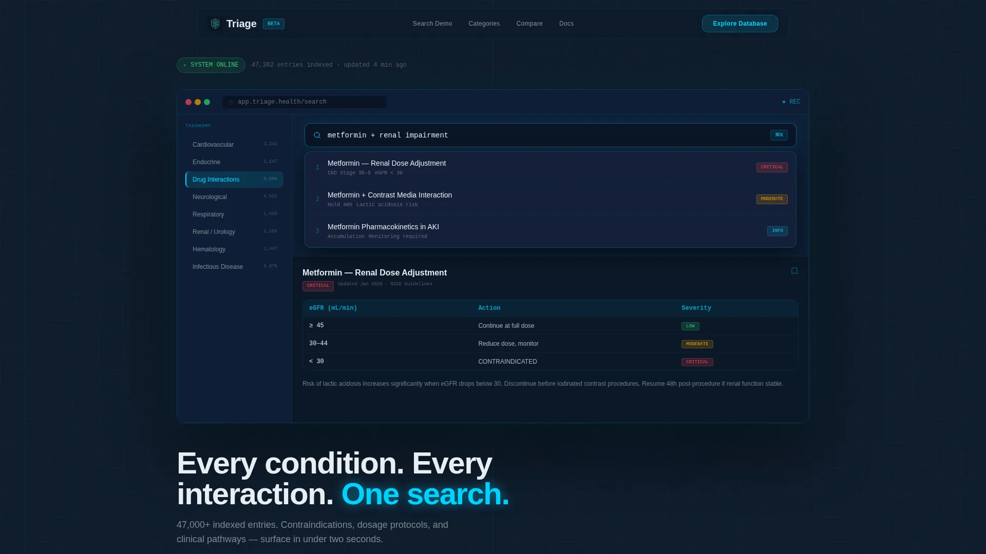
- A realistic Dashboard Preview header showing the knowledge base in mid-session use
- An Interactive Explorer scroll sequence with a live-feeling search demo, a clickable anatomical category map, and a data grid comparison section
- Three placements of the primary call-to-action and one secondary call-to-action for institutional buyers, all wired for click-through with no form fields
Feature list
This section describes the core built-in components and layout capabilities of the Triage template as defined in the source brief.
Realistic Dashboard Preview Header
The header renders a product screenshot that looks populated and active. It shows a search bar with a partially typed query, an auto-complete dropdown with ranked results, a left-side taxonomy panel with expandable condition categories, and a right-side detail card with severity-coded dosage highlights. A fade-in headline anchors the visual below the screenshot.
Live-Feeling Search Demo Section
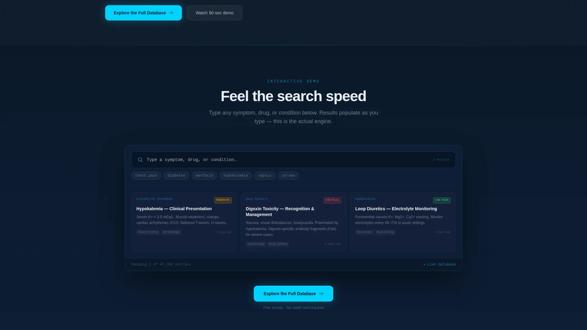
Section two presents an animated search experience directly on the page. Visitors type a symptom and watch results populate a grid in real time, giving them a direct sensory impression of the product's speed and data density before they commit to exploring further.
Clickable Anatomical Category Map
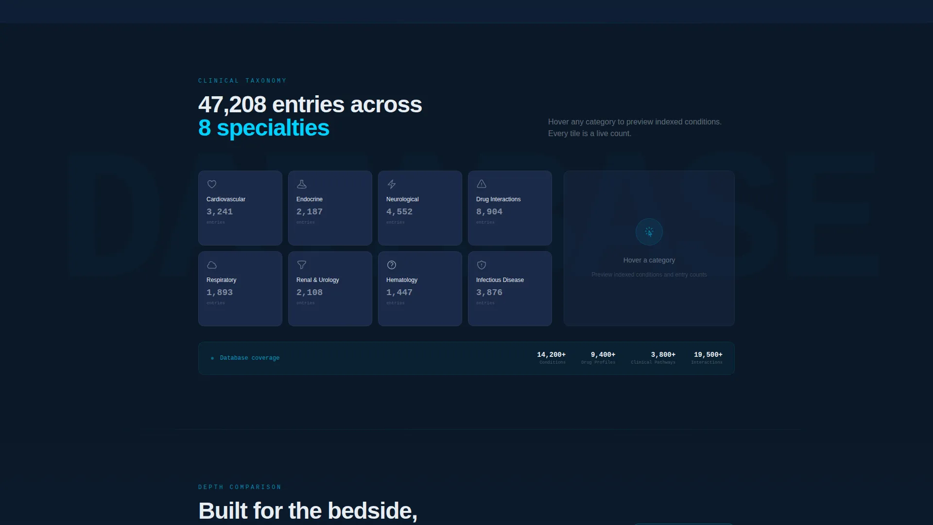
Section three organizes the knowledge base into a tiled anatomical map covering categories such as cardiovascular, endocrine, and neurological. Each tile displays an indexed entry count and surfaces a sample condition card on hover, communicating the breadth of the database without listing it exhaustively.
Comparison Data Grid
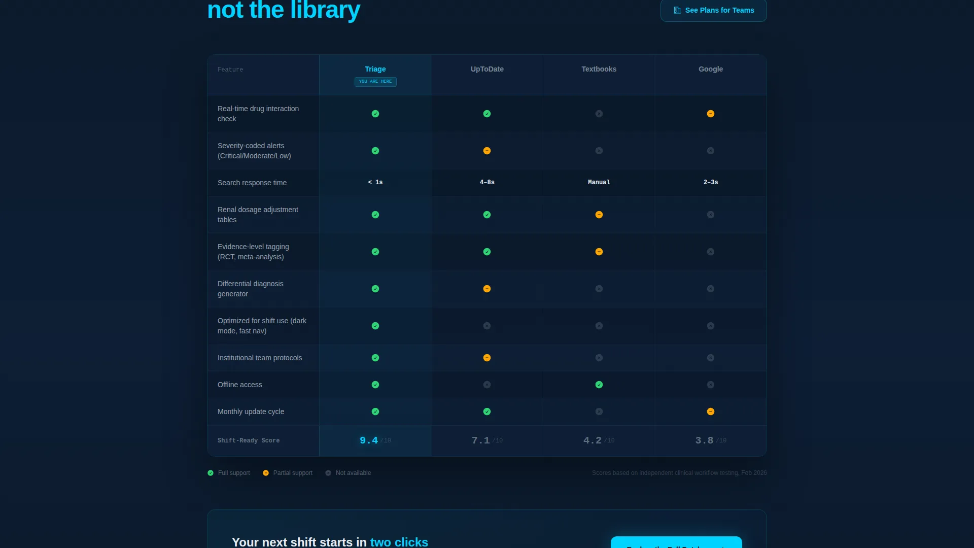
Section four presents a structured data grid that places the knowledge base alongside textbook references and general search tools. The grid uses checkmarks and depth scores to help institutional buyers evaluate the product against familiar alternatives.
Persistent Bottom Conversion Bar
A sticky bottom bar activates after the visitor reaches forty percent scroll depth. It carries the primary call-to-action without interrupting the scroll experience, keeping the conversion path visible across the full page.
Secondary Institutional Call-to-Action
A "See Plans for Teams" call-to-action appears once inside the comparison grid section. It targets clinic administrators and institutional buyers who need a team-tier pricing path separate from the individual free-access entry point.
Page sections overview
| Section | Purpose |
|---|---|
| Dashboard Preview Header | Shows the knowledge base in active use with a fade-in headline and primary call-to-action |
| Live Search Demo | Lets visitors type a symptom and watch animated results populate the grid |
| Anatomical Category Map | Displays clickable condition tiles with entry counts and hover-triggered sample cards |
| Comparison Data Grid | Benchmarks the knowledge base against reference tools using checkmarks and depth scores |
| Persistent Bottom Bar | Activates at forty percent scroll to keep the primary call-to-action continuously visible |
Design & branding system
The Triage template uses a Midnight Blue color system designed to reduce eye fatigue during long shifts while keeping interactive elements immediately visible. The palette feels like a monitoring station at night, stable, focused, and alert at the edges.
- Deep terminal navy (#0B1929) as the primary background, clinical steel (#1B2A4A) for card surfaces and data rows, and cool antiseptic white (#E8EDF3) for body text and search fields
- Pulse-point cyan (#00D2FF) reserved exclusively for active states, hover highlights, and live search indicators, creating a visual heartbeat across the grid
- The Directory and Discovery theme drives the layout, with dense data rows, expandable taxonomy panels, and card surfaces that mirror a real clinical workstation interface
Mobile & speed optimization
The template layout is structured to translate cleanly from a wide dashboard view to narrower screen sizes. Section hierarchy and tap targets are arranged to maintain usability across devices without losing the density that defines the desktop experience.
- Data grid and category map sections reflow to stacked card layouts on smaller screens, preserving readability of condition tiles and comparison rows
- The persistent bottom conversion bar remains anchored and visible on mobile, keeping the click-through path active at any screen width
How this template helps you convert
The Triage template earns the click by giving visitors a genuine taste of the product before presenting any conversion ask. Every section adds a layer of proof before the next call-to-action appears.
- The interactive demo and category map let visitors experience search speed and data breadth firsthand, lowering the perceived risk of exploring further
- The comparison data grid gives institutional decision-makers the evidence they need to advocate for the product internally, supporting both individual and team-tier conversion paths
- Three placements of the primary call-to-action, below the header, after the demo section, and in the persistent bottom bar, catch visitors at different stages of readiness without adding form friction
Other information about this template
This template is built for the Healthcare Digital Presence space within the broader Technology category. It is particularly well-suited for teams operating in the healthcare knowledge base niche who need a landing page that communicates both clinical credibility and product depth.
- The template style is Dashboard and Data Grid, making it a strong fit for any product that organizes large structured datasets for professional users
- The Interactive Explorer creative direction means the page is built to demonstrate rather than describe, which aligns with how clinical professionals evaluate tools they will rely on under pressure
- The header concept is a Dashboard Preview, meaning the hero section shows the product in context rather than an abstract illustration or empty-state mockup
Theme
Directory & Discovery
Creative direction
Interactive Explorer
Color system
Midnight Blue
Style
Dashboard/Data Grid
Direction
Click-Through
Page Sections
Dashboard Preview Header with Fade-in Headline
Interactive Search Demo with Animated Grid
Clickable Anatomical Category Map
Comparison Data Grid with Depth Scores
Triple-placement Click-through Conversion Flow
Midnight Blue Visual Identity System
Related questions
Who is this landing page template designed for?
Does this template require a form to convert visitors?
How many times does the primary call-to-action appear?
Can institutional buyers find a team-tier option on this page?
Is the dark color scheme practical for medical professional audiences?



