Data Mesh Technology Comparison Website Template
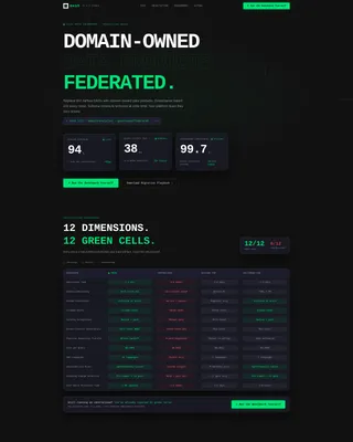
Mesh is a developer-first data mesh landing page template built for teams decentralizing monolithic data pipelines into domain-owned products. It leads with live-styled metrics, a twelve-dimension comparison grid, and interactive node graphs, all rendered in a carbon fiber visual system that communicates infrastructure authority before a single line of body copy is read.
by Rocket studio
Quick summary
Mesh is a single-page template for data mesh tools and frameworks. It opens with three dark glass panel metrics, drops immediately into a twelve-dimension comparison grid, and closes with clear calls to action. The design runs a carbon fiber color system: deep graphite surfaces, signal green accents, and monospace data text that feels like a live control plane.
Who this template is for
This template is built for teams who live inside infrastructure and care more about signal than decoration. It speaks directly to the people who have outgrown centralized data architectures.
- Platform engineers managing complex pipeline orchestration workflows who need a clearer story to tell stakeholders
- Data product owners who want to demonstrate the value of domain ownership without filing another request ticket
- Chief Technology Officers evaluating whether to invest in a decentralized data mesh approach over a traditional lakehouse setup
What problem this template solves
Centralized data teams create bottlenecks. When every schema change, access request, or pipeline update flows through one team, delivery slows and trust erodes. This template gives data mesh tools a page that proves the case visually, not just verbally.
- Visitors arriving from technical searches expect proof, not promises, the comparison grid delivers that proof immediately
- Teams evaluating competing frameworks need a structured side-by-side view, not a wall of marketing copy
- The call to action placement problem: most tool pages bury their sandbox link; this template pins it in the nav and repeats it after the grid
What you get with this template
You get a stats-first, comparison-led landing page layout designed specifically for data mesh tools and frameworks. Every section serves a function, nothing is decorative.
- Three frosted dark glass panel cards in the header displaying live-styled metrics: domain coverage percentage, query latency in milliseconds, and governance policy compliance score
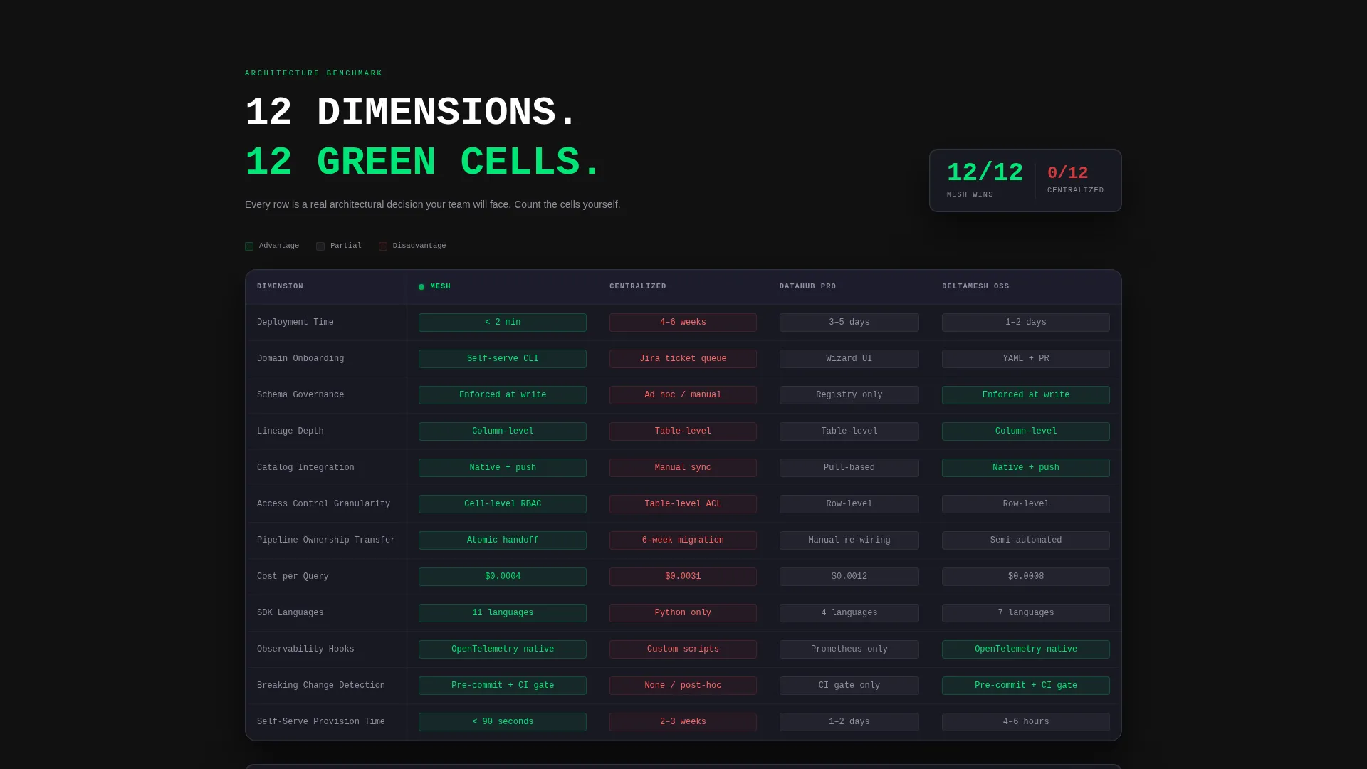
- A twelve-dimension comparison data grid with scroll-entry row animations and green cell emphasis, comparing this framework against centralized architectures and competing mesh tools
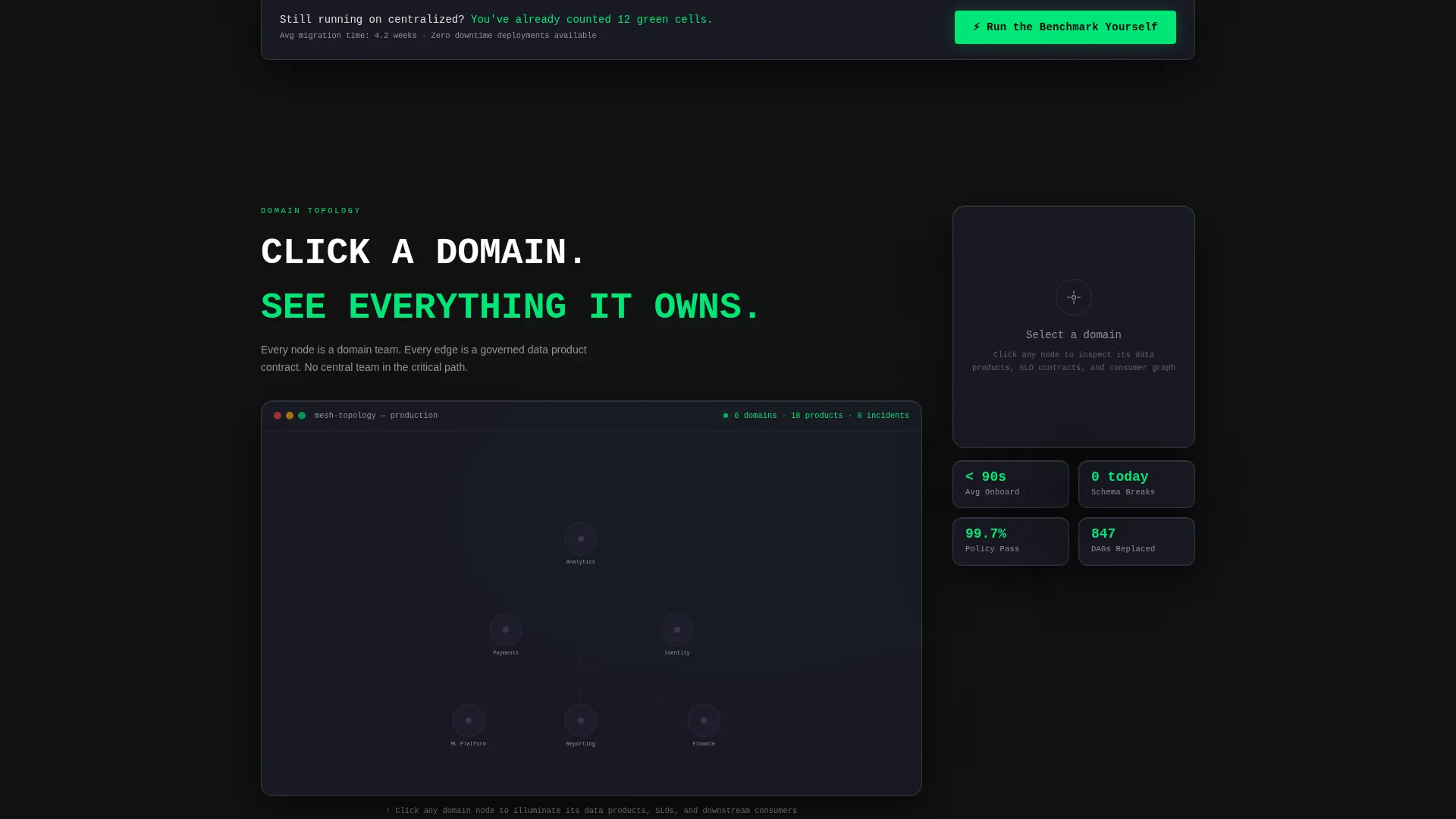
- Interactive architecture node graphs where clicking a domain illuminates its data products, service level objectives, and downstream consumers
Feature list
This template ships with layout components that are purpose-built for a technical, comparison-driven audience. Each piece earns its place on the page.
Dark Glass Panel Header Metrics
Three frosted-glass cards float over a deep graphite void. Each card displays one live-styled metric in monospace white text with a pulsing signal green status dot. The parallax depth and titanium edge reflection make the header feel like peering into a live control plane, not reading a brochure.
Twelve-Dimension Comparison Grid
The grid compares the framework against centralized architectures and competing mesh tools across twelve specific dimensions: deployment time, domain onboarding, schema governance, lineage depth, catalog integration, access control granularity, pipeline ownership transfer, cost per query, supported SDK languages, observability hooks, breaking-change detection, and self-serve provisioning time. Each row animates its value on scroll entry, and green cells visually outnumber competitors.
Interactive Architecture Node Graphs
Below the comparison grid, architecture diagrams render as interactive node graphs. Clicking any domain node illuminates its associated data products, service level objectives, and downstream consumers. This turns abstract mesh topology into something a visitor can actually explore.
Pinned and Repeated Primary call to action
The primary call to action, "Run the Benchmark Yourself," links to a sandbox environment. It appears pinned in the top navigation and again immediately after the comparison grid. The repetition is intentional, visitors who finish the grid are already convinced.
Email-Gated Migration Playbook
A secondary conversion path offers a downloadable migration playbook behind a single-field email gate. It gives visitors who are not yet ready to run the benchmark a lower-friction next step that still captures intent.
Stats-First Scroll Flow
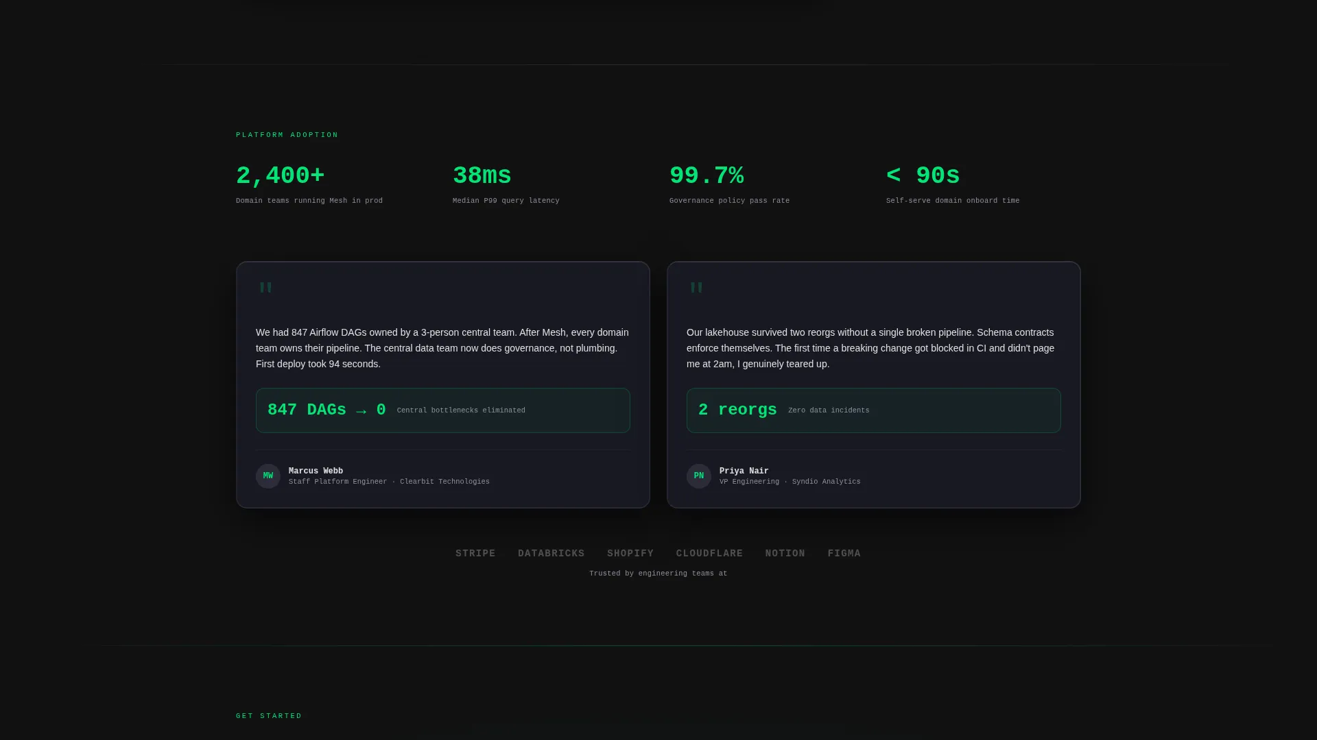
The scroll order is deliberate: metrics first, comparison grid second, architecture exploration third, call to action last. By the time a visitor reaches the bottom, the data has done the persuading. No hero image, no illustration, the data is the hero.
Page sections overview
| Section | Purpose |
|---|---|
| Dark Glass Header | Display three live-styled metric panels with pulsing status indicators |
| Comparison Data Grid | Compare framework against centralized and competing tools across twelve dimensions |
| Architecture Node Graph | Let visitors explore domain nodes, data products, and downstream consumers interactively |
| Primary call to action Block | Drive sandbox signups with a repeated benchmark call to action |
| Email Gate Block | Capture leads via a single-field download gate for the migration playbook |
Design & branding system
The visual identity uses the Dashboard Pro theme with a Carbon Fiber color system. Every color decision serves readability and data clarity over aesthetic decoration.
- Core palette: deep graphite (#121212) as the base void, woven carbon gray (#1E1E2E) for panel surfaces, titanium edge (#3A3A4A) for borders and reflections, cold white data text (#E0E0E0) for all readable content, and signal green (#00E676) for live-state accents on active nodes and passing health checks
- Typography renders in monospace for all metric values, reinforcing the terminal-at-2-a.m. feel described in the creative direction
- The overall aesthetic evokes a server rack interior: matte black surfaces catching thin strips of LED light, every element functional and nothing purely decorative
Mobile & speed optimization
The template layout is designed to keep the data-first experience intact across screen sizes. Technical audiences often evaluate tools on laptops and large monitors, but the structure adapts.
- The comparison grid is built to scroll horizontally on smaller viewports, preserving all twelve dimensions without truncation
- Dark glass panel cards stack vertically on mobile while retaining the monospace metric display and signal green status indicators
- The pinned navigation call to action remains accessible throughout the scroll on all screen sizes
How this template helps you convert
The conversion strategy is embedded in the layout sequence. Visitors do not need to be persuaded by copy alone, the data grid does the work.
- The three header metrics establish credibility immediately. Visitors see live-styled numbers before they read a single sentence of body copy, which builds trust with a technically skeptical audience.
- The twelve-dimension comparison grid turns evaluation into a visual exercise. Green cells accumulate as visitors scroll each row, and by the end of the grid, the case is made without a sales pitch.
- The dual call to action structure captures visitors at two different readiness levels. The sandbox link converts the convinced; the email-gated playbook captures the curious.
Other information about this template
This template is part of the Dashboard Pro theme family and is categorized under Data Mesh Technology within the Technology template collection. It is suited for teams building or marketing tools in the data mesh, data platform, and federated governance space.
- The template style is Dashboard and Data Grid, making it a strong fit for tools that need to demonstrate technical superiority through structured data presentation rather than narrative copy
- The creative direction, Stats-First Impact, was matched specifically to the Comparison and Versus landing page direction, meaning every layout decision reinforces the side-by-side evaluation experience
- The Carbon Fiber color system was selected for its association with precision engineering and high-performance infrastructure, which aligns directly with the audience of platform engineers and data product owners this template targets
Theme
Dashboard Pro
Creative direction
Stats-First Impact
Color system
Carbon Fiber
Style
Dashboard/Data Grid
Direction
Comparison/Versus
Page Sections
Dark Glass Panel Header
Twelve-dimension Comparison Grid
Interactive Domain Node Graph
Pinned Benchmark Call to Action
Email-gated Migration Playbook
Related questions
Can I customize the twelve comparison dimensions in the data grid?
Does this template require a specific technology stack to publish?
How does the single-field email gate for the migration playbook work?
Can the interactive node graph reflect our actual domain topology?
Is this template suitable for a product launch as well as an ongoing marketing page?



