Nexus — Telecom Landing Page Template
Signal is a bold, brutalist-styled telecommunications knowledge base landing page built for engineers who need answers fast. The split-screen layout pairs a live search interface with hard-hitting stats, driving visitors toward an app download or a free PDF lead capture. Purpose-built for RF engineers, network architects, and NOC technicians who demand utility over decoration.
by Rocket studio
Quick summary
Signal is a single-page, split-screen telecommunications knowledge base landing page. It serves RF engineers, network architects, and NOC technicians with a searchable vault of protocols, spectrum allocations, and infrastructure schematics. The Bold Brutalist design and Stats-First creative direction make every section feel urgent, precise, and built for the people who keep networks running.
Who this template is for
This template is designed for telecom professionals and technical knowledge base publishers who need a landing page that earns trust in the first three seconds. If your audience thinks in frequencies and link budgets, this page speaks their language.
- RF engineers who need quick access to interference debugging references and protocol documentation
- Network architects planning fifth-generation rollouts who want a credible, data-forward product showcase
- Junior network operations center technicians looking for plain-language explanations of technical metrics
What problem this template solves
Telecom knowledge tools often look like forgotten wikis. They bury their value behind generic layouts that fail to communicate depth, speed, or professional credibility. Signal fixes that by leading with proof before pitch.
- Engineers distrust tools that look unfinished, so this template opens with hard stats that establish authority immediately
- Visitors who might not install the app still need a conversion path, so a free PDF lead-capture option keeps them engaged
- Technical audiences scan before they read, so the brutalist grid and monospaced typography match the way engineers actually consume information
What you get with this template
Signal delivers a fully structured landing page built around one goal: get a technical audience to download the app or capture their work email. Every section is purposeful and production-ready.
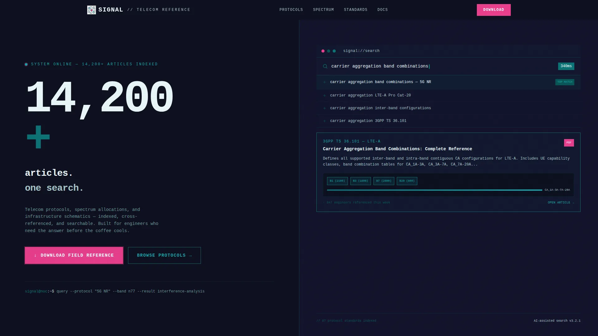
- A split-screen hero section with a product screenshot on the right and a dominant stat on the left
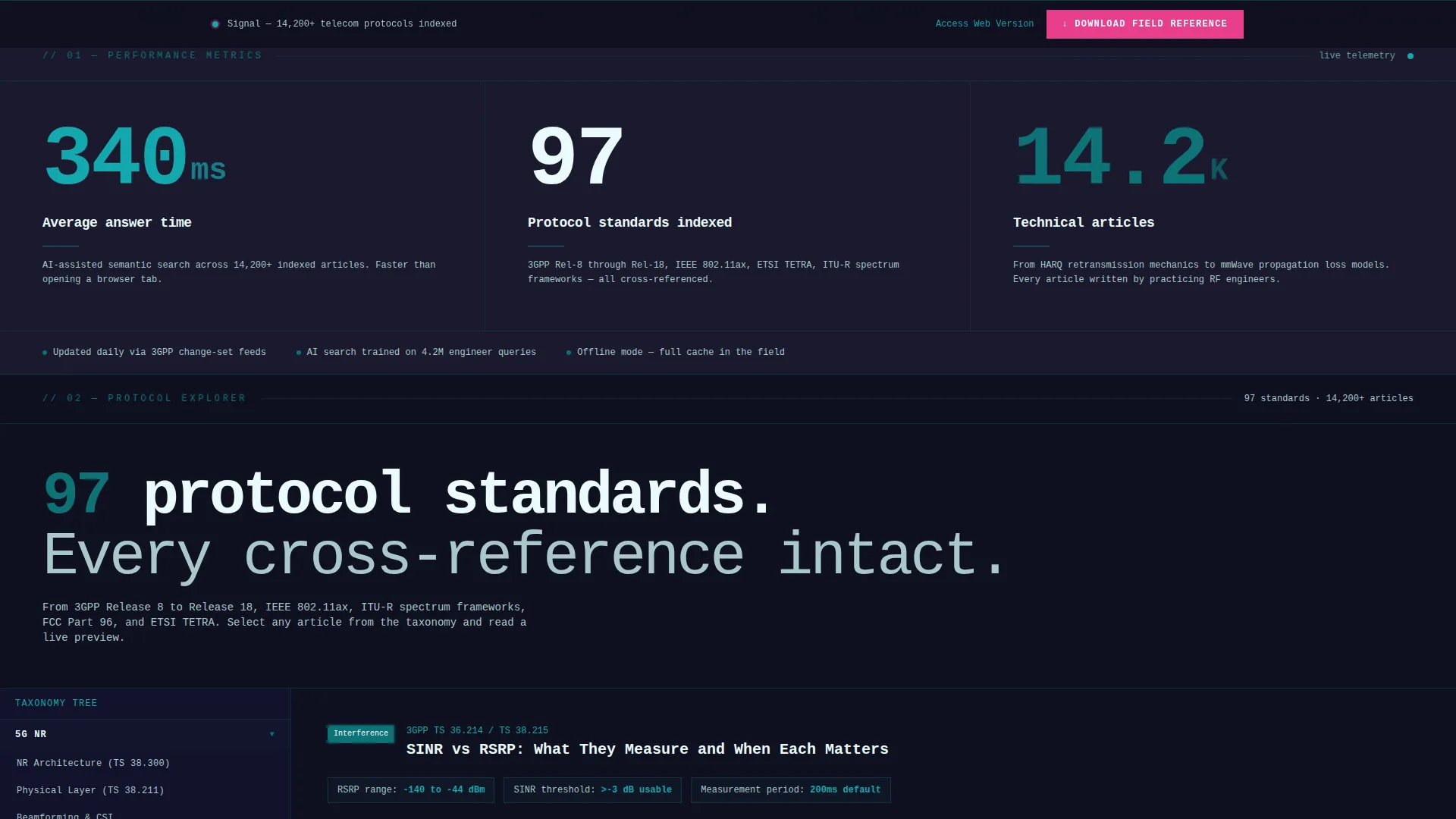
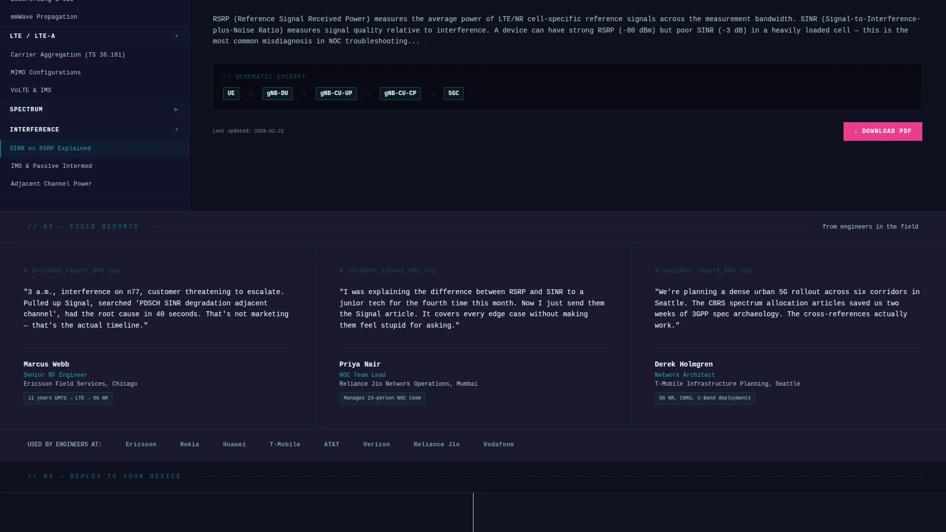
- A stats-first scroll flow with full-width number slabs, article previews, and taxonomy tree displays
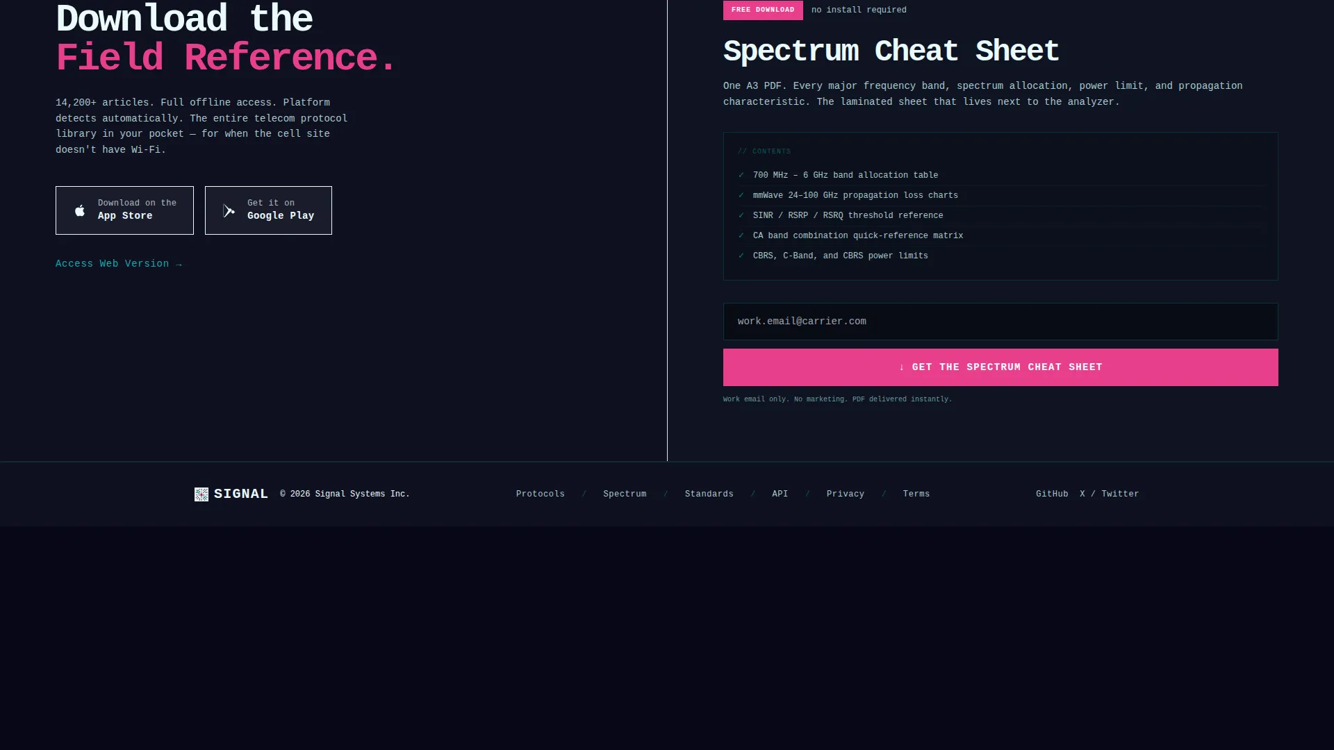
- A pinned download call-to-action with platform detection, iOS and Android badge support, and a web access fallback link
Feature list
Signal comes loaded with layout components and design decisions that serve a technical audience without compromise.
Split-Screen Hero Layout
The hero divides the viewport exactly 50/50. The left half holds a single oversized stat in signal white on a bunker charcoal background. The right half displays the app's search interface mid-query, with auto-complete suggestions and a rendered article card showing diagram previews.
Stats-First Scroll Architecture
Every scroll event opens with a prominent number before any explanation follows. Stats like "340ms average answer time" and "97 protocol standards indexed" land as full-width slabs. Each stat section then expands into proof: screenshots, article snippets, and interactive split-screen content previews.
Pinned App Download Call-to-Action
After the first scroll, a catalyst magenta download button stays pinned to the bottom of the viewport. The flow offers iOS and Android app badges side by side, with a tertiary text link for desktop users who prefer the web version.
Free PDF Lead Capture Gate
A secondary conversion path offers a downloadable spectrum cheat sheet. Visitors provide only a work email to unlock it. This captures leads who are not ready to install the app but are already engaged with the content depth.
Bold Brutalist Typography System
All type is monospaced, heavy, and set without rounded corners or gradients. Headlines feel like raw concrete. Data overlays use signal white for maximum contrast against the dark background slabs, keeping every word readable at a glance.
Interactive Protocol Reference Display
A dedicated section shows the table of contents on the left and a live article preview on the right. This split-screen interaction demonstrates the knowledge base depth directly on the page, letting visitors preview real content before committing.
Page sections overview
| Section | Purpose |
|---|---|
| Split-Screen Hero | Pairs live search screenshot with a dominant stat to establish immediate credibility |
| Stats Impact Slab | Leads with "340ms average answer time" before revealing the AI-assisted search engine |
| Protocol Index Preview | Shows 97 indexed standards with a split table of contents and live article view |
| Pinned Download Bar | Keeps the app download call-to-action visible after the first scroll event |
| PDF Lead Capture | Offers the spectrum cheat sheet in exchange for a work email address |
Design & branding system
Signal runs on the Teal Catalyst color system, a palette designed to feel like the inside of a network operations center at midnight. Every color carries meaning; nothing is applied purely for decoration.
- Deep circuit-board teal (#0D7377) is the primary action color used for interactive elements and key highlights
- Bunker charcoal (#1A1A2E) floods full-bleed background slabs throughout the page, anchoring the dark NOC aesthetic
- Raw signal white (#EAFAFB) handles all body typography and data overlays, while hot catalyst magenta (#E83E8C) is reserved exclusively for notification badges and download call-to-action buttons
Mobile & speed optimization
The template is structured so the split-screen layout and pinned elements adapt cleanly across device sizes. The brutalist grid uses hard padding and horizontal rules instead of decorative transitions, which keeps the visual weight consistent on smaller screens.
- The pinned download bar remains functional and visible on mobile, with iOS and Android badges stacking neatly for touch interaction
- Monospaced typography and high-contrast color pairing keep content legible on both phone screens and large monitor setups
How this template helps you convert
Signal is built around two conversion paths that work simultaneously. Technical visitors who are ready to commit follow the app download flow. Visitors who need more time are captured by the free PDF gate.
- The pinned catalyst magenta download button stays in view after the first scroll, reducing the friction between decision and action by keeping the call-to-action constantly accessible without interrupting content consumption
- The free spectrum cheat sheet PDF gate requires only a work email, lowering the commitment barrier for visitors who find the stats compelling but want a low-stakes first step before installing the app
Other information about this template
Signal is categorized under Technology and sits within the Telecommunications Digital Presence subcategory, targeting the Telecommunications Knowledge Base niche. The template style is a 50/50 Split Screen, and the theme is Bold Brutalist. Creative direction follows a Stats-First Impact approach, and the header concept is a Product Screenshot. The landing page direction is App Download, and the color system is Teal Catalyst.
- This template is well-suited for telecom SaaS products, field reference apps, and technical documentation platforms that need a high-authority first impression
- The intersection match between theme, creative direction, and niche context has been validated, making this layout a strong fit for telecommunications digital presence use cases
- The free PDF lead-capture gate makes this template useful for both direct app acquisition campaigns and early-stage email list building for technical audiences
Theme
Bold Brutalist
Creative direction
Stats-First Impact
Color system
Teal Catalyst
Style
Split Screen (50/50)
Direction
App Download
Page Sections
Split-screen 50/50 Hero
Stats-first Scroll Flow
Pinned App Download Bar
Free PDF Lead Capture Gate
Interactive Protocol Reference Display
Bold Brutalist Design System
Related questions
Can I customize the color palette and typography in this template?
Does the template support both app download and web access conversion paths?
How does the free PDF lead capture section work?
Is this template suitable for a telecom product still in early development?
Can the split-screen hero be adapted to show a different product screenshot?



