Developer Documentation Blog Website Template
Nginternals is a split-screen Angular developer blog landing page built for senior engineers who want proof before persuasion. It leads with real performance metrics, pairs data panels with code-level explanations, and uses a carbon-black motion theme to signal technical depth. The result is a focused, high-conviction entry point for an Angular internals blog.
by Rocket studio
Quick summary
Nginternals is a single-page, split-screen landing page template designed for an Angular developer blog. It opens with a full-bleed dark header built around a glowing performance metric, then scrolls through stat-explanation panels that build in architectural depth. The page is engineered to earn clicks through proof, not persuasion.
Who this template is for
This template is built for technically credible Angular content creators who need a landing page that matches their audience's expectations. It speaks directly to engineers who skip marketing copy and look for evidence of real expertise.
- Senior frontend engineers working with Angular's change detection, signals, and standalone component patterns
- Tech leads evaluating Angular for enterprise rewrites who need a sharp reference resource
- Open-source contributors and framework-level thinkers who want a home for deep technical writing
What problem this template solves
Most developer blog landing pages feel generic. They use stock illustrations, vague headlines, and calls to action that any JavaScript tutorial site could copy. That visual sameness signals shallow content before a reader even scrolls.
- There is no visual language that communicates Angular-specific technical depth at a glance
- Performance-obsessed readers disengage fast when a page looks slower or less considered than their own code
- Generic layouts fail to convert engineers who respond to data and architecture, not lifestyle copy
What you get with this template
You get a fully structured Angular developer blog landing page with a defined visual system, a scroll-driven data-narrative layout, and conversion touchpoints placed where they earn the most trust. Every section is mapped to a specific reader journey stage.
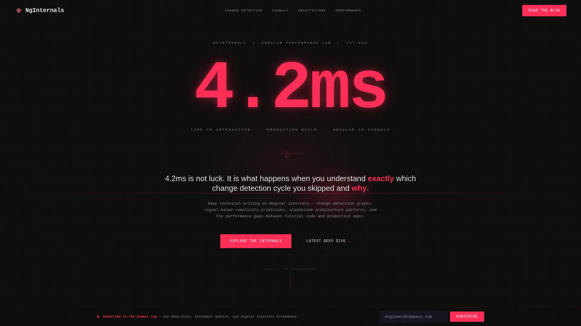
- A full-bleed header section with an oversized glowing performance metric as the hero element
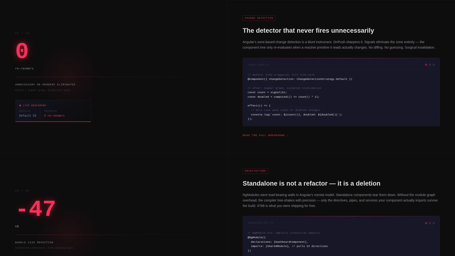
- Alternating split-screen panels that pair left-side metrics with right-side technical explanations
- A primary call-to-action block at the scroll midpoint and a persistent subscription bar at the bottom
Feature list
This template ships with a focused set of purpose-built features. Each one reflects a deliberate design decision rooted in the technical blog use case.
Full-Bleed Dark Hero with Metric Glow
The header fills the entire viewport with a carbon-black background. A radial reactive-red glow pulses behind an oversized monospace performance figure, such as a time-to-interactive reading or a zero-rerender benchmark. A single fade-in headline reframes that number as the blog's core philosophy.
Split-Screen Stat and Explanation Panels
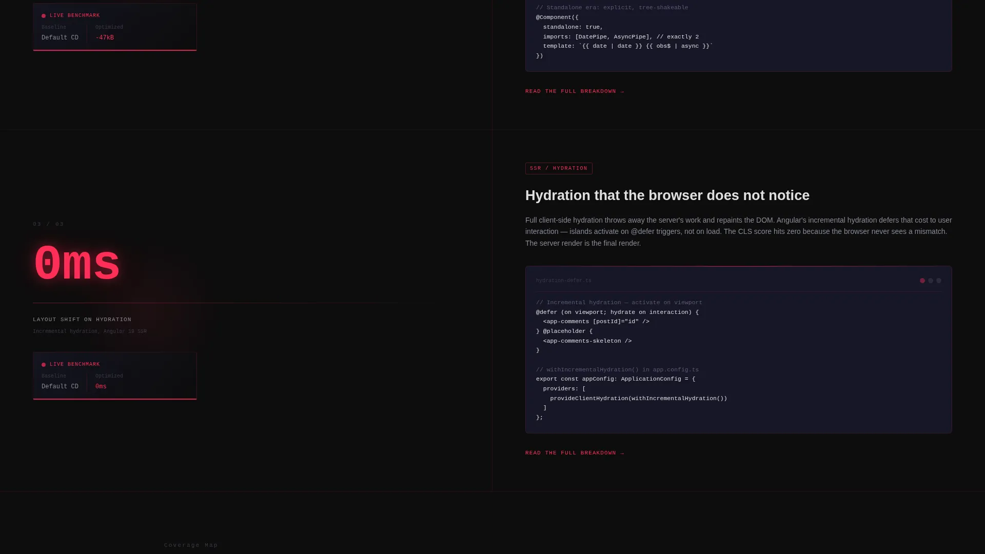
Each content section uses a strict 50/50 split. The left panel carries the metric: bundle size delta, hydration benchmark, or signal adoption figure. The right panel delivers the technical context, including code snippet placement and architectural callout space. This pairing creates a rhythm that rewards focused readers.
Scroll-Triggered Motion Blur Transitions
Each new panel animates in with a subtle motion blur that resolves to sharp focus. The effect mirrors the rendering pipeline itself, reinforcing the blog's Angular internals theme at the level of the page's own behavior.
Primary Call-to-Action at Scroll Midpoint
After the third stat-explanation reveal, a "Read the Deep Dive" call-to-action block appears at the split-screen centerline. Placement is intentional: by that point the visitor has seen enough proof to act without additional convincing.
Persistent Subscription Bottom Bar
A fixed bottom bar stays in view across the full scroll experience. It carries a "Subscribe to the Commit Log" prompt with a single email field. No name field, no extra steps. The low-friction design removes every barrier between interest and sign-up.
Dynamic Motion Theme System
The Carbon Fiber color system and Dynamic Motion theme are applied consistently across every section. Hover states ignite in reactive red, backgrounds shift through the carbon-to-graphite range, and typography uses a phosphor-tone monospace treatment that signals precision engineering throughout.
Page sections overview
| Section | Purpose |
|---|---|
| Full-Bleed Hero | Opens with a glowing performance metric as the hero statement |
| Stat Panel One | First metric reveal paired with a technical explanation panel |
| Stat Panel Two | Second data point with deeper architectural context |
| Stat Panel Three | Third metric reveal that builds toward the primary call-to-action |
| Primary call to action Block | "Read the Deep Dive" click-through placed at scroll midpoint |
| Persistent Bottom Bar | Fixed email subscription strip with a single input field |
Design & branding system
The visual identity is built on the Carbon Fiber color system, applied with strict intent across every element. The palette communicates technical precision before a single word is read.
- Core colors: deep carbon black (#0D0D0D) for backgrounds, woven graphite (#1A1A2E) for panel layering, reactive red (#FF2D55) for accents and hover pulses, and terminal phosphor (#E0E0E0) for all body text
- Typography uses a monospace treatment rendered with the crispness of a high-resolution display, reinforcing the data-first aesthetic
- Motion design uses controlled animation: radial glow pulses on the hero, motion blur resolves on scroll entry, and red ignites on interactive states
Mobile & speed optimization
The template is designed with a lean, performance-conscious layout that avoids heavy assets. Its visual weight comes from color and motion logic, not large images or embedded media.
- No photography or illustration assets are used anywhere in the layout, keeping the initial load profile clean
- The animation system relies on CSS-level motion effects rather than heavy JavaScript animation libraries
- The split-screen layout collapses cleanly for narrower viewports, preserving the metric-first reading order on smaller screens
How this template helps you convert
The conversion strategy is built into the scroll architecture itself. Every design decision moves a skeptical engineer closer to clicking or subscribing.
- The hero metric earns immediate credibility. A real Angular performance figure in the first viewport signals that this blog operates at a level worth following, before any copy is read.
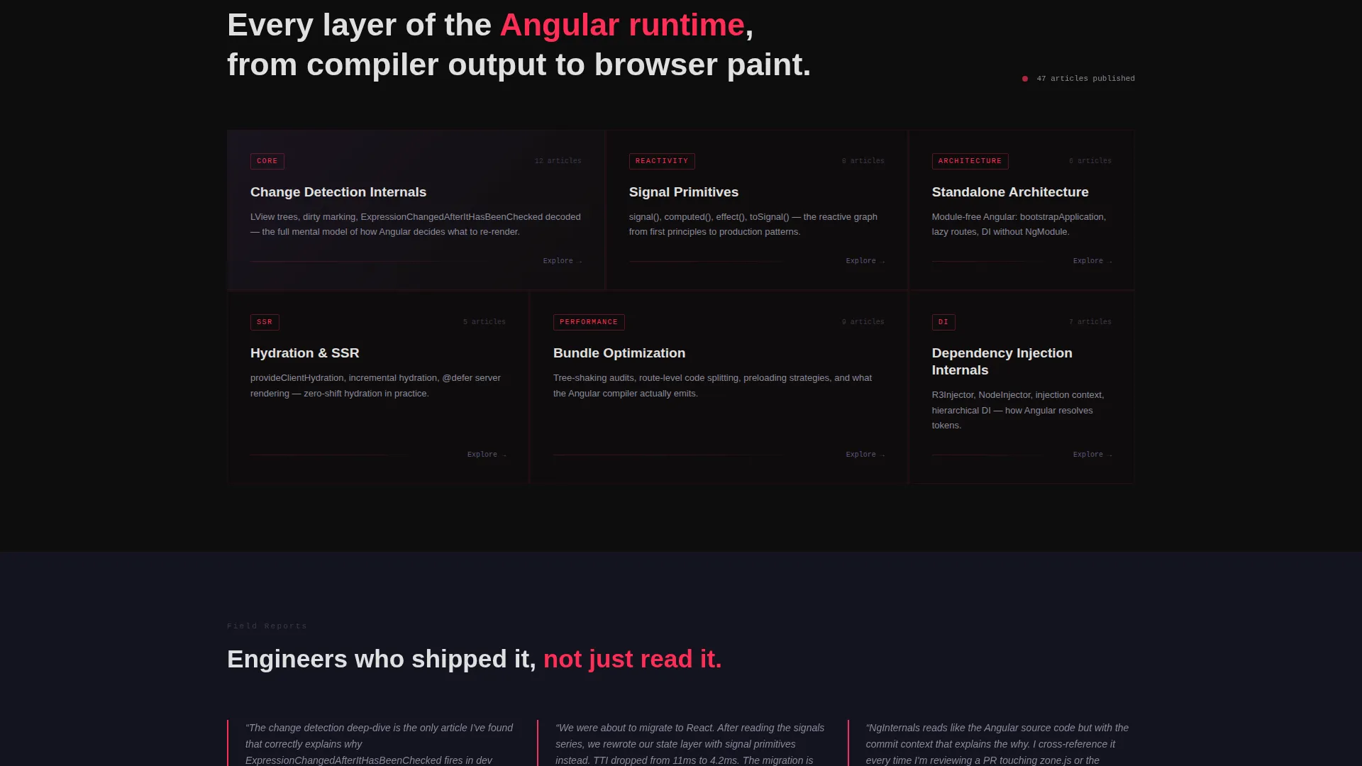
- Each stat-explanation panel adds a layer of proof. By the time the primary call-to-action appears, the visitor has seen three data points that demonstrate genuine framework-level knowledge, making the click feel earned rather than asked for.
- The persistent subscription bar keeps the lower-commitment option visible throughout. Readers who are not ready to click through can subscribe with a single field at any point in the scroll, reducing the cost of leaving without converting.
Other information about this template
This template sits within the Angular Documentation subcategory and is tailored for the Angular developer blog niche. A few additional details are worth noting for anyone evaluating it.
- The template style is Split Screen (50/50), a layout format well suited to technical content that benefits from side-by-side data and explanation
- The theme is Dynamic Motion and the creative direction is Stats-First Impact, both of which are reflected directly in the scroll behavior and section sequencing
- The header concept is Dark Full-Bleed and Glow, a specific treatment that differs from conventional hero layouts that rely on imagery or abstract illustration
- The landing page direction is Click-Through, meaning the primary goal is driving a single high-intent action toward the latest long-form post
- This template is categorized under Documentation and Support, making it relevant for developer-focused content hubs that need a credible, technically styled entry point
Theme
Dynamic Motion
Creative direction
Stats-First Impact
Color system
Carbon Fiber
Style
Split Screen (50/50)
Direction
Click-Through
Page Sections
Full-bleed Dark Hero with Metric Glow
Split-screen Stat and Explanation Panels
Scroll-triggered Motion Blur Transitions
Primary Call to Action at Scroll Midpoint
Persistent Low-friction Subscription Bar
Carbon Fiber Dynamic Motion Theme
Related questions
What kind of blog content fits this landing page template?
Can I change the performance metrics shown in the hero and stat panels?
Does this template include a working email subscription form?
How many pages does this template include?
Is this template suitable for a developer with no design background?



