Nonprofit Organization Careers Website Template
A dark-themed, dashboard-style careers landing page built for nonprofit organizations that want radical transparency. It combines a three-tab Feature Tab Switcher, a full department comparison table with expandable spec sheets, and a sticky call-to-action bar. Every section replaces persuasion copy with operational data, so candidates trust the organization before they ever click apply.
by Rocket studio
Quick summary
This single-page careers template turns a nonprofit's hiring process into a transparent, data-forward experience. It opens with a tabbed dashboard header, flows into a detailed department comparison table, and closes with a smart sticky call-to-action bar. The design is clinical, confident, and built to attract candidates who respond to specifics over slogans.
Who this template is for
This template is built for mission-driven organizations that want to recruit experienced, analytical candidates. It works best when the hiring team is ready to share real numbers and stand behind them.
- Mid-career program managers leaving burnout at large NGOs and looking for a role with visible structure
- Recent Master of Public Administration graduates who understand logic models and want their first field posting
- Seasoned grant writers who want ownership of a full portfolio from cultivation to close
What problem this template solves
Most nonprofit careers pages read like brochures. They describe culture with adjectives, hide salary ranges, and bury reporting lines. Strong candidates leave without applying because they cannot evaluate the role properly.
- Candidates cannot compare departments, travel requirements, or remote eligibility in one view
- Passive candidates have no low-commitment path to stay connected without submitting a full application
- Organizations that hide compensation data lose credible senior talent to employers who publish it
What you get with this template
This template delivers a complete single-page careers layout. Every component is designed to answer the questions serious candidates ask before they ever reach out.
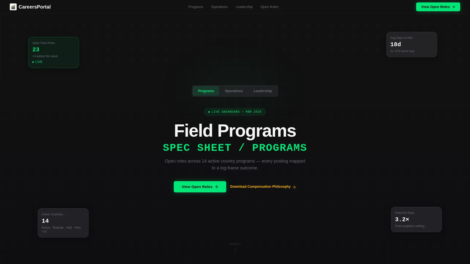
- A three-tab header dashboard showing live role counts, hiring metrics, and org-level statistics by department category
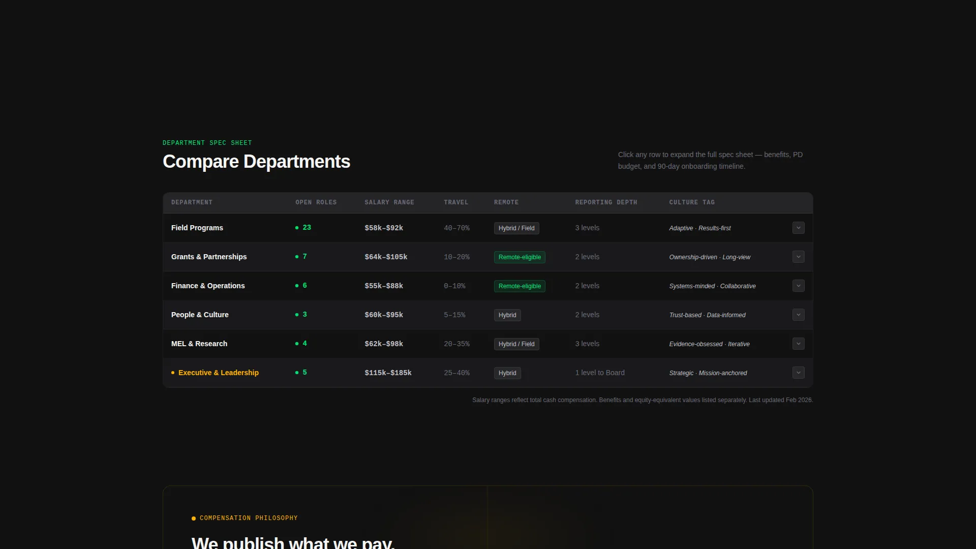
- A full comparison table with expandable rows that reveal benefits, professional-development budgets, and a 90-day onboarding Gantt bar
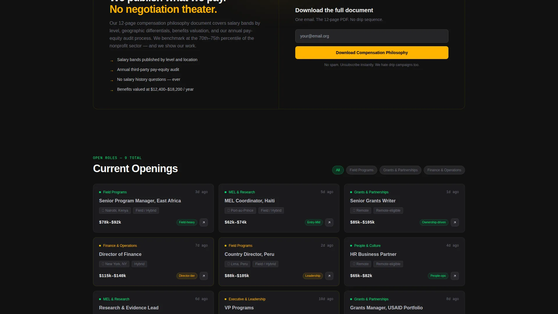
- A persistent sticky bar with a primary "View Open Roles" button and a secondary email-capture path for the compensation philosophy download
Feature list
This template includes a focused set of purpose-built components. Each one serves a specific function in moving a candidate from curious to committed.
Three-Tab Feature Switcher Header
The header organizes roles into three tabs: Programs, Operations, and Leadership. Each tab reveals a different dashboard card grid with role counts, hiring timelines, and org-level statistics. The tabs switch instantly, giving the visitor a full picture of the organization before scrolling.
Department Comparison Table
A structured table lets candidates compare every department side by side. Columns cover role count, average salary range, travel percentage, remote eligibility, reporting depth, and a team culture tag sourced from internal surveys.
Expandable Spec Sheet Rows
Each table row is clickable. Expanding a department fans open a nested spec sheet with a benefits breakdown, a per-employee professional-development budget figure, and a 90-day onboarding timeline rendered as a horizontal Gantt bar.
Sticky Call-to-Action Bar
A slim bar locks to the top of the viewport after the visitor engages with at least one tab or expands one table row. It holds the primary "View Open Roles" button in signal green and a secondary compensation philosophy download link in mission gold.
Email Capture for Passive Candidates
The secondary call-to-action path collects a single email address in exchange for the compensation philosophy document. This gives passive candidates a low-commitment way to stay connected without submitting a full application.
Dashboard Pro Visual System
The full Carbon Fiber color palette is applied consistently across all components. Signal green marks open-role indicators and hover states. Mission gold distinguishes leadership-tier positions. Every background stays in the deep-dark range, and text lives in silver and off-white.
Page sections overview
| Section | Purpose |
|---|---|
| Tab Switcher Header | Displays Programs, Operations, and Leadership dashboards |
| Programs Dashboard Tab | Shows field role counts, days-to-hire, and active project map |
| Operations Dashboard Tab | Surfaces finance and HR openings with headcount and retention data |
| Leadership Dashboard Tab | Presents C-suite and director searches with compensation philosophy stats |
| Department Comparison Table | Lets candidates compare all departments across six data columns |
| Expandable Spec Sheet Rows | Reveals benefits, development budget, and onboarding Gantt per department |
| Sticky call to action Bar | Persists primary and secondary calls-to-action after first engagement |
| Email Capture Field | Collects one email for the compensation philosophy download |
Design & branding system
The visual identity follows a Dashboard Pro theme using a Carbon Fiber color system. The palette is technical and restrained, built to signal institutional seriousness rather than warmth.
- Core colors: deep cockpit black (#121212) and woven graphite (#2A2A2E) for all backgrounds; instrument-panel silver (#C0C0C8) and near-white (#F5F5F5) for all text; single-pixel graphite dividers that appear only when needed
- Accent roles: signal green (#00E676) for open-role indicators and hover states; mission gold (#FFB300) reserved exclusively for leadership-tier position markers and the secondary call-to-action link
- The overall effect is a matte-black finish that feels technical, weightless, and precise, like cockpit instruments under steady overhead light
Mobile & speed optimization
The template is structured to remain fully usable on smaller screens. The tab switcher, comparison table, and sticky bar are each designed with compact display in mind.
- The three-tab header collapses gracefully so each dashboard card grid remains readable on a phone screen without horizontal scrolling
- The comparison table supports horizontal scroll on narrow viewports, keeping all six columns accessible without breaking the layout
- The sticky call-to-action bar remains visible and tappable at mobile sizes, so the primary conversion path is never buried
How this template helps you convert
This template earns the click before it asks for one. Every scroll layer adds operational detail that builds candidate trust incrementally.
- The tabbed header dashboard gives instant, department-specific context the moment a visitor lands, reducing early bounce by replacing vague welcome copy with real data
- The comparison table and expandable spec sheets reward exploration, so by the time the sticky bar activates, the candidate has already self-qualified and is ready to act
- The dual call-to-action structure captures both ready applicants through the primary button and undecided candidates through the email-capture secondary path, maximizing the total conversion surface
Other information about this template
This template is categorized under Nonprofit Organization Website Templates in the Technology category. It is designed as a single careers landing page, not a multi-page site.
- The template style is a Comparison Table layout combined with a Feature Tab Switcher header concept
- The creative direction follows a Spec Sheet approach: persuasion comes from data architecture, not descriptive language
- The landing-page direction is Click-Through, meaning every design decision routes the visitor toward a clear next action
- The template is well suited for organizations publishing salary bands publicly, reporting headcount and retention openly, and building a talent pipeline for both active applicants and passive candidates
Theme
Dashboard Pro
Creative direction
Spec Sheet
Color system
Carbon Fiber
Style
Comparison Table
Direction
Click-Through
Page Sections
Three-tab Dashboard Header
Department Comparison Table
Expandable Spec Sheet Rows
Sticky Engagement-triggered Call to Action Bar
Single-field Email Capture
Carbon Fiber Visual System
Related questions
Who is this careers landing page built for?
Can I update the numbers shown in the dashboard tabs?
Does the sticky call-to-action bar appear right away on page load?
What does the email capture section deliver to the candidate?
Is this template suitable for organizations hiring across multiple departments?



