Newsletter Template Landing Page | Tech Glass Design
A dark, data-rich newsletter landing page built for nonprofits that need polished email designs fast. This template combines a live interactive preview, frosted-glass flip-card template explorer, donor segment toggles, and a two-step signup form into one cohesive lead generation experience, so visitors are already using the product before they ever fill out a form.
by Rocket studio
Quick summary
This is a single-page, dashboard-style newsletter template landing page built for nonprofits. It uses a Tech Glass visual identity with electric lime accents, animated data counters, and a live interactive preview that lets visitors swap themes in real time. The goal is simple: turn curious visitors into signed-up users before they reach the bottom of the page.
Who this template is for
This template was built for mission-driven organizations that need high-quality email layouts without a design team or a long production cycle. If you are sending donor appeals at midnight or announcing a volunteer event with two days' notice, this is for you.
- Development directors drafting year-end appeals on tight deadlines
- Volunteer coordinators announcing events and campaigns quickly
- Grant writers and nonprofit communications leads who need polished donor-facing reports
What problem this template solves
Most nonprofit email tools offer either basic builders with limited visual control or expensive platforms built for enterprise marketing teams. The result is a painful gap: time-poor nonprofit staff producing emails that look underfunded, right when they need donor trust the most.
- No design team, no problem: the template makes professional layouts accessible to non-designers
- Removes the slow back-and-forth of briefing a designer or waiting on approvals
- Closes the visual quality gap between small nonprofits and well-resourced foundations
What you get with this template
You get a fully structured, single-page lead generation layout with five distinct interactive sections, a progressive two-step signup form, and a floating call-to-action bar. Every section is built to guide a visitor from curiosity to commitment using motion and live demonstration.
- An interactive hero with a live theme swapper across three newsletter styles
- A frosted-glass flip-card template explorer showing open-rate benchmarks per category
- A donor segment toggle that rearranges newsletter content in real time to demonstrate personalization
Feature list
This template ships with six core interactive and visual capabilities drawn directly from its design brief. Each one serves a specific conversion or trust-building purpose.
Live Theme Swapper in Hero
The header is not a screenshot. It is a functional newsletter preview rendered inside a glass-panel viewport. Visitors can click to cycle through three ready-made themes: Annual Gala Invite, Quarterly Impact Report, and Volunteer Spotlight. The headline block pulses once on load to invite the first click.
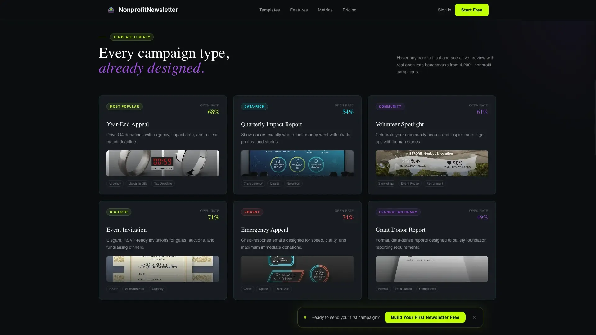
Frosted-Glass Flip-Card Explorer
Section one of the scroll experience presents a data grid of template categories. Each card is styled as a frosted-glass tile that flips on hover to reveal a live preview alongside an open-rate benchmark for that category. It turns passive browsing into active product discovery.
Donor Segment Toggle
Section two lets visitors select a donor segment and watch the newsletter content rearrange itself live on screen. This makes personalization tangible rather than theoretical, showing rather than telling how the platform adapts content to different audiences.
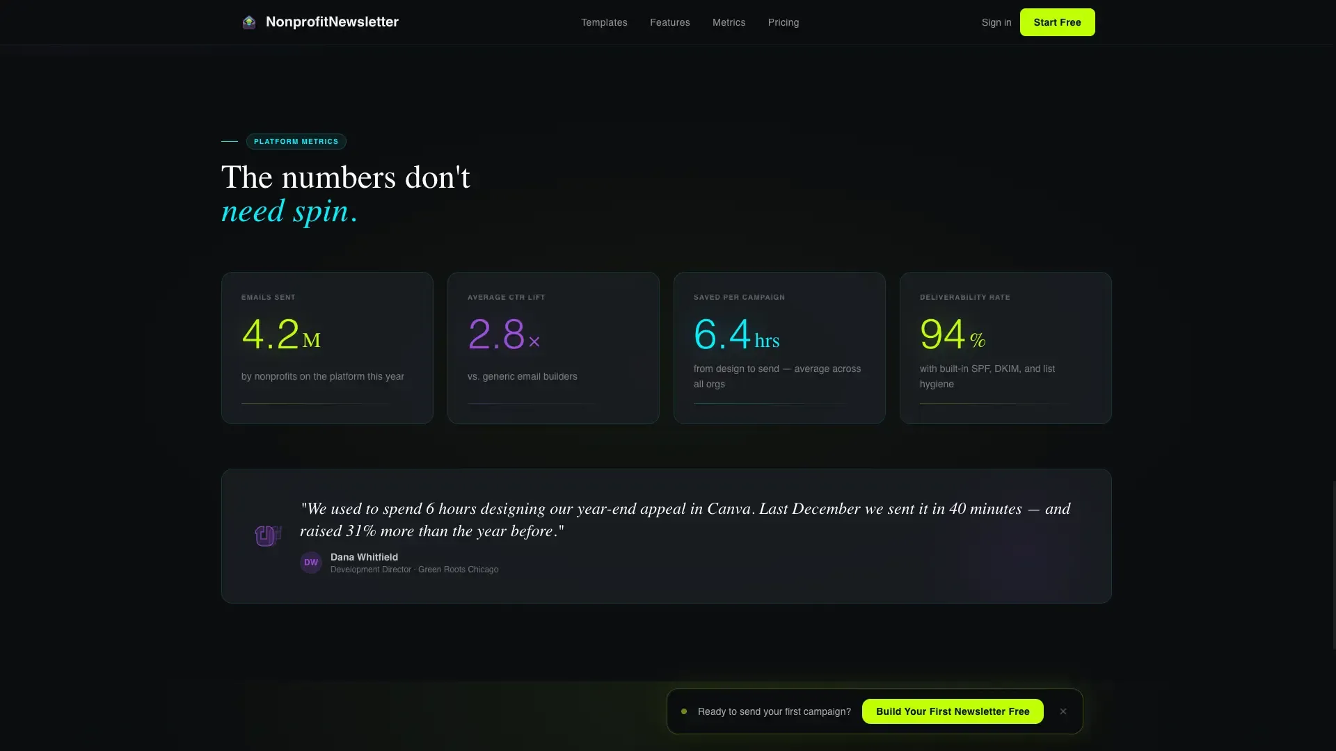
Animated Platform Metrics
Section three surfaces glowing, scroll-triggered animated counters: total emails sent by nonprofits on the platform, average click-through lift, and hours saved per campaign. These numbers act as social proof without requiring testimonials or case study copy.
Brand Color Puller
Before the signup form appears, visitors can paste their organization's website URL into an input field. The template pulls brand colors from that URL and applies them to a live newsletter mockup instantly. It converts curiosity into personal investment before any commitment is asked.
Two-Step Progressive Signup Form
The primary call-to-action form uses a two-step progressive disclosure flow. Step one asks only for organization name and email. After submission, the form expands inline to collect mission area, list size range, and sending frequency. This reduces friction at the highest-commitment moment.
Page sections overview
| Section | Purpose |
|---|---|
| Interactive Hero Preview | Live newsletter theme swapper with floating donor stat cards |
| Template Explorer Grid | Flip-card template categories with open-rate benchmarks |
| Personalization Demo | Donor segment toggle that rearranges content live |
| Platform Metrics Bar | Animated counters for emails sent, click-through lift, hours saved |
| call to action and Brand Puller | URL brand color input plus two-step progressive signup form |
| Footer | Horizontal flow footer with navigation and platform links |
Design & branding system
The visual identity follows a Tech Glass theme using an Acid Digital color system. The aesthetic feels like a heads-up display projected onto smoked glass: dark, luminous, and layered with purpose. Typography pairs Fraunces as the display serif with DM Sans for body and interface text.
- Void black (#0B0D0F) as the base background, with translucent panel gray (#1A1D23 at 85% opacity) for floating glass surfaces
- Electric lime (#BFFF00) for primary accents, active states, and the main call-to-action; hot violet (#9D4EDD) for secondary highlights and data visualization
- Faint cyan (#00F0FF) tracing borders and hover glows throughout the interface
Mobile & speed optimization
The template is built desktop-first, matching the primary use case of development directors working on laptops late at night. Full mobile support is included so the layout holds up across all screen sizes without sacrificing the interactive features.
- Server Components power static sections to keep initial load lean and fast
- Client Components handle the interactive demo, segment toggle, and progressive form to isolate rendering cost
- CSS keyframes, Intersection Observer triggers, and scroll-triggered reveals deliver animation without heavy JavaScript overhead
How this template helps you convert
Every design and interaction decision on this page is aimed at moving a visitor from passive viewer to active user. The page teaches the product by letting visitors play with it before asking for anything.
- The floating call-to-action bar reading "Build Your First Newsletter Free" appears only after the first interactive engagement, so it surfaces at peak intent rather than on arrival
- The "See It With Your Logo" brand puller creates a personal, branded preview that makes the visitor feel ownership before the form is ever shown
- The two-step form reduces the perceived commitment at signup by asking only two fields first, then expanding inline for richer data after the initial yes
Other information about this template
This template is categorized under Technology, in the Nonprofit Email Templates subcategory, targeting the nonprofit newsletter template niche. It is localized for English-speaking United States audiences using USD currency and MM/DD/YYYY date formatting.
- The creative direction is Interactive Explorer, meaning the scroll experience is structured like descending through layers of a control room, each depth rewarding curiosity with motion
- Animation is built with CSS keyframes, Intersection Observer, JavaScript counter animation, CSS flip cards, and scroll-triggered reveals
- The footer follows a Vercel Horizontal Flow pattern for a clean, minimal close to the page
- This template suits SaaS and nonprofit technology platforms serving both business-to-consumer and business-to-business mission-driven organizations


Theme
Tech Glass
Creative direction
Interactive Explorer
Color system
Acid Digital
Style
Dashboard/Data Grid
Direction
Lead Generation
Page Sections
Live Interactive Newsletter Preview
Flip-card Template Explorer
Donor Segment Toggle
Animated Social Proof Counters
Url-based Brand Color Puller
Two-step Progressive Signup Form
Related questions
Can I use this template without any design experience?
What newsletter styles come built into the hero preview?
How does the brand color puller work?
Is this template suitable for a small nonprofit with a limited budget?
Does this template work on mobile devices?


